One horned creature pursuing another while wielding a camera. A bit zany but interesting to say the least. The white oval shapes guide us through the image (shoes, backpack, antlers, rock, tail, body, head) from lower left to upper right and out of the frame, so we immediately see what we are meant to focus on and find the story, whether we understand it or now. A lesson in leading the eye.
May 1, 2024
52
-

-

An outstanding study of camouflage at work.
The left/right split with the two aspects of the camouflage makes the point beautifully.
The left hand side of the branch has more light on it and this pills our view a bit to the left and away from the butterfly. A little selective darkening and merging down the left would ice the cake further. -

Agree completely!
-

A very interesting image, especially as explained by your description Pete.
A couple of others suggested a little more space above the head and Mike a slight brightening of the lower right. I tried to deal with the noise of the image but none of the software I use would deal with it without introducing massive artifacting so I left it alone. I did not add much to the height. More could be added but it is a personal preference. I thought the original was fine.
Andrew -

The musicians seem to be looking at the swagman with a thoughtful expressoin on their faces, but who knows where the swagman is looking or even if he has a face. Still the connection is felt between them.
The text explains the scene and the linked article is very interesting, and informs us that Australia's last swagman is, rather ironically, a New Zealander.Pete
-
The three-toned water is neat, and I like the strong leading line of the jetty towards the island on the horizon.
Pete
-
This is another little corner of your home, which has been transformed by sunlight, which strikes the scene so obliquely, that even the slim light switch produces an over-sized shadow. The light also makes the most of the texture on the wall, and makes the part in shadow seem smooth in comparison.
The picture frame adds some vertical and horizontal lines to the composition, which play against the diagonal shadows of the blinds nicely.
I understand what Mike says about the steps n the bottom left, and by cropping off the lft side beyond the wall, they are removed and the composition is much more peaceful, but I quite like the tension the steps bring, and the slight curves and scalloped shadows they bring adds another little element to the image.
I was about to suggest cloning out the bright patch in the black shadow on the left, but realised that cleaning my screen solved the problem! Oops.Pete
-
This photo contains that very welcome, but elusive, element - humour. That always bumps an image up a few notches in my appreciation.
The viking has made it quite close to the reindeer, but they are not totally fooled by the horns and seem to be heading off into that lovely landscape.Pete
-
I agree with Rich's comments and also with the brightening and slight increase in saturation(?), however, I prefer the original crop, as I think those almost invisible shapes of the dam's construction, looming out of the darkness, add to the atmosphere of the place and to the mix of the natural and the manmade.
Pete
-
That seems to be a perfect specimen and your choice of a symmetrical composition underlines the symmetry of the mushroom. Having said that, I like the two diagonal grasses on the left, which, even though there is a balancing diagonal row of short pale-brown grasses on the other side, is enough to stop the background from being too perfectly symmetrical. This slight asymmetry in the background makes the mushroom seem even more perfrct.
Pete
-
I agree, and the slightly over-exposed greens in the background are the perfect colour to set off those brown tones.
Pete
-
Thanks to all who commented or looked.
I have had another go at processing the image, taking on board the suggestions made.
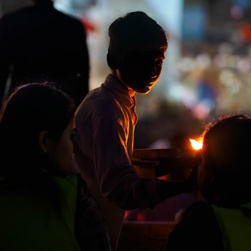
The image seen after posting is actually slightly darker than I see it in Lightroom, but I have brightened the new version a bit more. I used the new Denoise function in Lightroom to deal with the noise and it has done a decent job, leaving enough noise/grain to stop it looking totally plastic. I might play with the sliders some more, but have no time now. The top of the frame above the boy's head in the original is as shot, so there is nothing to be gained with a different crop, however, I used the trick up Photoshop's sleeve to extend the canvas and let AI generate the extended background, and, again, the result is very good.New Version:-
Actually, this looks darker than expected too! However, the woman on the left is more visible now. Do you think she distracts though, even though her gaze is back towards the boy's hand and the other person?
And here is a version with a crop down the left-hand side.
New version 2:-
-
It's hard to tell whether or not dark areas under discussion are in the original or what I am seeing on my monitor. I'm away from home and viewing these on my laptop and the screen isn't as bright as my home monitor. Until I saw this altered version I hadn't even seen the woman on the left. While I like the crop, I preferred it when the left hand side looked all dark to me. Previously, if we hadn't been told we were in Varanasi and if we didn't have the title, I wouldn't have understood what was happening. Now, I'd work it out.
But now my responses are all over the place and I like different things in the two versions. I could make a case for the more inclusive second version with the extra space at the top and the girl on the left watching. I could also make a case for the original tight crop at the top and a much tighter crop down the left to a little behind the boy's head while losing the girl on the left completely and keeping the raised shadow detail of the figure on the right. This version would increase the intensity and intimacy of the tika contact between the boy and the devotee. In both cases, I'd have a go at reducing the highlight of the flame a little. -
Thanks, Chris, I agree it's a bit too dark. Brightened it some but not enough. When it's cloudy it can get really dark down beneath the dam.
Thank you, glad you liked it. The dam is my go-to hangout and has been for 8 years. Some years the birds are crazy fun. Some years they are scarce. Changing weather patterns have a lot to do with it, as do the actions of the dam engineer, for whom the birds are so minor he didn't even realize they were there till I told him. My walls are full of dam birds, closets too. I need somewhere else to put them! I really like what you've showed me with the coloring and brightening.
Thanks Mike. I agree with you on the crop. I don't like to get too tight because it reveals the weaknesses of my m43 camera, and I also prefer to show some architectural elements in the bird photos I take there - it's one of my trademarks that no one else does. You are right that there are multiple light sources down there: the partly shielded arc of the sun (wherever it may be), and the light from the various grates in the dam structure, which are opened and closed according to the mysterious plans of the guys in the tower.
Thanks Pete, and that's why I do it. There is something pleasantly confusing about the mix of the concrete shapes, rampaging water, and graceful birds that has become the underlying theme of all my dam photos, and I tend to stick with it. I agree that Rich's rendering of light and color is an improvement.
-
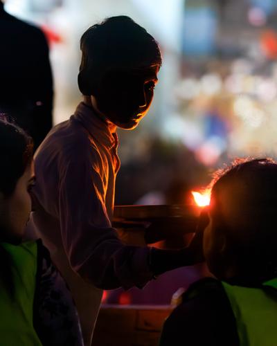
So, as suggested, I have chopped off the left hand woman. Originally I wanted to keep her in the frame to add a bit of information about the scene, but keep her very dark, to avoid her from becoming a distraction, but this crop works well and centres attention on the process of applying the Tika.
The flame is more difficult to deal with, but I have managed to tone it down a bit.Pete
-
I like this version best of all. It hits the possibilities I thought were in the original. What do others think?
-

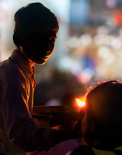
I like this version too, but I didn't mind any of them too much as the primary subjects (the lamp, the boy and the light of the lamp) take centre stage and the rest of the photo is what was there at the time.
This photo is quite exceptional to me as, although there is not a lot of illumination, the boy's partially lit face is enough to show a gentle softness - solemnity, in his demeanor. Also enough to show the geru colour of his shirt.
It is also intriguing in that we have a quite dark shaded area in the foreground but a well lit background. I feel the background accentuates the foreground. Perhaps if the background could be darkened a touch - I am not sure...