• Aug. 17, 2024, 3:59 p.m.

    Some of you have said you wanted to see the 'before & after' pictures and a small explanation. Well, here's my attempt at what I took, what I did with it and what it ended up like. [Please do not edit the images, although you may use them in any quotes in this thread].

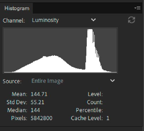
    First picture was this one:
    PBCF0267 (Superlarge).JPG

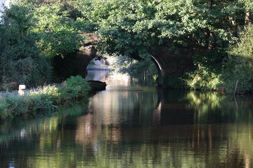
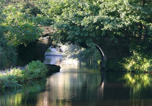
    I wanted the water reflections and light off the bridge. The original felt a little bit underexposed and I didn't want that white thing at the side, so a bit of cropping and add to the exposure and contrast and the end result was this:

    PBCF0267 copy_(Superlarge).jpg

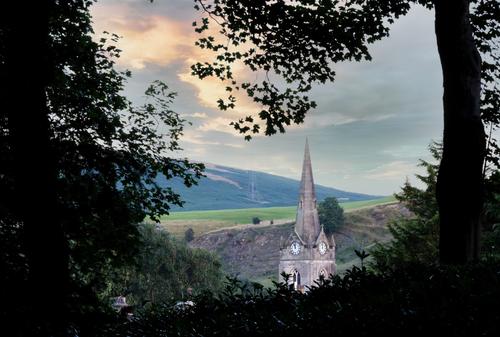
    Next picture was this one. A view of the church through the trees.
    PBCF0284 (Superlarge).JPG

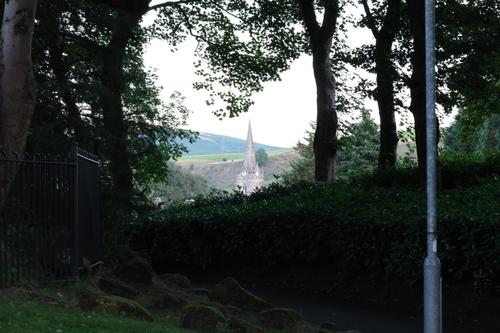
    I knew when I took it what I wanted. But I had the wrong lens with me so it needed a fair amount of cropping to get the church surrounded by the trees (but that is the advantage of a 40mp sensor - you can crop a lot at it still looks OK). Anyway, from the original, I ended up with this after cropping, editing and swapping the boring sky out for something better.

    PBCF0284-Enhanced-NR copy_000_(Superlarge).jpg

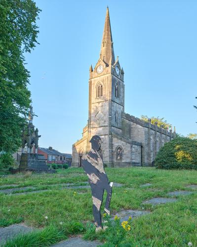
    Next was this one. Church & wooden war soldier.
    USCF0111 (Superlarge).JPG

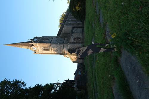
    I once again knew what I wanted out of it - the hypocracy of the church 'hosting' a war statue. But the sky overpowered it a bit, so I had a fair amount of work to do. Not a perfect picture because the soldier was fairly damaged (vandals?), but I thnk it gets the point across.

    USCF0111-c1-15_(Superlarge).jpg

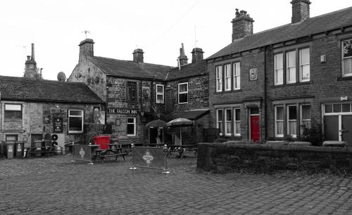
    Then, the Falcon Inn.
    USCF0128 (Superlarge).JPG

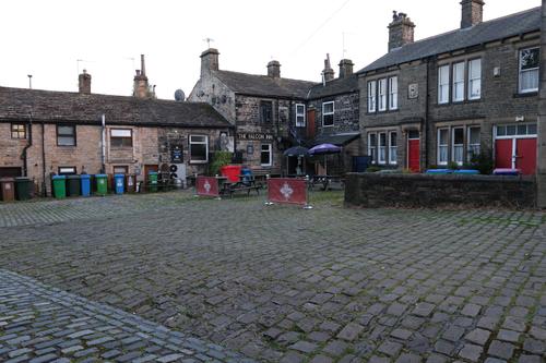
    Just crying out for B&W. But I felt it needed a touch of colour. So, new B&W layer in Photoshop and then erase the bits I wanted with colour. It's a shame I cut the top of the chimney off, but I didn't notice at the time.
    USCF0128-2 copy 2_(Superlarge).jpg

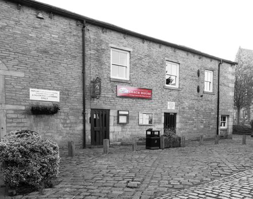
    Same idea with this picture of the Coach House
    USCF0114 (Superlarge).JPG

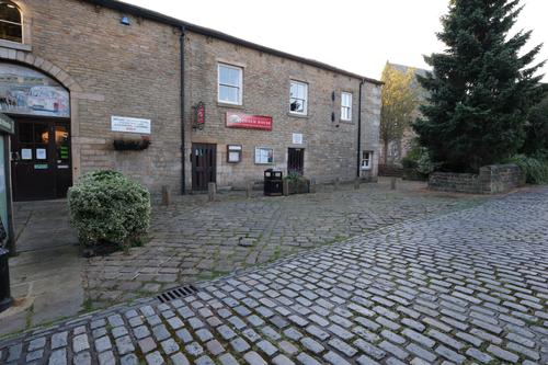
    I think it works well. I wanted to crop it because the big tree and the door were distractions.
    USCF0114 copy_(Superlarge).jpg

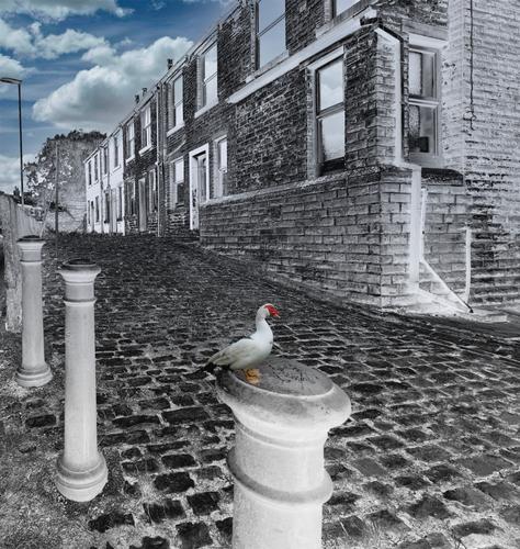
    Lastly, a fun picture of what is a boring set of houses.
    USCF0127 (Superlarge).JPG

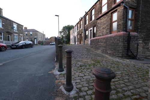
    I cropped the street out, the reduced the saturation and increased the black. Added the sky and my bird to make it a bit of fun.
    USCF0127 copy 4_0000 (Superlarge).jpg

    So, there you have it - what I did and why I did it. Feel free to comment (as long as it's about the pictures).

    Alan

    USCF0127 copy 4_0000 (Superlarge).jpg

    JPG, 1.9 MB, uploaded by AlanSh on Aug. 17, 2024.

    USCF0127 (Superlarge).JPG

    JPG, 1.9 MB, uploaded by AlanSh on Aug. 17, 2024.

    USCF0114 copy_(Superlarge).jpg

    JPG, 1.6 MB, uploaded by AlanSh on Aug. 17, 2024.

    USCF0114 (Superlarge).JPG

    JPG, 2.3 MB, uploaded by AlanSh on Aug. 17, 2024.

    USCF0128-2 copy 2_(Superlarge).jpg

    JPG, 2.0 MB, uploaded by AlanSh on Aug. 17, 2024.

    USCF0128 (Superlarge).JPG

    JPG, 2.1 MB, uploaded by AlanSh on Aug. 17, 2024.

    USCF0111-c1-15_(Superlarge).jpg

    JPG, 1.5 MB, uploaded by AlanSh on Aug. 17, 2024.

    USCF0111 (Superlarge).JPG

    JPG, 1.3 MB, uploaded by AlanSh on Aug. 17, 2024.

    PBCF0284-Enhanced-NR copy_000_(Superlarge).jpg

    JPG, 1.1 MB, uploaded by AlanSh on Aug. 17, 2024.

    PBCF0284 (Superlarge).JPG

    JPG, 1.4 MB, uploaded by AlanSh on Aug. 17, 2024.

    PBCF0267 copy_(Superlarge).jpg

    JPG, 2.8 MB, uploaded by AlanSh on Aug. 17, 2024.

    PBCF0267 (Superlarge).JPG

    JPG, 2.1 MB, uploaded by AlanSh on Aug. 17, 2024.

  • Members 3318 posts
    Aug. 17, 2024, 9:42 p.m.

    You did a pretty good job in most of them Alan. I like the first two the most.

    But the after church photo, although shows the details in the original's foreground shadows, looks way too flat (lack of contrast) with very little depth for me.

    Just out of curiosity was it a sooc you edited or the raw file?

    As you are most likely aware, 16 bit raw data gives much more flexibility and options than 8 bit jpegs to process high contrast scenes like the before church photo.

    If you like and you still have the raw file, you can post a link to it and I or someone else can have a go at coming up with an image with more depth and contrast.

    Just some food for thought 🙂

  • Aug. 17, 2024, 10:06 p.m.

    Dan,

    Thanks for the comments. I don't find the church scene flat, but I am happy to give it another go. I may have overdone some bits as my masking technique is still very basic.

    Just FYI, I always edit raw files.But I'd rather not have people edit them at the moment. I'm still learning.

    Alan

  • Members 3318 posts
    Aug. 17, 2024, 10:16 p.m.

    No problem 🙂

    Just a hint fwiw, use the luminosity histogram to ensure maximum overall contrast by having luminosity data as close to 0 and 255 as possible. I normally use a Levels Adjustment Layer.

    Localised dodging and burning can also help add contrast and depth to a scene.

  • Members 3318 posts
    Aug. 17, 2024, 10:35 p.m.

    Just as an example of what I mean above.

    This is the luminosity histogram of the after church photo.

    churchHistogram.jpg

    There is significant room to the left and right of the data. Moving the left and right extremities of the luminosity data to the left and right sides of the histogram using a Levels Adjustment Layer should help improve overall contrast and depth to the scene noticeably imo.

    Anyway, just some more food for thought.

    churchHistogram.jpg

    JPG, 42.5 KB, uploaded by DanHasLeftForum on Aug. 17, 2024.

  • Aug. 18, 2024, 6:59 a.m.

    Thank you. I will try that out when I am next near PS.

    Alan

  • Members 3318 posts
    Aug. 18, 2024, 11:09 a.m.

    No problem. If you need more help simply post back 😊

  • Aug. 18, 2024, 11:18 a.m.

    My personal opinions.

    1st one - bridge
    On original image composition is better, the white thing at the left could be cloned out. About exposure - original is a bit more like painting, edited one is more like photograph. Depend on context and intention either one can be used; I have no clear preference. (I often prefer darker images.)

    2nd - church I
    Crop is good (there are few possible options, yours is most logical). What I personally do not like, is replacing sky with completely impossible one (light/colors do not match) - either you keep original, either you will edit entire image to create something new.
    Was the sky uniform gray/white? You could use some EV stacking or just taking multiple images to recover sky (even gray sky has some gradation). When I'm faced with huge dynamic range of scene, I usually take 3-4 shots with different EV correction; I have not enough skills to set it right once (histogram view helps, but sometimes multiple source images are needed anyway).

    3rd - church II
    Sorry, too flat. I don't know from where comes the urge to lift up all the shadows (you're certainly not alone) - for me this kills the dynamics. Again, for such a scene you could take multiple exposures and combine them in some HDR tone mapping software - result is often better, containing both shadow details and local contrast.

    4th, 5th - selective colouring
    Intent is good, I also sometimes keep only red color on b&w. Maybe there are too few of colored objects left - you could try with cropping much more of uninteresting parts of image off.

    6th - composite with bird
    This I like most - you replaced sky with wrong one, but you altered entire image to match it and end result is balanced and artistic.

  • Members 3318 posts
    Aug. 18, 2024, 11:38 a.m.

    I pretty much agree with what you say. I do very little HDR merging mainly because I would need to set up the tripod to maximise the chance the various exposure photos align correctly in the pp. If I hand hold, there is a higher chance my images won't align properly.

    In high contrast scenes like the church scene my approach, whether hand holding or on a tripod, would be to use the camera's histogram to help me get as much light onto the sensor as possible within my dof and blur constraints without clipping important highlights - in this case the sky.

    If using a tripod I would lock in base ISO and then ETTR after setting the widest aperture that gave my dof.

    Then the 16 bit raw data gives me much more flexibility in raising the shadows and lowering highlights to suitable levels than 8 bit sooc jpegs would give me.

    Getting as much light onto the sensor as described above minimises the visible noise when the shadows are raised in post.

    In Alan's case he has left some contrast "headroom" in the image (as shown in the histogram), but it seems from his comment that he is comfortable with that and that is fine.

    Imo increasing the contrast to maximum according to the histogram improves "depth" in the scene and helps to give it a bit more punch.

  • Aug. 18, 2024, 11:59 a.m.

    This is given.
    I don't know about Alans XT5 - my Fuji (X100V) includes very little highlight headroom (at least compared to my previous Sigma), thereby I'd rather underexpose a stop or half. Noise in shadows is possible to remove, burnt highlights unfortunately not. Taking multiple images with different exposure allows me to choose best one; for me that is simpler than analysing histogram in the wild. YMMV.

  • Members 3318 posts
    Aug. 18, 2024, 12:14 p.m.

    No problem. Everyone will have their preferred way of doing things 😊

    Regarding the histogram, the camera's histogram is of the jpeg data the camera makes for the lcd display and not of the actual raw data.

    To view a histogram of the actual raw data you need something like RawDigger which unfortunately cannot be viewed in the field immediately after taking a photo.

    But comparing the camera's histogram of several ETTR'd images with the raw data histogram in post shows that my 90D still has about 1/2 - 2/3 of a stop of highlight headroom when the camera's histogram has been pushed all the way to the right.

    This is where common sense comes into play. That 1/2 - 2/3 stop of highlight headroom is not going to make any visible difference in a scene with good light - sunny day on a beach - but could make a visible difference in a low light scene where minimising visible noise in the final image is a significant priority.

    In summary, in very good light I tend to push the camera's histogram to the point where the data only begins to touch the right side for fear of increased risk of clipping important highlights if pushed another 1/2 stop.

    But in a low light scene I am much more likely to push the camera's histogram up to 1/2 stop past where it begins to touch the right side.

  • Aug. 18, 2024, 5:09 p.m.

    Thank you all. I have much to think about and I will respond in a while. I've just arrived at our campsite for a few days away and only have my laptop, so any processing will be slow (ish).

    BTW, I love the feedback from you all. This, for me, is what this forum should be all about. Keep up the good work.

    Alan