I have received some interesting feedback for the images I have posted so I thought I would post another one. Thanks for any comments/critique.
April 14, 2023
8
-

-

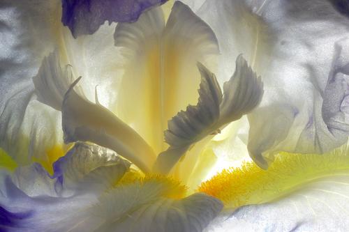
Great detail, texture, beautiful colors and light! I think a slightly different framing/getting a little bit closer or using a shallower DOF (if possible) might help getting a clear point of interest for the eye to focus on, but of course that depends on what you want to achieve in the first place.
-
Simplejoy, thanks for the input. Your suggestions mirror what I have heard about some of my other photos. They often lack a clear center of interest/subject, which could be altered by your recommendation of shooting tigher or using a shallower DOF to emphasize a subject.
-
I love the color and texture here…but more importantly, the creative and unique way you used the light.
-

I agree with the previous comments.
In this case, just increase the contrast and you will see that the image becomes more three-dimensional. -
Davinator, Manuel, thanks for the comments. I will add a bit of contrast and probably also a bit more saturation.
-

I agree with the others that one’s eye struggles a bit for a specific area of interest. OTOH that’s probably what contributes to this being a somewhat abstract view of the flower. The use of light, contrast, form & color make it interesting to look at. Enjoyed.
-

Color and tonality and the sinuous curves of the iris make this a striking flower portrait. It's bit abstract for some tastes but I like it lots.
If it were mine, which it is not, I would crop in from the right and let the V form dominate right smack in the middle, moving the brightest area with the lost highlights off a bit to the right of the frame where it's still doing its magic but doesn't act as much like a magnet. But that may be more Georgia O'Keeffe-ish than you have an inclination for.
I am not entirely sure how I feel about the graininess of the flower on close inspection. I think it is backlighting shining through the textural structure of the flower. It bothers me a bit enlarged but not at all in the smaller version. I am not sure how it would be in print, which is always something I automatically think about. How this would render, and what paper you would need, is something I'd give thought to if printing.
A beauty!
-
Definitely inspired by O'Keeffe as are many of my photographs and paintings.
I will have to give some thought to the crop. BTW, the areas of bright highlights and the texture are substantially toned down with a print versus the transmitted light of a monitor. When printed the texture is actually quite appealing, at least to me. I rarely use metallic paper but a similar vertical composition did really well on metallic paper. The metallic brought out the silver colors.