• March 28, 2023, 7:48 a.m.

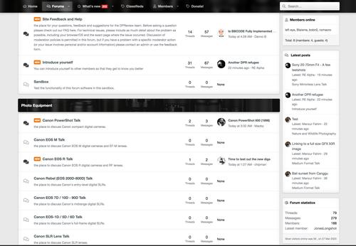
    I seem to remember when this site first went live the Categories screen was a list.

    Then a couple of days ago you unleashed the extra features of some in-built crazy block-view option in the software. It doesn't work. Less is more. Or at least more simplicity and order is more.

    Please do change the Categories screen to an ordered list, which basically means the actual forum headings under each other rather than arranged into sectioned blocks.

    You can have the extra 'sidebar' info on who's posting to the right, but keep the forum headings all as a vertical list on the left, within sections. We need some clarity.

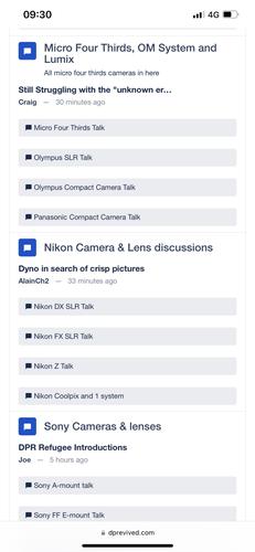
    Here (a confused block, where to go? - my brain is exploding!!) :

    Screen Shot 2023-03-28 at 08.31.49.jpg

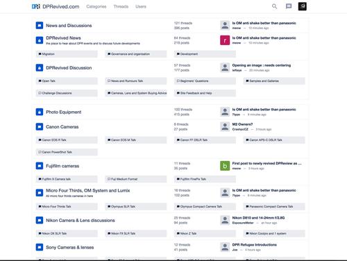
    DPR (looks ok though has always been too narrow) :

    Screen Shot 2023-03-28 at 08.33.04.jpg

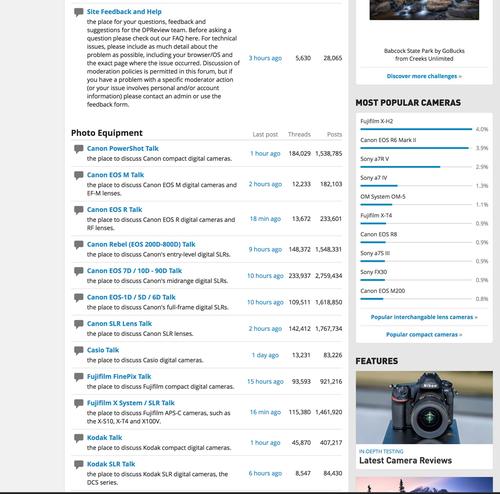
    DPRenewed at myBB (looks ok) :

    Screen Shot 2023-03-28 at 08.32.19.jpg

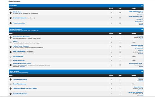
    DPR Clone (looks ok)

    Screen Shot 2023-03-28 at 08.33.30.jpg

    So mainly, organise forums as a vertical list (with other stats stuff you want to include over on the right). Keep it compact though, to reduce the need for too much scrolling up and down. Less is more, loose the complex block.

    Screen Shot 2023-03-28 at 08.33.30.jpg

    JPG, 454.4 KB, uploaded by lefteye on March 28, 2023.

    Screen Shot 2023-03-28 at 08.32.19.jpg

    JPG, 439.8 KB, uploaded by lefteye on March 28, 2023.

    Screen Shot 2023-03-28 at 08.33.04.jpg

    JPG, 503.5 KB, uploaded by lefteye on March 28, 2023.

    Screen Shot 2023-03-28 at 08.31.49.jpg

    JPG, 401.1 KB, uploaded by lefteye on March 28, 2023.

  • March 28, 2023, 8:29 a.m.

    Alan did both this and DPRenewed at MyBB. I thought that the new arrangement was better. One problem is that until we've done new style sheets the layout is less dense than we'd like, and this three level layout was an attempt to fix that. Still, it will settle down one way or the other - thanks for the feedback.

  • March 28, 2023, 8:36 a.m.

    [/quote]
    Alan did both this and DPRenewed at MyBB. I thought that the new arrangement was better. One problem is that until we've done new style sheets the layout is less dense than we'd like, and this three level layout was an attempt to fix that. Still, it will settle down one way or the other - thanks for the feedback.
    [/quote]

    Actually the blocks order to a list on a mobile phone... which is better...

    image_123986672.JPG

    Though as I raised elsewhere about too much 'white space' and large margins, again I think there too much padding between lines - not that it should go to other extreme and be too dense. Anyway my vote is for the clearer ordered lists (that also exist everywhere else) rather than blocks.

    • many thanks for your reply.
    image_123986672.JPG

    JPG, 288.0 KB, uploaded by lefteye on March 28, 2023.

  • Members 13 posts
    March 29, 2023, 1:43 p.m.

    I totally agree, and hesitate to come here because of the landing page.
    It really is that bad!

    How hard would it be to make a context menu with direct links to all forums, à la old DPR? When hovering over the menu item?
    (And why is it called "categories" rather than "forums" or "fora"? This is besides the point, just wondering).

  • Foundation 32 posts
    March 29, 2023, 1:52 p.m.

    I wish it were called Forums and not Categories as well. But we have what we have.

    Alan

  • Members 509 posts
    March 29, 2023, 2:13 p.m.

    When viewing on a monitor, the new layout somehow looks better in dark mode (using a browser add on).

  • Members 15 posts
    March 29, 2023, 3:47 p.m.

    I think I will go elsewhere for a few
    Months then come back. It’s a valiant effort but the pain of losing is to fresh.

  • March 29, 2023, 5:29 p.m.

    Agreed. Well, I'm not avoiding this site of course, but such kind of page design is real nightmare. Even list with two or three columns would be preferred - this way it could be fully visible and easily navigable.

    I like 'mother site' Forums popup menu layout (attached) - allows me easily switch between few favourite forums and stay mostly in single, most preferred one.

    forum-list.png

    PNG, 175.7 KB, uploaded by Arvo on March 29, 2023.

  • Members 214 posts
    March 29, 2023, 5:39 p.m.

    I actually disagree
    It's different but I like the main segment and then subsegments just below eg Micro Four Thirds as a generic and then with sub categories beneath
    I don't care what they are called - fora, category, banana...
    At the moment it's the least important ...much more important to get things up and running and to get members joining (in our 1000s)
    As I pointed out in another thread the best change is the Threads appearing as they are added/amended so you have a feel for what's happening on the site

  • March 29, 2023, 5:57 p.m.

    (about categories view)

    Yes and no.
    There is such little thing as the first impression - and if this happens to be negative, then some potential users look for alternatives at next click.
    Of course getting site running smoothly is first priority, but look and feel are very important factors too.

    But as always, different standpoints and views are welcomed. I can't know beforehand, does my personal opinion belong to majority or minority - but I hope that all ideas, suggestions, opinions etc will be taken into account here somehow.

  • Members 1521 posts
    March 29, 2023, 6:23 p.m.

    There are surely qualified people who could make layout proposals, like web page designers, or graphic designers.
    This is what made the strength of DPReview at its beginning.
    An easy-to-read and pleasant-to-use interface.