I can't decide what I don't like about these images, but there's something odd about them.
Comments and critique are welcome.
April 18, 2023
19
-
-
Both are nice and moody but the second one is my favorite, the first one might be just a bit to dark
-
Hi this is going to be about what I think is wrong about them and therefore will be negative.
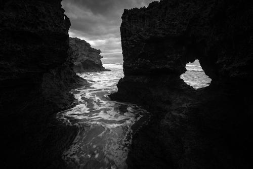
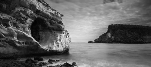
Top image the horizon is sloping
The hole is interesting in itself but is just adding a view of fairly nondescript water.
Half of the image is so dark that little or no discernible detail
The background rocks just lack contrast, slightly lighter grey against slightly darker grey.
The sky, background rocks and water are all roughly similar in luminosity.
The water is ok but it is the major interest in the scene.
If the hole in the rock is the subject then it is too small, stuck off to the side with what little light that is present in the scene elsewhere.
I suggest that you isolate each element and see if they stand up by themselves, I suggest that as shown none of them do.
The only flow in the scene is down the quarter just left of centre but it isn't particularly interesting.This is meant to help and I hope it does but remember it is only my opinion.
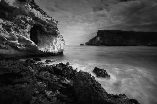
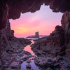
2nd image
This image isn't helped by the light that is flat (again)
The light rock is nice and the cave is interesting but not photographically
The foreground rocks are dark and part from a smallish central section lack contrast. I look at them once and I have seen everything about them
The background peninsula is mostly very dark but the brightish rock on the end and the tiny bright bit of foam look nice
Shutter speed is either too long or way too short.However radical cropping may produce a good image although I haven't downloaded it to see if it really works as lots of people get very uptight about this.
My crop would be crop the bottom just up to remove the isolated rock in the foam, Crop half of the sky between the top of the peninsula and the present edge of image
Crop half the peninsula off the right hand side and a little off the left to leave all of the circular cave plus some to the left of this.I would be interested to see this, of course it could look terrible.
I may just be in a bad mood but that is what I see in these images, lots of it is down to very flat light. Ken
-

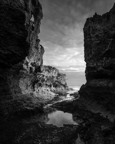
Everything is about what one is reaching for. I like being lead by light, lines, whatever, through an image for multiple points of interest.
Also have always been big on the Zone system and distribution of light values from 0/1 to 9/10, where available. But that's me...
agree with much/most of what NotsoGloomy1 has noted.
I would add, for whatever reason (likely because there so much light is missing) there's a sharp vertical 'line'/demarcation in the water... One of the 1st things I saw, without even looking for 'concerns' - drew my attention straight off... not sure what that is...
I'm not big on making sizeable amounts of edits...
So with what the image has: crop to focus, Light to lead - active water leads to Cave, to light on the horizon, and then some dimension to the 'headland which was just a plug of 'dark' no dimension.
Bringing some dimension to the foreground rocks, allowing interest and linger on them. Then more dimension to active water and especially the cave/rock structure.
2 mods, crop, tonal curve adjustment to bring light and more dimension.
Hope OK to show my edit... was fun and learning for me...Thx, Yuri
-

The second image is nothing short of stunning. Absolutely perfect. Hard to imagine that anyone could have shot this better. Extremely well done IMO.
The first image misses it for me compositionally as, to me, the ‘path’ of the eye through the image is the water ‘canal’ but my eye is very distracted by the hole in the rock and keeps darting over to that bright spot. It just doesn’t work for me (but that JUST me…..for all I know you could sell a million copies of this image!!!!!)
-

On my screen, your edit is better than the original but now too light 🙂 Something in between would look nice on my screen.
On my screen the first one is just too dark and the scene itself doesn't really do much for me either. If it was mine, I would lighten it (to suit my screen) and maybe try adding some pop and punch with some selective dodging and burning.
The second one, the scene is very interesting but again the image is a little too dark, but not a lot, on my screen.
People need to remember that when viewing images online, what the image creator sees on their screen in terms of colours and lightness can be noticeably different to what viewers of that image will see on their screens.
-
Thank you! That's actually quite helpful. Yes in #1 the scene feels like two separate scenes, but it's very hard to get that circular opening work in a composition. There's nothing interesting behind it and putting a human behind it would have been dangerous because of the surf.
I've got another version of it taken ~3 years ago
As to #2, it was an attempt to produce an interesting composition with that cave, unfortunately a better PoV was unreachable.
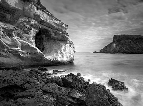
Here's the crop roughly as you suggested, although I'm not sure if it got drastically better. I guess the scene needs better light (golden hour) -
Thank you! Yes this crop might look a bit better than the original (in fact it was a full frame, no cropping was applied). I need to think if I want to adopt a similar cropping for the image.
This version looks a bit too bright to me though, it was darkened deliberately for mood :) The foreground rocks aren't hugely interesting so I used a bit of dodging and burning there to emphasise the cave and the foam that leads to the cave diagonally. -
Thank you! Yes I agree about the #1, the scene feels like split into two parts (the water flow and the opening) and those parts don't play together well.
-
Thank you :))
-
Thank you! Yes as above I made them dark deliberately. With the #1 actually it was post sunset or near sunset with clouds, so the place actually looked quite gloomy.
I use a calibrated monitor but quite often my images look a bit darker than I would expect when viewed on a phone or a monitor with enhanced contrast setting. That crushes the shadows sometimes. -

The first one immediately caught my attention. It has impact. I saw a comment saying it was too dark but I don’t think so. All that contrast just grabbed my attention.
However, these comments are based on seeing it on a relatively small cellphone screen. A large print might cause a slightly different reaction - or might not.
-
I should have noted in my post, there's a lot to like in this image! Yes, the light is flat, but that does have it's 'presentation value' in the sense of drama. A clear or un-worried sky would have an opposite effect. The breaking water is turbulent enough, but the blur is not too much to make it smooth and lacey.
And, as I noted, how one/you presents the image depends on what you feel is important.
I don;t get 'foreboding' from this. The overall water is too quiet, the sky although clouded is not showing 'foreboding/storm'.
I chose 'mystery'... The Cave is the key element, for me. What is it? what's inside? What created it? Why? A perfectly round opening, why?
Nature created or Human? With some thought, why would humans chose to carve a perfect circle cave, in this place (so prolly not 'human')?
It is a mystery, mysterious.
I chose to light the exterior just a bit more and thereby put some 'gradient' into the receding interior, to add dimension/depth - for the 'What's Inside?' Q.
The rocks in the foreground - just very flat dark, so I chose to show more volume thru gradient, which brings out their craggy, serrated, rough form.
What does perplex me - the vertical line of tonal demarcation in the water. And the inverted Triangle of darkness (pointing down) at the top of the image, in the sky.
Neither seem to be changing 'light'. Their lines are sharp and the underlying forms of water and cloud are continuous thru them.
These would be very noticeable if the image was enlarged beyond the small images seen here, in the posts. In an 8x10 or 11x14 or larger, they would be very obvious and disconcerting, as if they were some wayward 'masking'...
Do you see those? are they in the original image?
I think this image would look great/dramatic printed on a hard white, semigloss paper.
Thx
Yuri -

I like the 2nd image exactly as-is & wouldn’t change the lighting or crop. IMHO it’s a really good image.
The 1st image is, for my eyes, so black in large areas that it lacks much to look at. I find that off-putting.
-
I'm liking both more than a little, but favor the first one due to both the contrast and the shape, path, and pattern of the water. The whole on the right helps break up the darkness, which brings up my only criticism: the darks are too dark. Yes, the contrast is part of the appeal, but it's overdone a tad. If the left had some feature to break up the darkness, that would have helped, but it doesn't, so a bit lighter would help. Or so I'm thinking.
-

The first one for me really captures the mood. Lovely b&w.
-
Thank you! Yes I'm trying to exaggerate contrast. I need to think if the images deserve to be printed large.
-
Thank you! That's pretty insightful. I'll need to try playing with the cave more, not sure if it's possible to draw more attention to it but it's a good point.
The sky was dodged/burnt a bit, that could create that inverted triangle, probably something to fix.
Vertical demarcation line in the water is, in turn, natural. It's actually the fuzzy reflection of the background cliff/peninsula. It gets stretched like a moonlight path on water and then emphasised by the long exposure.
-
Thank you!
I edit on a 10-bit monitor and despite exaggerated contrast (as I'm focused more on impression rather than detail), there's some detail in the dark areas. The details often disappear when the images like that are viewed on different monitors or on phones which bump the contrast up even further. -

It does look a bit too dark, especially displayed resized within an overly-bright forum. Not just the blacks too dark, but the highlights and midtones too dark as well. Lots of black and dark greys, but not much white or light greys or even middle greys. I think you could make it less dark without reducing the overall contrast. You have the right idea to make it dramatic and contrast the rocks and the water. The lack of contrast in the shadows calls to attention to the water to lead the viewer's eyes into the photo.