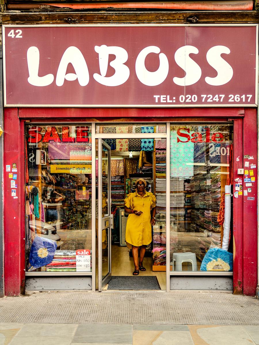
Maybe too colourful, what do you think ?
July 21, 2025
4
-

-

No!
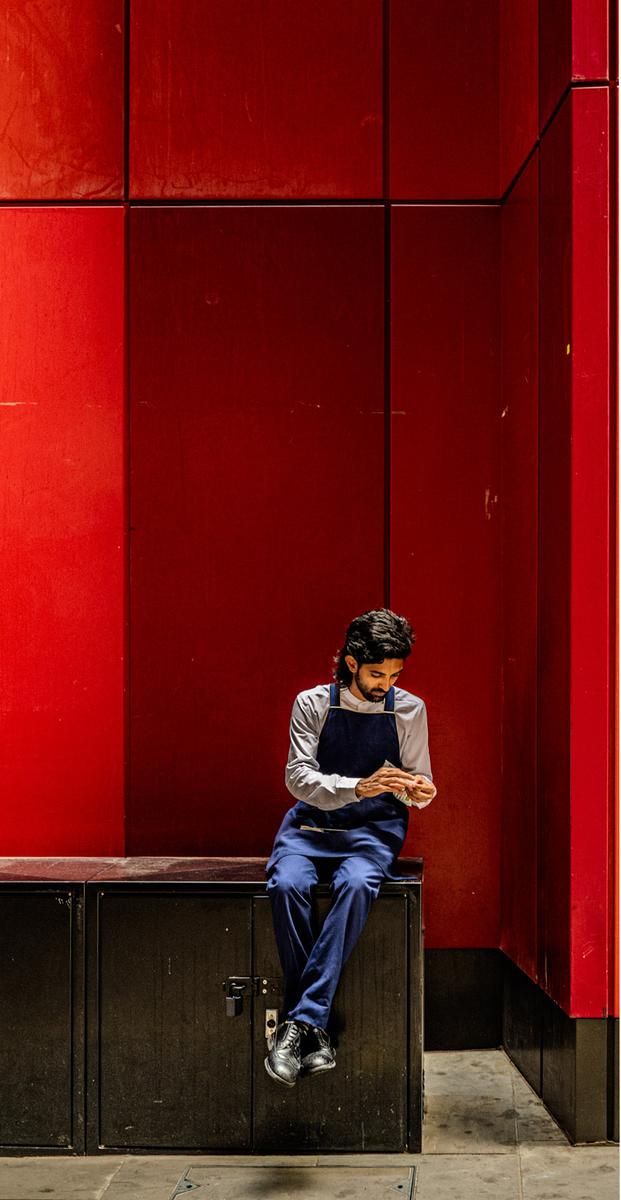
Number 1 with its glorious red is the best (IMHO), but I think you've included too much in the image.
A suggestion? . . .
Rich
-

Cropping the image ↑ has destroyed the perspective completely.
For viewing here on the web, I have resized it to 25% and added one pixel externally to the image borders to preserve and show the shadow gaps of the structural panels.
This resized image is 503 pixels by 752 pixels.
It's tall and skinny and not very close to the golden ratio, but I like it, and it would work well as a gallery photo framed minimally in your next exhibition. :-)Rules for those that like to observe them...
The Golden Ratio in Photography: A Complete Guide.
www.shutterstock.com/blog/what-is-the-golden-ratioDaneland wrote: Maybe too colourful, what do you think ?
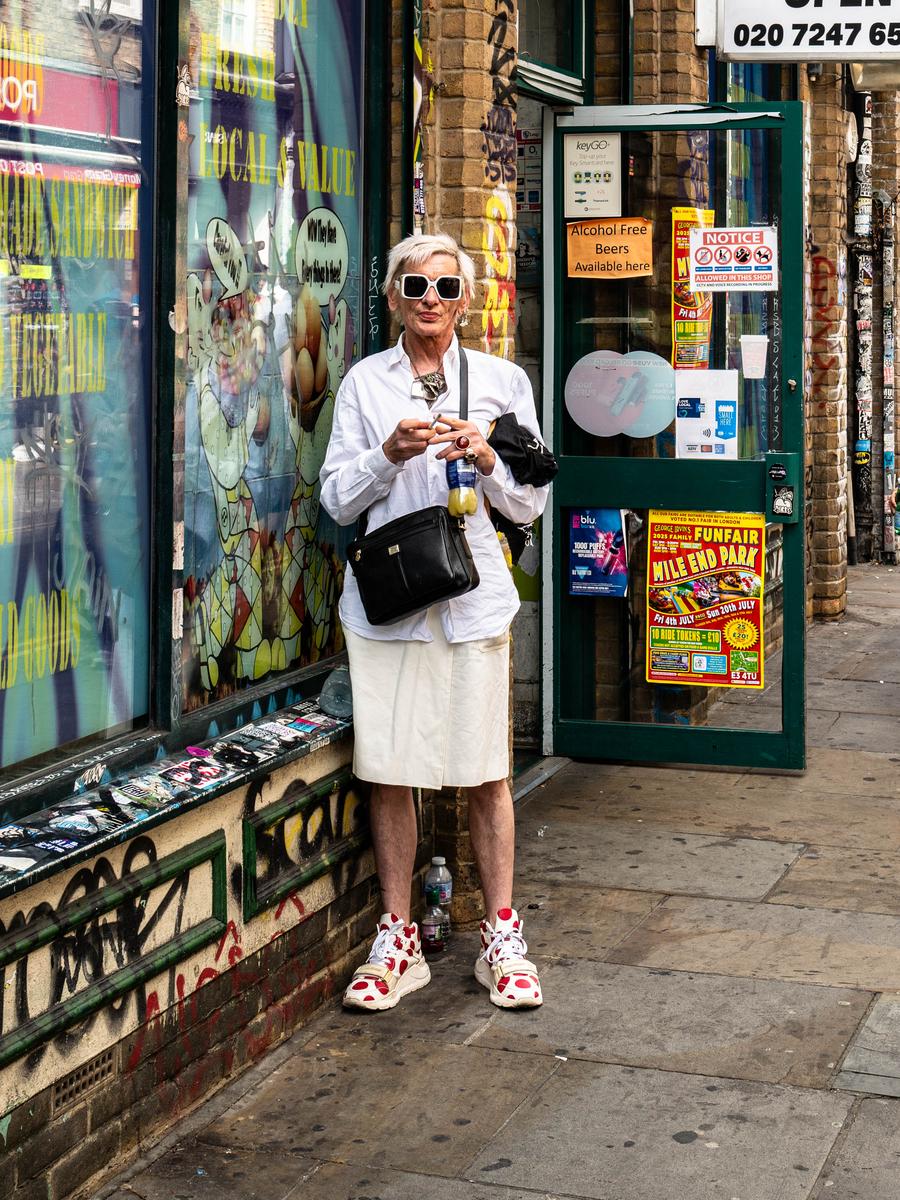
Either the guy is wearing too much foundation on his face, or you have overcooked him in Photoshop. lolI'm not a great lover of analyzing photographs too much, and some of the corny written descriptions on this forum make me want to run a mile. lol
Anyway... the curved flagstones are funky, and the two short vertical yellow repeater lines draw the viewer's attention to the manhole cover and then to the subject. The silver door latch on the extreme left is interesting too in a minimalist kind of way. I sure hope that the tobacco he is hand-rolling is legal!
-
Obviously, I disagree about the cropping.
Since you didn't write the article, the following is not about you, but about it.
Like just about all the so-called "rules" in photography, or other types of graphic composition, this is just total nonsense.
Believe it all you want. Wrap yourself up in it. (As you seem to have done). Some people are happy with defined borders to their existence.
As Duke Ellington said when asked about rules in music, "If it sounds good, it is good."
Rich
"That's like, just your opinion, man" 😉 -
Greg wrote: Rules for those that like to observe them...
The citing of the article was for the benefit of the readers here who may not be familiar with the Golden Ratio.
Daneland's uncropped image tells the whole story.