• Nov. 27, 2024, 4:17 p.m.

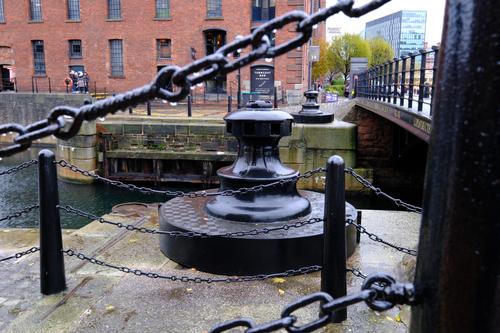
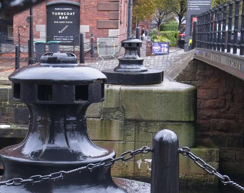
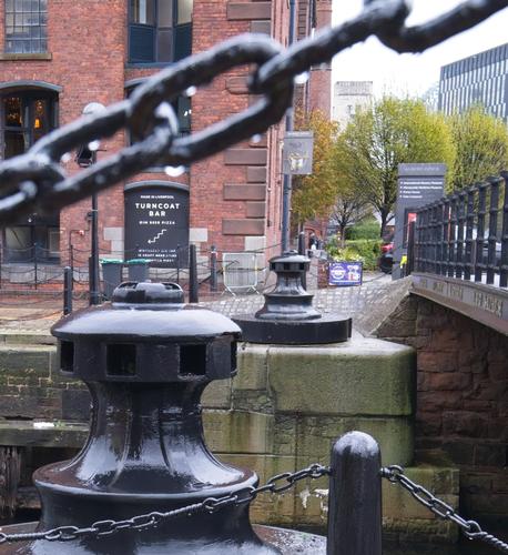
    Do you think this photo has an interesting composition? I'm not interested in whether the colours are right or it's exposed properly - but is it something you'd look twice at? [I just feel it's nearly there, but the big chain goes the wrong way].

    RBCF0066_000.jpg

    It was a crop from this picture (resized to make it quicker to upload/download)

    RBCF0066_(Superlarge).JPG

    RBCF0066_(Superlarge).JPG

    JPG, 2.0 MB, uploaded by AlanSh on Nov. 27, 2024.

    RBCF0066_000.jpg

    JPG, 5.6 MB, uploaded by AlanSh on Nov. 27, 2024.

  • Members 1856 posts
    Nov. 27, 2024, 5:40 p.m.

    I will go for the first shot, even if the chain is a little distracting for my taste. But the chain keeps the interest focused on the capstans, as it forms a sort of frame.

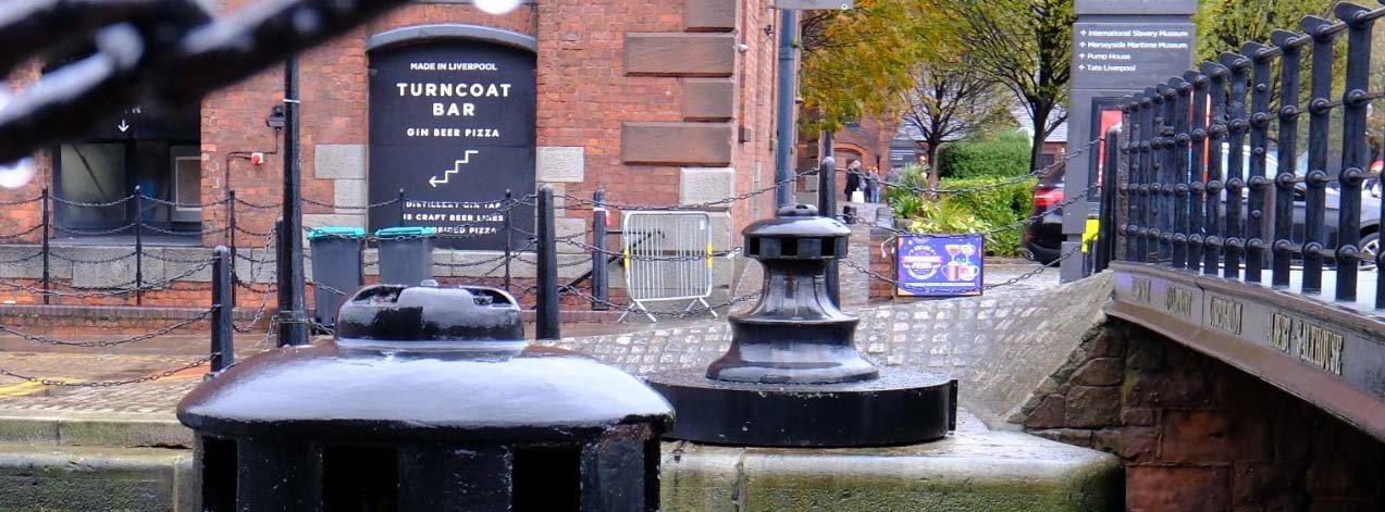
    The second shot does nothing for me, and the last framing lacks something.

  • Nov. 27, 2024, 9:53 p.m.

    Disclaimer - I have no clue about composition rules.

    First (original) image is nicely balanced and certainly contains couple of leading elements (including bold chain - it both balances image and leads eye to right) and makes your eye follow path into the ... somewhere under the green tree? There is no object there - and also no open space (sometimes leading eye to open emptiness is itself a goal, but this is not possible on such scene).

    I could look twice at it, but more to look at details (what are those two black things anyway?), not at image as a whole. Maybe it is too busy for my taste.

    I don't know what people here make of Ken Rockwell, but you could read his article about composition - simplify and exclude. He is certainly not authority, but some of his ideas are IMO pretty usable.

  • Members 1856 posts
    Nov. 27, 2024, 10:08 p.m.

    The best book I have read about composition is "Principles of composition in photography by Andreas Feininger. He pretty much debunks most of the "rules".

    Long out of print, it is a book to buy SH if you are interested in this subject. No other book about composition that I have read even comes close.

    So do not worry too much about the rules of composition.

  • Nov. 27, 2024, 10:21 p.m.

    Thanks, interesting ideas.

    When I took it, I stood and looked and I knew wnat I wanted to get out of it. By the time I got home and put it on the PC, I'd forgotten what I'd 'imagined' and the image was just plain boring. But I wanted to see if anyone else thought that way - and I think you both do.

    NCV, I thought the first picture was crowded and had no real focal point. The past one (in my eyes) is better but still no focal point, but at least the bollards and bridge both lead the eyes to the back of the image. The black things are mooring bollards. And yes, it's a collection of details which don't add up to an image.

    I have no idea where I'd find that book second hand, but I'll have a look around.

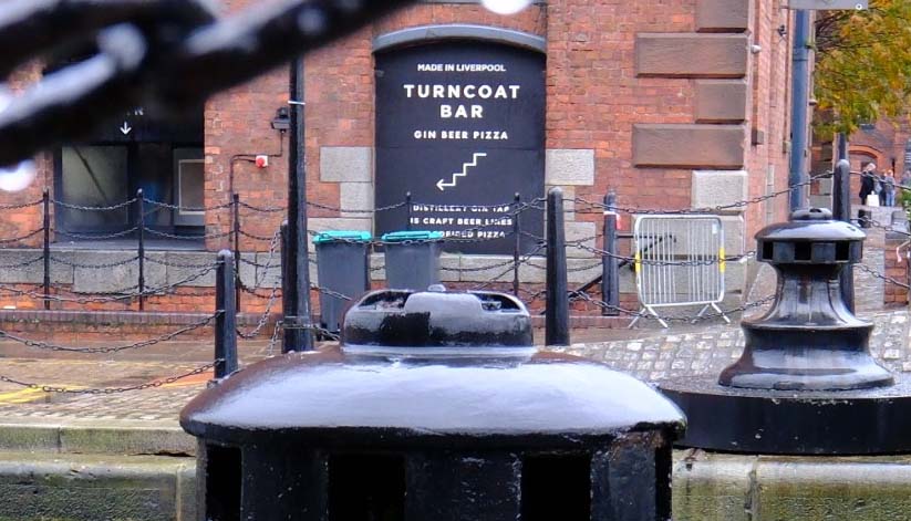
    Arvo, The bold chain (to me) goes the wrong way, which is why I tried to remove it in the third image. And I agree, there's no focal point. I'll look at Ken's article.

    Cheers

    Alan
  • Nov. 27, 2024, 10:28 p.m.

    Abebooks.co.uk

    David

    PS: I think you may be trying too hard! 😤

  • Members 4254 posts
    Nov. 27, 2024, 10:44 p.m.

    Out of the 3, this one works best for me.

    In the other two the chain, for me, does not work as any type of natural frame or relevant element in the scene.

  • Members 2350 posts
    Nov. 28, 2024, 12:12 a.m.

    you have to ask yourself what has the photographer added to the image

  • Members 4254 posts
    Nov. 28, 2024, 2:26 a.m.

    Actually they are only guides for people to optionally use.

    They certainly are not enforceable rules.

  • Members 1856 posts
    Nov. 28, 2024, 6:34 a.m.

    For curiosity, I had a look on Ebay, where I usually hunt for SH books. It was once very cheap. Now I see it has become pretty rare and expensive.

  • Members 1856 posts
    Nov. 28, 2024, 6:41 a.m.

    Sometimes, we find what looked interesting and promising in the field, was pretty boring when we get home and look at the pictures on the PC. It is all part of the quest to make interesting pictures.

    I rarely find that extreme post processing, B&W conversion or radical cropping, can save a picture that was not quite there.

  • Members 4254 posts
    Nov. 28, 2024, 6:51 a.m.

    Obviously that is true to some extent but especially if shooting raw and depending on the post processing skills of a photographer some very amazing things can be done in post to come up with very usable images when things didn't quite go to plan when the shot was taken.

  • Members 1856 posts
    Nov. 28, 2024, 6:57 a.m.

    No, that is not true. A flawed composition is never rescued by mucking around in post. You should make sure things go to plan when you shoot. Otherwise reshoot.

  • Members 4254 posts
    Nov. 28, 2024, 7:04 a.m.

    It depends on the type of compositional flaw and the extent the composition was flawed.

    Another example is when the lens doesn't have enough reach for the composition you want. Cropping in post can often improve the composition.

    There are many other situations where cropping in post can improve the final image.

  • Members 4254 posts
    Nov. 28, 2024, 7:45 a.m.

    I hope this doesn't violate the don't edit someone's image without permission rule but you seem to be asking for cropping advice and/or help on "rescuing" your image.

    It's difficult in this case to describe a crop accurately without actually posting it.

    Yes, I agree you need a subject/focal point for the eyes. One option is to make the Turncoat Bar sign the "subject".

    A crop something like this works much better for me but the crop still lacks "drama".

    If it was mine, I would turn it into a night scene with either moon light or a spotlight of some kind focussed on the sign.

    You could also highlight elements of the bridge with lighting.

    That would create an interesting image for me.


    dprevived.com/media/attachments/54/6c/QsVYSMFs7T9dyzF91vUCMVoMQkqFfLvdVfpPcf8b1cKRKHiNbMenxOrolPwVXFle/cropalansimage.jpg

    cropAlansImage.jpg

    JPG, 133.3 KB, uploaded by DanHasLeftForum on Nov. 28, 2024.

  • Nov. 28, 2024, 8:57 a.m.

    Have you tried tighter crop, removing right side completely (about at left side of blue sign)? This way I can imagine some nice conflict - lines lead to right, then you look at the (now prominent) bar sign - and there is arrow, pointing into opposite direction.

    I have no editing tools here, can't test that myself.

  • Members 4254 posts
    Nov. 28, 2024, 9:14 a.m.

    Something like this below?

    Yes that could work as well depending on what else you might do with it.

    This becomes very subjective now and comes down to personal taste and goal for the final image. The crop below is very tight and would probably need to be enlarged to some extent with something like Gigapixel to make it more useful.

    Personally, I prefer the panoramic crop above, only because it gives me more options to play with lighting, as described earlier, to highlight different elements to help guide the viewers' eyes around the scene.


    dprevived.com/media/attachments/a8/64/E55U50ZX5PqJNvavXx0NCCO2LU9qNaeHiuVfbxQCVOyLhlLrdPaaakY2KjFxKd9F/cropalansimage-v.jpg

    cropAlansImage_v2.jpg

    JPG, 90.8 KB, uploaded by DanHasLeftForum on Nov. 28, 2024.

  • Nov. 28, 2024, 9:25 a.m.

    Yes - but seems that this idea was not usable, leading effect is almost gone and no conflict anymore :(

  • Members 4254 posts
    Nov. 28, 2024, 9:27 a.m.

    I think Alan's uncropped version in the op would make another excellent starter image in the "Edit Me An Image" threads to see what members would come up with to make it an interesting image.

  • Members 154 posts
    Nov. 28, 2024, 10:19 a.m.

    For me the first image is the better one. The important details if we are trying to give away location or say something about history, are the bar sign as well as the old manual lock mechanisms.
    I like the the different edits too, I didn't picture this as a pano at all and that was interesting.

    These pictures make me want tacos. El Jefe's is open to 2am on the south side of the Commons. Midnight Tacos!

    Did you get any images of the Independence?

    Edit: Silly me, reminded me so much of Boston and it is actually Liverpool! It would help if I read those detailed signs!

  • Members 184 posts
    Nov. 28, 2024, 1:35 p.m.

    First question would be, what are we trying to compose exactly? What's the subject? What are we're trying to show the viewers? Once we've decided on the above questions, we can compose so that the composition serves the purpose.

    So depending on the goals, the chain in the foreground can be a distraction or it can be an important element.

  • Nov. 28, 2024, 3:38 p.m.

    Yes, and that is what I forgot between taking the picture and processing it.

    Alan