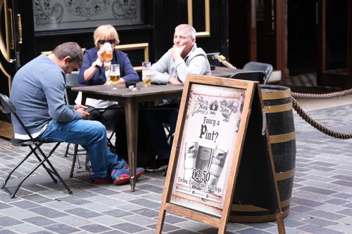
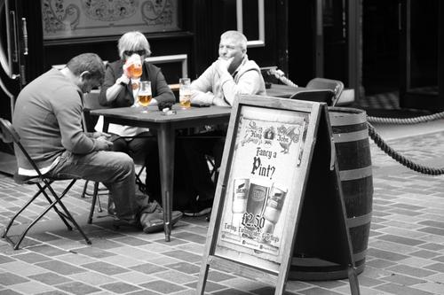
This, to me, really tells a story.
Aug. 7, 2023
20
-

Yes, that is a wonderful story telling and thought provoking image. Your title is very appropriate 🙂
The first impression I got was that the woman is the only one who appears to want to be there.
The two guys appear to be wishing they were anywhere but there 🤔
I wonder what is really going on there at that table 🫤
Thank you for sharing.
-
Hola Alan, a funny situation. I have to admit that, at first glance, I had a hard time understanding it. I needed a little help (thanks, Danno) :-)
-
Thank you both for your comments.
Alan
-

I think the title fits the photo perfectly. Nice capture!
Bob -

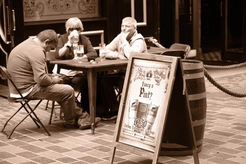
Indeed quite an interesting capture with the expressions in combination with the "Fancy a Pint?" claim... not much fancy to the whole scene, but then again, I'm afraid I often look (and feel) like that - or what I assume them to feel like - as well. Perhaps they're way more content than they appear. Anyway - well spotted and captured. Because of the color of the Poster I'm wondering, what it might look like as a sepia version. Could be interesting to try that.
-
I don't think it works as well.
-
I like the sepia version, but in the original version the color of the beer works well.
Bob -
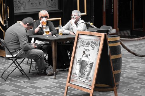
I may have a play tomorrow where I do a B&W version but colour the beer. Thanks for the idea.
Alan
-
So, on this one, I've tried to remove to colour from everything but things associated with beer - so, the sign, the barrel and, of course, the beer. Do you think that works better?
-

I agree. There’s no reason for this image to be sepia and the artifice blunts the presentation.
-
I agree - the Sepia version lost something essential... in this one you've got it though! It would need a little bit of finetuning with the areas, but it looks excellent overall. 👍
-
Thanks.
What fine tuning would you suggest?
Alan
-
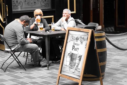
Something like that perhaps:
-
What did you do? I see some changes (table legs for example) and how did you do what you did?
-
The most critical change I see is adding the color back into the face of the man to far right. (Beyond that I’m not a fan of selective color so I’m going to recuse myself from the jury.)
-
The effect I really wanted is this (which I finally worked out with the help of someone else)
-
Very interesting version. We sure are putting you through a lot of work.
Bob -
An excellent use of spot color. I prefer this to your previous take. Well executed overall, but if it’s going to be viewed large there’s still some pink skin tone visible on the woman’s hand and face, and I’d also desaturate her necklace(?).
-
If you found what you intended it to be, I think that‘s ideal! 👍 I rarely use selective color, but feel like it‘s fun from time to time and it helped me understand color better I‘d say.
-
Oops - you are right, I missed those bits. But I like the necklace being coloured.
Cheers
Alan [Still learning]