I like the last two 👍🏼
Jan. 28, 2025
24
-

-

It's voting time !
Thanks again for all entries so far. Some good ones here already :-)
The submission period for your edits ends tomorrow, on the 5th Feb.
And voting will continue until the end of one day laterPlease get your votes in now :-)
-

A crop and some color work in mobile ap iColorama, one of my strangest mobile apps, it defies description and understanding, and there is no manual or guide. It's also free, I think. I've never paid anything for it.
-
We have a winner!
With a light and airy version of the image “Morning drama at the Gössler wall”.
Congratulation to minniev :-)
So now, over to you to post a new image for us to play with.
Many thanks for all the entries. I'll post some comments on selected images later todayAnd here is the winning image from minniev
-
Thank you dear people and thanks to Fireplace for a lovely starter image. I'm "on the road" but will get home this afternoon or evening and will post something for you to play with.
-
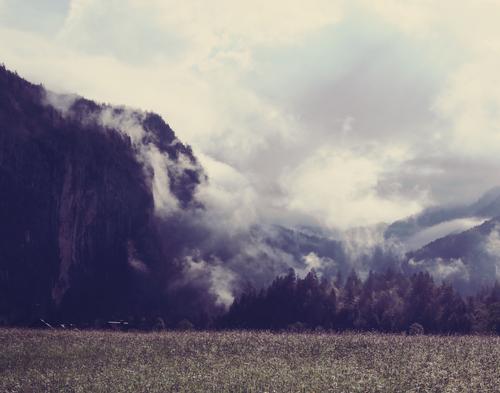
“Morning drama at the Gössler wall”. Comments.
Thanks once again for all your entries, I wasn't sure if a bracketed 3-shot-set would be popular in the weekly edit-me-an-image , but you you managed to deal with it really well and perhaps enjoyed the extra challenge.
Here's some comments from selected edits:
yep, it was all the mist in the trees, and all the mist pouring down the cliff face and then swirling around in the air that originally caught my attention, especially as it was all lit up by the sun which is just out of the image, top right.
Your edit has made all that nicely visible and also highlighted the bright roof of the building on the left hand side.
The crop has put more focus on all this, which is good, but somehow I miss the bright grass all covered in dew and also shining in the sun.That's a good title for this version!
At first I thought it was just way over the top, but it does grow on you and then it looks good and there's definitely a place where this would fit in well on the wall, maybe a modern cafe ? it was one of the joint 2nd place runner ups!This works well, nice and bright and the grassy field is still there :-)
A similar good crop to your first edit but this time more relalistic
This is probably the most realistic version, gently done and subtle. Not as much punch as some of the other edits, but do we always need so much "punch"?
An interesting and different take on the image. Not my favourite but it got 3 votes and so came in as a joint 2nd place runner up!
As you mentioned, the dark blue edge at the top of the cloud bank probbaly came from the lack of feathering in that edit layer and sort of spoils the result. Interesting but not my favourite.
The first B&W entry. The processing fits well to the image and your title. Good edit!
Edited far away from reality, and also a bit dark which sort of detracts from the result for me, since I was there and saw the original.
But for someone that didn't see the real view, this might still be a good image.This second B&W version works well, with its subtle and gentle treatment making the fine whispy clouds and mist look great
I much prefer this one to your previous version with the strong vignette, It's well done, but the very dramatic new sky here in this image is not my cup of tea here, because although well done, the original sky was already dramatic
I think this second attempt of yours, with a little more punch, is the better version of those two
I'll add in the comments for the last 3 images later, I have to leave now :-)
-
I had to leave in the middle of writing the comments to the #17 edit me an image.
Here' the comments to the last three.An interesting, perhaps even an "old fashioned" colour scheme here? An effective crop too turning it into a portrait mode.
Whatever the app did the result has subdued the colours as if it were a print that's been hanging for many years on a "Gasthaus" wall in a small Austrian village ;-)
And finally the winner from minniev...
"Light and airy"
True to the given title and a worthy winner
Hope you all enjoyed playing with this starter image :-)
Fireplace :-)