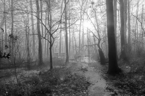
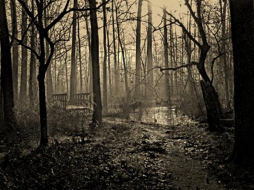
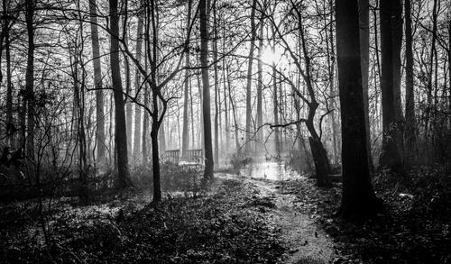
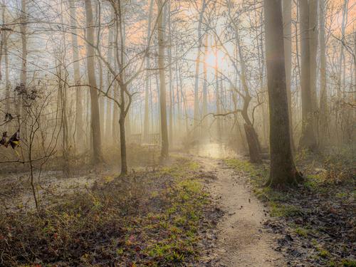
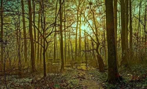
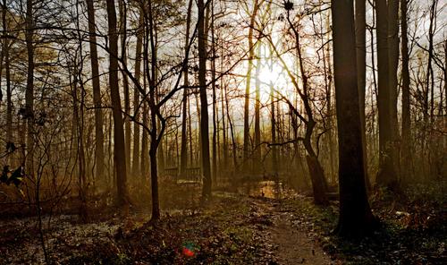
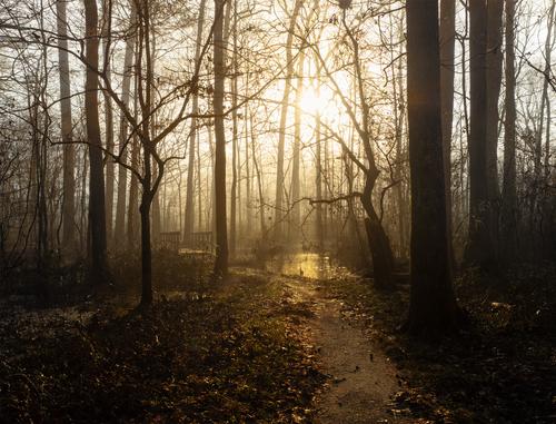
BW attempt
BW seems to suite better for such scene, colours make it appear muddy, BW concentrates on shapes and details...
DXO with HDR Black and White preset, then nik silver efex' high structure preset.
-
-
-
-
-
-
-
Two more days to submit your version!
Thanks to all who are playing with us here. I'm amazed how many different looks you've been able to create, most of which I never thought of.
Be sure and vote vote vote for your favorite, either now or after we close the thread to new submissions two days from now.
-
Submissions are now closed!
If you haven't voted, or you want to change your vote, now is the time to do it. On Friday morning, US time, I will tally up the votes and we will crown a new winner and pass the baton!
Thanks to all who are playing in this fun activity.
-
One of my entries is a joint leader atm.
If by some miracle it wins I will pass the baton to whoever else would like to submit a starter image because I don't agree with the rule that the host cannot post suggested edits.
-
I have cast my votes ☺️
-
And the winner is Maoby, for this, his second entry, a beautiful monochrome rendition of my humble swamp. Thank you to all who played this fun game with us and I’ll pass the baton on to Maoby and wait to see what he shares for us to have a go at in the coming week.
I ran a thread like this in another forum and it was always interesting to try figure out what attracted voters to one version when so many good ones were submitted. I learned over the years that there are many factors - skill in PP, uniqueness of vision, creativity, a strong artistic eye- all play a role. I’d never considered this image for black-and-white. I was surprised to see how well it turned out. Maoby seems to have made good use of the excess contrast in the capture, tamed the sun enough to make it work, which was a challenge I knew I’d face when I took it, and did it without sacrificing the early morning mist effect. This version manages to be stark without being depressing or threatening, hard to manage with bare trees in monochrome. Well done, and thank you for giving me ideas for an alternate version to my own, which most closely resembled Fireplace’s entry.
I’ll add comments to the other submissions later today. Maoby, next week is all yours to run with!
-
I had a bit of a shock when I first looked at your entry because for a moment I thought I'd accidentally posted my own final edit. I did much the same as you: pushed the WB, shaped up the scene a bit, mitigated the damage done by shooting directly into the sun. I like it a lot because, well, it feels very familiar!
-
I cannot figure out whether you added the ghost of a different sky back there, or whether you found something I had no idea was there. Very creative solution!
-
Though you have removed your submissions, I remember loving the vivid deep golds you used. Yellows/golds are about the only color I tend to go overboard with, but I'll do that in a heartbeat if I have the right scene!!
-
That touch of HDR really brings the leaves to life here.
-
I have not added anything, only adjustments.
-
@Bryan has written:
First attempt - on the jpg only
The cropping brings the viewer into the scene more rapidly. I don't think I tried that.
-
@Andrew546 has written:
Going for the play of light with a hint of autumnal colour, (@minniev nice photo).
A subtle rendition that gently brings that path and the stream out of the darkness. Love the subdued color in the sky, in particular. It conveys the early winter morning feel so well.
