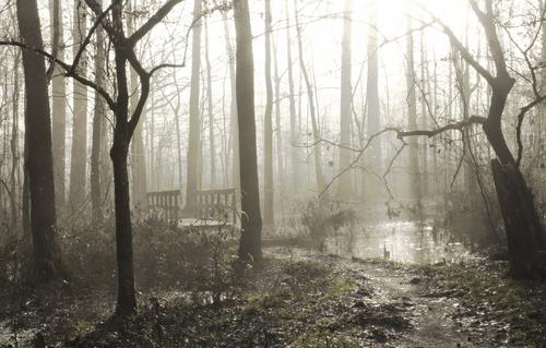
You definitely would need the raw to do this with an ORF! Tons of detail you got out of there. Every little twig is visible, with wood details showing on the bridge, too. Clearview is in NIK software too, but I've never tried it. I'll have to to experiment with it.
-
-
Another creative rendition. I have not tried toning this one either, and would not have thought of this peachy red-gold color but it works. The crop makes the scene more intimate.
-
Indeed a very moody, almost foreboding effect with the crop. I'd never have thought to crop down. You still have the effect of the sun but without having to fight the sun itself. And the film-like toning lends to the mood.
-
Arvo, you have the most unusual cropping choice. With those two bare twisted trees, and the fog, the image takes on a very spooky look. They rise like hands, as if to snatch up the person who dares to cross the enchanted bridge. Plenty of impact.
-
Here you went even further with the crop. Now we find a separate scene, a story within a story. The witch who was about to grab the hiker is gone, and we have instead a peaceful, quiet winter morning with subtle color and a twisted tree as a framing device. See what a difference it makes!
-
This is beautiful. I love Glamour Glow in the Nik suite, and use it to some degree on the majority of my photos. You mix it with some of my other standby's in the NIK suite (tonal contrast, sunlight). The depth such combinations can provide is so painterly. Love it.
-
Thank you minniev.
I posted another version with a cold wintery morning look and feel which I liked more.
But ArvoJ made it clear to me he will delete any suggested edits submitted after submissions close which to me sounds grossly against the purpose of these threads to share and discuss editing ideas and techniques.
If someone stumbled across this thread say next week or in a few months time and posted a suggested edit for discussion, he will delete it. Makes no sense to me.
So I'll continue to post edit suggestions up until submissions close for anyone interested to discuss and then delete them after submissions close.
-
@Vahur has written:
BW attempt
BW seems to suite better for such scene, colours make it appear muddy, BW concentrates on shapes and details...
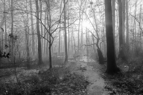
DXO with HDR Black and White preset, then nik silver efex' high structure preset.And this version, too is lovely, with plentiful details. Black and white lets you bring out the path more, so there's a clearer way into the swamp. You got more detail without giving up the mist, too!
-
@xpatUSA has written:
From the raw:
Converted, then cropped and cloned out the red bit in FastStone Viewer
De-Hazed and Local Contrast in RawTherapee
Sepia'd and Elliptical Vignetted in GIMP
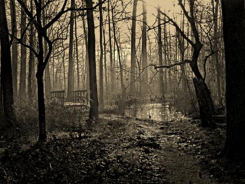
You certainly got the sun issue out of the picture! Surprisingly to me, the bridge becomes more prominent in this sepia version.
-
@finnan has written:
My second variant: misty winter.
This time i decided to get rid of the worst sun ghost flares.
Based on the OP's jpeg file, edited in Snapseed (some HDR, reduced color contrast, glamour glow).
This is a black and white fairyland of a scene, with rays emerging from the sun - not sure if you found and enhanced them or did something to make them happen, but I do love rays. As I said in an earlier response, I also dearly love Glamour Glow. Somehow the bridge is lost but I'm not missing it. Indeed, why would fairies need a bridge anyway? Nice magical rendition.
-
@Sagittarius has written:
Second attempt "morning fog"
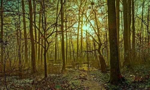
Yes, the magic is better with more mist and without the red flare, which was just an artifact from me shooting deliberately into the sun. Still curious about the sky.
-
@Bryan has written:
My 3rd attempt - Early morning light
View large to see the recovered foliage of the more distant trees...
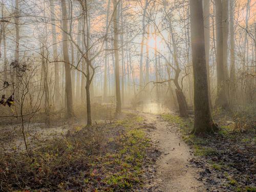
I believe you've done a little creative toning in addition to the detail work. You even brought the pine trees in the back of the swamp into view with that detail thing. You even found some extra lens flare I didn't know was there! (on the lower right). Oh the hazards of shooting directly into the sun. But I keep doing it anyway.
-
@minniev has written:@Bryan has written:
My 3rd attempt - Early morning light
View large to see the recovered foliage of the more distant trees...
I believe you've done a little creative toning in addition to the detail work. You even brought the pine trees in the back of the swamp into view with that detail thing. You even found some extra lens flare I didn't know was there! (on the lower right). Oh the hazards of shooting directly into the sun. But I keep doing it anyway.
You are spot on with the creative toning but I didn't do anything specific on detail (see below) other than default sharpness and some (not 100% like the previous version) ClearView Plus and then ran it through one of the more involved DxO de-noising options.
In the previous version I had chopped the top off the RGB tone curve to try and ameliorate the sun / blown out areas.
With this one I had a play with the individual R,G,B, curves and found quite by accident, just pulling the top of the R & B curves down the right side a little brought out the detail in the far trees and lesser blown out areas.After submissions closed I reduced the green slider a bit which was a little better balanced. I am surprised at the amount of detail that was still present / recoverable in the RAW and there is a lot to explore in it.Those ghosts were popping up everywhere. I gave up after cloning out the main couple - not easy to do without a clear background to use. There are a few fall leaves in the pic and I thought the ghost on the lower right could pass as some!
Quite a good learning exercise...n
[Edit] Oops! Was quite wrong above. It was just clearview, lots of contrast and pulling highlights very low and shadows very high. I remember I changed the curves to remove some halo around the sun...
-
@Bryan has written:@minniev has written:@Bryan has written:
My 3rd attempt - Early morning light
View large to see the recovered foliage of the more distant trees...
I believe you've done a little creative toning in addition to the detail work. You even brought the pine trees in the back of the swamp into view with that detail thing. You even found some extra lens flare I didn't know was there! (on the lower right). Oh the hazards of shooting directly into the sun. But I keep doing it anyway.
You are spot on with the creative toning but I didn't do anything specific on detail (see below) other than default sharpness and some (not 100% like the previous version) ClearView Plus and then ran it through one of the more involved DxO de-noising options.
In the previous version I had chopped the top off the RGB tone curve to try and ameliorate the sun / blown out areas. With this one I had a play with the individual R,G,B, curves and found quite by accident, just pulling the top of the R & B curves down the right side a little brought out the detail in the far trees and lesser blown out areas. After submissions closed I reduced the green slider a bit which was a little better balanced. I am surprised at the amount of detail that was still present / recoverable in the RAW and there is a lot to explore in it.
Those ghosts were popping up everywhere. I gave up after cloning out the main couple - not easy to do without a clear background to use. There are a few fall leaves in the pic and I thought the ghost on the lower right could pass as some!
Quite a good learning exercise...
Yes, these kinds of threads and honest critique are the best learning exercise we can have without taking classes. I learned everything I know in forums like this, and by experimenting on my own.
It seems like Clearview is a tool that finds detail, perhaps a cousin of Clarity in Adobe programs and tonal contrast in others. I'll have to play with it a bit. I see it sitting over there in the NIK suite aps but having done too much with it.
-
@minniev has written:@ArvoJ has written:
Less of the forest, more of the bridge. From jpeg.
Arvo, you have the most unusual cropping choice. With those two bare twisted trees, and the fog, the image takes on a very spooky look. They rise like hands, as if to snatch up the person who dares to cross the enchanted bridge. Plenty of impact.
Thank you! Yes, I like cropping experiments - sometimes hidden scenes may reveal itself; sure they have to be present in original image already.
I see one big problem with my edit - the centre of image is empty and viewer can't decide, which of disjointed objects - bridge or pond - is the main one.
