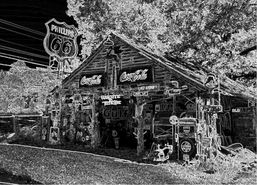
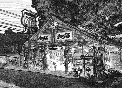
Love this sketch look and curious what it's done in. I've used some PS actions by Dave Seeram for sketching, and also the old Topaz art plugins. I've also tried just sketching them myself in PS and layering them with versions of the image. Would like to know more about this.
-
-
Agree, yours needs to be seen large to appreciate all the details you found in there (and there is a lot of stuff in the frame). I appreciate the straightening, I seldom like leaning buildings. I especially liked that you got detail in that tricycle, I had trouble getting it sorted out from the trees, and it was my favorite piece of the memorabilia. (I'm always reminded of William Eggleston when I find an old tricycle).
-
That is an indeed ghostly look. Disney's Haunted Mansion hillbilly style.
-
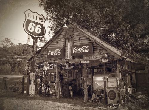
A nice clean sepia version with the detail revealed but a wet plate type look. Maybe Analog Pro? I have a bunch of fun with that software but wouldn't have thought of it for this. Good version!
-
I'm not usually a fan of selective color but those bright red Coca Cola signs do look great in bright red against the contrasty black and white conversion. Well done.
-
Thank you Bryan. I do love a junkyard type scene, glad you enjoyed it too!
-
@Bryan has written:
Neon...
Now that's mighty creative: a neon filter on a black and white conversion with all the details almost in reverse. The trees look almost like infrared light rays emanating from the building. Ya'll have outdone yourselves this week!
-
@Vahur has written:
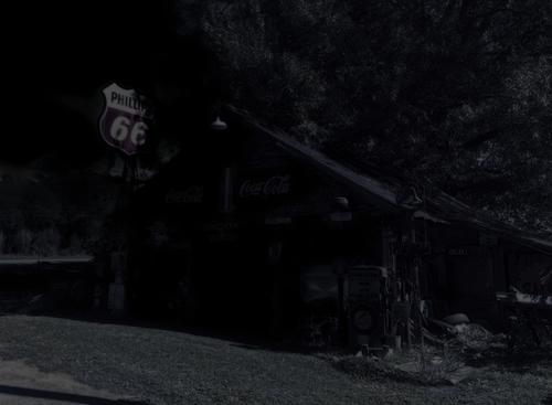
It was dark Thursday midnight on crossroad with full moon.
Edit: I used DXO Color Efex plugin with midnight (for night look) and sunlight (for blue moon light) filters and then played with levels, globally and locally to get desired darkening in shade area. Also desaturated and tried to fiddle with colours, but was not getting quite the look I intended...
Another that needs to be looked at full size to appreciate. It actually looks like I imagine it might in the moonlight on that lonely backwoods road.
-
@ArvoJ has written:
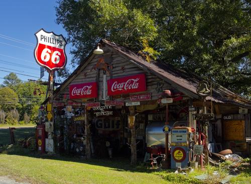
Got me the DXO PL8 :)
Colorful version, perspective changed:
Color and contrast make this pop. Glad you fixed the perspective on it. You added a lot more life to the sunlit objects. You got extra detail in that tricycle that I wasn't able to, as well, just a different look than NCV's.
-
@ArvoJ has written:
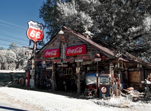
Let it snow, let it snow, let it snow...
Oh, now, I'd never have thought of snow, nor would I have known how to create it. I have some snow brushes but they aren't as convincing as this. Just a light dusting, followed by a sunny day. This is what snow in the south looks like.
-
@Andrew546 has written:
Old Photo 2
Very nice classic looking version with the right balance of detail and grain/artifacts. Very well done.
-
@Bryan has written:
Evening
This looks like a sketch version is involved somewhere in here, where some detail is enhanced/outlined but other detail allowed to melt away. An interesting outcome, like an illustration. Cool.
-
@finnan has written:
Tone mapping? Some colors are enhanced and others subdued. Makes the structure look mysterious for sure, and kinda spooky.
-
-
@minniev has written:@Bryan has written:
Evening
This looks like a sketch version is involved somewhere in here, where some detail is enhanced/outlined but other detail allowed to melt away. An interesting outcome, like an illustration. Cool.
Yes a sketch version. I quite liked XPat's sketch and noticed that FastStone had a sketch effect so tried that. However it was completely different. It also lit up some of the darker areas way too much but served as the base of the two I submitted. I then tried a negative to reverse the over lit areas, which resulted in the neon look. For the second I just wound back highlights and shadows completely to reduce the over lit entrance ways. It's a good exercise to see what these effects end up doing. One day I hope to have some pp with a bigger bag of tricks...
