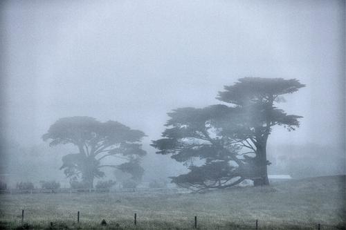
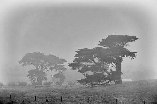
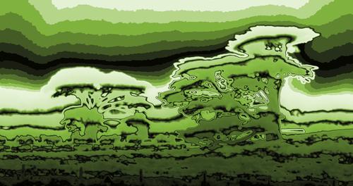
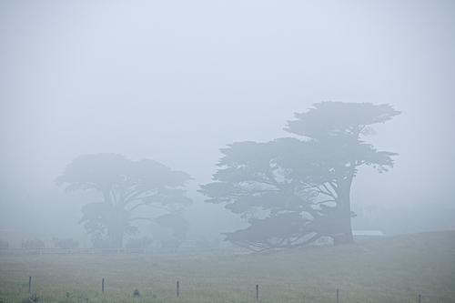
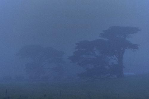
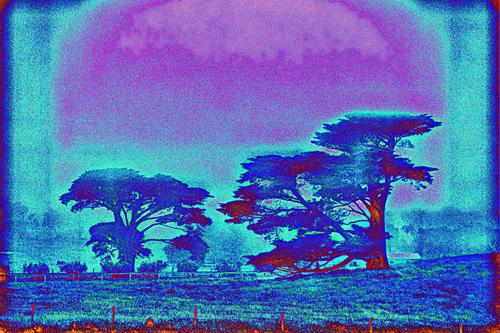
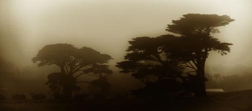
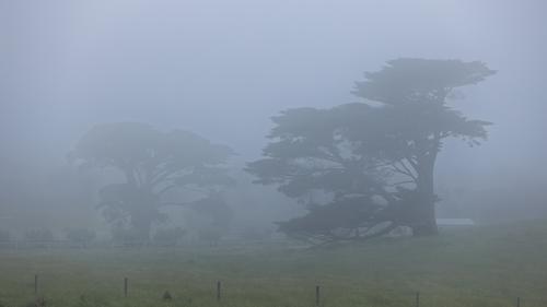
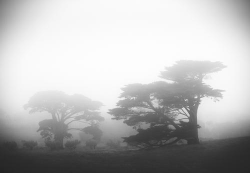
Northern lights gone south, Australian special ;)
-
There is also a method called Contrast-Limited Adaptive Histogram Equalization ...
... works quite well, it seems:
-
-
-
Actually now that I think about it, the subtle halo could be caused by the sun being behind me (somewhere above the fog) or simply by condensate on the lens. Apparently dehaze and similar contrast-increasing tools exaggerate it greatly.
-
-
@Bryan has written:
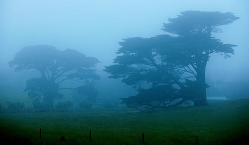
Eke'd a bit more colour out of it. And just noticed a post and rail fence between the trees...
Interesting to note that that fence is plainly visible in the Retinex image posted earlier.
-
-
-
@xpatUSA has written:
Interesting to note that that fence is plainly visible in the Retinex image posted earlier.
Yes it's visible in quite a few of the previous posts, I just hadn't noticed it.
-
-
-
-
-
I'm sure Quarkcharmed will close submissions soon, you all have the last opportunity to upload your version!
-
As we have had no conatct with Quarkcharmed (I hope he's doing well!), then I take over.
Submissions are now closed, you have one day to cast your final, decisive votes! Choice is yours :)
-
Apologies - I sent a closing message prematurely as I thought I was the whole day late. I suspect nobody noticed though as it only lasted a few minutes :) Please cast your final votes!
-
From timestamps, we have about 2 hours left before the voting closes. There's still time to cast your final vote!
-
And the voting has been closed.
The winner was determined in the last few hours. @Fireplace33 and @Maoby both got 5 votes.
It's very close and very tough but the win goes to @Maoby as I had to decide the winner by the rules. Congratulations @Maoby!
Some comments will follow. -
Congratulations.
It was amazing seeing how many took part and the different images that were available from one photo.
Alan
-
A few thoughts on the entries. I was amused to see so many different interpretations. It's interesting that in many cases the direction the editing took was to reduce the fog by applying dehaze or similar contrast-increasing tools, as if the fog was a problem. And depending on the creative goals, the fog can be a problem indeed. However, some entrants took advantage of the fog (including the winning entry).
The runner-up entry dprevived.com/t/edit-me-an-image-9-trees-in-fog-nov-17/6474/post/88897/ was executed very well, and @Fireplace33 provided an excellent explanation on the editing rationale and steps. Technically the image looks very good.
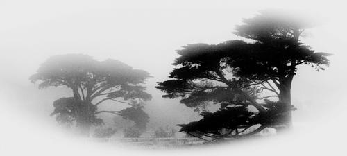
The winning entry dprevived.com/t/edit-me-an-image-9-trees-in-fog-nov-17/6474/post/88944/ has a canvas-like filter(?) and positive (white) vignetting applied. That creates quite a mood, although at a cost of technical quality - but I think it was intentional.
Now in the opening post I said that removal of distracting objects was up to the entrants. Not everyone decided to clone them out. It's very subjective but I treated the fences and the barn roof as very distracting. In the foreground, some posts are cut in half which is not only distracting but also annoying (at least to me). The main subject I considered to be the juxtaposition of the two trees, one fading out due to the fog. The fences seemed to be a mere distraction.
So the winning entry hides almost all the distractions behind vignette, and the runner up entry just accepts them. Both interpretations are fine, the winning one is a little bit more appealing to me.
Another entry I liked - dprevived.com/t/edit-me-an-image-9-trees-in-fog-nov-17/6474/post/88861/ - also hides distraction by increasing the fog level. Personally I think I like it more that the winning image but it's just me.
Some of the entries made use of creative/strong processing filters. And some of them look interesting. I think, however, the filters that were applied were a bit too much, so that the effect becomes more important than the content.
In some entries, the colour saturation was increased. It creates an interesting look although it's a departure from how things look like in the fog.
So thanks again everyone for the entries and good luck with your photo editing endeavours :)
And in the end I'll post my own version - please feel free to comment in critique:
-
@Quarkcharmed has written:
Some of the entries made use of creative/strong processing filters. And some of them look interesting. I think, however, the filters that were applied were a bit too much, so that the effect becomes more important than the content.
For my 'stoned' entry this was intentional :)
But I agree that processing should not hide original content, it can of course amplify some (more or less hidden) aspect of it. Like winning entry did, congratulations to Marc from me too! -
@Quarkcharmed has written:
And in the end I'll post my own version - please feel free to comment in critique
Putting all positive comments aside :), I personally would avoid 'partial' vignetting. In full screen / dark background such vignette looks much better, but as for preview image on light gray background here upper corners seem a bit too contrasty or just disjointed. This is one of such images where I would prefer no strong vignetting - it creates some conflict between round image circle, rectangular image area and horisontally extended scene. For me :)
-
@ArvoJ has written:@Quarkcharmed has written:
And in the end I'll post my own version - please feel free to comment in critique
Putting all positive comments aside :), I personally would avoid 'partial' vignetting. In full screen / dark background such vignette looks much better, but as for preview image on light gray background here upper corners seem a bit too contrasty or just disjointed. This is one of such images where I would prefer no strong vignetting - it creates some conflict between round image circle, rectangular image area and horisontally extended scene. For me :)
Yes agree - in my version, vignetting might be a bit too much.
