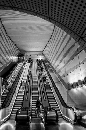
Very nice subject and lines but maybe it's the way my eyes are wired to my brain but I find the darkish arch across the top of the scene too over-powering and so throwing the image way out of "balance".
I think cropping out the arch or making it much lighter in the b&w conversion while leaving the rest the same in order for the arch to blend more into the background (which is the subject for me) would make it a much better final image.
The left and right ends of the escalators at the bottom would also provide a more balanced and compelling scene if they matched which they don't at the moment. Cropping would improve that.
If you like I can post a crop showing what would work better for my eyes and brain.
Anyway, just some food for thought and just my opinion.
