
This is a 100% crop from a screen shot on my 12" Pro iPad. The icon bar there is 6mm high, whereas on this desktop screen (27") it is 8.5mm and on my 21.5" monitors it is 9" -- better but still niot obvious what it stands for: too clever by half !
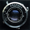
As you can see from the photo, at present I get a mixture of the two icons on the site: the DPR one, while not terrific, is more recognisable. A large P and small H (PH) might be even better.