• May 9, 2023, 7:38 a.m.

    We started with onhover but all the menus were so close together that a slight twitch of the mouse made different things appear. So we went for onclick.

    We are still discussing how that menu should appear. So, nothing's finalised yet. But it's better than what we had before (nothing at all)

    Alan

  • Members 2239 posts
    May 9, 2023, 7:50 a.m.

    In a group PM with Martin I suggested that in the Beta testing version the child menus were too close to the left edge of their parent menu and to move the child menus to about 10% in from the parent menu's right edge.

    That would have made the hovering over menus and submenus much more user friendly.

    The submenus should be able to be easily repositioned using CSS positioning.

    For some reason clicking menu items instead of repositioning submenus leaving the hovering as is was chosen as the solution.

  • May 9, 2023, 9:14 a.m.

    Ah - I wasn't aware of that conversation. Sorry. I would have supported your idea - and maybe gone further than 10%.

    I'll discuss it with the team

    Alan

  • May 9, 2023, 9:23 a.m.

    From my experiments with hovering first level submenu is good at 70% (from left) and second level at 40-50%, so must submenu top be about at same level (+ 3-5px) where clicked item is - this way selecting submenus feels almost natural.

    Question - should first level menu open on click [to Forums] or on hover?

  • Members 2239 posts
    May 9, 2023, 9:27 a.m.

    After the recent migration/update I left the group PM.

    43Review (Martin) was the group owner and the participants were DonaldB, Lefteye, NightOwl and myself. So hopefully maybe Martin can add you to the group private thread.

  • Members 507 posts
    May 9, 2023, 9:29 a.m.

    As this is a UK site under UK legal jurisdiction, it is subject to the Equality Act, which means it needs to be accessible. My professional experience was with compliance with the Public Sector Bodies (Websites and Mobile Applications) (No. 2) Accessibility Regulations 2018, which build on the Equality Act and are more onerous (and not legally applicable to private sites) but the compliance requirements in the regulation is common sense for any web site provider. I'm guessing the age demographic for this site is nearer the higher end than the lower, so accessibility is very much in the interests of its readers!

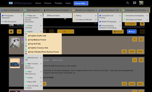
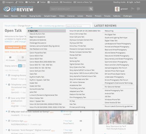
    For example, are the menu mechanisms you are building keyboard only operable? If not, they should be. Mouse only operation is not acceptable in a modern website.

    EDIT: Just did a keyboard operation check. You can tab a bit into the menu, but it doesn't look like you can successfully operate the menu via keyboard. It probably needs some keyboard events as well as the OnClick.

    www.w3.org/WAI/GL/wiki/Making_actions_keyboard_accessible_by_using_keyboard_event_handlers_with_WAI-ARIA_controls

    We used to use the services of the Digital Accessibility Centre (a non profit). They are not cheap, though, but they do provide some free resources including an online automated accessibility checker tool digitalaccessibilitycentre.org/resources.html

  • Members 2239 posts
    May 9, 2023, 9:34 a.m.

    Those settings would probably work as well. I suggested 10% from the right but it was only meant as a rough guide as a starting point to experiment with to see what works best. In any case I wouldn't use px as the units for positioning as it can cause issues with different sized screens. My prefernce has always been to use percent or em units for sizing and positioning.

    That would be a personal choice for the creator of the web page. Personally I prefer events to happen on hovering for menus rather than clicking where practical.

  • May 9, 2023, 9:53 a.m.

    David, thanks for that. I will add this requirement to our feature list.

    Alan

  • May 9, 2023, 11:22 a.m.

    This I can agree, but mixing different kind of units (px / em - absolute vs relative) is even worse. If everything font size related is measured in pixels, then generally all this scales pretty well.

  • Members 2239 posts
    May 9, 2023, 11:33 a.m.

    That is certainly not my experience for phone sized screens and desktop screens.

    For proper scaling 'em' works best for me when setting styles for different sized screens.

  • May 9, 2023, 11:35 a.m.

    I tend to agree. If people have 4k monitors everything looks tiny.

  • Members 2239 posts
    May 9, 2023, 11:39 a.m.

    Exactly 🙂

  • May 9, 2023, 11:59 a.m.

    You can alwys change zoom on desktop, browsers even can remember that per site basis :)
    About mobile screens I can't comment.
    All what I have created from scratch (what is not much) is not measured in pixels - but tweaking other (older) layouts may need pixels too.

    Unfortunately misago/dprevived sources (styles) include many elements sized in pixels and adjusting them in pixels is easier.

  • Members 2239 posts
    May 9, 2023, 12:09 p.m.

    Why on earth would you deliberately make visitors adjust the browser zoom when you don't need to if using 'em'.

    It sounds like you don't take the variety of devices/screen sizes into account if you use px to size text.

    If you use 'em' the font sizes scale correctly for the screen.

    But we're straying way off-topic now so I'll leave it at that 🙂

  • May 9, 2023, 5:15 p.m.

    New Bugfix update Online.
    Users with Zero Upload can Upload Files again.
    Silly Bug Null != Zero!!

  • Members 509 posts
    May 10, 2023, 1:30 p.m.

    My experience with a 39" (1m) 4K monitor for several years now is not all joy. Part of it is that GUI elements get lost in the corners, very difficult to see, because my visual DOF is rather shallow in low light with positive diopter reading glasses, and the center of the screen is a very different distance than the corners, and the corners are oblique. The best-case use of the monitor is for viewing images from about 2 to 3 times as far from the monitor than normal viewing distance, but then GUI elements and text get unreadable, unless they are large, and use up a lot of screen real estate. So, the only way to see more GUI material on the monitor at normal viewing distance is to move my head in X/Y translation. I must look like a hawk moving its head side to side to better see prey. I wonder what a curved screen could do for this, as I've never used one.

  • Members 509 posts
    May 10, 2023, 1:40 p.m.

    Unfortunately with many sites (and programs), if you use something like 150% to optimize the GUI for yourself, "100% pixel views" of images get resampled to 150%, which may not be desirable and not really 100% anymore. I generally prefer more upscaling of GUI than with images. DPReview, fortunately, was independent when you went from the posts to the separate image pages. I could use 125% for the posts on this laptop, but when I clicked on "original", it was still 100% scaling.

  • Members 125 posts
    May 10, 2023, 9:34 p.m.

    The Dark Mode is very well designed! 👍

  • May 11, 2023, 8:25 p.m.

    Another way we could try for landscape and desktop:
    menu2.jpg

    Open up first and second level at once on click/hover
    and another click to open third level.

    Should do on touch and mouse use and needs less clicks.

    menu2.jpg

    JPG, 147.7 KB, uploaded by 43review on May 11, 2023.

  • May 11, 2023, 8:33 p.m.

    Why not something like DPReview where all the low level forums (the ones you are allowed to post in) are listed. So, one click and you are there.

    Alan

  • May 11, 2023, 9:02 p.m.
    • only few css changes from now
    • compatible with touch (dpreviews dose not work on touch devices)
    • a little more structure to move to the right spot
    • fits more on screen than dpreviews

    I dont think is perfect but a nice interim solution

  • Members 81 posts
    May 12, 2023, 4:18 a.m.

    I like this behavior.

    This could work at the expense of what seems to be a negative (in my view) of way too much white space in this site's GUI.

    Could the compact display of all sub-forums work for touch if you expanded/enlarged the string under the user's finger tip?

    I've never had to design for touch and I have no idea what is easy/hard within the paradigm you guys are using.

    This is just so compact:
    change forum.jpg

    change forum.jpg

    JPG, 76.6 KB, uploaded by grsnovi on May 12, 2023.

  • May 23, 2023, 7:44 p.m.

    2023-05-23 Update

    • Choosen style set in html so no fliker on page load.
    • Post per Page jumping to wrong page fixed
    • Download wrong image in Pic Viewer fixed
    • New Exif Style
    • Double Image in 100% view form pic Viewer fixed

    Still missing Post_per page only working on threads with more than 18 posts

  • Oct. 30, 2023, 6:09 p.m.

    Long Time no see, was quite busy in the last month with private matter.
    Now working on an update to the latest Misago Version.

  • panorama_fish_eye

    Thread has been unpinned.