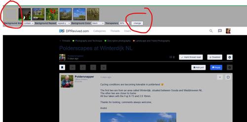
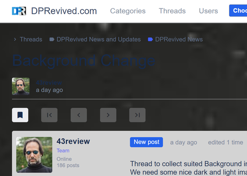
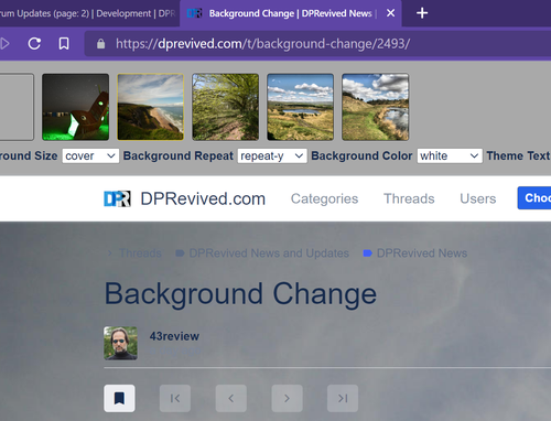
Perhaps I'm being simple, but what's the benefit of changing the background to one of the posted photos?
Am I missing something?
-
-
-
everyone can tryout options, we could choose the best ones as default option on every page.
Will make a couple of default style to choose between later on. -
I am routinely amazed at the intense, quality, and focused work that a bunch of “guys” who got together to donate their time and skills to build this site can do.
Thank you.
-
Thanks.
-
@DMCO has written:
I am routinely amazed at the intense, quality, and focused work that a bunch of “guys” who got together to donate their time and skills to build this site can do.
Thank you.
100% agree. A ton of dedication going into this, pretty darn impressive!
Danny.
-
I'll try it in the test area.
-
When I click the thumbnail preview here -
dprevived.com/t/forum-statistics-as-of-this-morning/2514/#post-23362
then '1:1', the image is enlarged to Fit To Width, rather than 'pixel level' 1:1.
-
@43review has written:
New Testpage is up.
add ?test=1 to url.
example:
dprevived.com/t/polderscapes-at-winterdijk-nl/2149/?test=1Not keen on the wallpaper background photos, we're here for the posted photos placed on a clean blank table.
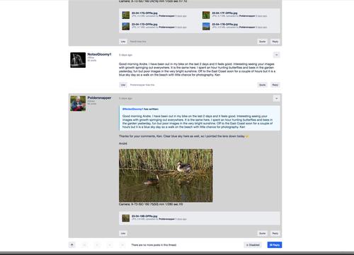
The other colour options are too large in their jumps. The only two variations that are viable, are is as it is now, but the alternative grey blocks need to be paler - more subtle. The other viable option is with a pale grey background, but on the whole the current light theme is best though needs subtle tweaking, not big jumps.
There's a reason why Google and Apple use a 'white look' - and they are the top, once you start going anywhere near mid grey, you're old.
As is, but the grey blocks need to be paler (I'd make many other tests to margins and padding, font size, etc, but this is a simple one to change),
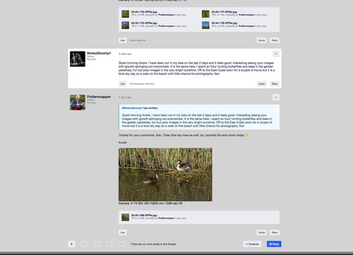
Grey background, could be even paler (with the paler blocks), needs to look lighter than this (would prefer to tweak the above) -
Anything else is distracting from the posts.
-
Latest update is done please check out:
dprevived.com/t/background-change/2493/
and put up some images. -
@43review has written:
put up some images.
This seems to be disabled.
-
Dark theme isn't dark, just a dark background behind bright white forum content.
-
@LeeJay has written:
Dark theme isn't dark, just a dark background behind bright white forum content.
Yes…still blinding at night. As well, the white banner at the bottom doesn’t help either.
-
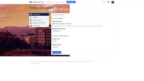
And besides, the background color for the dark mode should be a dark grey, rather than straight black - for example #0F0F0F, which is what Youtube's dark mode uses. The background images also don't play right with the options panel at the moment:
-
if people dont like the dark modes ,just use dark reader extension.
-
Adding this in here - PS with dark mode, it makes little sense when the main body is still white? Can this be fixed? All the threads still glow in bright white.
-
From user Raythentic (dprevived.com/t/formfield-text-becoming-invisible-previewing-a-reply/2570/)
After choosing a style from the dropdown menu all was well again as all the user options reappeared but perhaps some of the styles have to be tweaked still. When previewing a reply the text in the formfield takes the same color as the (formfield) background (white).
Style: dark+bg
OS: Windows
Browser: Chrome Version 109.0.5414.120 (Official Build) (64-bit) -
