• 1737 posts
    2 years ago

    Some time ago, Roger Cicala and Zach Sutton, both of Lensrentals, asked me if I'd do some posts for what used to be Roger's blog. I demurred, saying that Roger was a hard act to follow. But I've come around, and have written two already. I'm working on a third about -- you guessed it -- raw exposure. The first one I wrote was on how to use the focus bracketing system in your camera, if you are lucky enough to have a camera that supports that function. Maybe I'll post a link to it in the future, but it's of interest to a minority of photographers.

    However, the second post, How Your Camera and Image Processor Determine Colors, is of interest to many more image makers. Here's a link to it:

    www.lensrentals.com/blog/2023/03/how-your-camera-and-image-processor-determine-colors/

    There are some statements in there that have proven to be quite controversial, especially the ones relating to the fact that the image values in raw files -- with the exception of the JPEG preview image -- aren't colors. In fact, a heated discussion on the DPR MF forum about that is what lead me to write the article.

    Feel free to discuss that here, as well as any other issues you may have with the article.

    Jim
  • martinhbpanorama_fish_eye
    35 posts
    2 years ago

    Thank you, most interesting & very illuminating. For the sake of sanity I found link to the Shadow Optical Illusion. What can one say
    other than its incredible, literally unbelievable.
    Looking forward to further posts.

  • 1737 posts
    2 years ago

    There are many such illustrations. I once had two decks of playing cards, each with a different confounding visual image.

    Suggestion: download the shadow image, bring it into Ps, and measure the two squares.

  • 1737 posts
    2 years ago

    šŸ˜Š

  • martinhbpanorama_fish_eye
    35 posts
    2 years ago

    Ah yes in more ways than one :-)

    Every so often I delve into colour space & am instantly overwhelmed by such depth of research into something we take so much for granted.
    Some of the terminology used calls for further investigation E.g. the ā€œprinciple of color opposition correlationā€
    To quote :
    "Published in 1976 by the International Commission on Illumination, the CIELAB system has become the universally accepted colorimetric reference system for quantifying and communicating color. CIELAB is the reference color model used by the paper making and graphic arts industries. CIELAB forms the foundation of color management and is generally the ICC profile connection space used for gamut mapping. The basic architecture and operating premise of CIELAB is based on scientific theory demonstrating that the brain translates retinal color stimuli into distinctions between light and dark (lightness), and between mutually exclusive zones of opposing colors: red/green, and blue/yellow. We call this the ā€œprinciple of color opposition correlationā€ due to the fact that a color cannot be red and green or yellow and blue. Ever see a greenish red?"

    Over on the old DPR site I can remember Iliah Borg making reference to the fact that colour space was possibly non orthogonal & that instantly had me searching the web for more info into colour space.

    Glad you're both here.

  • pwillypanorama_fish_eye
    26 posts
    2 years ago

    Hey Jim, that's one exceptional work. It filled in a lot of blanks.
    Reading your Bio, I had no idea we were almost neighbors. I was just off Cottle on Nepo from '72 to 74.

  • DonCoxpanorama_fish_eye
    280 posts
    2 years ago

    Why do you think that the image values in the JPG preview are colours ? Are the values in a TIF file colours ? Are the various recipes for mixing pigments when making a Color Checker colours ?

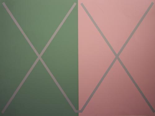
    The illustration below is from a silk screen print by Itten.

    FP011777_p3_half.jpg


    Don Cox

    FP011777_p3_half.jpg

    JPG, 588.6 KB, uploaded by DonCox 2 years ago.

  • 1737 posts
    2 years ago

    They are created based on the CIE 1931 weighting functions. and they are to be interpreted in relation to those functions. They don't have to be accurate colors to be colors.

  • 1737 posts
    2 years ago

    If a color profile is attached, yes.

  • 1737 posts
    2 years ago

    If I understand your question, they are recipes to make colorants.

  • 1737 posts
    2 years ago

    I used to use a similar illustration with yellow and gray to illustrate some aspects of human vision.

  • AlanShpanorama_fish_eye
    2 years ago

    Jim,

    I found your article very interesting. However I have a couple of questions:

    1. You said "When a scene is illuminated by single-spectrum light ā€“ think sunlight, electronic flash, candlelight, etc." - I thought sunlight was a multi-spectrum light. What am I missing.

    2. The picture of the chess board. Why can I see A & B as differenr colours?

    Alan

  • 1737 posts
    2 years ago

    I am using the word spectrum to mean the wavelength by wavelength energy distribution of the light source. By single spectrum light, I meant that the light source for the hole scene has the same spectrum. D50 defines a single spectrum. Single spectrum doesn't mean single wavelength.

    An example of dual-spectrum illumination would be sunlight with fill flash, although those spectra aren't all that far apart.

  • 1737 posts
    2 years ago

    Color constancy at work. Mask off the two squares and you'll see them as the same.

  • AlanShpanorama_fish_eye
    2 years ago

    Good heavens - so it is.

    How weird.

    Alan