This is a good step forward. I'd prefer it if it didn't go full screen, though. On my 4k monitor it is extremely wide. It would be better as a centred block with generous white space on either side, more like the mobile device mock ups earlier in the thread.
It would be better if the top image was the same width as the content block as well. On my screen, the effect is a bit like a pyramid with the banner image the pointy bit on the broad shoulders of the section blocks.
I think it’s looking good - and congratulations to you on moving things forward.
I suspect I’m borderline OCD - I’d like to see the Quick jumps in a single vertical column with a bit of white space between them and all of the contents of the three lines menu in that list so that you can get rid of it from the header. Also I think having the rows of Read more and Start here buttons horizontally aligned would improve the appearance. I read the site on a 12.9” iPad and I have no idea what these changes would do to the mobile version.
Then it would take up too much space - think aspect ratios.
It isn't full screen, but there is not much space round. I could increase it, but how many of us have 4K monitors? I have to allow for everything. But I will see if I can improve it.
That can be done but means a page redesign (I was doing stuff the easy way). Let me have a look and see what I can do.
Yes, I agree. But the text varies in height depending on the page width (that's responsive design for you). I will see what I can do to make it better.
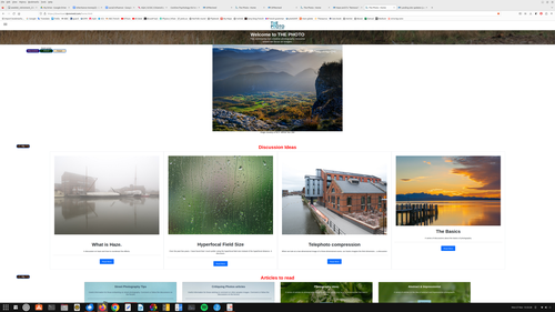
I've made the home page (download.dprevived.com/home.html) a little bit better. I think that's about as good as I can do for now.
Jump buttons are now vertical. Discussion and article buttons are as close to parallel as I can get. The issue is that the images are not the same size, so changing display size changes everything. I will continue to work on this, but I have other things to sort out - so I hope it's OK for now.
While I suppose that finally thephoto.uk is going to become the final index page, you might change the name (logo) and link from "dprevived" to "ThePhoto"
Then I would become clear to occasional and former dprevived.com visitors that there is something very positive coming up...
Yes, I know that needs changing. But at the moment, the FORUM is dprevived.com and the SITE is theforum.uk. It all needs tidying up - but some of it is outside my control
The title of the forum now better reflects our two personalities.
We have a better web site name for the landing site - the-photo.org. The old ones will still work. Note that they still translate to dprevived.com when the URL is translated. This will be sorted once we have finished sorting out the DNS entries.
I've added a web page with some information about how our forum works here download.dprevived.com/foruminfo.html - I will add to it as time goes on.
Thank you very much Alan for your hard work on this! I feel like many aspects have improved considerably and it's fantastic to hear that the site is likely going to be united under one banner (The Photo). I like the (non UK) .org adress as well.
The portfolio by @Fireplace33 is very impressive and a great example of how this can be used effectively - fantastic work! Even though I live in Austria, I wouldn't be able to ever take shots like that.
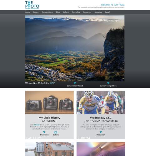
I still think the overall appearance of the main site should be a little bit cleaner design-wise, so here's my suggestion:
Desktop:
Mobile:
Some explanations:
1.) I would by all means avoid the Comic Sans font for any kind of main navigation.
2.) I wouldn't use a 'mobile type navigation' (three bars) for anything but mobile devices because it takes away the ability to get to a place via one click, doesn't let you see the structure without it and adds another CSS-challenge of getting a dropdown menu to behave and look good on an almost infinite amount of different screen sizes.
3.) The font I used for the description is meant as a placeholder. This is the kind of stuff where you can get creative and where I wouldn't mind some kind of more personal style. Because it's part of every page, I feel like it has to be uniform though. And I also would recommend avoiding any kind of photographs in the background, because one of the last things you want to do on a photography site, is distracting from the main thing (the images) by using another photo inside of a header, content box etc.
4.) The style of the links I've used is also still a kind of placeholder. Of course you can use regular buttons as well. But I would suggest doing so in a consistent and clean style, without lots of effects (shadows, outlines etc.), backgrounds and different colors. Misago has its clean and quite consistent system. I'm perhaps not the biggest fan of the particular color choices, but the general system works quite well and seems well thought-through. So I would suggest taking that as a basis. (I'm talking about the Quote, Reply etc. buttons)
5.) I don't feel like a separate "Forum Info" point is needed. To me it would make sense to add this information to the "About Us" section.
6.) I also feel strongly about the Forum not being a separate entity, but using the same menu on top! It feels way more professional if you have the impression of staying on the same site (regardless of what happens on the backend) than jumping to a different site when looking at the forum and then having to return via another menu to the "Web Site".
What do others think? I'm using Open Sans to replace Ariel as I come across it. I can do that for the menu too.
I did have a menu with names across - but as I added more items it became harder to keep it all on one line as the page size reduced. The 'hamburger' menu option was clean and easy - and other sites use it. I will investigate this further, but no promises.
I can do that - it's just a lot of work as every picture has to be exactly the same size or the text/buttons below move around as the page size changes. I will investigate.
I can check that out. But I don't necessarily want it all the same.
Yes, it's one less menu item. I will investigate.
They ARE two separate systems. There's nothing I can do about that as Misago won't let me embed itself in my site and a forum is not a web site. What I have done is the closest we can get. The only change is that I could have the links (both ways) open in the same tab rather than in a new one. So the 'back' button of a web browser takes you back to where you were before. What does everyone else think.
Not much may happen this weekend as I have a really bad hip and sitting in front of my PC hurts!!!
We can chat tomorrow on the Zoom call if you are going.
No. 0. Thanks for your work, Alan. I hope your hip gets better soon!
1. Agree with Simplejoy. Use the same font as further down the page.
2. I think it must be quite a challenge to restrict the hamburger menu to mobile sites, unless they are to be separately compiled.
3. Agree with Simplejoy about background images.
6. Alan's proposal seems worthy of trial.
Actually, if I can get Zoom to play ball, I am coming to the meeting! 😀
Not really - that's pretty basic CSS responsive design and standard on almost all websites nowadays. It certainly doesn't need a separate build.
Yes indeed. I have nothing against it on mobile and narrow viewports. However I don't know many sites (with a considerable amount of content) which use it on a desktop view.
And then narrow the window to what you would see on a mobile phone in portrait view and you can see how it changes. That's what I have in mind. You still have an CSS wizard on the team, don't you?
I've had a play. see what you think now. The menu is there until you get to less than 900 pixels wide. Then it goes to a hamburger one.
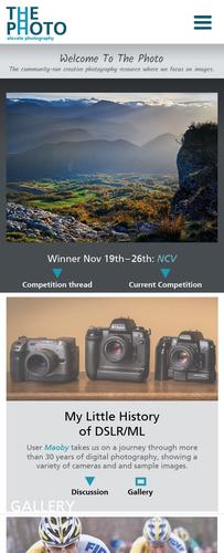
I've also changed the first set of cards on the home page to show the image underneath the card info rather than as a background. The second set are as before. Which do you prefer?
The whole card is now clickable for cards that have a link. That fixes a slight issue that it was only the button text that was clickable in a card button.
The forum info is now below the About Us information. Do you like it there?
I think this is a good idea…. I think there is progress in the right direction and the present version would be ‘good enough’, but there are always improvements possible. I’m in agreement about buttons, simple would be best: backgrounds, rounded corners, drop shadows etc. are so 1990s and all ‘decorative’ fonts should be avoided like the plague! The ‘what’s new’ section could be moved to a link on the left rather than its current placing in an obtrusive place in a non-matching font size etc. Indeed, the ‘quick jumps’ aren’t really needed if you stick with the string of links in the header.
More contentiously, I wonder whether the ‘dpRevived’ branding hasn’t already served its time and become irrelevant. The original now seems likely to survive at least in the short term and this site is now developing its own identity as something distinctly different.
One last thing: I wonder about the hyphen in the domain name - is it really needed?
Yes, way better! I don't understand the change of colors though. I think it should be pretty neutral and particularly no complementary colors. The mobile navigation has no background... it only seems to appear on hover, (but I'm sure you're aware of that).
That's great - makes it easier to navigate.
I would probably call the section 'About' and then make different headlines for the forum idea/philosophy and the people behind the project, but yes, overall I think this can go together.
I was just experimenting with colours. I like the red for the menus. Background blue is a bit of a mess - it allows the underneath to bleed through as you scroll down which I don't like.
I'll do some more playing.
I think I've mentioned this before, but I need to make each image the same size. So, more playing...