• Nov. 23, 2023, 10:43 a.m.

    OK - I've done enough for now. We have a different look landing page (the winners photo and links to article headers), a series of articles for you to read and discussion areas on this forum. I have more articles I can add, but I won't add more at the moment until you say it looks OK and is the way you want the landing site to go.

    Please tell me what you think.

    Cheers

    Alan
  • Members 1662 posts
    Nov. 23, 2023, 11:29 a.m.

    Thank you very much @AlanSh - excellent work 👍 (I‘m only able to comment on mobile for now)! If you need any single elements for buttons/design etc. please let me know!

  • Foundation 1504 posts
    Nov. 23, 2023, 12:27 p.m.

    Alan,

    It is beginning to look very good. I do wonder, however, whether we need to make it clear that, as the articles linked to are not on our site, we do not necessarily endorse their views, and cannot take responsibility for the contents of these external sites. (Perhaps not the right formulation, but I hope you get my point.)

    David

  • Nov. 23, 2023, 12:55 p.m.

    Good idea. I can add something like that as a footnote and/or in the legalese page.

    Alan

  • Nov. 23, 2023, 9:21 p.m.

    Thank you.

    Last update for tonight. I've added a 'favicon', I've renamed some of the pages so they say "The Photo - xxxx' on the tabs in a browser, I've made the menu a nicer highlight colour and I've added a footer to the articles page saying we take no responsibility for anything.

    Note that the resources page has been renamed as 'articles'.

    Enjoy the site - and keep posting on here.

    Alan

  • Foundation 1504 posts
    Nov. 24, 2023, 12:12 p.m.

    Alan,

    further thought (always disastrous) makes me uneasy about the fact that, as far as I can see, all the links to articles on the page are to other sites. In the fullness of time, I hope we shall have our own articles, but for the time being I think it should be made clear that the links lead out of our site. I think our own material should be showcased on the landing page above these links, which now are currently more prominent. It should not be necessary to use the menu to discover the original material on our site.

    There is plenty of room to push the links down and put a row of our homegrown material and photo threads.

    Best,

    David

  • Nov. 24, 2023, 1:26 p.m.

    Good idea. I'll look to doing something once I am back on the project. Probably not till Sunday or Monday.

    Alan

  • Members 1662 posts
    Nov. 24, 2023, 11:33 p.m.

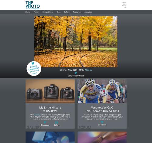
    Here are my thoughts:

    Landing page:

    ThePhoto_LandingPage.jpg

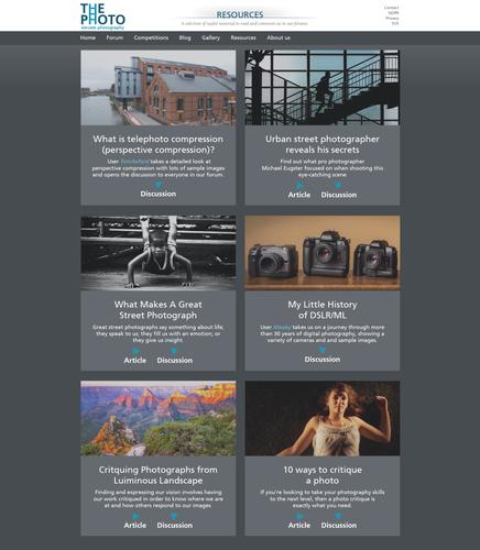
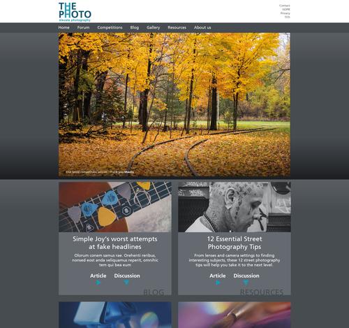
    Resources page (I like that term, as it encompasses other types of media, for example a good video, podcast or internal things like threads on the forum, a themed photo series etc.)

    ThePhoto_LandingPage2.jpg
    As you can see I've tried to integrate some of the 'non article' stuff already.

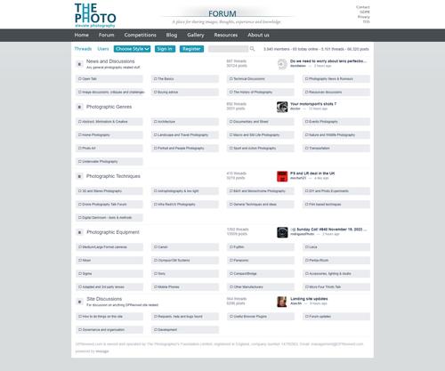
    An attempt at integrating the forum into the site layout:

    ThePhoto_LandingPage3.jpg

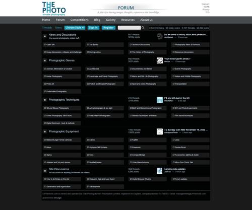
    Forum dark mode:

    ThePhoto_LandingPage4.jpg

    I'm not sure about the 'Section headline + description' in the header, but I wanted to incorporate it, as it seems to fit the approach of the site and may be able to give it a little bit of a personal note, something that says: "This is who we are!". That being said, I don't feel like it's quite there yet.

    ThePhoto_LandingPage.jpg

    JPG, 1.5 MB, uploaded by simplejoy on Nov. 24, 2023.

    ThePhoto_LandingPage3.jpg

    JPG, 347.9 KB, uploaded by simplejoy on Nov. 24, 2023.

    ThePhoto_LandingPage4.jpg

    JPG, 308.3 KB, uploaded by simplejoy on Nov. 24, 2023.

    ThePhoto_LandingPage2.jpg

    JPG, 511.3 KB, uploaded by simplejoy on Nov. 24, 2023.

  • Members 1578 posts
    Nov. 25, 2023, 3:40 p.m.

    This is starting to look really good! Great work, Alan and Simple Joy!

  • Members 300 posts
    Nov. 25, 2023, 5:20 p.m.

    Looks good!👍

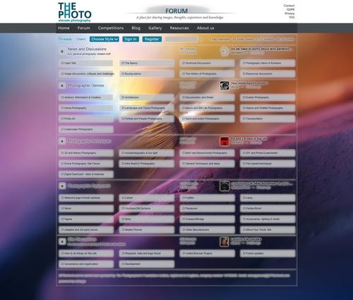
    But I think the forum pages should also look like a Photography or a Picture Forum. This is quick and dirty sketch made in Gimp. In Html you can do it much better. But I hope you see my idea here.

    Forum_light.jpg

    Forum_light.jpg

    JPG, 470.8 KB, uploaded by TimoK on Nov. 25, 2023.

  • Nov. 25, 2023, 5:37 p.m.

    You can already do that by changing the style. It's just you have to have the picture that Martin chose.

    Alan

  • Members 1662 posts
    Nov. 25, 2023, 6:15 p.m.

    Thanks a lot for your input! You're right - the option should certainly be there. As Alan has stated, it is already possible to do something like that via the design button, however it takes some careful consideration when creating a design which works with background images and I am of the opinion that this should always be optional, because many people prefer forum designs without any images from my experience.

    I like a lot of the basic forum design as it is by the way - the two things which would improve it in my opinion, are a.) integrating it into an overarching site structure and b.) using the placeholder(?) icons (for example in front of 'News and Discussions') more effectively by replacing them with icons which fit the respective field.

    Thanks to @davidwien who has made me aware of the fact, that the Landing Page should feature 'our own' content exclusively or at least clearly highlight it in order to get further away from the aggregate-site impression. Here's a slightly changed version, trying to take that into consideration:

    ThePhoto_LandingPage.jpg

    I also like the idea to highlight some of the important or particularly interesting topics, which was also suggested to me by David. While researching various topics for my own articles, I've stumbled upon threads (some of them on the dpreview forum) which would have been more than worthy of being featured as 'articles' on their main page.

    I don't think this happens on a lot of sites though... so it would be another way to incentivice in-depth analysis and write-ups in the forum, and also make this more unique compared to many other photography sites.

    ThePhoto_LandingPage.jpg

    JPG, 1.5 MB, uploaded by simplejoy on Nov. 25, 2023.

  • Members 300 posts
    Nov. 25, 2023, 6:23 p.m.

    Sorry! I did not know that. Looks better made in html.
    I think it should be the default.
    I also think somebody must choose the pictures to backround because not all pictures do work as backrounds. Let it be Arvo!

  • Members 300 posts
    Nov. 25, 2023, 6:29 p.m.

    You are so much speedier! When I was thinking you already wrote a long story! But I say it again I think the forum page with a backround photo should be the default.

  • Nov. 25, 2023, 8:52 p.m.

    I shall do some more work in the landing site tomorrow. I've also got some ideas I think you may like as well as what has been suggested above.

    Alan