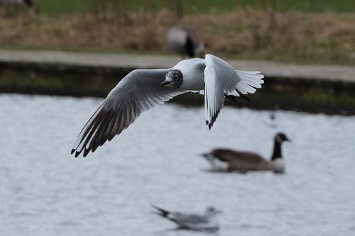
I went out with my 70-300 lens and tried to get some decent 'bird' pictures. I t was an interesting exercise, and I did end up with a few. I particularly liked this one. It's been cropped from the original picture.
-
-
Well done for putting the first photo up in this thread. I'll stick my head up and try the first critique.
Firstly it looks much more impressive if clicked on and looked at large with a black background. The head is nice and sharp, you've essentially held the white details in the feathers, perhaps there is more detail in the white on top just behind the head. I don't really like that wing position but that's a matter of taste and it has the advantage of making the subject compact in the image. It's nice to see the bird from the side rather than looking up to it. Depending where it was in the original frame I'd like to see a little more space in front of the bird for it to fly into. I'd be tempted to clone out the gull on the water and the out of focus blur on the water under the tail.
Birds in flight are a challenge, bigger slower ones are easier.
David
-
Thank you David. I will take your ideas on board and see if I can make it better. I'm new to 'birding' so any response like yours is always welcome.
Alan
-
Very nice capture. The bird is in focus, sharp without motion blur.
I find the background to be very distracting. You did such a good job of capture on the bird, I think I would select the bird and completely remove everything else. Then add a plain, neutral background. If you still want to retain the environment, I would consider a B&W conversion to lessen the pull of the background in the upper area. Then also clone out whatever creature is above the bird's back.
-
Your first bird picture? You did a darned good job. I've been taking bird pix for years and I still don't get many keepers. I like the angle, kind of a 3/4 view. He's plenty sharp, from wingtip to tail, with good detail in his face. He did not chose to give you a pleasant background to work with, especially with that thick dark line that runs right under him and obscures the dark feathers in his tail. You could extricate him and stick him in another background without a lot of trouble if you wanted, but you'd need to find him a prettier but still gloomy background. At the very least, I'd clone out that curious looking blurred thing right above/behind him. Good bird debut!
-
BIF is not my thing either (more into landscapes) but it can be fun and challenging 🙂
I like your photo because the details on the bird are clear and I like the wings position. I assume you used burst mode and chose the frames that worked best.
However, if this was my photo (and I would be very happy with it as well) I would try to unclutter it a bit by cropping even more and removing unnecessary distractions.
I would also straighten the path in the background. Being on a slope is a little too distracting and 'unbalances' the scene to some extent imo. I would clone out the distraction on the path just above the bird's back.
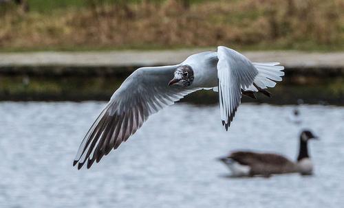
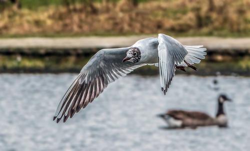
On my screen (and my screen settings are most likely different to yours) the image a little dark and needs a bit more 'punch'. On my screen, the edited version below looks a little better. On your screen it might or might not.
I edited the jpeg in ACR and then Photoshop Elements + Elements XXL plugin. I basically raised the shadows and whites a bit and lowered the highlights and then applied a bit of dodging and burning to the bird.
Hope this helps and thank you for sharing and letting us post edited versions to help show what we mean.
-
-
The colours in the image I posted look fine on my screen.
Perhaps your screen is calibrated to a different brightness than mine and profiled differently to mine.
Online images will appear differently on people's monitors depending on if/how the monitors are calibrated and profiled.
-
It was a dull day and I think I used Provia Standard to create the JPG from the raw. So, I think my colours match what my eyes saw at the time.
Not to say the other one is wrong - I think it looks nice and brings out colours. After all, art doesn't have to match reality, does it?
Alan
-
Critique made before reading any others…
As a first effort this is excellent. A nice moment of capture. Good gesture. The wings are nicely articulated which is generally more interesting than the (all-too) typical flat wing glide.
The DOF is problematic here — the transition from subject to background is so abrupt that the bird might almost be pasted in.
The background borders on too crowded. The sea wall is unfortunately placed, bisecting the subject and providing an exit path from the frame. The dark grass at top-of-frame is also distracting.
A tighter crop might help with both of these issues.
All that being said, you captured the bird, in focus, at an interesting moment. That’s more than many are capable of. Nicely done.
After reading what others have said…
I’m not particularly bothered by the color overall, but I do agree with dodging the grass to lighten it a bit. While it improves the image, I am opposed to cloning out the bird in the background. This crosses my line between photograph and photo illustration[1]. It also makes the image ineligible for most of our local nature clubs if that's of any consequence. Artist's choice though. So long as the artist is honest about it.
[1] I have no issue with photo illustration as an art form or means of expression. I am tired of competing against them in photographic salons. I cringe every time one of our judges suggests I should "take that out with the healing brush." I do lightly retouch portraits to remove non-permanent imperfections. If it's forever I won't touch it unless the subject requests otherwise.
-
I agree with those who say excellent first effort. Personally, I don't mind the background, with one exception, and that's the annoying thing (person?) smack on the bird's back.
-
It’s another bird, (Loon? Goose?), beak to the ground.


