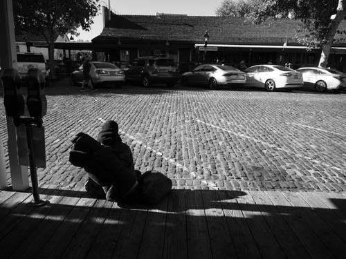
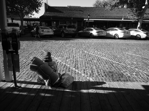
Hello, it's a nice image, but I think the protagonist may need a touch of light...
-
-
-
-
Hello again.
Yes, I like it better that way. In the first version, it was a little difficult for me to distinguish the character. But I suspect it also has to do with the type of screen you see the image on: I use an iPad, which tends to contrast a little more than ideal...

