• Members 2370 posts
    Sept. 29, 2026, 12:26 p.m.

    Caspar David Friedrich,...

    ...painted a lot of landscapes in the beautiful area where we have just spent a few days on holiday in the "Saxon Switzerland" part of Germany.
    We visited some of those places he painted, and also visited a good immersive exhibition of his work in "Bad Schandau".

    One of his most famous paintings is the "Wanderer Above the Sea of Fog"
    Here's a wikipedia photo of that painting

    caspar painting.png

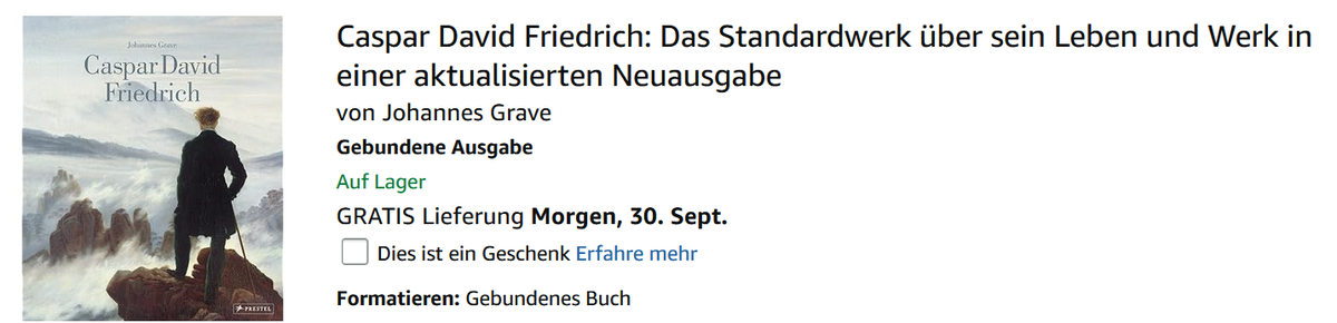
    But looked what happened to this painting when it was used as a book cover for his work,...

    .
    caspar.png

    Of course the book author can take any image , or painting, or a crop of a painting, that he likes for his book cover,
    but here it seems the "Rule of thirds" guided that choice.

    What do you prefer , the original or the ROT version ?

    caspar.png

    PNG, 222.7 KB, uploaded by Fireplace33 on Sept. 29, 2026.

    caspar painting.png

    PNG, 1.9 MB, uploaded by Fireplace33 on Sept. 29, 2026.

  • Members 1947 posts
    Sept. 29, 2026, 12:57 p.m.

    That's quite an interesting exercise.

    When I look at the original painting the centred wanderer dominates the scene and then the eyes follow out to the other parts of the image. The positioning seems appropriate.
    But the use of rule of thirds for the book cover image feels somehow more balanced. Perhaps with the image at the left of the larger white bg / text area and the painter's name added to the image it needed it that way. I can almost feel a layout compositing rule there that would have been taught in a publishing course...

  • Members 2764 posts
    Sept. 29, 2026, 1:18 p.m.

    I think the cantered text, makes the shifting of the person rightwards visually necessary.

    I agree that the two different framings alter the subject from the man in the first to the landscape in the second.

  • Sept. 29, 2026, 1:35 p.m.

    Totally different compositions.
    I like painting more - but for book caption (on painting) I can see only position for text at right side, from bottom up - text at top would kill painting airiness, I think.

  • Members 1607 posts
    Sept. 29, 2026, 2:49 p.m.

    Well found!

    I prefer the painting. For me, the figure in the book cover is too far over at about 0.667 to the right edge from the left edge.

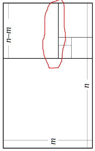
    I prefer the Golden Ratio (1.618) φ = (1 + √5)/2 in other words and in this case, 1/φ = about 0.618 to the right edge from the left edge

    golden mean.gif

    Going a little further, when I place an object in a frame, I place it's center of area (centroid) which is often not it's "middle".

    golden mean.gif

    GIF, 6.9 KB, uploaded by xpatUSA on Sept. 29, 2026.

  • Sept. 29, 2026, 6:56 p.m.

    I thinkl the centered person picture is unbalanced. Which sounds odd, but the person dominates and "destroys" the rest of the picture. The one where he is situated on the right third allows me to "see" the rest of the picture.

    Alan

  • Sept. 29, 2026, 8:15 p.m.

    I am not a believer in the "rule of thirds" at all. I have no complaint with either the original, which needs to be seen big (the painting is 98cm x 74cm), or the bookcover version. The latter takes account of the need to highlight the title of the book, and does so successfully in my opinion.The title of the painting is "The Hiker above the Sea of Fog", so the man alone is not thr focus of the picture in any case.

    David