• Members 109 posts
    April 10, 2023, 11:44 p.m.

    Since I am asked for the Photo Critique forum, I think I better add another image for discussion.

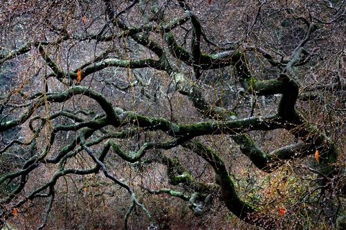
    For many years I followed the goal of creating simple photos where the subject was clearly evident and the composition was simple and emphasized the main subject. Over the past couple of years I find a great many of my photos have become complex often without a clear subject or focal points. I am curious about the appeal of this approach and whether I should go back to trying to simplify our complex and often chaotic world. Thanks for any input.IMG_2049 .jpg

    IMG_2049 .jpg

    JPG, 1.8 MB, uploaded by camperjimk on April 10, 2023.

  • Members 244 posts
    April 10, 2023, 11:49 p.m.

    Your vision, at any point in time, is your own. This is a lovely image and well-shot.. But when I look at am image my “personal test” is “would I buy it?” My answer here is “no”. To me only, it lacks power, has too many distractions, and simply doesn’t speak to me in a way that the organic branches would if unencumbered of the other growth.

    If I must say it (despite not my place to do so), I would say “simplicity over complexity”.

  • Members 252 posts
    April 11, 2023, 12:40 a.m.

    This is indeed lovely and well shot I agree. It kinda resembles the chaos of the concrete world, like nature's equivalent of overemphasized urbanization. While it is not what I would like to hang on my own walls I can however see its appeal towards other people, aesthetics are subjective always. If simplifying anything perhaps it could/should be letting go of the idea that your art should reflect anything at all, forsake any attempt at rationalising why it is what you are doing the way you are doing it.

  • Members 143 posts
    April 11, 2023, 2:46 a.m.

    Your photo is detailed, but not necessarily complex. The dark tree trunks are emphasized against white water droplets. The green moss on the tree trunks contrast with the magenta background (green and magenta are opposite colours on the colour wheel). The tree trunks are not only diagonal, but originate from the brightest and more colourful part of the photo, which draws even more attention to them. The branches and water droplets act as a natural frame, seeming to give the circular glow, especially on the left side of the trees, which draws attention to them and to the centre of the photo. There are a lot to see, but also a lot that can be missed at first glance. You found some order in the chaos, and that's the part of the fun of photography, especially forest photography. I am not sure what more you could have done. Simplicity via minimalism is obvious, and obvious can be boring. There are photos that immediately grab you, and there are some that can draw you slowly in.

  • Members 109 posts
    April 11, 2023, 3:58 a.m.

    Thanks for the feedback. This is even more than I expected with some detailed thoughts and observations.

    In addition to helpful comments, the first two responses are clearly point towards an overly complicated presentation. I will need to give these comments some additional thought. I am not sure I understand "rationalising". My approach to composition is highly analytical and intentional. I guess that can be described as rationalizing.

    Doady, there is not much I can say. You see this pretty much as I intended. It is largely a study in composition designed to bring the viewer's attention to the patterns and shapes. How well that works is another issue. Whether that is enough to create an interesting image out of complexity is an even bigger issue.

    Again, thanks for the comments.

  • Members 252 posts
    April 11, 2023, 6:07 a.m.
  • Members 109 posts
    April 11, 2023, 12:01 p.m.

    How does that apply to photography? What behavior or attitude is involved?

    Do you mean the process of critique is some sort of rationalization? Who is rationalizing what?

  • Members 50 posts
    April 11, 2023, 2:13 p.m.

    In my book, a good image needs to have a reason, a story, a motive to be worth watching by others. It should be something that visually shares and tells an idea or a view. And it should deliver this idea as clearly and nicely as possible. To achieve this goal may be easier in abstract, minimalistic images. But complex pictures can do it too if they concentrate on one idea.

    In my humble opinion, your image failed this criterion. It got nice branches of wood and shows wilderness, but it is sprinkled with small water droplets, which unfortunately are blurry and the light is not optimal to make them clear against the background. If you wanted to show this as the main feature of the image, you need to do it better. If you wanted to show the nice branches, then that, possibly against a more silent background light. But this mess is too much.

    I hope you don't mind. You asked for it, didn't you?

  • Members 109 posts
    April 11, 2023, 2:29 p.m.

    I certainly do not mind. In fact, this is the sort of clear opinion along with explanation that matches what I expect from a critique forum.

  • Members 252 posts
    April 11, 2023, 3:34 p.m.

    To me it applies in several ways in reference to the OP though considering the amount of confusion you seem to experience regarding my personal opinion and the words I use to express myself in regard to your art I think it best to stop trying to explain myself as we clearly see things thus much differently it seems of no use to continue this conversation.

    Have a great day.

  • Members 1560 posts
    April 13, 2023, 11:50 p.m.

    This is one of the most appealing photos I have seen here. It is indeed one I'd be pleased to have on the wall of my personal gallery (large white matt, thin black frame). If you are suggesting that it is complex, I would challenge that. Yes, it is just part of a tree with a lot of twisted limbs going different directions against a naturally mottled background of vegetation or landform. It is well taken, sharply rendered, with a variable color palette ranging from bright to pastel to dull. It is well composed with lines (not straight but very well delineated by tone) for the eye to follow. But I don't see it as complex - it is a photo of a universal and recognizable visual symbol. It's a tree. It is also a river or floodplain seen from the sky. It is also diagram of the blood flow in the body of any living creature.

    It reminds me of the more recent work of Guy Tal. That is one of the highest compliments I could give to an image. It also recalls Freeman Patterson's writing and lecturing on symbolism and visual perception in photography.

    If there were anything to change I would offer this. If the lighter spots in the background of the tree in the left half of the frame were brightened in post, I'd consider unbrightening them. If they are natural I'd consider some careful manual highlight reduction in just those spots, just to see if you like it any better.

    Overall I'd encourage you to pursue this inclination further. We learn, with practice and discipline, to create a certain type of subject-focused imagery. You are edging into a different kind of art. Let your creativity chart your path.
  • Members 109 posts
    April 14, 2023, 1:03 a.m.

    minniev, thanks for the comments. I think I see the issue you described as overly bright areas on the left side. I think the issue is actually too much of a vignette but the result is the same.

    I find the diversity of opinions interesting. I showed this image to a photography group I belong to and the response was at best neutral. I also showed it to a gallery critique group of mainly painters. There it was very well received.

  • Members 1560 posts
    April 14, 2023, 1:21 a.m.

    Some photographers are craftsmen. Others are artists. One is no better or worse than the other, and a person can be good or bad at either one.

  • Members 621 posts
    April 14, 2023, 1:26 a.m.

    Interesting take. I like that

  • Members 109 posts
    April 14, 2023, 3:12 a.m.

    I look at this a little differently. The vast majority of photographers I know have technical backgrounds and were at least partially attracted to photography due to the technology and gear. Very few amateur photographers have any formal training in the visual arts.

    I would also agree that is neither good nor bad.

  • Members 12 posts
    April 15, 2023, 11:23 a.m.

    You have already simplified a very complicated subject by finding a simple grouping of branches that works to draw the eye around the image. One sees the branches first, the few little bursts of leaf colour next, and then the awesome background. I find the few little bursts of colour to be intriguing and ultimately what causes one to investigate the image further.

    Being an avid wideangle landscape photographer I often throw the telephoto on the camera for a few "portrait" shots but I rarely get something this dramatic. Keep it up.

  • Members 109 posts
    April 15, 2023, 12:51 p.m.

    John, thanks for the comments. At one time I shot a lot of wide or ultrawide compositions. Lately I have been more often using a telephoto for my landscape photography. I think it depends partially on the subject matter. When traveling out West or at the seashore, I often find the wider view is better. In forest areas I often find myself using a telephoto in order to tighten the view.

  • Members 118 posts
    April 16, 2023, 5:46 p.m.

    re: Simplicity vs Complexity: If you walk into a candy store & can’t decide whether to get a Hershey bar or a Nestle bar, what should you do?

    re: this specific image: I find the image appealing & might put it on a wall in a specific environment. (The others have offered plenty of detailed comments, which I won’t repeat.)

  • Members 118 posts
    April 16, 2023, 5:50 p.m.

    BTW, I like doady’s comment “Your photo is detailed, but not necessarily complex”. Good observation. I agree.