No, I didn’t see that.
Reading too fast is a bad habit of mine. lol
-
-
No worries. 🙂 Do you like the use of green instead of blue?
-
In this instance, rev is just a shortening of the word revived.
An abbreviation is a shortening of a word or a phrase.
Noah Webster’s 1913 dictionary is 110 years old, but… it contains the most charming definitions.
You can access it online here: www.websters1913.com/
Connoisseur's reference to American English - a dictionary for writers and wordsmiths. -
@Mbruinsma
Yes, the green looks okay. -
[quote="@Greg"]
In this instance, rev is just a shortening of the word revived.
An abbreviation is a shortening of a word or a phrase.
Okay, I see where you come from with this one. I wrote: “Here I made a list what ‘REV’ could mean:” And rightfully so you mention that the discussed REV over here means revived. But I was wondering how other new forum members could pick up the abbreviation of REV. Or if others don’t like revived, take your pick out of the list, if you will. Just brainstorming again.
-
This is quite true. Where there is an abbreviation that is not widely accepted, common, or well-known, it could mean any one of the known (or even unknown) abbreviations.
DigitalRev TV as I mentioned above in my reply to Bob, was the most popular YT channel about photography. Having Rev in its title did not hold it back, though it was quite evidently a gear review channel, so there was little doubt was Rev stood for. Though the fact it was called 'DigitalRev TV' not 'DigitalReview TV', did help it I think.
In our case here, this isn't first and foremost a gear review site (as DPR originally was before their forum balanced that). So Rev, which we kinda all assume must mean Review is misleading, in fact we probably take it to be an abbreviation of the original DPReview site. That it's slightly cryptic I'm not totally against, I stay open, though as you guys might be guessing I like clarity, not obfuscation. So it's rather up in the air for me, but on the whole I think it's ok, better than longer versions with don't really mean much either, like Evolved (ok evolved is a word not an abbreviation, but I don't really need 'evolved' in the name, and it makes the previous sound larval).
-
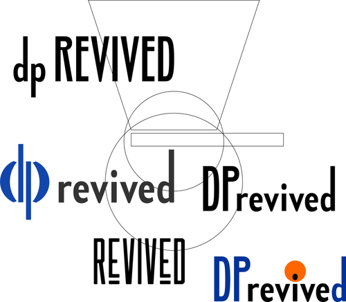
On many levels these do not work, IMO.
Why underline? is it a link, an extra important word in a sentence, or a title from an old book may 50-100 years go. When I look I see underline, underline, underline, underline. Loose the underline.
Why all lowercase, and why is dp so much larger than revived? - the dp is about to eat revived, or drive over it.
The italic D is super annoying, like a fly that wont go away. I know that the word revive is within revived (like many words ending in ed) - no need to point it out every time we read the name. It's almost like we are at a systematics class deconstructing words, we're not.
Italics, make no sense, unless this is a car review site testing speed etc.
Green, makes it look like we're selling eco batteries. Unless we are all about eco credentials (or landscape photography only) I think it's trying to be too PC.
Blue has an acceptance and presence in the photo-world. It also is accepted in other sphere's as well, such as legal bodies, or the old background for Windows OS (which was supposed to appeal to offices) though often there it tends towards greyish cyan. The bright blue is more photo, maybe it's from lenses - the glass - often symbolised by blue? - not sure why, but blue is used for photo and optics. Keep with what's given. We could try something else, less used, like a hot orange, but not so sure.
Once a colour is chosen (i.e say blue) it can be offset by a second colour (or black or white), but by adding a third colour it makes a title or logo become a fairground, and the actual name much harder to read (ok it can be read, but the colours really vie for attention for no reason). The obvious three would be RGB, but that's cheap, and distracting.
Add all the above up, and into the mix, and the name become the least of it. Its should be the most of it.
As I mentioned I initially knocked up 20 versions, this is what I often do, rather then tunnelling into one version, and then often making it worse! Having more options, made by oneself, makes one honest about which one is best (and it might not be the one you've spent days working on!). All my 20 options I'd say were ok contenders, but chose one which was one of the most simple, mainly because it 'worked' - and didn't need more. If it doesn't need more, don't give it more.
There is also the case where we might have a neat title (i.e not too complex) and a more 'designed' 3D logo.
I'd go at this again once the name has been decided (I currently think dpREV is best, but there might be another we haven't explored yet), so don't want to offer another round of examples again right away, I'll wait until Bob has a plan...
-
@lefteye has written:
On many levels these do not work, IMO.
Without getting into the specifics, I do think that this comes off somewhat as an exercise in trying to use design trickery to compensate for a lack of substantive relevance.
The problem is that the name is not very meaningful (except right now to those exiting from dpreview) and not at all forward-looking. Visual tweaking might distract from that a bit, but it doesn't address the actual issue.
If nobody has yet hit upon a site name that makes everyone immediately smile (with or without fancy typography), maybe we should keep throwing in suggestions until we do. While it would be nice to have a solution soon if we can, there's no 'hard deadline'.
-
@SilvanBromide has written:@lefteye has written:
On many levels these do not work, IMO.
Without getting into the specifics, I do think that this comes off somewhat as an exercise in trying to use design trickery to compensate for a lack of substantive relevance.
The problem is that the name is not very meaningful (except right now to those exiting from dpreview) and not at all forward-looking. Visual tweaking might distract from that a bit, but it doesn't address the actual issue.
The name is perfectly meaningful, it describes the revival of DPReview, a 25 year old institution that Amazon thought they’d killed but the power of its community has brought back and revived. I don’t understand why that’s not something to celebrate and be proud of, or why anyone imagines it’s “meaningless” either now or in the future.
Will there come a day when people interested in photography aren’t aware of what DPReview was, yes maybe several years down the line, but at that point one of two things will be true:
A) This forum will have long since failed and become redundant/forgotten itself, or
B) DPRevived will be firmly established as the home of photography discussion (and more) on the web, and the history of how it got its distinctive name long since passed into folklore.
I just really disagree with the fundamental premise of this thread. I get it, it’s fun to pick out names for stuff, but this site already has one.
-
@Threaded has written:@SilvanBromide has written:@lefteye has written:
On many levels these do not work, IMO.
Without getting into the specifics, I do think that this comes off somewhat as an exercise in trying to use design trickery to compensate for a lack of substantive relevance.
The problem is that the name is not very meaningful (except right now to those exiting from dpreview) and not at all forward-looking. Visual tweaking might distract from that a bit, but it doesn't address the actual issue.
The name is perfectly meaningful, it describes the revival of DPReview, a 25 year old institution that Amazon thought they’d killed but the power of its community has brought back and revived. I don’t understand why that’s not something to celebrate and be proud of, or why anyone imagines it’s “meaningless” either now or in the future.
Will their come a day when people interested in photography aren’t aware of what DPReview was, yes maybe several years down the line, but at that point one of two things will be true:
A) This forum will have long since failed and become redundant/forgotten itself, or
B) DPRevived will be firmly established as the home of photography discussion (and more) on the web, and the history of how it got its name long since passed into folklore.
I just really disagree with the fundamental premise of this thread. I get it, it’s fun to pick names, but this site already has one.
Going back to somewhere near the top of this thread, I came to the same conclusion having fleshed the subject out, that actually Revived is ok
...photography is kept alive and hopefully isn't a zombie.I also think Rev could be ok. I'm remaining open to either - or a better one.
Anyway back up the top, where I first offered a kick-off basic text logo (another more graphic logo could still be relevant in addition), I suggested my whole 'issue' with the name, might just be a lower & upper case issue. I still keep reading DPRevived as Deprived, and somehow find the balance slightly ugly (yes I'm being picky!). With DPReview, 'review' is a shorter word and more common so it reads quickly and clearly, also they have two 'logos' a name and a graphic disk, the name is all in uppercase. They had top designers working on it, again not that it should be copied but there are reasons for decisions, they went with all uppercase - DPREVIEW.
DPRevived doesn't read quickly and clearly (I could say it does, but I have to be honest and it doesn't read well). As well as 'Deprived' it can also look like DPR evived, weird, or I just don't know what, I almost break out in a sweat reading it, wondering what the word is.
Hence the simple conclusion to me (but not for everyone) was dpREVIVED...
In terms of the above, I much prefer the cleaner light background versions, which might mean placing the text within a light background shape - to remain as is on a dark theme (rather than using a dark version logo), anyway such stuff is down the line.
Mainly and firstly we should all decide that revived is the one, or rev or something else. That as you say the site already has a name, is true, and maybe we should all work with that; it is an ok-ish name when it can be read and understood clearly.
I think I'll leave it here! - until (and if) some further developments come to light on this front.
-
@lefteye has written:
Hence the simple conclusion to me (but not for everyone) was dpREVIVED
Except it's not "dp" that has been "revived".
I'm happy for @Threaded to disagree, as he/she evidently does. However I think a name should be accurately descriptive of the thing it names, not a reference to an isolated event somewhere back in the mists of its history that many folk might not recall or understand.
Moreover, semantically speaking, this site itself is not a "DP Revived" (Digital Photography has not died, so it doesn't need reviving and in that sense - the current name as written doesn't makes sense at face value) nor is the site a "DPR Evived" since "evived" is not even a word.
We have to decide if the name matters. If we take the approach that "the history of how it got its distinctive name [will have] long since passed into folklore" then maybe it doesn't matter. But that's not my view. The site (including its name) should, ideally, be transparent, accessible and approachable, not arcane and alienating (with a name that is only understood and appreciated by a shrinking clique of old codgers who were there at its founding).
-
@lefteye has written:
On many levels these do not work, IMO.
Start bashing my ideas below - maybe I'll learn something today :)
-
@lefteye has written:
We're all glad this is here, but I and many others don't like the name DPRevived. Ok, it was fun and a joke for a kick off, but now, no. Let's be a bit more serious about this site's name. I even saw a thread locked on another site, as someone suggested they read it as DP Deprived !! - I've done that also.
This isn't primarily a Review site - which DPR started out as, and was it's main pull (despite the growing forums over the years). Review is a noun, it's a thing, a review. Revived isn't a thing, it's a verb, referring to something else, so is already vague and dispersing. This site should be a 'thing' throughout, positive.
Can we suggest other names, before this sticks?
others...?
I agree with Threaded. And from a business placement, it should be positioned with key words and such so that anyone that looks for DPR in the future, and people will be looking at it's archives for years to come, either lands here or this is the second listing. A strategic way to get the traffic of anyone looking for DPR(which one?).
And what's in a name anyway? My favorite forum is The Ugly Hedgehog....,. so go figure!John
John
-
@Threaded has written:@SilvanBromide has written:@lefteye has written:
On many levels these do not work, IMO.
Without getting into the specifics, I do think that this comes off somewhat as an exercise in trying to use design trickery to compensate for a lack of substantive relevance.
The problem is that the name is not very meaningful (except right now to those exiting from dpreview) and not at all forward-looking. Visual tweaking might distract from that a bit, but it doesn't address the actual issue.
The name is perfectly meaningful, it describes the revival of DPReview, a 25 year old institution that Amazon thought they’d killed but the power of its community has brought back and revived. I don’t understand why that’s not something to celebrate and be proud of, or why anyone imagines it’s “meaningless” either now or in the future.
Will there come a day when people interested in photography aren’t aware of what DPReview was, yes maybe several years down the line, but at that point one of two things will be true:
A) This forum will have long since failed and become redundant/forgotten itself, or
B) DPRevived will be firmly established as the home of photography discussion (and more) on the web, and the history of how it got its distinctive name long since passed into folklore.
I just really disagree with the fundamental premise of this thread. I get it, it’s fun to pick out names for stuff, but this site already has one.
DPR is way more than just forums.
So I don't think this forum site should be considered a “DPR reloaded”, there are no videos, no articles, no product reviews, no galleries, no comparison tools etc etc. -
@SilvanBromide has written:@lefteye has written:
Hence the simple conclusion to me (but not for everyone) was dpREVIVED
Except it's not "dp" that has been "revived".
Given the rough ride the photo industry has been through lately, I'd say that reviving digital photography may well be an aspirational mission of this new site.
So yes, I think dprevived can work even for people with no memory of the old DPR.
-
@lefteye has written:
I think I'll leave it here! - until (and if) some further developments come to light on this front.
I'll stay with the party...
How about an optical 'light-path' graphic?
Bringing together a widespread community to a point of focus :
-
@Johan has written:@SilvanBromide has written:@lefteye has written:
Hence the simple conclusion to me (but not for everyone) was dpREVIVED
Except it's not "dp" that has been "revived".
Given the rough ride the photo industry has been through lately, I'd say that reviving digital photography may well be an aspirational mission of this new site.
So yes, I think dprevived can work even for people with no memory of the old DPR.
Digital photography has exploded. There's never been more of it. It's just that much of it is done on 'phones rather than dedicated cameras. Or is it that phone calls are made on cameras these days. Who can say?!
Regardless, whatever it is that you think may be in need of reviving, it's not "digital photography" per se. ; )
-
@SilvanBromide has written:@Johan has written:@SilvanBromide has written:@lefteye has written:
Hence the simple conclusion to me (but not for everyone) was dpREVIVED
Except it's not "dp" that has been "revived".
Given the rough ride the photo industry has been through lately, I'd say that reviving digital photography may well be an aspirational mission of this new site.
So yes, I think dprevived can work even for people with no memory of the old DPR.
Digital photography has exploded. There's never been more of it. It's just that much of it is done on 'phones rather than dedicated cameras. Or is it that phone calls are made on cameras these days. Who can say?!
Regardless, whatever it is that you think may be in need of reviving, it's not "digital photography" per se. ; )


