IMO '.com' is not needed. 'digital photography' - not on logo, maybe in site header/description. Graphical logo - you didn't bash my previous ideas, where dp was built from lens schematics - this dp part was suitable for icon too. Recalling some of your previuos ideas - no 3D, please :)
One more possible quirk, based on symmetry - dpREViVED - can be read as revved (depend on font, colors and letter spacings).
Or for icon - render 'dp' or 'dpr' in some exotic font and you are done. Again just for ideas :)
March 28, 2023
197
-
-
Just providing the link to your text-logos, as things are getting lost in this ever-growing thread -
dprevived.com/t/site-needs-a-new-name/406/post/5575/There was so much going on in those versions I didn't know where to look ;-) Actually the lens / optics of the d and p is quite a good idea. I did find the fonts too high and thin, as if from a slimming campaign, and kinda reminded me of the hp logo (-which is ok, and not as thin). So I'm not sure how such tall fonts relate to this site ...anyway the optics of dp...
I've applied a couple of 'lenses' to the same verticals of the d and p...
it looks ok, but the 'lenses' might need to be more obvious - as lenses yet without being too show-offy, and for some reason it's getting more 'fonty' and corporate than the basic version. Maybe there is some mileage to go with this optic/lens idea. So how to make them look more like lenses while keeping it focused and restrained, i.e. without adding loads more colours or extra graphics otherwise it'll quickly get messy for no reason.
This is more like lenses, it's getting a bit more abstract and looks ok, unless we want the dp to be super clear and easy to read :
Making the 'lenses' flatter on the inside more convex on the outside, does make them look a tad more like solid pieces of glass (though I do like the version directly above) :
Back to the base :
-
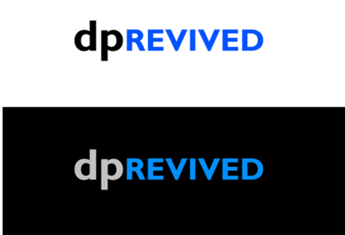
This - and then you gave me few ideas to make the dp part more stylized. With that I had to change font also - Gill is a bit emotionless, at least in this context :) As always, some unneeded graphical noise added.
-
That's clever and attractive.
-
I'm still fond of UK Gill !
and may be the 'lens graphic' not so tall/thin and the space between it and REVIVED more regular? I'm keeping these smallish within the embed to be closer to their size if on a regular page, open them to see larger -
or on dark with colour differentiation between the verticals of d & p, and their 'lenses' -
-
It looks little boring to me, sorry. In your base design contrast between dp and REVIVED makes it live; using it only for uppercase part unfortunately not - that's one reason why I'm choosing different fonts.
Needs some more testing, maybe in icon form too.
My idea about graphic was that all parts of d/p letters should have similar visual width - in your second version curved parts are much heavier. Well, to use with Gill this is likely needed. Your first version is actually more balanced in this regard. You could play with reducing font size (or increasing dp size) a little, for my font choice it made a big difference.
About space between elements - in my version it looks optimal :)/edit/ Your dark design appeared - looks good, esp. first one. I would say that dp letters are lost - but this may not be a problem at all.
I know that you like your design more - and I think that mine is better anyway :)
-
...I take everything on board and remain open.
The good point about the first vers of the dark design, is in connecting the verticals of dp - it looks like a shutter - within a lens. So now we also have a shutter! - kind of.
-

After reading the FULL THREAD I have my saying:
We are a really FUN bunch of people, hard to shoot them all in still mode!
Nobody has made a REFERENCE to:
DPREFERENCE
Hahahahah!!! < D preference > English or American, it will sound great when pronounced
As an alternative ... directly from the Pc world
DIReference > Digital Images Referencesbut I don't like it
As LOGO
... I like the most this one.. the first ... simple and catchy , both dark and light. -
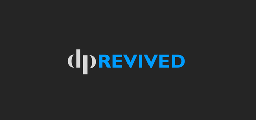
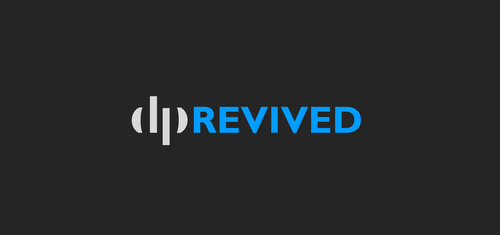
The clever bit is that the 'dp' looks like a lens diagram.
-
The problem with that is that it detracts from the lensiness.
-
yes I'm not sure what is detracting, but my 'lenses' look less like lenses than Arvo's. Maybe mine are too fat (not tall enough), and the flat top and bottom edges not pronounced enough.
Even if Gill Sans isn't the ticket I still have some basic aversion to calligraphic fonts (and serif fonts) in this context. But I may be just one in a million.
-

I don't want to insert myself here as you clearly are on a great path already. I really love your idea with the lenses in the letter d and p, and I'm sure you're able to come up with something simple and effective, which highlights that. This is where I went with the idea:

I'm sure there's a significantly better way to do it, but perhaps the lenses in blue might be something to consider?
-
to be honest so do I.
Problem is, once you've seen the 'trick' of the lenses in dp it's hard to go back to dp just as pure text. We all want more bells and whistles on our cameras for instance (actually most of us don't, but we get them anyway).
Could be that the text version is just text - or just about, and then there's a more compact logo - with the lenses (which would also need an R in it).
I'll need to out of this for a few days, too much other stuff on, and I expect you'll be glad of a break from me! - and this never ending thread ;-)
-
Great I was waiting for something fresh! This is like a flower rising, a rotating world at the centre, has overall triangular height, I really like this.
My only blink judgment, is I feel like the 'I' is being pushed down (I know it is - and cleverly) but I feel sorry for it - as if it's being repressed through being depressed. Could learn to love the I pushed-down I though.
Anyway maybe the best yet IMO.
Something about the dp though, I know the stylisation is based on one one my pngs but something about the whole thing reminds me of a company involved with soap (possibly the choice of dark blue-green for REVIVED on white), cotton hand towels, or maybe wind energy. More clean and stimulating than photographic. I still like it though, feels protective.
-
I DO HATE that contraption, as I hated them when they started to appear in 1990.
Please don't go back to the '90 !
Simple and clean.
We, for sure, don't need to sell nuthing -
I like your no no-nonsense attitude, and quite true we don't need cracker toys here!
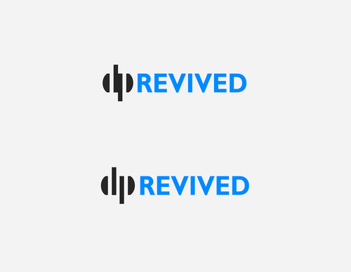
How do you like simplejoy's version above? The lens trick isn't apparent there.
-
What I get from these contraptions is >revived< the meaningless word in the photography world.
We have a foundation here that will stay with us till DPRvv is online:
and that's the Forum from where we all came.Otherwise We can Ignore It and choose DigiPhotoRev
...or stay where we started.
In three years or less, we can change the logo without any fussN O W
we need a pretty solid idea to Rev up the ambiance we were used to.We have nothing yet. Thanks to @bobn2 we have hopes.
We can work with him to make a >>>> NON-EXISTING something, >>>>>> into something existing.
That can be obtained NOT using any distracting frill.
WE ARE, ALL TOGETHER, REBUILDING FROM SCRATCH
That's the reason I can't see the "lenses" things to help us in the next 12 months.
It will be a difficult path for all the people involved, and not short troubles await us.
Stay simple, avoid hurdles, that's what I may suggest
-
I get the 'keep it simple' attitude. I still like the lens idea by lefteye and think it has the potential to be implemented properly.
Here are a couple of different ideas - some trying to highlight the 'new home' or 'elevating the community' aspect...

I'll happily remove myself from the equation here though. Don't want to distract from what's currently the consensus.Keep up the great work!