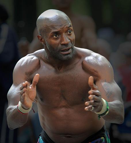
Shot this in Central Park a while back. I like the serious expression of this gentleman. The lighting seemed to help.
Would like to hear how to improve.
-
-
Whoa!
Damn powerful street portrait. Great lighting. Good stuff!
How to improve? Keep making light work for you, like this!
Rich
-
Lovely picture - but wrong forum. Where did you mean to post this?
Alan
-
Photo critique
-
Keep doing this. You nailed it…light, expression, everything.
-
- By AlanSh on April 14, 2023, 5:52 p.m..
-
-
A really good portrait and if that was your goal I have no thoughts or advise.. . However, if "street' is important to you then I need more to give me a story .. I don't do street portraits and would have moved back tried to to put him in context with his surroundings and tried to find a story with his expression/attitude ... I think ...
WhyNot
-
This is an arresting image because of the excellent angle you took to the capture and the intensity of expression on the man's face. The photograph is sharp where it needs to be with a street portrait, on the man's face and especially the eyes. There is nice catchlight in the eyes. The fact that there is motion blur in his hands is not a big bother to me, since it conveys activity, but it might matter to you if you had wanted to freeze his movement. The initial impression is of a very impactful street shot, and that is what you want with street photography since studio perfection is not usually in our reach. But I will point out some issues just in case you want to be aware of them. If you don't care, then ignore them, and enjoy. It's your photo!
You do have a fairly sizeable blownout spot, on his head, and it may or may not be retrievable in the original capture but is worth trying. So you might have benefitted from a slightly higher shutter speed and lower ISO. My eldest son keeps his head shaved, and I have learned from experience that when he is in bright light I have to expose for his head the same way I treat egrets in bright sun. It's gonna be the brightest thing in the frame and it's gonna reflect light fiercely. It's especially tricky with part of the frame shadowed like the background in this one.
There are a couple of anomalies that I'm not sure what they are: a stripe along the edge of his ear that seems almost black, and an edge between his hand and his waist on the left side of the frame (right side of his body) that is kind of light and jagged. It would take some pixel work to fix those, but they are very small and you may not want to bother. At any rate, I would not feel I was giving you a full reply if I didn't point them out.
Overall, good image, strong impact, a few quibbles. You have an eye for this!
-
Not much to add…
Well captured. Strong pose and great expression. Good use of the available light. Well exposed overall. I too would consider this image to be, and judge it as, a portrait because there is absolutely no environmental context. It could have been shot against a backdrop. This makes the blown highlights more problematic than they would be in the context of an environmental portrait. If you make this type of picture frequently, you might consider the benefits of a small off-camera flash unit and/or a folding reflector. (Or not. I have both of those things, but seldom carry or use them for street.)
I’m also going back and forth as to whether or not I want eye contact from the subject here. Again, I’m forced to judge this as a straight portrait. Without context I’m left to wonder why he won’t look at me. What’s the story?
