• Members 866 posts
    Nov. 22, 2024, 11:59 p.m.

    L1070509.jpg

    L1070509.jpg

    JPG, 1.1 MB, uploaded by Daneland on Nov. 22, 2024.

  • Members 3983 posts
    Nov. 23, 2024, 8:29 a.m.

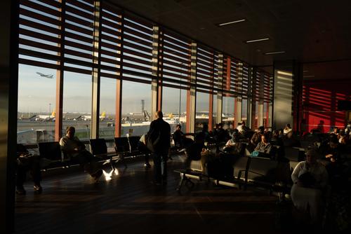
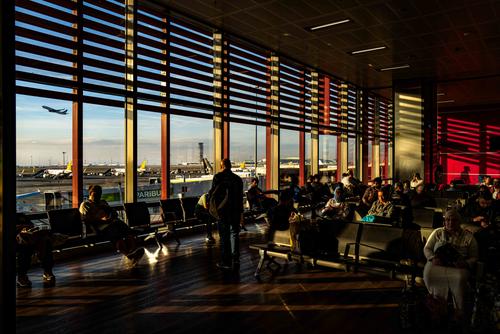
    Very nice light but including the ceiling doesn't add to the lighting or the scene for me. I like the plane taking off in the background.

    A cropped version without the ceiling, or without most of it, turning the image into a panoramic aspect works much better for me.

    I also would raise the shadows a little more to help give more "character" to the waiting passengers.

    Just my $0.02 worth 😊
  • Members 1093 posts
    Nov. 23, 2024, 11:20 a.m.

    That's a wonderful photo capturing the play of light from the sun low on the horizon. The bright and dark areas are fundamental elements here. The lightness of the photo is just right - in keeping with the mood of the passengers doing waiting time.

  • Members 1642 posts
    Nov. 23, 2024, 11:30 a.m.

    Another shot with an interesting use of light, shadow and negative space.

  • Members 866 posts
    Nov. 23, 2024, 2:30 p.m.

    Thanks for your feedback, but I can’t think of a crop that would remove the ceiling while keeping all the horizontal lines and their shadows. I think raising the shadows will reduce the contrast here, which is something I don’t want.

  • Members 3983 posts
    Nov. 24, 2024, 2:22 a.m.

    Yes, removing the ceiling will definitely cut out some of the "horizontal" shades but for me the cropped lines of shades would stand out even more, adding "drama" to the scene.

    The contrast definitely is a main feature of the image and scene but I feel raising the shadows just a bit, not much at all, still maintains the effect of the contrast while adding more "character" to the passengers.

    Anyway, it's still a very nice image as is and I was just throwing in my 2c worth fwiw.

    If you like I can post a version which might make what I mean clearer.