David,
That's wonderful that you were able to use that Minolta camera and get such good quality photos of the music. Seeing such things make us appreciate the photography tools we had in those days that were indeed very nice!

David,
That's wonderful that you were able to use that Minolta camera and get such good quality photos of the music. Seeing such things make us appreciate the photography tools we had in those days that were indeed very nice!
That older Mi.Di A1 😆 still delivers nice shots David. 👍
Nice bird shots Digirame.

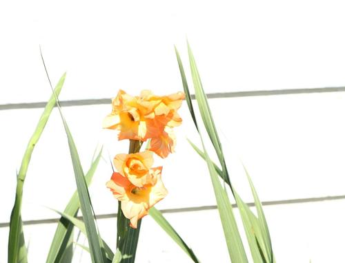
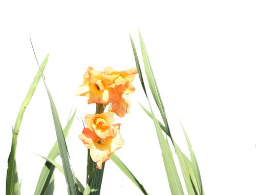
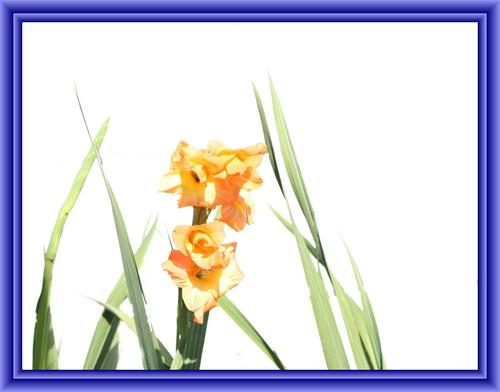
I was going for a high key affect here.
I used fill flash up against a white wall.
These are Gladiolus.
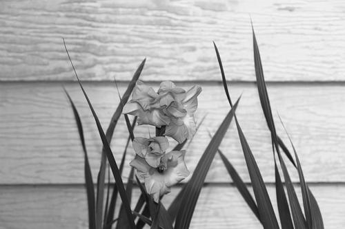
Originally, I had forgotten to take my camera out of monochrome mode.
Thought I'd kind of throw this in here anyway. It's a kind of interesting shot in its own right.
Steve Thomas
I prefer the black/white one Steve.
Photobygms,
Yes. Just for the heck of it, I blew that B&W picture up and heavily cropped to just show the flower, there are all kinds of angles and textures.
Steve
Photobygms,
Thanks. It's a been a while since I've been able to get close to herons or white egrets. Yesterday I saw some white egrets but they were quite far away.
Steve,
On my monitor the color version of the flower is too bright. Why did you use fill flash against a white wall? What were you trying to achieve? Fill flash works when something needs more lighting, but that does not appear to be the case here. The B&W version shows the flower & leaves better and the wood siding texture. If the B&W version was in color with the same details, I think it would have been best.
Can you edit out the upper gray line between planks? I like high key images (hard to create in color), but this line looks a bit distracting to me.
Otherwise very good :)
Dig,
Like I said, I was going for a high key affect. Read up on high key photography..It's a genre all its own.
Here's an example. This image is not mine. I copied it off a web site. The photographer's name is Jaymes Dempsey.
Steve Thomas
ArvoJ,
Thank you.
How's this? (I'm not the best editor in the world)
Steve Thomas
Better than my quick attempt (what I didn't even post) :)
But in this edition it needs dark frame, otherwise composition looks somewhat disunited.
My idea was actually to remove only upper line - lower one would be binding element then; frame is likely needed anyway.
ArvoJ,
A border is nice.
Steve
Steve,
Thanks for explaining what you were trying to achieve. I did not know there was a separate genre for that. As a high key photo, seeing the lines removed from the wood siding does improve it for me. I like the border, but feel it should be thinner and maybe of a color matching the plant leaves or flower. That's great you are doing different things.
Yes, it makes the image whole :)