
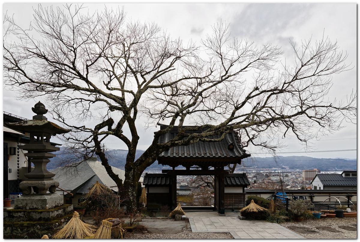
I like them about the same, but I think I'm going to go with the former. The wider version "should have" been framed wider still and cropped or the camera should have been angle up a bit more (I realize it's a stitch of 5 photos, but I'm talking about the final result as "the photo"). There's "too much" foreground in the latter -- it's unbalanced and the tops of the center tree is still cut, so it gives the impression of a "compositional error" as opposed to the former which comes across as a "compositional choice", if that makes any sense.
If the latter had been framed wider still and angled up a bit, so that the whole of the center tree were in the photo (with a little clearance), then that would likely have been my choice.
I apologize if I'm coming across as overly critical, but here's a photo I took (which I like) that has the same "flaws" that I'm pointing out in yours:
This photo, too, "should have been" framed wider. And I would have done so if I had had a wider lens with me at the time, but that's as wide as the lens I had went, and I couldn't back up enough to get the "proper" framing. So, same kind of thing: photos I like that have obvious "flaws". In fact, one might say that taking "obviously flawed" photos is a specialty of mine. : )