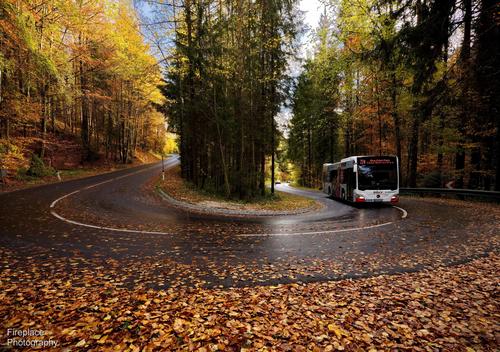
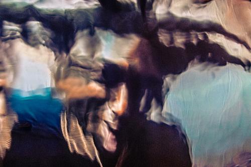
I tried to give an abstract look to the bus. Yes it is better to be out even cant take a good shot.
-
-
@Fireplace33 has written:@Daneland has written:@Fireplace33 has written:
The autumn time has finally arrived in Austria, in previoius years I've taken autumn pictures in September!
Here's one while standing on the corner of a hairpin bend on the main road leading to our little village in Pilsbach
With the wide angle lens you can see the sharp bend and the incline nicely.
I liked this one, with the bus coming up the hill, best. Maybe I'll use it in next year when we refresh the pictures in our local open air gallery. The audience love local shots!
This hairpin shot is so nice, the location gives me so many ideas to try. Colours are so nice.
Thanks, Maybe you have some suggetions for me to try here ?
I would try light trails, slow shutter speed, BW and hire a cycle crew coming down from the hill :) or combinations of them. And I definitely want to try much lower POV.
-
@Wormsmeat has written:
That's interesting. Which bands claim him as an influence? TBH I've never heard any band reference him. I remember the song very well though.
Alice Cooper, Marilyn Manson, Kiss...just pick a weird rock band and they probably stole something from him.
-
@ChrisOly has written:
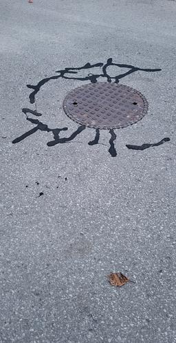
Street art
It looks like an alien came and left its seal :) Nicely seen and captured.
-
@Vahur has written:
Another week another Rock show 😄
This time it was new release presentation by band called Itk (can be translated as cry or wail). As warm up there were 2 other bands, which were OK, hard rock and metal.
BUT then main performer came and everything else paled in comparison. It was probably best show I've seen for a while. Their music is described as pagan metal but the sounds lead singer does... and performance... I have no words, I'll let images speak instead.Another good set of not my cup of tea kind of music.
-
@FloridaNature has written:
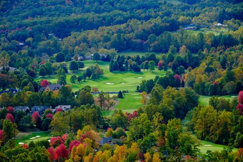
More from my fall colors trip in October...
Last one is my pick.
-
@SteveMonks has written:
Back To Brinscall Woods
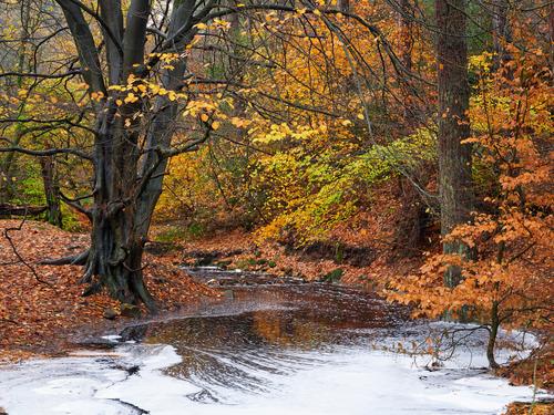
1. Fat River
Hatch Brook looking a bit swollen. It's usually shallow enough to just walk across here, but not this morning as its regular route out of the woods and into The Goit (a drain guarded with iron bars) appears to be blocked.
Another beautiful set, with wonderful colours and compositions. The best one is the first one for me.
-
@Daneland has written:@FloridaNature has written:
More from my fall colors trip in October...
Last one is my pick.
This is one of the values of this forum. I expected this one to be the least popular of the three I posted this week. Very educational to hear the comments.
-
@FloridaNature has written:@FloridaNature has written:@Wormsmeat has written:@FloridaNature has written:@Wormsmeat has written:
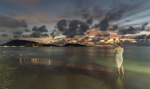
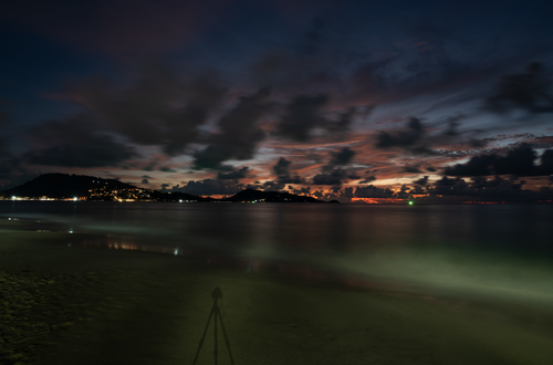
I asked my daughter to try to stand still for 10 seconds for a long exposure shot. This is her best effort. I had no flash so added a little light with my mobile torch. Phuket, Thailand.
Nice shot but I feel like the bright light in the lower right corner attracts too much attention from the main beauty in the upper left.
B..bb..but there's absolutely nothing happening in the upper left...
My mistake. Center left if more correct. The lights and hills that she is looking at.
Maybe just light paint her with a flashlight and not have the beam of light coming in from the right.
That's what I did - I used the light from my mobile.
I have to say I think the image needs her to be slightly illuminated, I have plenty where she wasn't (they don't work) and only at the end hit upon the idea of adding a touch of light.O.K., I'm seeing that now. Then just burn down this area in post so the light points towards what she is looking at without having a bright beam of light leading away from her (your foreground object of interest).
Just my opinion, of course, but I wish there were more of these types of discussions in this forum. I'm enjoying the back-and-forth on Fireplace33's hairpin bus photo, as well.
[/quote]For me, the colours are a large part of what make this shot so attractive. The patch of pale turquoise water at bottom right, together with the apricot and violet colours in the sky make a colour triad that really sings. Lose that turquoise (or darken it) and you risk losing this effect.
-
@SteveMonks has written:
Back To Brinscall Woods
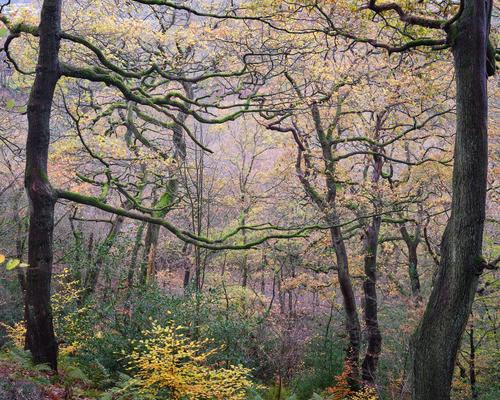
7. Outreach
As previously mentioned, the promised mist was a no show, what were looking at here in the distance is the floor of the valley as it rises up the other side, giving the impression of a misty background.
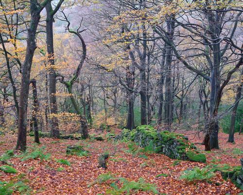
10. Less Colourful Chaos
This is similar to a shot I posted last week, but the trees are looking an awful lot more sparse now.
These are my picks. I rather like the violet shades coming through from the sky, especially in the last one, easily making up for the loss of yellow leaves.
-
-
@Woodsider79 has written:@FloridaNature has written:@FloridaNature has written:@Wormsmeat has written:@FloridaNature has written:
[quote="@Wormsmeat"]
I asked my daughter to try to stand still for 10 seconds for a long exposure shot. This is her best effort. I had no flash so added a little light with my mobile torch. Phuket, Thailand.Nice shot but I feel like the bright light in the lower right corner attracts too much attention from the main beauty in the upper left.
B..bb..but there's absolutely nothing happening in the upper left...
My mistake. Center left if more correct. The lights and hills that she is looking at.
Maybe just light paint her with a flashlight and not have the beam of light coming in from the right.
That's what I did - I used the light from my mobile.
I have to say I think the image needs her to be slightly illuminated, I have plenty where she wasn't (they don't work) and only at the end hit upon the idea of adding a touch of light.Quoted message:Quoted message:O.K., I'm seeing that now. Then just burn down this area in post so the light points towards what she is looking at without having a bright beam of light leading away from her (your foreground object of interest).
Just my opinion, of course, but I wish there were more of these types of discussions in this forum. I'm enjoying the back-and-forth on Fireplace33's hairpin bus photo, as well.
Quoted message:For me, the colours are a large part of what make this shot so attractive. The patch of pale turquoise water at bottom right, together with the apricot and violet colours in the sky make a colour triad that really sings. Lose that turquoise (or darken it) and you risk losing this effect.
I'll go along with that :-)
... the elegant young lady here in this photo might have been enjoying a party in a beach house, and has perhaps just stepped outside for a few minutes to enjoy the sunset view. She is still lit by the lights from that that beach house. The bright part is explained and the image works for me too ;-)
We know, from Wormsmeat's description of how of how the photo was made, that's not really the case, but for an innocent viewer of the photo, it could be -
@Woodsider79 has written:@FloridaNature has written:@FloridaNature has written:@Wormsmeat has written:@FloridaNature has written:@Wormsmeat has written:
I asked my daughter to try to stand still for 10 seconds for a long exposure shot. This is her best effort. I had no flash so added a little light with my mobile torch. Phuket, Thailand.
Nice shot but I feel like the bright light in the lower right corner attracts too much attention from the main beauty in the upper left.
B..bb..but there's absolutely nothing happening in the upper left...
My mistake. Center left if more correct. The lights and hills that she is looking at.
Maybe just light paint her with a flashlight and not have the beam of light coming in from the right.
That's what I did - I used the light from my mobile.
I have to say I think the image needs her to be slightly illuminated, I have plenty where she wasn't (they don't work) and only at the end hit upon the idea of adding a touch of light.O.K., I'm seeing that now. Then just burn down this area in post so the light points towards what she is looking at without having a bright beam of light leading away from her (your foreground object of interest).
Just my opinion, of course, but I wish there were more of these types of discussions in this forum. I'm enjoying the back-and-forth on Fireplace33's hairpin bus photo, as well.
For me, the colours are a large part of what make this shot so attractive. The patch of pale turquoise water at bottom right, together with the apricot and violet colours in the sky make a colour triad that really sings. Lose that turquoise (or darken it) and you risk losing this effect.
[/quote]
I'm with you, that pale green turquoise patch is a plus point in my eyes. And I can't be bothered to edit the HTML to get the quote highlighted properly! -
@Fireplace33 has written:@Woodsider79 has written:@FloridaNature has written:@FloridaNature has written:@Wormsmeat has written:@FloridaNature has written:
[quote="@Wormsmeat"]
I asked my daughter to try to stand still for 10 seconds for a long exposure shot. This is her best effort. I had no flash so added a little light with my mobile torch. Phuket, Thailand.Nice shot but I feel like the bright light in the lower right corner attracts too much attention from the main beauty in the upper left.
B..bb..but there's absolutely nothing happening in the upper left...
My mistake. Center left if more correct. The lights and hills that she is looking at.
Maybe just light paint her with a flashlight and not have the beam of light coming in from the right.
That's what I did - I used the light from my mobile.
I have to say I think the image needs her to be slightly illuminated, I have plenty where she wasn't (they don't work) and only at the end hit upon the idea of adding a touch of light.O.K., I'm seeing that now. Then just burn down this area in post so the light points towards what she is looking at without having a bright beam of light leading away from her (your foreground object of interest).
Just my opinion, of course, but I wish there were more of these types of discussions in this forum. I'm enjoying the back-and-forth on Fireplace33's hairpin bus photo, as well.
Quoted message:For me, the colours are a large part of what make this shot so attractive. The patch of pale turquoise water at bottom right, together with the apricot and violet colours in the sky make a colour triad that really sings. Lose that turquoise (or darken it) and you risk losing this effect.
I'll go along with that :-)
... the elegant young lady here in this photo might have been enjoying a party in a beach house, and has perhaps just stepped outside for a few minutes to enjoy the sunset view. She is still lit by the lights from that that beach house. The bright part is explained and the image works for me too ;-)
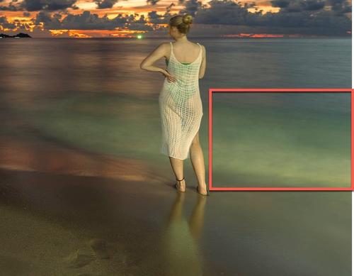
We know, from Wormsmeat's description of how of how the photo was made, that's not really the case, but for an innocent viewer of the photo, it could beActually, the mobile only lit her. I like it too. The bright area was indeed caused by a beach floodlight or something. Here's a screenshot of an unedited version with no mobile torch used (and with tripod shadow still included).
-
-
@Daneland has written:
Men in Black!
cool!
-
@Daneland has written:
Men in Black!
Oh yes, you have nailed it! Man of colour vs white one with b&w pp. 5 stars!
-
@Woodsider79 has written:@SteveMonks has written:
Back To Brinscall Woods
7. Outreach
As previously mentioned, the promised mist was a no show, what were looking at here in the distance is the floor of the valley as it rises up the other side, giving the impression of a misty background.
10. Less Colourful Chaos
This is similar to a shot I posted last week, but the trees are looking an awful lot more sparse now.
These are my picks. I rather like the violet shades coming through from the sky, especially in the last one, easily making up for the loss of yellow leaves.
Exactly my choices . The rest is absolutely fabulous as well.
