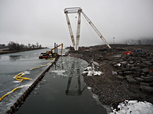
Is it construction of a dam?
-
-
-
Port Lands in
downtown Toronto are going through mayor flood control project to facilitate Don River which flows into Lake Ontario. -
@Daneland has written:
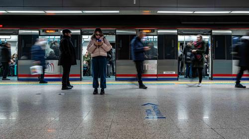
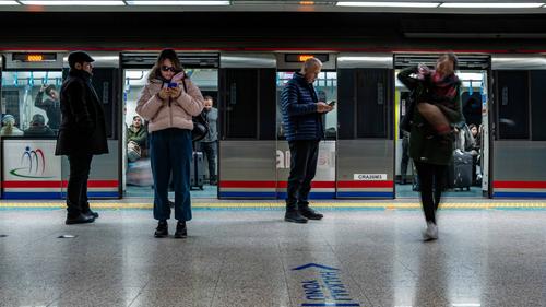
Istanbul Metro
Excellent and clear capture of a passenger station. Like the white horizontal lights running along the image. Well spotted.
-
@Vahur has written:
Moment
Well spotted and very apropos.
-
-
@ChrisOly has written:
Excellent and clear capture of a passenger station. Like the white horizontal lights running along the image. Well spotted.
Thanks for your comment, what do you think, which one is better ?
-
@Wormsmeat has written:
Which do you prefer? I nearly always go mono for street pics but I quite like the colour version.
Mono for me in this case. Sometimes colour version has more "information" or impact, but not in this case.
-
@Fireplace33 has written:
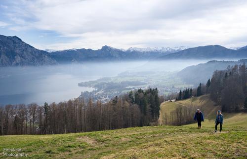
A quick hike up to Gmundnerberg
And with two hikers to make it a bit more interesting
This last shot for me, has everything needed: people to give some impression of scale, fog, clouds, water...
-
@NCV has written:
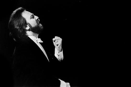
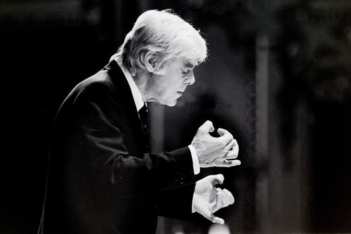
"Musical Hands"
I have not been able to get out to do any photography, so here are a couple more from part of my archives that resurfaced recently.
I can post process in C1 in a way that was impossible in the darkroom.
Riccardo Chailly
First shot is my pick, seems like you managed to capture crescendo here.
-
@Woodsider79 has written:
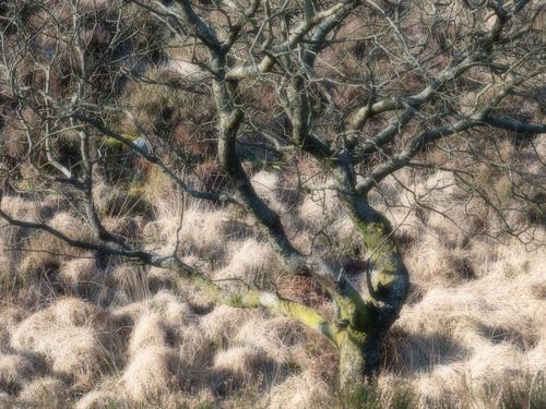
Galloway hills.
Went for a walk up into the local hills this week.
The branches and twigs of alder and birch were glowing in the sunshine (with a little extra help 😉)
Enchanted magic.
-
@Daneland has written:@ChrisOly has written:
Excellent and clear capture of a passenger station. Like the white horizontal lights running along the image. Well spotted.
Thanks for your comment, what do you think, which one is better ?
Yes, second shot is better, because the impact of seeing the activity is closer, but for me I would like to see the same top horizontal lights as the first image. It can be added in pp. And it would definitely add to the general impression of almost being there and watching all goings-on. That Leica setup is gold and the lens captures it all.
-
@ChrisOly has written:@Daneland has written:@ChrisOly has written:
Excellent and clear capture of a passenger station. Like the white horizontal lights running along the image. Well spotted.
Thanks for your comment, what do you think, which one is better ?
Yes, second shot is better, because the impact of seeing the activity is closer, but for me I would like to see the same top horizontal lights as the first image. It can be added in pp. And it would definitely add to the general impression of almost being there and watching all goings-on. That Leica setup is gold and the lens captures it all.
Just curious, why did you elect f6.3 instead of native f1.7?
-
Depth of field?
-
@Daneland has written:
Istanbul Metro
Moving doors. A lot of good action going on in this shot. I like the way you have blurred some of the commuters.
-
@NCV has written:
"Musical Hands"
I have not been able to get out to do any photography, so here are a couple more from part of my archives that resurfaced recently.
I can post process in C1 in a way that was impossible in the darkroom.
That's a nice way to combine old and new techniques.
Quoted message:Riccardo Chailly
Frans Bruggen
These two are the most pleasing for me
-
@simplejoy has written:
I'm usually not a fan of photo collages... but because it was a recent theme in one of the weekly flickr groups I'm participating in, I made two:

Color collage composite by simple.joy, on Flickr
What if the ordinary is already exceptional? by simple.joy, on FlickrBoth are from recent walks, where I had my camera with me. It's incredible to me how much there's to see (and shoot), if you're able to keep your eyes open. I've not been able to during most walks in the last couple of years, due to having my (small) kids with me... Now that they're a bit older, it opens new possibilities and I'm starting to enjoy that.
The idea to combine the "right" coloured pencil with those shots is really good. The diagonal collage in the secind is a good idea too.
The first collage works best for me, those colours are amazing -
@Vahur has written:
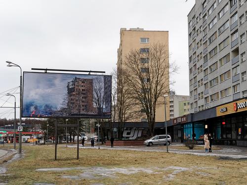
Moment
Moment is name of exhibition, part of which was shown on billboards in city. And as you can imagine, caused quite lot of polarizing opinions by showing familiar (though AI interpreted) images of destructed buildings.
Homepage of exhibition www.hetk.info/Here is one such billboard, causing 'what if...' or 'I'm grateful that...' thoughts..
That is a truely frightening image in the big poster, especially when placed next to the real, still intact, building.
Bloody hell, the horrors a sudden, unexpected, war become jarringly apparent. -
-
@ChrisOly has written:
Construction
This is quite interesting when looking at the details of the downloaded image
-
@ChrisOly has written:@ChrisOly has written:@Daneland has written:@ChrisOly has written:
Excellent and clear capture of a passenger station. Like the white horizontal lights running along the image. Well spotted.
Thanks for your comment, what do you think, which one is better ?
Yes, second shot is better, because the impact of seeing the activity is closer, but for me I would like to see the same top horizontal lights as the first image. It can be added in pp. And it would definitely add to the general impression of almost being there and watching all goings-on. That Leica setup is gold and the lens captures it all.
Just curious, why did you elect f6.3 instead of native f1.7?
DoF and exposure control, it was 1/4 sec and 320 ISO. A wider aperture could have overexposed it.
