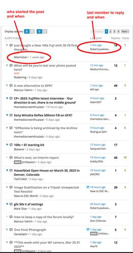
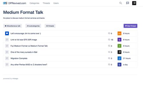
When viewing a list of threads, either in Threads or more normally within a selected forum, it's more useful to see the name of the latest poster on the right, rather than their avatar-thumbnail.
I'd even say if it were a choice, either or, I'd choose the name rather then the avatar. The avatars on the whole mean nothing, and generally add to mess. Ok at present one can hover over an avatar and see a name, but that's serial, we need to see all the names at once in 'parallel'.
For the most part just looking at DPR forums and seeing how minimal and neat they work and appear would be point A, then adapt. It's not just a case of having got used to DPR, it did work well. The main issue I always had with it was that the main central window, containing posts, was way way too narrow, otherwise pretty good.

