OK, I see you figured it out! The site is not intuitive.
-
-
We need time.
-
-
@minniev has written:
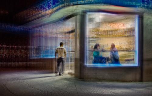
As far as suggestions, I have little to offer other than the notion that the stream of purplish light leading from the left edge to the building may not be necessary. But artist's choice!
I took your suggestion to heart and tamed that purple streak a bit. Thanks.
-
@minniev has written:
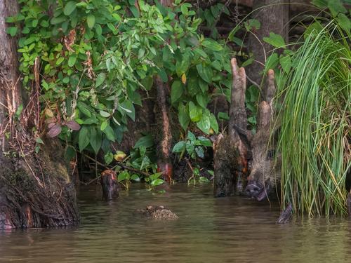
This is a photo I've had out to work on lately in paints, and I want to start in the best place I can with the photo. Shot in the Honey Island swamp in south Louisiana on a dark rainy day.
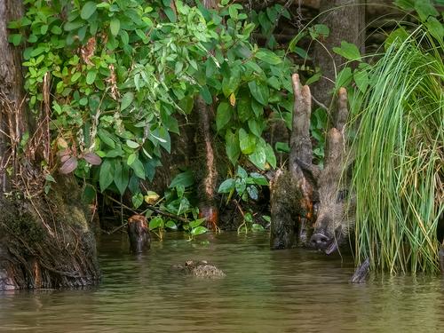
The primary thing that jumps out at me about this image is the white balance - too magenta and a bit cool IMO, a very common occurrence with Auto-WB in the "woods" with lots of bark and earth in the frame (it doesn't actually seem to be the presence of green that causes this issue). A simple fix with a RAW file, but much harder to correct with a very compressed jpeg. I gave it a go anyway to illustrate what I'm getting at. A very cool shot, BTW, I just don't see that sort of thing in Connecticut.
-
@WhyNot has written:
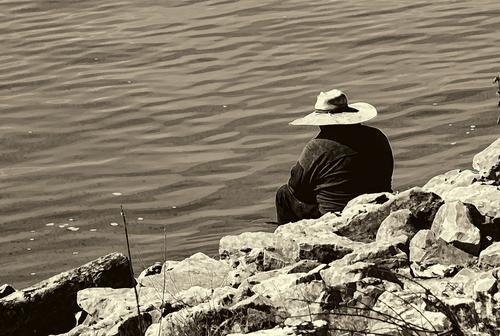
CONTEMPLATION
This is a repost from Minniev's trial thread .. I appreciate her resonse but suspect I'll get no more critique over on that thread and as this is official start ...
WhyNot
I like titles that shape my response. What is he contemplating? Jumping in? Reeling in The Big Fish? Or just whatever daydream is stored under that cool hat? The hat looks well worn and it conveys the idea that this is not this fellow's first sit on that rocky edge. You have a very nice compositional theme of diagonals running all through the image - the rocky shore, the repeating waves in the water, the dark points of the rocks, the shadows, the hat brim. Monotone helps sort those out so they drive the eye up from the lower left corner, to the subject, then out the other side. Very nice flow in the image.
Sepia is a toning that most people either like or dislike. I'm a fan. I don't tend to use heavy handed sepia processing but a light touch like this works well IMHO.
Here's a couple of suggestions: I'd deal differently with that plant that is half cut off the right edge. I'd either add the whole thing back in (assuming this is a cropped image) or I'd crop it all out. And, you've got a tad bit of bright halo around the edge (sharpening? contrast? adjustment of highlights and shadows? clarity?). I often have this and if it's an image that doesn't matter much they are fine with me. If I'm gonna print them I fix it, either by reducing whatever I did that caused it, or if I don't want to do that, I do the quick and easy Photoshop repair to it.
I had to smile when I saw this one, because where I was shooting yesterday was a dam with the very same kinds of rip rap, and a man wearing a not quite so interesting hat doing the same thing your guy is doing.
-
@JimKasson has written:@minniev has written:
As far as suggestions, I have little to offer other than the notion that the stream of purplish light leading from the left edge to the building may not be necessary. But artist's choice!
I took your suggestion to heart and tamed that purple streak a bit. Thanks.
I like the Taming Of The Purple. I'll be interested to see what others say. Artist's choice, though, always!
-
OK, I´ll give this a try.. yikes! :D
A shot from yesterdays walkabout, no explanation. I just liked the shot enough that is now on my laptops lock screen. Here it is:"Arch enemy / man´s best friend"
C & C welcome..
And now to my comments.. I liked these shots. They got potential, in B & W they might be awesome. Like the symmetry and so on. Classic look to them.. And those shots might look interesting even if they were a really small thumbnail somewhere.. Get what I mean? Strong enough to click and expand it bigger to see what´s what.
Anyway.. yeah I guess that all from me for now. I´m not good at giving c&c.. carry on. :)@ChrisOly has written: -
@lefteye has written:
Should this thread be somewhere else - or did I miss something, it is actually for Olympus SLR photographers?
Kinda similar to 'this week through your eyes' in the 'Photography Discussion' section -
dprevived.com/t/this-week-through-your-eyes-20230401/766/Though this thread seems to be more about one photo and actively inviting C&C.
I was going to reply here but saw now that Minnie has already done it; and better.
-
@minniev has written:@ChrisOly has written:
Chris, I think you were duped by a post Roel made in error in another section of the forum far from our home. Would you mind posting your image here too, as a reply to this thread, so we can keep everything together?We don't have the tools to move it ourselves or to close the thread Roel erroneously posted in the other section. The links in Roel's post (both of them actually) have hints about navigation here, which I had trouble figuring out.
My bad!
I was still getting used to the mechanics of starting a thread on these forums.
I was in Oly where I was supposed to be, but when you start a thread, a dropdown menu lets you chose a home for that thread. And that got mixed up.
I wanted to retract or move, but that did not work.
Sorry for the jumble. -
@ChrisOly has written:
I'm gonna reply to this one and get to your question about displaying multiple frames later, after I scour the site for information about how to do that. I may play with it myself in the test threads we started Monday, and you're welcome to dabble around in there too. They are in this OLY SLR section. (Anyone is welcome to dabble there as well, if you want to experiment before you post a "real" post. It's kind of like the mud room. It's just there, and the mess doesn't count.)
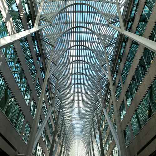
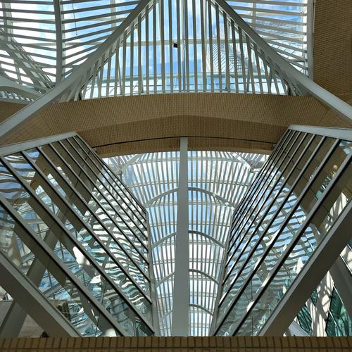
What an amazing building! I was quickly picking the first as my favorite because I really like the cathedral-like vanishing point effect from that angle. Geometry abounds: arches, squares, rectangles, triangles, diagonals, straight and curved lines. The other two grow on you but they take longer to visually sort out because they are unusual angles/viewpoints. The last one seems almost whimsical compared to the elegance of the first. I think they would benefit, as I think you intended, from some space between them in a vertical display. Now all we gotta do is figure out how to do that! I also notice that when multiples are posted, only one shows up when you double click for the larger view. We have lots to learn about how this place works.
I would suggest ( I find I suggest this often to you in particular because your shooting style seems to be compatible with it) considering black and white conversion for these, at least on a trial basis. I have long admired the work of Joel Tintjelaar www.photographyoffice.com/blog/2011/06/the-art-of-black-and-white-photography-by-joel-tjintjelaar and think that look would be quite a nice approach to experiment with for the photos in this set.
-
@ErikWithaK has written:
The primary thing that jumps out at me about this image is the white balance - too magenta and a bit cool IMO, a very common occurrence with Auto-WB in the "woods" with lots of bark and earth in the frame (it doesn't actually seem to be the presence of green that causes this issue). A simple fix with a RAW file, but much harder to correct with a very compressed jpeg. I gave it a go anyway to illustrate what I'm getting at. A very cool shot, BTW, I just don't see that sort of thing in Connecticut.
Well spotted, you're right, and thank you for showing a correction.
Yes, I bet you don't see a lot of feral pigs and alligators hanging out together in Connecticutt! Definitely a Southern thing.
Welcome to our little party, and we hope you'll hang around, comment as you see fit, and maybe share some of your own! Makes no difference to us what you shot them with. We are brand-blind.
-
@RoelHendrickx has written:@minniev has written:@ChrisOly has written:
Chris, I think you were duped by a post Roel made in error in another section of the forum far from our home. Would you mind posting your image here too, as a reply to this thread, so we can keep everything together?We don't have the tools to move it ourselves or to close the thread Roel erroneously posted in the other section. The links in Roel's post (both of them actually) have hints about navigation here, which I had trouble figuring out.
My bad!
I was still getting used to the mechanics of starting a thread on these forums.
I was in Oly where I was supposed to be, but when you start a thread, a dropdown menu lets you chose a home for that thread. And that got mixed up.
I wanted to retract or move, but that did not work.
Sorry for the jumble.Chris found his way home...
-
@PenA has written:
OK, I´ll give this a try.. yikes! :D
A shot from yesterdays walkabout, no explanation. I just liked the shot enough that is now on my laptops lock screen. Here it is:"Arch enemy / man´s best friend"
C & C welcome..
Welcome to the party! Return whenever you can, share photos and comments.
Now let's talk about your very cool shadow shot. I can see why you made it your screensaver. It's appeal is in its easy recognition (we all know the guy with the dog on the lead, and many of us are him), total simplicity (the subjects reduced to outlines, the color removed so that only tonalities remain, even the edges slightly blurred) and clarity of message. Both figures are partly off the frame, which leads us to the leash. The diagonal of the twisted leash connects the two figures and pulls the eye from one to the other so that the connection becomes the subject. I see it from the dog's viewpoint because his figure is slightly more in focus, and his upward glance at the man forms another invisible line that connects the two.
I find this pretty masterful street work. Thanks for sharing.
Don't worry about not having experience in critique. You'll learn more about it as you go. Once we get settled in here (and figure out how stuff works) we will pull together resources to help. Meanwhile, just speak from your heart and it'll be fine!
(Hint) Next time please make your comments about another's post in a separate post from your photo so that when people reply to you, they won't drag the other photo along with yours. This is a huge problem we are encountering because the formatting of this forum is so different than the threaded view we had on DPR. We are all subject to drag other's posts into our own and get them tangled up. You're likely gonna be dragging Chris's cool architectural shots along with your cool dog-and-master through this thread. Wishing for a smile emoji...
-
@lefteye has written:
Should this thread be somewhere else - or did I miss something, it is actually for Olympus SLR photographers?
Kinda similar to 'this week through your eyes' in the 'Photography Discussion' section -
dprevived.com/t/this-week-through-your-eyes-20230401/766/Though this thread seems to be more about one photo and actively inviting C&C.
This is where it was in DPReview. This is where it has been for a very long time. I believe AlanSH has been approached about having it in a different location but it was his decission to leave it here for the time being and see how it goes. Alan has been getting some negative feedback about some decisions that have been made and I suspect is getting a bit gun shy about moving things of this nature.
Andrew
-
@minniev has written:@WhyNot has written:
CONTEMPLATION
.....
WhyNot
I truly appreciate your returning for a second comment .. ( I haven't learned how to interject comments so I'll use bold text.. another learning experience with this site)
I like titles that shape my response. What is he contemplating? Jumping in? Reeling in The Big Fish? Or just whatever daydream is stored under that cool hat?
It was the hat that got me to take this picture as I walked along the river ...
The hat looks well worn and it conveys the idea that this is not this fellow's first sit on that rocky edge. You have a very nice compositional theme of diagonals running all through the image - the rocky shore, the repeating waves in the water, the dark points of the rocks, the shadows, the hat brim. Monotone helps sort those out so they drive the eye up from the lower left corner, to the subject, then out the other side. Very nice flow in the image.
Sepia is a toning that most people either like or dislike. I'm a fan. I don't tend to use heavy handed sepia processing but a light touch like this works well IMHO.
Here's a couple of suggestions: I'd deal differently with that plant that is half cut off the right edge. I'd either add the whole thing back in (assuming this is a cropped image) or I'd crop it all out.
The crop was from the left and bottom .. no crop from the right. AND I missed that plant or I might have removed it but I removed nothing else from this picture ...
And, you've got a tad bit of bright halo around the edge (sharpening? contrast? adjustment of highlights and shadows? clarity?).
Sharpening!!! and I should have noticed before submitting to C&C!!! The way I approach that it is work.. but for this picture I really didn't need sharpening and should have removed that application ... However, I did use Topaz to convert to monotone and that too may have contributed ...
I often have this and if it's an image that doesn't matter much they are fine with me. If I'm gonna print them I fix it, either by reducing whatever I did that caused it, or if I don't want to do that, I do the quick and easy Photoshop repair to it.
I tend to often do this painting at the Pixel level or a very convoluted Affinity function process.. How does Photoshop correct that halo? ..
I had to smile when I saw this one, because where I was shooting yesterday was a dam with the very same kinds of rip rap, and a man wearing a not quite so interesting hat doing the same thing your guy is doing.
**Thanks again for stopping by
WhyNot**
[/quote] -
@minniev has written:@ChrisOly has written:
Onwards and upwards. BCE Place in Downtown Toronto.
Apparently, Just put a carriage return between the urls and you can have a separation of images..
I'm gonna reply to this one and get to your question about displaying multiple frames later, after I scour the site for information about how to do that. I may play with it myself in the test threads we started Monday, and you're welcome to dabble around in there too. They are in this OLY SLR section. (Anyone is welcome to dabble there as well, if you want to experiment before you post a "real" post. It's kind of like the mud room. It's just there, and the mess doesn't count.)
What an amazing building! I was quickly picking the first as my favorite because I really like the cathedral-like vanishing point effect from that angle. Geometry abounds: arches, squares, rectangles, triangles, diagonals, straight and curved lines. The other two grow on you but they take longer to visually sort out because they are unusual angles/viewpoints. The last one seems almost whimsical compared to the elegance of the first. I think they would benefit, as I think you intended, from some space between them in a vertical display. Now all we gotta do is figure out how to do that! I also notice that when multiples are posted, only one shows up when you double click for the larger view. We have lots to learn about how this place works.
I would suggest ( I find I suggest this often to you in particular because your shooting style seems to be compatible with it) considering black and white conversion for these, at least on a trial basis. I have long admired the work of Joel Tintjelaar www.photographyoffice.com/blog/2011/06/the-art-of-black-and-white-photography-by-joel-tjintjelaar and think that look would be quite a nice approach to experiment with for the photos in this set.
-
@minniev has written:
Welcome to the party! Return whenever you can, share photos and comments.
Now let's talk about your very cool shadow shot. I can see why you made it your screensaver. It's appeal is in its easy recognition (we all know the guy with the dog on the lead, and many of us are him), total simplicity (the subjects reduced to outlines, the color removed so that only tonalities remain, even the edges slightly blurred) and clarity of message. Both figures are partly off the frame, which leads us to the leash. The diagonal of the twisted leash connects the two figures and pulls the eye from one to the other so that the connection becomes the subject. I see it from the dog's viewpoint because his figure is slightly more in focus, and his upward glance at the man forms another invisible line that connects the two.
I find this pretty masterful street work. Thanks for sharing.
Don't worry about not having experience in critique. You'll learn more about it as you go. Once we get settled in here (and figure out how stuff works) we will pull together resources to help. Meanwhile, just speak from your heart and it'll be fine!
(Hint) Next time please make your comments about another's post in a separate post from your photo so that when people reply to you, they won't drag the other photo along with yours. This is a huge problem we are encountering because the formatting of this forum is so different than the threaded view we had on DPR. We are all subject to drag other's posts into our own and get them tangled up. You're likely gonna be dragging Chris's cool architectural shots along with your cool dog-and-master through this thread. Wishing for a smile emoji...
WOW! Thank you, was not expecting that much praise or anything sorts. Made my day :) . I´m just a humble guy having fun shooting. Started in 2010 more seriously shooting just about anything that cought my eye.. If someone likes, fine. If not, OK. :)
I´m really used to quoting on forums like this, no problem for me but I understand and take your hint. I actually hated threaded view on DPR.. always using flat, BUT I was just a lurker there for 10 yr or so.. Never registered. Anyhoo, THX again for commenting.
