Well that's simple enough! Thanks for figuring it out and sharing.
-
-
Is it a proper critique? Absolutely!
I take your point that photography may seem unsuited to the abstract. But in another sense, couldn't every photograph be considered a two-dimensional abstraction of a three-dimensional scene? It seems to me that the concept of abstraction is a continuum, from flattening a 3D scene down to 2D all the way to a completely unrecognizable image. If the criteria of abstraction is that the original must be unrecognizable, then that is too high a bar in my view.
By the way, the "flat field" concept is certainly valid. Many of my reflection attempts were near misses because the depth of field was too shallow to keep everything sharp enough.
-
@WhyNot has written:@minniev has written:@WhyNot has written:
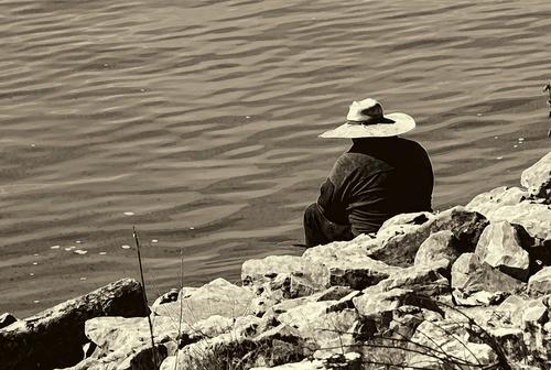
CONTEMPLATION
.....
WhyNot
I truly appreciate your returning for a second comment .. ( I haven't learned how to interject comments so I'll use bold text.. another learning experience with this site)
I like titles that shape my response. What is he contemplating? Jumping in? Reeling in The Big Fish? Or just whatever daydream is stored under that cool hat?
It was the hat that got me to take this picture as I walked along the river ...
The hat looks well worn and it conveys the idea that this is not this fellow's first sit on that rocky edge. You have a very nice compositional theme of diagonals running all through the image - the rocky shore, the repeating waves in the water, the dark points of the rocks, the shadows, the hat brim. Monotone helps sort those out so they drive the eye up from the lower left corner, to the subject, then out the other side. Very nice flow in the image.
Sepia is a toning that most people either like or dislike. I'm a fan. I don't tend to use heavy handed sepia processing but a light touch like this works well IMHO.
Here's a couple of suggestions: I'd deal differently with that plant that is half cut off the right edge. I'd either add the whole thing back in (assuming this is a cropped image) or I'd crop it all out.
The crop was from the left and bottom .. no crop from the right. AND I missed that plant or I might have removed it but I removed nothing else from this picture ...
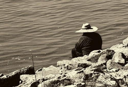
And, you've got a tad bit of bright halo around the edge (sharpening? contrast? adjustment of highlights and shadows? clarity?).
Sharpening!!! and I should have noticed before submitting to C&C!!! The way I approach that it is work.. but for this picture I really didn't need sharpening and should have removed that application ... However, I did use Topaz to convert to monotone and that too may have contributed ...
I often have this and if it's an image that doesn't matter much they are fine with me. If I'm gonna print them I fix it, either by reducing whatever I did that caused it, or if I don't want to do that, I do the quick and easy Photoshop repair to it.
I tend to often do this painting at the Pixel level or a very convoluted Affinity function process.. How does Photoshop correct that halo? ..
I had to smile when I saw this one, because where I was shooting yesterday was a dam with the very same kinds of rip rap, and a man wearing a not quite so interesting hat doing the same thing your guy is doing.
**Thanks again for stopping by
WhyNot**
[/quote]
I'm gonna tell you how I fight halos in Photoshop and show you a very quick and dirty example.It may work similar in other apps. I'd have been more careful if we were headed to the printer's. I brought it into PS, and duplicated the layer in case I messed it up and needed to start over (I always do that). Then I got a small round brush , medium soft. You can change size/softness of brush to fit the area you're working on. I chose the clone tool and selected the Darken mode in the menu at the top (not the layer blend mode). I sampled from the side I wanted to get pixels to fill in the halo. Placed the brush across the edge of the area and worked my way around. I had to undo redo a couple of places but mostly it got what was needed. It took about a minute. I would go slower with something for print to be sure. I like to do this at 50- 100% magnification. Yeah, Topaz oversharpens any chance it gets, it's a fierce tool that has to be beaten into submission. Result below.
-
@RoelHendrickx has written:
Not A Phoenix, But...
For the last image in the old forum, and simultaneously the first one here, I picked an older animal portrait.
The cassowary is among the strangest birds.
It is not a mythical phoenix, rising from the flames and its own ashes.
But it does look like an animal that appears to have survived an extinction.
Especially if you look at the fierce head and the mighty legs and claws, they are as close to a dinosaur as you will get in a live animal.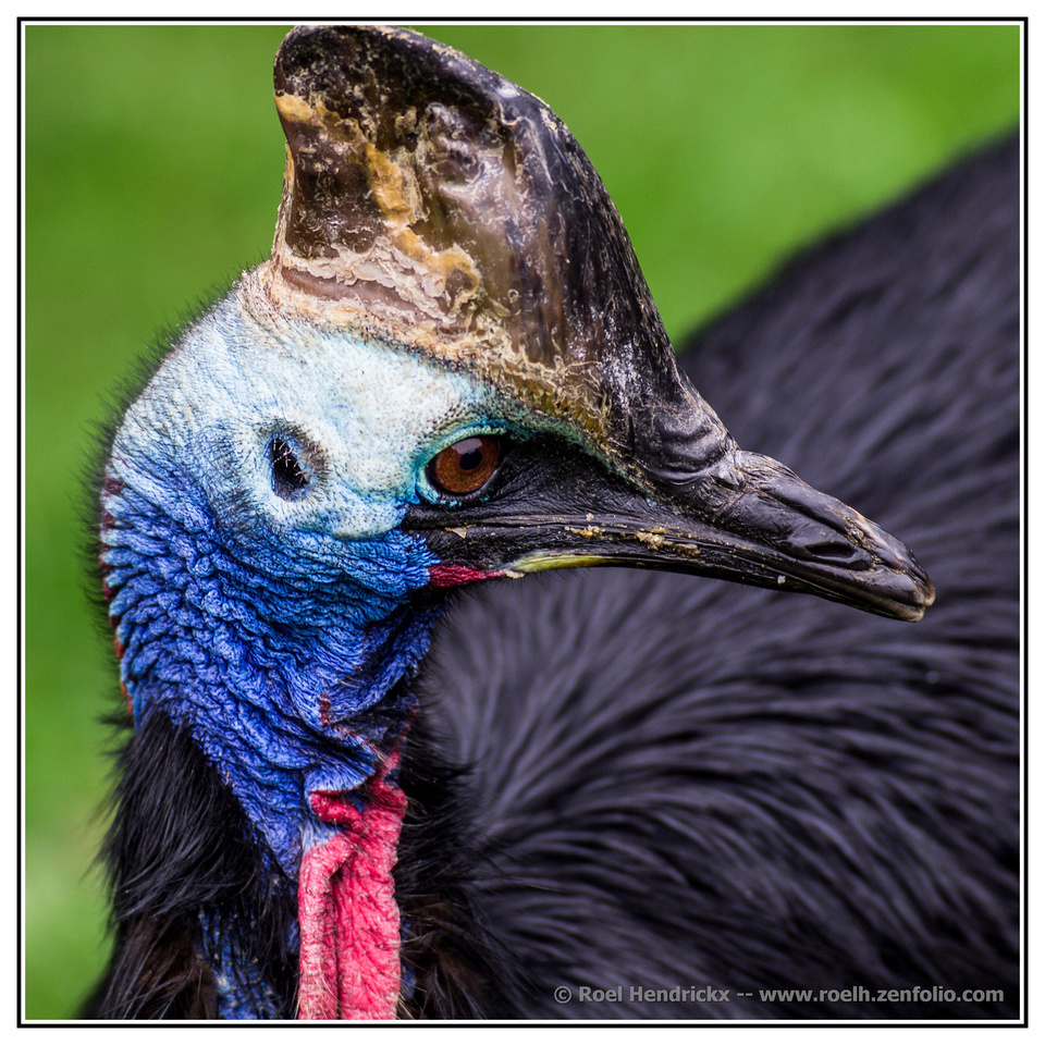
Roel, there is great background bokeh, and the head is sharp throughout - both things that most wildlife photographers strive fore. However, I think Minniev was on to something re: cutting off the top of the head. I might add one more point. This would be a much more imposing creature taken from a lower point of view. Looking down on an animal like this from a "normal" human view point diminishes it somehow. So if you get a chance to shoot him again, get down below his eye level and shoot up. :)
-
@minniev has written:
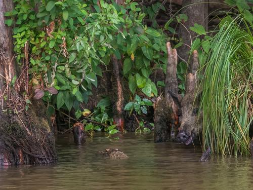
This is a photo I've had out to work on lately in paints, and I want to start in the best place I can with the photo. Shot in the Honey Island swamp in south Louisiana on a dark rainy day.
I like this one! Not subjects I would ever expect to see in the same photo.
I suspect you want to keep the dark, moody feel. But, in addition to the white balance suggestion made earlier, might I suggest a slight brightening of the two subjects - probably no more than a third of a stop. That will help them pop out of the foliage/water and will help draw the viewer's eye to them. It would be tricky for the boar because of the grass, but worth it. I wonder what it would look like cropped in from the left to move the 'gator closer to the rule of thirds point... Just a thought.
-
@JimKasson has written:@minniev has written:
As far as suggestions, I have little to offer other than the notion that the stream of purplish light leading from the left edge to the building may not be necessary. But artist's choice!
I took your suggestion to heart and tamed that purple streak a bit. Thanks.
@minniev, I've been looking at this image on and off for a couple of hours, and I want to thank you for your suggestion about the purple streak. I've probably printed that image three dozen times, and never looked critically at the streak. Your suggestion is a definite improvement, in my book.
-
@ChrisOly has written:
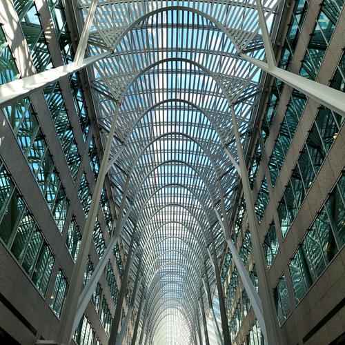
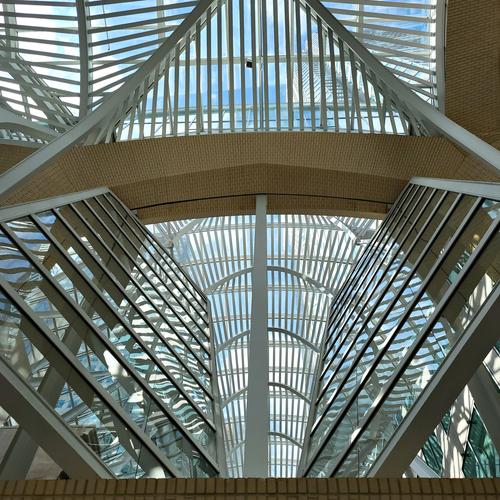
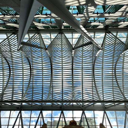
ONWARDS AND UPWARDS
BCE Place in Downtown Toronto.
Chris, these are fascinating images that go together beautifully. In fact, when I first saw them (without the carriage return to separate them) I thought you had created a very tall vertical pano. I really like the concept of a tryptich of the three shots vertically - would make a great print, I think.
-
-
-
@MikePDX has written:@minniev has written:
This is a photo I've had out to work on lately in paints, and I want to start in the best place I can with the photo. Shot in the Honey Island swamp in south Louisiana on a dark rainy day.
I like this one! Not subjects I would ever expect to see in the same photo.
I suspect you want to keep the dark, moody feel. But, in addition to the white balance suggestion made earlier, might I suggest a slight brightening of the two subjects - probably no more than a third of a stop. That will help them pop out of the foliage/water and will help draw the viewer's eye to them. It would be tricky for the boar because of the grass, but worth it. I wonder what it would look like cropped in from the left to move the 'gator closer to the rule of thirds point... Just a thought.
I see your point. I'll work on a slight brightening esp of Mr. Pig. The new masking tools in Lightroom will be my first stop, then PS if necessary. I'm not sure about the crop but will give it a look. My thinking on the framing was having sort of matching exit points on each upper corner kind of like drapes framing a scene. Thanks for the tips and the kind comments.
-
@JimKasson has written:@JimKasson has written:@minniev has written:
As far as suggestions, I have little to offer other than the notion that the stream of purplish light leading from the left edge to the building may not be necessary. But artist's choice!
I took your suggestion to heart and tamed that purple streak a bit. Thanks.
@minniev, I've been looking at this image on and off for a couple of hours, and I want to thank you for your suggestion about the purple streak. I've probably printed that image three dozen times, and never looked critically at the streak. Your suggestion is a definite improvement, in my book.
Thanks for coming back to share!! Your comment makes my day! I'm so pleased to add my opinion to what I think is a very fine piece of art.
One online mentor (who's still shooting at 92) taught me that I should look for what the image needs that it doesn't have, and what it has that it doesn't need. Not really flaws, just a way of looking.
Really hope you'll hang around with us here, sharing your images and your ideas.
-
@LouHolland has written:
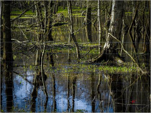
Hi Lou, you got two posts up, so I'll answer the first. This forum has some tricky formatting, doesn't it? Here I find a beautiful swamp (and you know I love swamps), in rich swampy colors with lovely reflections and lovely late day (I think) side-light. I love the colors. I love the serenity and the wild untamed look of it. The fence is a worrisome intrusion. I am assuming that you chose to keep the fence in there, because it looks like it would have been possible to walk over and shoot through it. So I'm interpreting the message of the fence to be exclusion: you can't come in. The fence's worrisome intrusion is part of the story. Thank you for sharing it.
-
-
@minniev has written:
This is a photo I've had out to work on lately in paints, and I want to start in the best place I can with the photo. Shot in the Honey Island swamp in south Louisiana on a dark rainy day.
Lurking in murky waters. An unusual view of an alligator: we most often see them in a head-on or sideways.view. Looking with the animal over its shoulder creates a kind of immersion (no pun intended, or is it?) : it puts us in its POV and makes us wonder what it is looking at.
-
@JimKasson has written:
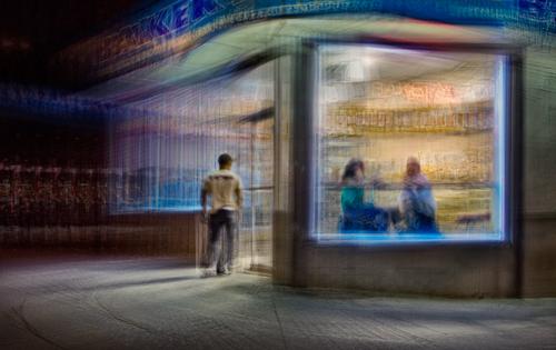
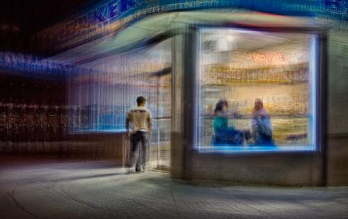
A NYC street scene
I prefer not go into detail about how I made this image here; it tends to dominate the discussion. I will say that the captures were made from a moving car.
Hello Jim,
Welcome to our weekly venture!
And the first thing I have to ask is this: where have you been all these previous years?
Your photo is beautiful and enigmatic, and original. Just the kind of thing we want to see and try to get our heads around.The Edward Hopper vibe is unmistakable here.
(That epitheton gets pasted onto almost any shot of a diner at nighttime, looking in from outside. But in this case, the connection is really remarkable.)You say that you prefer not to get too deep into how you made this image, but you do give a hint that this is not a single file, but a composite of multiple images, by using the word "captures" (plural). I think you have invented the "layered drive-by micro timelapse".
It is an intriguing and very cool concept and we want to see more of it (and of you).
Let's agree that you will become a regular.
Right? -
@JimKasson has written:@minniev has written:
Welcome to Wednesday C&C, an old activity that is embarked on an unexpected new adventure here.
Oh my what a nice image! It screamed "Nighthawks" to me before I even opened the post. I love Hopper's work and Nighthawks is a favorite so you have captured my attention right away. It is hard to divorce my mind from the connection enough to give an unbiased critique so I 'll share a biased one. Like Nighthawks, the people in this image "feel" somewhat isolated, even though they are not alone. In the emptiness of the city at night, the people are drawn from the darkness to the light of the bakery, and our eyes follow them. Your color palette, while different from Nighthawks, has a similar set of tonalities (your neon blue serves the same function as Hopper's teal), with the yellow/gold framing the focal point. Whatever you might have done here (burst shooting from a moving car, some kind of in-camera multi-shot combining, layer stack in editing software, or other), it works. It's blurred where it needs to be blurred, and discernably clearer where clarity is needed (the people, the wording, the chrome legs of the unoccupied stool). There is a sense of rounding the corner that is shared with Hopper's painting, though the way that sense is arrived at is very different. Your version has an impression of movement while Hopper's is utterly still. Yours also has a door. Those make your image more dynamic than the original. Fascinating.
As far as suggestions, I have little to offer other than the notion that the stream of purplish light leading from the left edge to the building may not be necessary. But artist's choice!
I do hope when all's said and done you'll tell us more about what you did here. I am always curious about images I can't figure out, and I'm an inveterate tinkerer both in camera capture and in Photoshop.
Thank you. About the purple streak. I see what you mean, but I don't like to remove things from images in this series unless I think it's necessary.
Here are some more images from that series:
www.kasson.com/gallery/staccato/
And here's the artist's statement:
"This series is an outgrowth of Nighthawks, with much the same subject matter but a different interpretation. Instead of a making single exposure per final image using motion blur and panning to isolate the subjects and control sharpness, in the Staccato series I take many sharp images from slightly different positions and incorporate them into a single composite image, aligning the elements that I wish to be sharp and letting the others fall where they may. This approach allows more precise control over the important elements of the image, as well as producing more interesting patterns in the areas that were just broad blurs in the Nighthawks series."
Here's the artist's statement for Nighthawks:
"Night in the city. Most people head home, to families, to the tube, to warm beds. Others go out. Recently, I’ve been out there myself, with the goal of capturing a few moments that tell a story or, even better, invite the viewer to supply one. Using fairly slow shutter speeds and making my exposures from a moving car produces images that are more gestures than clear depictions. I use panning to direct the viewer’s attention, making some things sharp at the expense of others. I try to walk the line between pure abstraction and explicit clarity, tempting the viewer to fill in the details."
Aha, that is about right with what I suspected. Staccato is a perfect term here.
-
@MikePDX has written:@RoelHendrickx has written:
Not A Phoenix, But...
For the last image in the old forum, and simultaneously the first one here, I picked an older animal portrait.
The cassowary is among the strangest birds.
It is not a mythical phoenix, rising from the flames and its own ashes.
But it does look like an animal that appears to have survived an extinction.
Especially if you look at the fierce head and the mighty legs and claws, they are as close to a dinosaur as you will get in a live animal.
Roel, there is great background bokeh, and the head is sharp throughout - both things that most wildlife photographers strive fore. However, I think Minniev was on to something re: cutting off the top of the head. I might add one more point. This would be a much more imposing creature taken from a lower point of view. Looking down on an animal like this from a "normal" human view point diminishes it somehow. So if you get a chance to shoot him again, get down below his eye level and shoot up. :)
I'll make sure to wear my protective gear then...
This cassowary lives in an enclosure in Planckendael Zoo.
There is a tight-netted fence around him (or her).
And that fence is pretty high, because these animals are known to attack fiercely, using beak and claws (to slash your gut).
They can jump too.
So the only way to get an unobstructed view when he is near the fence, is to get up on a bench and aim over the fence.
Hence: looking down. -
@MikeFewster has written:
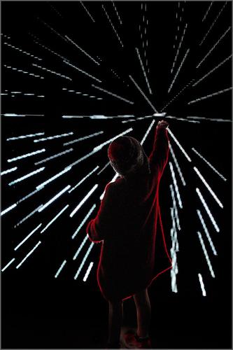
That's an eye catching image. The subject is heavily shadowed but we can't miss her because every line of the light beams takes us right back to her outstretched hand, which is thoughtfully placed at the upper right thirds intersection. The reddish outline of her form is the only color discernible, simplifying the composition further. The lights themselves are puzzling because they re so pixelated so I'm assuming some kind of pulsing projection. Very graphic, and very interesting.
