An excellent seafaring scene captured quite perfectly. The little rowboat is almost isolated on the sea, surrounded by water and sky, but we can pick up delicate details like the animated expression of the guide, the sign advertising the tour, even the water dripping off the paddle. The hazy atmospherics adds to the impression of vastness of the scene. I'm not sure about the tiny boat on the right edge, which is too far away to add much, it is just a kind of tiny eye magnet that might not be necessary unless it serves a function for the creator. Good work.
-
-
I like the photo.
Maybe it's a guitar.
I wouldn't be surprised if you also used MATLAB when editing this photo. -
I did not. It was all in the waving the camera round during the exposure. It is indeed a guitar, on a sign outside the Hard Rock Cafe in Las Vegas.
-
The idea is good, and well implemented.
It's a good photo except for the white stripe in the foreground.
Easily removed in Photoshop. -
Then it really is skill.
You probably have to do a lot of tries to get such a good result.
I'll try next time, but have little hope. -
@Kumsal has written:
You probably have to do a lot of tries to get such a good result.
I did when I started that series, but the odds got better then more I did it. Not unusual in photography, or in life.
Like Gary Player said, “The harder I practice, the luckier I get.”
-
@MikeFewster has written:

A very good photo, I would have liked to see more details.
Where is it captured?
Can you go into the water and swim there? -
@Kumsal has written:@MikeFewster has written:

A very good photo, I would have liked to see more details.
Where is it captured?
Can you go into the water and swim there?* Melbourne. The remains of the old Station Pier. It used to be the major maritime passenger arrival pier. The rails lead to a ladder that seems to be mainly for maintenance. It would be possible to swim there but there are better places near by. A wet, misty morning.*
-
@simplejoy has written:
Another macro image, titled "How'd you get into the bottle, cap?"

How'd you get into the bottle, cap? by simple.joy, on FlickrIt was shot with a Steinheil Optronic lens (no focal length mentioned, but it might be around 50-60 mm and it has a maximum aperture of f/2.8). This simple triplet lens was used in a so-called Oscillophot, which was a camera meant to capture images of an oscilloscope. Doesn't make any sense? Well, wait until you hear about some of my stranger lenses. 😂
Why would you adapt this thing, you ask? Here's another image, but just meant to show some of the bokeh-qualities (or probably lack thereof in many people's eyes 😉) of this peculiar piece of glass:

Wide open by simple.joy, on FlickrSo please don't go and criticise the lighting in this one... 😱 of course there had to be some compromises.
These are certainly different. The second gets my interest more than the first. The first is very static but apart from the minor curiosity of the cap inside the neck, it simply doesn't engage me. Two does though. The cap's position in the bottom right feels as though we are looking down on a cap that is opening. The bokeh balls with their taper down to the bottle neck suggest the fizz of opened soda. There is enough detail from the bottle neck to build further the moment that a bottle is opened. The greens and golds are colours I associate with beer. My head provides the sound effects of the moment. Like it.
-
I do like the larger version with more building beneath him better, but I am one of those folk that like to include lots of stuff in the frame. It's a tendency I sometimes fight against and sometimes not. At least I know it so I make myself question what is needed and what is not.
@Rich42 has written:@minniev has written:@Rich42 has written:(Also posted in Medium Format forum)
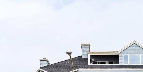
The image seems well taken, as there is good rendition of the soft blues of the sky and the building, and the gentleman on the balcony is clear and recognizable. It has a feeling of being cut off and I'm wondering if having more of the building in the frame would give more balance. Perhaps there re reasons for leaving it off. As it is, the subject is quite low in the frame in addition to being small which makes it harder to find him as a subject without being told.
Thanks for looking! This is a crop of a larger GFX 100S image that I discuss more fully in the Medium Format forum here: dprevived.com/t/this-week-with-your-mf-camera-apr-15-21-2023/1948/2/
The larger, "messy" image can be seen there.
I do want the main figure low in the frame. I would have placed it even lower if there were more sky in the original. I debated "adding" clouds and sky, but resisted the temptation. 🙄
It was a mostly cloudy, foggy day at the coast in Carlsbad, CA. I liked the muted tones and very limited palette of blues and tans. I tried to keep the composition as minimal as possible.
I should have intensified the small blue patch of sky at the top.
Rich
-
@Bryan has written:@MikeFewster has written:

Barnacle encrusted swimming lanes?
[edit] That was meant as a joke not a criticism, in that barnacles would make you swim straight...
Excellent training course for backstrokers.
I am assuming it is an old wharf / pier that has lost it's deck through age. Whatever, it is very long. -
@minniev has written:@Bryan has written:
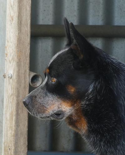
Australian Cattle Dog (Blue / Red Heeler)
I would have preferred a different background, but then again these dogs are often found on farms. Cropped to remove an over exposed light coloured wall to the right.
How many different emotions can you see in his eyes?He is a beautiful dog. I see a bit of wistfulness in his expression: does he long for the glory days of old, herding cows and chasing girls? Good profile portrait with enough sharpness, but not too much (after all he is a family member having his portrait done, not a trophy animal on a safari). Good rendition of the "blue" tones in his fur. I do think you should remove the pipe if you've got software that will permit pixel level work. If not, you will eventually want to acquire something that will do that. The world is full of unsightly objects like trash cans, plastic drink bottles, electric wires. It's nice to be able to clean them up when we take a notion. I'd also twist it a tad to the left to get that wooden post straight vertical.
I agree with minniev about the pipe. Re. the background. It might be argued two ways. The colours and bars across the ears and nose don't show off the dog to the best advantage. The off vertical angle on the doorframe could be made less intrusive by cropping the left hand side tighter to remove one of the angled verticals. On the other hand, sheds like this are very much the places where blue heelers will be found. As to what the dog is thinking, especially when the ears are pricked up like that- it is thinking what these dogs are always thinking. "C'mon, let's go, let me work with you."
-
@WhyNot has written:
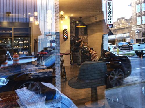
Ambiguity
or maybe a shave and a haircut ....
WhyNot
For me, this image isn't working. The reflection and the background have too many objects and consequently I'm lost in the details without finding lines or theme to bring them together in one composition.
-
@MikePDX has written:
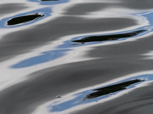
Abstract - Untitled
Another from my recent experiments with abstracts. This one is so abstract that I wasn't able to come up with a suitable title.
* There are several things here that create a harmonious whole for me. Colours and shapes first. Water, clouds sky with flowing soft edges. Generally horizontal lines that create peacefulness. The blacks hint at life forms, birds and/or fish.
These are all things I feel positive about so the image has me feeling contemplative and OK with the world.* -
@minniev has written:@ChrisOly has written:
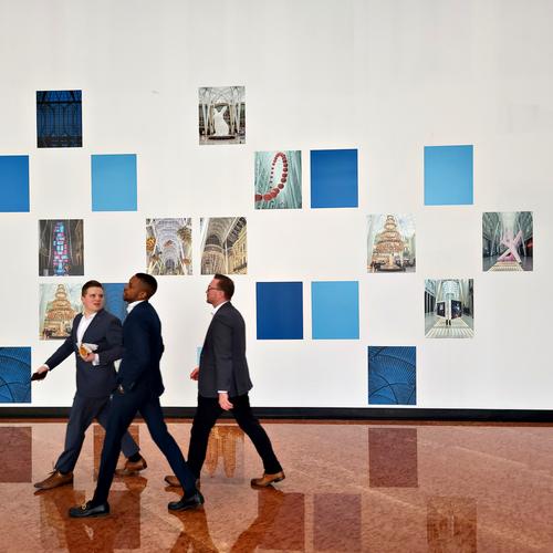
Lunch Hour
Something about this image makes it feel like a modern day Norman Rockwell type picture. I think it is the graphical nature of the frames on the wall that make it feel almost like an illustration rather than a photo. The three guys, caught mid-stride and dressed as they are in almost identical suits just before they exit stage left, give an illustrative impression as well. It is a very pleasing shot, I like it a lot.
Social commentary. The men have a unity about them. Same size, same clothes,same stride and overlapping each other. Two of them talk together. We can identify them as one group. The black line at the bottom of the wall intersects with the black lines of the suits so we feel there is some connection.Their position has them moving out of the frame. The rest of the image, including the reflections, makes it clear that we are in an art gallery. We feel that the art itself is of no interest whatsoever to the men. There are plenty of conclusions that might be reached.
A statement about art as business.
Or. "We came along to be seen at the opening. The speeches are over and the wine has now run out." -
-
@minniev has written:
I do like the larger version with more building beneath him better, but I am one of those folk that like to include lots of stuff in the frame. It's a tendency I sometimes fight against and sometimes not. At least I know it so I make myself question what is needed and what is not.
@Rich42 has written:@minniev has written:@Rich42 has written:(Also posted in Medium Format forum)
The image seems well taken, as there is good rendition of the soft blues of the sky and the building, and the gentleman on the balcony is clear and recognizable. It has a feeling of being cut off and I'm wondering if having more of the building in the frame would give more balance. Perhaps there re reasons for leaving it off. As it is, the subject is quite low in the frame in addition to being small which makes it harder to find him as a subject without being told.
Thanks for looking! This is a crop of a larger GFX 100S image that I discuss more fully in the Medium Format forum here: dprevived.com/t/this-week-with-your-mf-camera-apr-15-21-2023/1948/2/
The larger, "messy" image can be seen there.
I do want the main figure low in the frame. I would have placed it even lower if there were more sky in the original. I debated "adding" clouds and sky, but resisted the temptation. 🙄
It was a mostly cloudy, foggy day at the coast in Carlsbad, CA. I liked the muted tones and very limited palette of blues and tans. I tried to keep the composition as minimal as possible.
I should have intensified the small blue patch of sky at the top.
Rich
It's the kind of shot I need to see many times before I develop thoughts. As it is, I'm struggling find a reason or interpretation of the subject and composition. We have a prominent figure inside an elongated horizontal slice of building and roof line. If the roofline is especially important, I'd have taken more off the sky and really gone for the horizontal aspect.
If the man within the period house setting is important, I'd have gone with the original version that includes a lot more of the old house. The man is still quite prominent.
The roofline itself gets lots of attention in the image as posted. I can't see why and I'll be interested to see how others respond. -
@MikeFewster has written:@minniev has written:@ChrisOly has written:
Lunch Hour
Something about this image makes it feel like a modern day Norman Rockwell type picture. I think it is the graphical nature of the frames on the wall that make it feel almost like an illustration rather than a photo. The three guys, caught mid-stride and dressed as they are in almost identical suits just before they exit stage left, give an illustrative impression as well. It is a very pleasing shot, I like it a lot.
Social commentary. The men have a unity about them. Same size, same clothes,same stride and overlapping each other. Two of them talk together. We can identify them as one group. The black line at the bottom of the wall intersects with the black lines of the suits so we feel there is some connection.Their position has them moving out of the frame. The rest of the image, including the reflections, makes it clear that we are in an art gallery. We feel that the art itself is of no interest whatsoever to the men. There are plenty of conclusions that might be reached.
A statement about art as business.
Or. "We came along to be seen at the opening. The speeches are over and the wine has now run out."What more can I say?
I love (taking and viewing) photos of visitors in museums and art galleries.
There is a kind of "street shooting" to be practiced there: interactions between humans and an interesting environment.
In that respect, this image does not disappoint, although it does the opposite : it shows NON-interaction.
The art is there, but the visitors just breeze through the space, talking and walking clearly faster than would be good for watching the art.
Minnie made good observations, and Mike absolutely nailed a description of the vibe the image projects.
