I agree 100% on the pipe. I have a lot to learn with pp. Thanks for the plus on clarity although if I view at full size it looks like it could be more sharp. That was only my 411th pic with my FZ300, which I bought to capture these dogs.
For the record, only my second ever camera. Way back in the early 80's, I had a Chinon (anyone remember them?), with a power winder attachment (2.5 / sec), if I remember correctly a 2nd hand 75-210 zoom and an el cheapo Tamron 800mm telephoto for $80 (with washed out blue overtone to go with the price). I got it to take surfing shots and was happy enough - had a great big box of slides which I would entertain the grommets with.
-
-
-
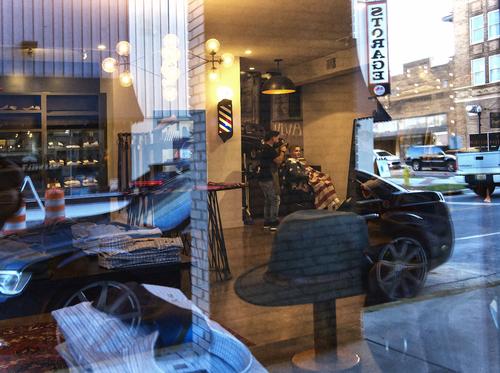
That is a great photo. If it was any less busy it wouldn't be as good. And the shiny car, decor and new buildings juxtaposed with the backend of the pickup, older buildings and mirrored storage sign. The hat is indistinct even though foreground and the fact you can still see the bricks of the pillar under the reflection...
-
-
This is interesting.
I'll already respond to two ideas proposed here, because both were something that I had considered (the second while shooting; the first while processing) but had ultimately decided against.1) The white line painted on the tarmac.
While processing I had considered cropping further in order to remove that line for exactly the reasons that have been stated here : it does conflict with all the straight horizontals.
But I have kept it for a number of reasons: * I wanted my crop to be square, and cropping higher would have made me lose too much of the sides. * The line, like the bus shelter, is an odd reminder that even on remote islands, there is traffic. * The sloping line does have its parallel equivalent in the background : the border between land and sea. * Most importantly : the line creates something of a zigzag eye movement through the image (at least that is how it works for me). Like any good diagonal, it starts in a corner, moves higher to the other side, gets taken over by the side of the tarmac and that leads us to the bus shelter (with the oil rig framed in the frame).
Anyway, that was my consideration. But images are like that : we can all have opinions about them, and that is alright.2) Getting lower on my knees for a lower vantage point and angle.
I did actually get down on my knees while I was there to explore the possibilities, but decided against it.
Again for several reasons (some unconscious, but reconstructed by looking at the image). * I tried to get the bus shelter as straight as possible. A lower shooting angle would have resulted in necessity to correct perspective vertically. * More importantly, I wanted the lines painted on the glass of the shelter to be harmonious with the horizontals in the background.
For some reason, this was what felt best. * I thought that the early sky had interesting texture and colours. With the position I did use, the roof of the shelter interfered minimally with that sky texture. Much more so with a lower angle that would have brought the lowest clouds in collision with the shelter roof.
But again : all opinions are valid. -
@19andrew47 has written:@OpenCube has written:
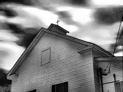
It looks like a scanned film image with something happening along the right edge. Perhaps not though. For me it would work better as a monochrome image as shown below.
Andrew
I am really in favour of Andrew's B&W version.
For some reason, that cross on the roof had almost escaped me in the colour version. In the B&W version, it becomes a focal point.
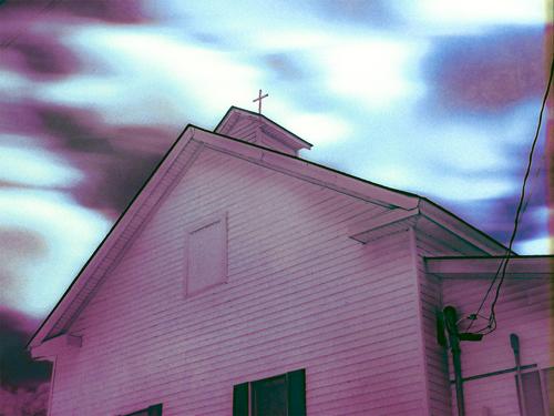
The original colours remind me of classic analog film with some weird happenings in the development bath. -
@JimKasson has written:
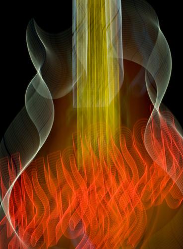
More ICM -- a descriptor I learned from last week's thread.
That guitar just calls for strummin'!!
And a great guitarist it is, the guy playing here: he really is on fire.
The tunes are smokin' hot.Love the effect.
Love the technique on display.
Love the creativity. -
-
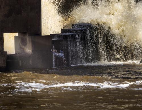
Aiming for the Portal
A few dam birds are back, but it's not crowded so there isn't as much confrontation going on, sort of like a new photography forum, except that confrontation is not much fun on a forum and dam birds squabbling over perches is pretty cool. Trying out the new controls in LR that came out yesterday.
-
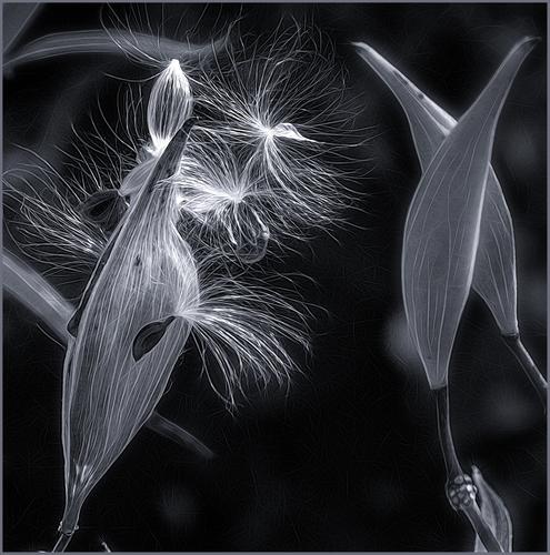
Seed Pods. My first posting to the weekly thread (I put another in main critique earlier). I was invited to join this group by MinnieV, whom I've known (online) for years. Looking forward to getting to know you all and to participate in giving/receiving feedback. Would love your opinions on my heavily edited shot. Thanks! -
@RoelHendrickx has written:@WhyNot has written:@RoelHendrickx has written:
My image for this week is an Iphone image from the Orkney Islands: "WAITING"
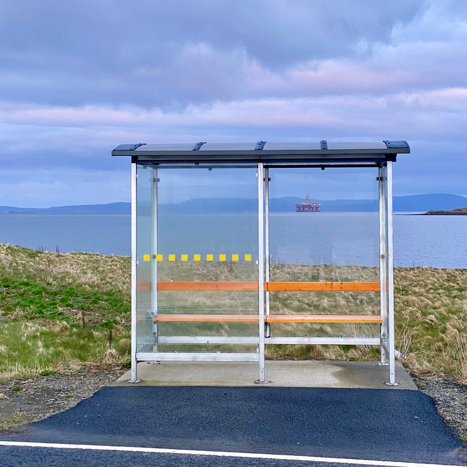
Shot around sunrise, about a year ago, on a pre-dawn walk on the Orkney Islands.
(This is an image from my preview gallery of that trip, filled with iphone images.
It is a placeholder for a more definitive gallery that will be filled with "real camera" images - if I ever get around to processing those...)I like the idea ... I agree mostly with Mike ,,, I'd like that white line gone and I really think you could have taken a knee and gotten a lower angle of view ...But I do like the picture and the idea ...
WhyNot
This is interesting.
I'll already respond to two ideas proposed here, because both were something that I had considered (the second while shooting; the first while processing) but had ultimately decided against........
Given your considerations .. I wasn't thinking so much about moving forward as much as cloning or in-painting out that white line .. Not sure I would think more about traffic seeing those lines as I'm looking at a bus stop! .... Second given you perspective considerations i was wondering why you didn't move a bit to the left and to get better symmetry .....
-
@ChrisOly has written:
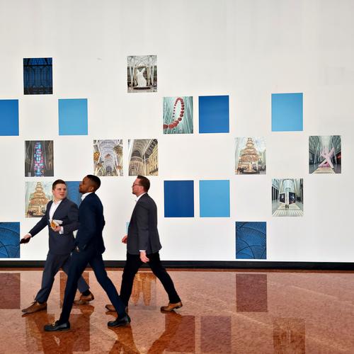
Lunch Hour
I like it. Wish you had caught them "earlier" in the frame. No one wears ties anymore. Children playing grown-up. 🙄
Rich
-
@minniev has written:
Aiming for the Portal
A few dam birds are back, but it's not crowded so there isn't as much confrontation going on, sort of like a new photography forum, except that confrontation is not much fun on a forum and dam birds squabbling over perches is pretty cool. Trying out the new controls in LR that came out yesterday.
Hope he makes it. Nice shot.
Rich
-
@LindaS has written:
Seed Pods. My first posting to the weekly thread (I put another in main critique earlier). I was invited to join this group by MinnieV, whom I've known (online) for years. Looking forward to getting to know you all and to participate in giving/receiving feedback. Would love your opinions on my heavily edited shot. Thanks!Great lighting. Interesting detail and texture.
Rich
-
@RoelHendrickx has written:
My image for this week is an Iphone image from the Orkney Islands: "WAITING"

I have a fascination with public transit stops, so this has instant appeal for me. There's good geometry of repeating rectangles and the stray horizontals for interest. There's a good color palette. The upper right rectangle is a frame for a photo inside the photo, of the oil rig or whatever that is, set in the sea. The pastel sunset has its own visual appeal. The question arises about the white diagonal. My first inclination would be to get rid of it and I think that is perfectly reasonable choice to remove a visual annoyance. But a good case can be made for the inclusion of it as a partner for the other diagonal in the frame, the sloping shoreline. So either version would work.
-
@MikeFewster has written:

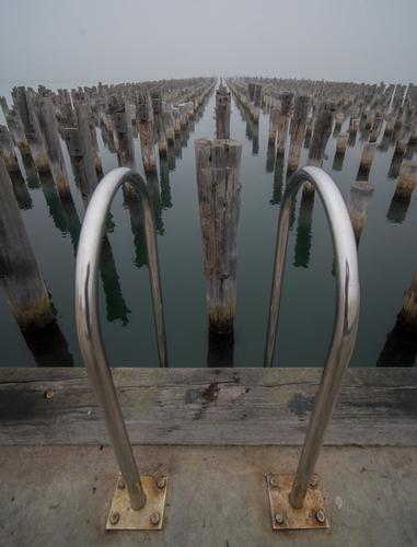
What a cool place to photograph! I cannot imagine what it really is. Docking for a thousand small fishing boats? If so, how might the boatmen dismount? I'm sure it is some exotic location I've never been. It appears it has not been used of late, but perhaps that is because I don't know the use. The chrome bars make it look like I might climb down to see more for myself. There is excellent symmetry with leading lines, a vanishing point that tells us where sea meets sky, and a contrast of rough and smooth textures, so there's much to study.
I am offput by the tilt. Perhaps it is there for a reason, but I have a bit of a personal visual issue with tilt so I took the liberty to straighten it a bit.
-
@WhyNot has written:
Ambiguity
or maybe a shave and a haircut ....
WhyNot
Ambiguity indeed! I really like this one. It has so many layers and overlapping objects that my eye wanders all over the place, finally landing on the barber's chair and American flag. The exposure must have been tricky. You've got bright sunny sky in the upper right corner as well as dim building interiors. Nicely done.
Here's a thought - I don't know how it would look - if you wanted to emphasize the concept of ambiguity, you could flip the image horizontally. That would make the Storage sign read correctly. Seems to me that would increase the ambiguity of whether an object is real or reflection. Might be worth a try to see if you like it.
-
@simplejoy has written:
These images have tremendous visual appeal, but the reasons for the appeal may vary from viewer to viewer. For me, the sharpness vs extreme blur and bokeh is what keeps me looking again and again. You can even see a fingerprint (yours, no doubt) on the bottlecap as it emerges from the bottle (??). I would not begin to criticize the lighting since I have no understanding of the fascinating lens you are using here.Just an appreciation for the project.
