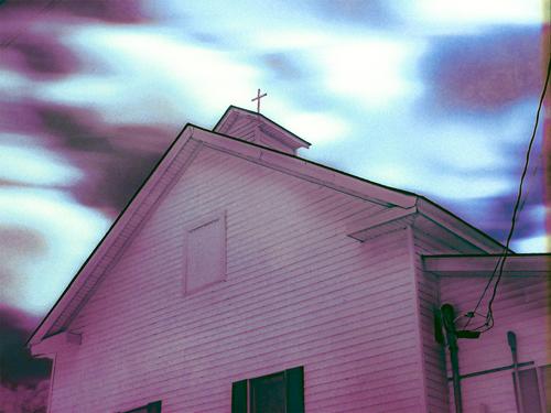
It's a bit eerie, like a scene from a scary movie, with the church in the foreground and a weirdly rendered sky that must be the result of a special lens. What I don't care for is the purple tint. I dislike purple as a color and dislike purple/magenta tones in photography because of that, but I also don't care for color that overtakes the subject and becomes it. So I prefer Andrew's monochrome version which allows me to think about the image itself rather than the color. Now it becomes a still kind of spooky but pleasing image with the triangular shapes and the cross on top assuming an expected role as subjects and compositional building blocks.
-
-
-
He is a beautiful dog. I see a bit of wistfulness in his expression: does he long for the glory days of old, herding cows and chasing girls? Good profile portrait with enough sharpness, but not too much (after all he is a family member having his portrait done, not a trophy animal on a safari). Good rendition of the "blue" tones in his fur. I do think you should remove the pipe if you've got software that will permit pixel level work. If not, you will eventually want to acquire something that will do that. The world is full of unsightly objects like trash cans, plastic drink bottles, electric wires. It's nice to be able to clean them up when we take a notion. I'd also twist it a tad to the left to get that wooden post straight vertical.
-
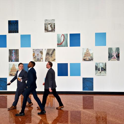
Something about this image makes it feel like a modern day Norman Rockwell type picture. I think it is the graphical nature of the frames on the wall that make it feel almost like an illustration rather than a photo. The three guys, caught mid-stride and dressed as they are in almost identical suits just before they exit stage left, give an illustrative impression as well. It is a very pleasing shot, I like it a lot.
-
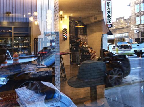
There is something fairly wonderful about the complicated worlds we build when we photograph partial reflections. The reflected content gets transposed into the actual contents behind the reflective material, at differing opacities and in different shapes. Here it is not clear where the haircut is happening or why the car is driving into the shirt shop. It is a mashup of fun puzzle pieces in the ordinary life of an urban setting. The clarity of the barbershop pair with the flag drape lets us set a focal point and work our way outward. Masterfully caught. Very nice.
-
Thanks very much. I've always been drawn to backlighting (or side light).
-
-
@JimKasson has written:
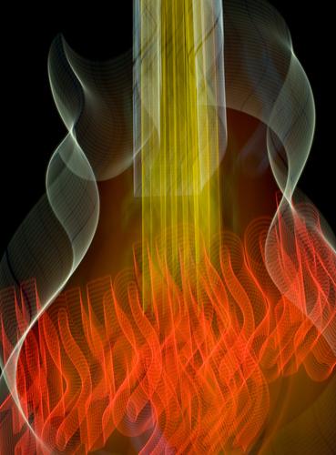
More ICM -- a descriptor I learned from last week's thread.
I won't venture what you intended to be represented but what I find in this interesting image is Muddy Waters' red guitar, in its new musical afterlife form. His house and probably his red guitar that was usually kept inside were blown to smithereens in the tornado that obliterated Rolling Fork, MS, a couple of weeks ago. Fiery, since it is so near The Crossroads. Excellent manipulation of light, balance and color to create something out of the realm of reality. which can be interpreted by the viewer.
-
@Rich42 has written:
(Also posted in Medium Format forum)
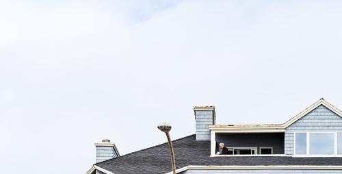
The image seems well taken, as there is good rendition of the soft blues of the sky and the building, and the gentleman on the balcony is clear and recognizable. It has a feeling of being cut off and I'm wondering if having more of the building in the frame would give more balance. Perhaps there re reasons for leaving it off. As it is, the subject is quite low in the frame in addition to being small which makes it harder to find him as a subject without being told.
-
@MikePDX has written:@WhyNot has written:
Ambiguity
or maybe a shave and a haircut ....
WhyNot
Ambiguity indeed! I really like this one. It has so many layers and overlapping objects that my eye wanders all over the place, finally landing on the barber's chair and American flag. The exposure must have been tricky. You've got bright sunny sky in the upper right corner as well as dim building interiors. Nicely done.
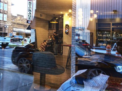
Here's a thought - I don't know how it would look - if you wanted to emphasize the concept of ambiguity, you could flip the image horizontally. That would make the Storage sign read correctly. Seems to me that would increase the ambiguity of whether an object is real or reflection. Might be worth a try to see if you like it.
Thanks for the comment/critique Mike ..... A really good idea
But whether I like it better .. well I'm a bit ambiguous ....
WhyNot
-
@OpenCube has written:
Hi, new member here. I found the monochrome version fascinating. What a great example how different the story can be once color is removed. In both, the white in the sky is hard on my eyes, and detracts from my ability to comfortably explore the rest. The point of view, culminating with the tiny cross, is very cool. Definitely an image to spend time with.
-
@JimKasson has written:
More ICM -- a descriptor I learned from last week's thread.
Hi. New member here. I love this result! I've played with ICM on occasion and have a couple I love, and many I've quickly deleted. The red "flames" are a great base from which to travel up the gossamer threads. Energetic and appealing.
-
I had toyed with it in b&w, but I'm admittedly not always comfortable with it. The cross does pop much better that way. Perhaps I will return to this at some point.
-
@ChrisOly has written:
Lunch Hour
Hi. New member here. I love this shot. What I find most appealing are the long strides of each person (they're in a hurry!) and that they are at the edge of the frame, like you snapped just in time. Tension and action against rigid squares of color and prints too small to discern. Just super-cool for me!
-
@minniev has written:@Rich42 has written:
(Also posted in Medium Format forum)
The image seems well taken, as there is good rendition of the soft blues of the sky and the building, and the gentleman on the balcony is clear and recognizable. It has a feeling of being cut off and I'm wondering if having more of the building in the frame would give more balance. Perhaps there re reasons for leaving it off. As it is, the subject is quite low in the frame in addition to being small which makes it harder to find him as a subject without being told.
Thanks for looking! This is a crop of a larger GFX 100S image that I discuss more fully in the Medium Format forum here: dprevived.com/t/this-week-with-your-mf-camera-apr-15-21-2023/1948/2/
The larger, "messy" image can be seen there.
I do want the main figure low in the frame. I would have placed it even lower if there were more sky in the original. I debated "adding" clouds and sky, but resisted the temptation. 🙄
It was a mostly cloudy, foggy day at the coast in Carlsbad, CA. I liked the muted tones and very limited palette of blues and tans. I tried to keep the composition as minimal as possible.
I should have intensified the small blue patch of sky at the top.
Rich
-
@LindaS has written:
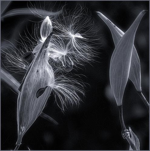
Seed Pods. My first posting to the weekly thread (I put another in main critique earlier). I was invited to join this group by MinnieV, whom I've known (online) for years. Looking forward to getting to know you all and to participate in giving/receiving feedback. Would love your opinions on my heavily edited shot. Thanks!Welcome Linda! This almost has the feel of an IR image. It is tack sharp. The whites and blacks are heavily exaggerated which emphasizes the details of the pod, the tonalities in between are playing a supporting role and the processing gives it an etched look on close inspection. There's even some implied motion in the seeds that are almost airborne. It is beautifully composed and well balanced and calls to mind the concept of rhythm in photography. An idea to think about: would it be better or worse if the etched effect were not evident in the light blurred spots?
Very impactful image.
-
@minniev has written:
Welcome Linda! This almost has the feel of an IR image. It is tack sharp. The whites and blacks are heavily exaggerated which emphasizes the details of the pod, the tonalities in between are playing a supporting role and the processing gives it an etched look on close inspection. There's even some implied motion in the seeds that are almost airborne. It is beautifully composed and well balanced and calls to mind the concept of rhythm in photography. An idea to think about: would it be better or worse if the etched effect were not evident in the light blurred spots?
Very impactful image.
Thanks so much for your time, Paula. I'll try your "idea to think about" - sounds good!
-
@MikePDX has written:
Abstract - Untitled
Another from my recent experiments with abstracts. This one is so abstract that I wasn't able to come up with a suitable title.
I know I am making connections that probably are not there, but this abstract reminds me of the color palette of some of your Antarctica photos of seals and penguins, and their reflections in the water. It could just as well be the reflection of a black building or sign under blue sky in the ripples of water. Whatever it was in real life, it is pleasing as an abstract now with fluid lines leading from lower left to upper right with a built in U turn to bring the eye back around. Nice work.
