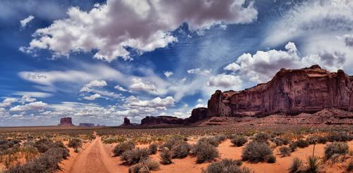
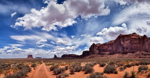
What an amazing sky! There's at least 3 different kinds of clouds in those formations, set against a fiercely blue backdrop. And of course nothing looks better against a blue sky than a red rock landscape. I've always thought the road in MV is almost as much a compositional attraction as the the more familiar subjects, those impressive formations. While sunrise and sunset offer softer and more photographically cherished lighting, the remainder of the day can still yield good images there as you have proven. For my eye, the sky along the top edge has gotten too dark, creating a couple of black spots that distract me. Whether from lens, camera, filter or processing, I wouldn't guess. If it were mine, I'd dial back the darkness to get a more uniform blue so the sky doesn't fight so much with the landscape. Lovely shot.
-
-
-
-
@Bryan has written:
Ummm, I am not sure if this hurts my eyes, like a slightly out of focus 3d viewer. I will delete it if there is a consensus...
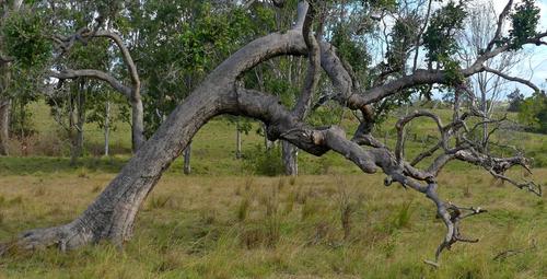
A tree shape like this lends itself to a couple of approaches.
Maybe use the curve to find something you want to have framed. Or. Look for an angle that isolates the tree from a complex background so the inverted U with i's medusa of branches can be admired in its own right.
ie., I feel that the tree has lots of potential although your chosen angle might be better. -
@OpenCube has written:@MikeFewster has written:@OpenCube has written:
Whole lotta reasons I dislike it.
Sure.
In any art communication there is the intent and technique of the artist; there is the background and experiences of the viewer. the image itself may draw memories and experiences from the viewer that completely change the communication generated by the piece.
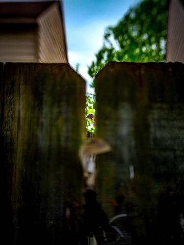
When I look at this example I feel as though I am peeking through a fence although I don't feel this strongly. The subject through the fence isn't resolving into anything I can interpret and so It isn't satisfying. At the same time, it feels as though something is being photographed, it doesn't feel like an abstract, and so in looking it isn't working for me as a composition of from and colour either.Re the image, I agree with you. You first Open Cube, why do you dislike it and if so, why did you post it?
My standards/feelings and others will never be the same, as such, just because I think a photo doesn't meet whatever lofty goal it had in mind, doesn't mean others think or feel that way. To me, that's kinda the fun of it all. It's always interesting to see others look at your work without all your biases attached. Maybe it helps you see or think differently. Maybe they can help you find something you can't, or inspire something to make the next one like this better. Maybe they can help you see a beauty your bias won't let you. I was just watching some video, and the guy told a story about doing portfolio reviews and he thought the one submitter was pulling his leg because "This has to be a professional messing with me. These are too good to not be professional work." Allegedly, nope, just someone thinking their work wasn't very good, when in fact, the guy was pushing him towards agents telling him he's ready now for bigger and better things. You're always your own worst critic.
The image fails to me, in all the theories of composition and prep. Everything about this image could be better....but all I have is what I could get and of the 40 or so images that were taken, this is the one that was "best" by my lofty standards. Better to turn in a C grade paper and see what can be done better next time than no paper at all.
-
@minniev has written:
You have made a Mondrian of a cluttered garage door. That is quite an artistic achievement. I don't think I would ever have found this treasure. What a good photographic eye you have! You've reduced the scene to the rectangular frame, isolating in good proportions the various forms: rectangles, vertical/horizontal/diagonal lines, ovals, and enriching the color/contrast/texture to help us see. Marvelous work.
Thank you, very much.
Rich
-
@JimKasson has written:
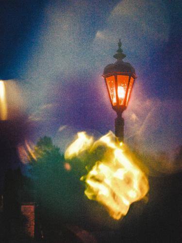
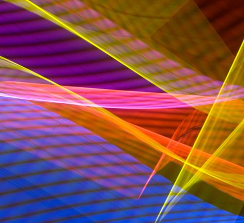
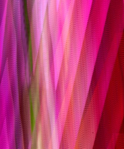
More ICM:
First, an admission. I would love to have been able to do either of these. On the other hand, and I wouldn't know until I had tested it out, I don't think either would keep my interest for very long if they were on my wall as prints.
One has the pink and green/gold plume forms that draw the eye to their points. Those points give focus to something like a subject point that give a starting point to an overall composition.
2 does something similar with the cone form, just left of the centre.
Both then play with light and colours as variations on a theme and that's fun to explore for a while. 2 might have been inspired by the northern and southern lights. -
@MikeFewster has written:@JimKasson has written:
More ICM:
First, an admission. I would love to have been able to do either of these. On the other hand, and I wouldn't know until I had tested it out, I don't think either would keep my interest for very long if they were on my wall as prints.
One has the pink and green/gold plume forms that draw the eye to their points. Those points give focus to something like a subject point that give a starting point to an overall composition.
2 does something similar with the cone form, just left of the centre.
Both then play with light and colours as variations on a theme and that's fun to explore for a while. 2 might have been inspired by the northern and southern lights.Meant to add, I like the different side ratios of the two photos. For myself, I never hesitate to change the proportions to suit whatever I feel to be the requirements of the image. I never work to a set proportion and try to work the image into that frame.
-
@simplejoy has written:
This image is called
Face it... love fades!
Face it… love fades! by simple.joy, on FlickrIt was a lot of fun to create.
This is very creative and I'm a curious one so I'm wanting to know how it was made. It seems to be silhouettes of a couple but I'm not convinced that it really is a silhouette or that either or both figures are real people. I can't figure out what the little mechanical looking item is at the bottom where the electrical red dot is but it serves as a punctuation mark and a reference that all is not what it appears. However it came to be, it is a fun and fascinating image. Hope you'll solve the riddle for us once the week's business is done.
-
@JimKasson has written:@minniev has written:@JimKasson has written:
Dirt road, Monument Valley
What an amazing sky! There's at least 3 different kinds of clouds in those formations, set against a fiercely blue backdrop. And of course nothing looks better against a blue sky than a red rock landscape. I've always thought the road in MV is almost as much a compositional attraction as the the more familiar subjects, those impressive formations. While sunrise and sunset offer softer and more photographically cherished lighting, the remainder of the day can still yield good images there as you have proven. For my eye, the sky along the top edge has gotten too dark, creating a couple of black spots that distract me. Whether from lens, camera, filter or processing, I wouldn't guess. If it were mine, I'd dial back the darkness to get a more uniform blue so the sky doesn't fight so much with the landscape. Lovely shot.
What if I crop it out?
You could, and then the dark area is gone but you're giving up real estate. You could just mitigate it. (Rough approximation)
-
@MikeFewster has written:@OpenCube has written:@MikeFewster has written:@OpenCube has written:
Whole lotta reasons I dislike it.
Sure.
In any art communication there is the intent and technique of the artist; there is the background and experiences of the viewer. the image itself may draw memories and experiences from the viewer that completely change the communication generated by the piece.
When I look at this example I feel as though I am peeking through a fence although I don't feel this strongly. The subject through the fence isn't resolving into anything I can interpret and so It isn't satisfying. At the same time, it feels as though something is being photographed, it doesn't feel like an abstract, and so in looking it isn't working for me as a composition of from and colour either.Re the image, I agree with you. You first Open Cube, why do you dislike it and if so, why did you post it?
My standards/feelings and others will never be the same, as such, just because I think a photo doesn't meet whatever lofty goal it had in mind, doesn't mean others think or feel that way. To me, that's kinda the fun of it all. It's always interesting to see others look at your work without all your biases attached. Maybe it helps you see or think differently. Maybe they can help you find something you can't, or inspire something to make the next one like this better. Maybe they can help you see a beauty your bias won't let you. I was just watching some video, and the guy told a story about doing portfolio reviews and he thought the one submitter was pulling his leg because "This has to be a professional messing with me. These are too good to not be professional work." Allegedly, nope, just someone thinking their work wasn't very good, when in fact, the guy was pushing him towards agents telling him he's ready now for bigger and better things. You're always your own worst critic.
The image fails to me, in all the theories of composition and prep. Everything about this image could be better....but all I have is what I could get and of the 40 or so images that were taken, this is the one that was "best" by my lofty standards. Better to turn in a C grade paper and see what can be done better next time than no paper at all.
I'm not getting it.
Images that might break the usual rules I understand. In these cases it's exciting to see why the rules have been broken in this particular image. But the rules in themselves aren't stupid. They aren't "rules" set in concrete by some guru. They are guidelines that have evolved through much experience. If posts are made that break new ground, I expect that the poster sees virtue in the image. I don't see point in posting images where the poster doesn't see point to the image in the hope that maybe someone else will unearth positives that the poster missed. -
@minniev has written:@simplejoy has written:
This image is called
Face it... love fades!
Face it… love fades! by simple.joy, on FlickrIt was a lot of fun to create.
This is very creative and I'm a curious one so I'm wanting to know how it was made. It seems to be silhouettes of a couple but I'm not convinced that it really is a silhouette or that either or both figures are real people. I can't figure out what the little mechanical looking item is at the bottom where the electrical red dot is but it serves as a punctuation mark and a reference that all is not what it appears. However it came to be, it is a fun and fascinating image. Hope you'll solve the riddle for us once the week's business is done.
My response is similar to Minniev's. It doesn't matter whether or not the silhouettes are really people, the shapes suggest faces in profile and we respond by interpreting them as such. Perhaps there are two people? Perhaps it is a composition of different versions of one person? I was struck by the difference in sharpness of the two. Focus changing becomes time passing. That sits with simplejoy's title. Of course, the image might be interpreted as precisely the opposite - love can grow as well.
There are so many forms to love. As here, detail isn't needed.
Like min, I hope the curious symbol like feature is resolved. -
@minniev has written:
I can't figure out what the little mechanical looking item is at the bottom where the electrical red dot is
@MikeFewster has written:Like min, I hope the curious symbol like feature is resolved.
I believe that is a form of incense called dhoop.
-
@minniev has written:
This is very creative and I'm a curious one so I'm wanting to know how it was made. It seems to be silhouettes of a couple but I'm not convinced that it really is a silhouette or that either or both figures are real people. I can't figure out what the little mechanical looking item is at the bottom where the electrical red dot is but it serves as a punctuation mark and a reference that all is not what it appears. However it came to be, it is a fun and fascinating image. Hope you'll solve the riddle for us once the week's business is done.
@MikeFewster has written:My response is similar to Minniev's. It doesn't matter whether or not the silhouettes are really people, the shapes suggest faces in profile and we respond by interpreting them as such. Perhaps there are two people? Perhaps it is a composition of different versions of one person? I was struck by the difference in sharpness of the two. Focus changing becomes time passing. That sits with simplejoy's title. Of course, the image might be interpreted as precisely the opposite - love can grow as well.
There are so many forms to love. As here, detail isn't needed.
Like min, I hope the curious symbol like feature is resolved.@Bryan has written:@minniev has written:I can't figure out what the little mechanical looking item is at the bottom where the electrical red dot is
I believe that is a form of incense called dhoop.
Thanks a lot for your creative and spot-on interpretations! These are indeed two (mannequin) heads. The red dot at the bottom is the last glowing heat from a burning wick. The item is therefore the upper part of a regular candle. Of course some incense device would work as well though. I tried to evoke the shape of smoke rising from the extinguished candle (there is some real smoke in there as well).
I love the bolded statement above by @minniev with 'the point' being, that I view the title as a well-trotten cliche. People say things like that and often mean the first stage of being in love, which is far from the only one. Therefore I also really enjoy what @MikeFewster mentioned (also bolded): '...love can grow as well.' Indeed, I believe it can change and grow and shift its shape over time and perhaps we shouldn't focus on the (inevitable) fading of the first stage, the 'falling in love' (the right mannequin head actually is upside down...) as something negative.
Thanks again for your feedback!
-
@simplejoy has written:
The red dot at the bottom is the last glowing heat from a burning wick. The item is therefore the upper part of a regular candle.
Ahh that's cool. The shiny molten wax and outer cone of the candle looked to me like a typical little metal dish used for burning dhoop like things.
-
-
@MikeFewster has written:
I'm not getting it.
Images that might break the usual rules I understand. In these cases it's exciting to see why the rules have been broken in this particular image. But the rules in themselves aren't stupid. They aren't "rules" set in concrete by some guru. They are guidelines that have evolved through much experience. If posts are made that break new ground, I expect that the poster sees virtue in the image. I don't see point in posting images where the poster doesn't see point to the image in the hope that maybe someone else will unearth positives that the poster missed."One man's trash is another's treasure," is a saying I've found to be malleable when the concepts of art become a discussable point.
I find value in the discussion. I find value in the search for answers. It's a journey. I will never see with another person's perspective, and it's nice to get it when you're exploring art.
Also, what if the point isn't related to any of the discussions? Sometimes just the act itself is everything. If I'm being brutally honest with myself, posting here the last few days has been a helpful anchor in keeping my mind together while going through a very rough patch. Forcing myself to engage and not throwing the proverbial baby out with the bathwater, has been a light in a very dark tunnel I'm still not sure I'm fully out of.
-
Thanks for giving it a try. You got some improvement in the back gator, the one I processed separately in Topaz, so I'll follow your lead on that one. You're definitely right that they two gators are going to require separate editing, then I'll have to adjust the log so it doesn't look crazy. I've never caught two on the same log close enough to shore to get them in a single shot, so I'll keep wrangling with it.
