Thanks so much, Mike!
-
-
@Rich42 has written:@simplejoy has written:
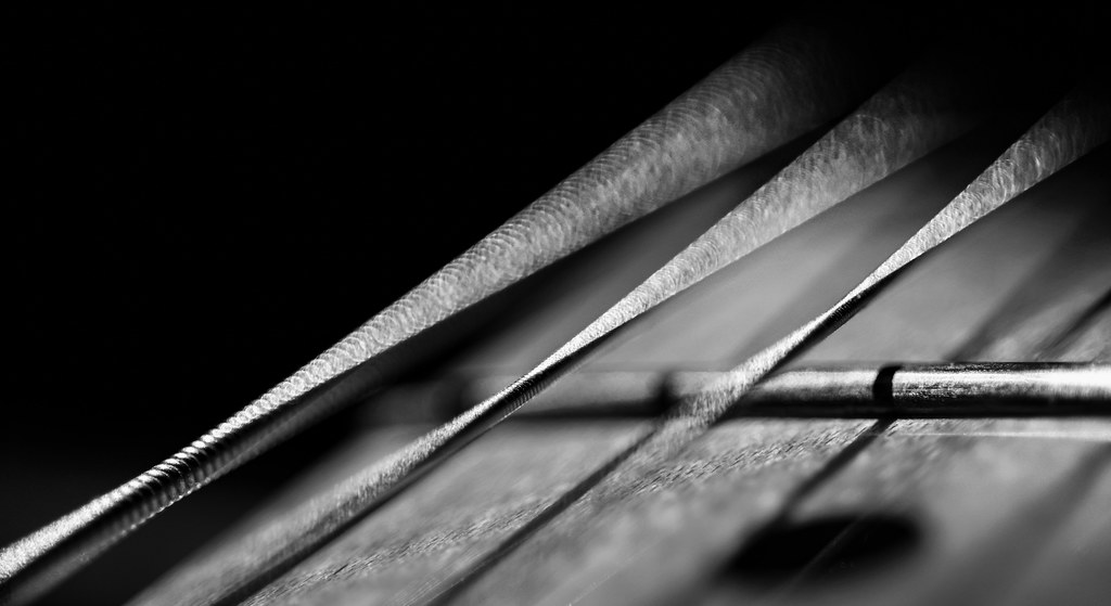
Signals in a foreign language by simple.joy, on FlickrI like this a lot. Good photography often shows us things in ways we never previously appreciated. I never realized vibrating strings looked quite like this. Or is that just the OOF effect of the lens beyond the point of focus? The monochrome treatment is perfect.
Great texture in the strings, the fret and the fret board.
Looks like an F#min7 chord to me. 🙄
Rich
Thank you - no vibration there, just bokeh from an old lens.
@Dodie has written:I love B&W!! I'm drawn to this photo because, firstly, it is B&W but the main reason is because I haven't a clue what it is. My first thought was guitar strings that had been plucked or strummed and are vibrating.
Please let me know; I'm quite curious and would like to put it into context.
Many thanks! Yes, these are indeed some guitar strings, but they are still, just out of focus and part of them illuminated by (natural) light.
@minniev has written:Doesn't look like you're having too much trouble with black and white here. You have a full range of tonalities and a large very dark triangle occupying the upper 1/3 as a compositional device to focus the eye on the subject. I'm not entirely sure what it is but seems to be a stringed musical instrument. Focus seems to be constrained to a very narrow plane across the top but then there is a thin diagonal band of focus on the wooden understory that I don't quite understand you did it. Nonetheless I find it a quite pleasing image with some mystery to it.
Thanks a lot, that's very kind! I get quite a bit of positive feedback, whenever I decide to share a B&W image... my struggle is internal. Most of the time I feel like an image is loosing something by getting rid of color. I get that it can be an effective tool to highlight other aspects, but I often think I could do those somewhat effective in color as well... might just be a misconception though. I'm certainly not very good at 'thinking in B&W' so maybe I just need to train that. I don't even know if the Canon R5 still has that B&W in-body feature the 5D IV had... need to check that.
And yes: It's a guitar... my electric guitar to be precise, because unlike lenses, I only got one! 😉
-
@LindaS has written:
SHADOWS only appreciation og
Really like your shot and I fully appreciate your ability to spot the interplay of light and shadows like that. I'm sure I'd miss it. Excellent work!
-
@JimKasson has written:
I really like the shot you chose, it's very effective and unusual enough for a musician's portrait to get your attention. I think it works perfectly, if that's what Karina wants and identifies with. In any other case the outtake above is great as well in my opinion as a more standardized/customary but still very professional alternative. (But what do I know about portraits... nothing, really, I'm afraid! 😅)
-
@simplejoy has written:
And yes: It's a guitar... my electric guitar to be precise, because unlike lenses, I only got one! 😉
Gasp
Get a grip! One guitar?! How do you play more than one song!?
Better get working on that. At least several electrics (Strat, Les Paul at the minimum), Tele, at least one acoustic, nylon string . . .
My wife rolls her eyes and asks when I say I need another guitar, "Will I be able to hear the difference between that one and the ones you already have?," I say, "No . . . but I will!"
😉
Rich
-
@LouHolland has written:
The house on the corner is called "het Waaggebouw", A Waag is a scale.This building is intended to inspect the cargoes that were transported by ships (like the ship on the left) to Haarlem to provide the population with necessary supplies. Except for modern objects such as cars e.g. is the statue the same as it looked in the 18th century or earlier. It is possible to look at it on a 1:1 ratio.
Thanks for looking,
LouMaybe it's good to show the color version as well, but maybe not. Anyway this is the color version.
Lou
-
My contribution has disappeared because of my mess and because I wanted to add the color version, but also because I wanted the two photos under each other. Which didn't work out. So if someone can guide me in this respect I feel very obliged and I can still make my contribution in this way. Thanks.
Lou
-
@Rich42 has written:
Gasp
Get a grip! One guitar?! How do you play more than one song!?
Better get working on that. At least several electrics (Strat, Les Paul at the minimum), Tele, at least one acoustic, nylon string . . .
My wife rolls her eyes and asks when I say I need another guitar, "Will I be able to hear the difference between that one and the ones you already have?," I say, "No . . . but I will!"
😉
Rich
I know, I know... Well, I got an acoustic guitar too, the one from back when I was five and started playing guitar. And I got other instruments as well. Finally I'm not a good guitar player, so it would not feel right. I do have fun shooting some details of those instruments though:

Not a star on my guitar... by simple.joy, on Flickr
Keys to happiness. Keys to despair. by simple.joy, on Flickr
Pianist writing music on a guitar... by simple.joy, on Flickr -
@LouHolland has written:
My contribution has disappeared because of my mess and because I wanted to add the color version, but also because I wanted the two photos under each other. Which didn't work out. So if someone can guide me in this respect I feel very obliged and I can still make my contribution in this way. Thanks.
Lou
We can see the color version it if we click on the thumbnail. You can go back and make it show up larger in your post by going to Edit, then clicking the two little overlapping boxes on the left of the preview screen, and you should see the code for the image come up. Then click Preview and see if the image shows up. Then you can add the black and white version back in and click the two little boxes for it too. Let us know if that doesn't work and we will figure it out together!
You can check the preview to make sure it is turning out the way you want before you click "edit reply" to post it. I'm not sure which image is causing the broken paper clip, but if you can't make it go away this way, you can remove all the images but leave the text, then add them back one at a time. The system won't take an image more than 4 mb so that can sometimes trigger problems. Let us know!
PS - I still like the monochrome best!
-
@minniev has written:
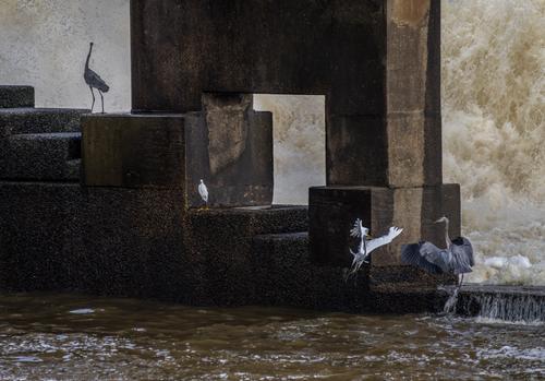
Should you ever want to see more of these things, or read about the project, here's a link to the closing report.luminous-landscape.com/the-dam-birds-luminous-endowment-grant-winner/
If you haven't seen Paula's work in the link above, it is a must read / view...
Thank you for the link. It speaks for itself...
-
@simplejoy has written:

Signals in a foreign language by simple.joy, on Flickr- no vibration there, just bokeh from an old lens.
The backyard physicist in me had decided that that was a great view of vibrating strings. And that the sharp edges were correct in that the string is briefly stationary at the edge of it's movement. Although what looks like a triangular shape was a touch confusing - but also knowing the plane of vibration could possibly rotate around the axis of the string...
After now having my bubble burst, I am intrigued to learn about what sort of lens would produce sharp bokeh. A google search only showed up a dutch for sale site with no details about it. Do you know much about the lens you could share?
-
-
@minniev has written:@19andrew47 has written:
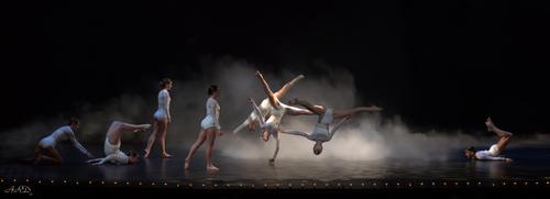
Dance Recital from 2019. I did not look through all the images I took there. Looking through some of the unprocessed images I decided to process the one below today.
Andrew
Andrew, this is just wonderful. I have never seen a more appealing capture of dance recital. The warm/cool light/dark contrasts, the subdued but focused lighting and atmospherics set the state, literally, for wonderful photography opportunities. (And I am sure you used your PP skills to sculpt those conditions for the best possible use in your finished image). Catching this particular formulation with the central trio in their dramatic acrobatic moves was brilliant, with two totally airborne and the central one maintaining the lightest touch with the watery-looking surface, casting a shadow that grounds the group. The other dancers are arranged in a compositional line with the two on the ends as living parentheses. A really nice image that would be a delight to the parents of these young ladies.
Thanks Paula. Timing on these images is everything and anticipating that is the key. This was with the old noisy EM1 and I was very pleased with the way it turned out. I really did not do all that much to the image to get it to the state as presented. Most of what was done was to right the wrongs from shooting more from the left side of the stage than the centre. That did require some intervention to get the left most dancer to not appear in front of a curtain that came down that side of the image.
I have been having some serious pain from back issues so I have not a lot of time to sit in front of the computer and give responses. I did see your image and really did not have anything of merit to offer. For whatever reason Linda's flip of the image made it better for me. Who would have guessed! I have flipped images on occasion but rarely to improve their appeal. Makes you wonder about all the images one takes!
Andrew
-
@LouHolland has written:
Thanks for looking, (Does anyone know how to delete the photo you posted yourself now or later?)
LouI think you found out Lou! You just edit your post, select what you want to delete by highlighting it and then delete it. You can not delete or withdraw the post however so the title will remain and you may have to insert some text in the post. I am not sure about the last part. I have tried to delete a post before and at this point in time it can not be done by the poster. One of the admin team members can delete the post for you if you wish to do that.
I liked the image as presented in monochrome but the colour version is also attractive. Using this site to do what you want can be frustrating. Hopefully it will improve over time.
Andrew
-
@19andrew47 has written:
Dance Recital from 2019. I did not look through all the images I took there. Looking through some of the unprocessed images I decided to process the one below today.
Andrew
As has already been said it is an excellent shot.
In my opinion the dancer on the left hurts the aesthetics of the composition, have you considered removing it?
I know it's a controversial procedure, I avoid doing it myself but in this shot I would. -
@JimKasson has written:@minniev has written:@JimKasson has written:
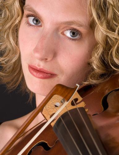
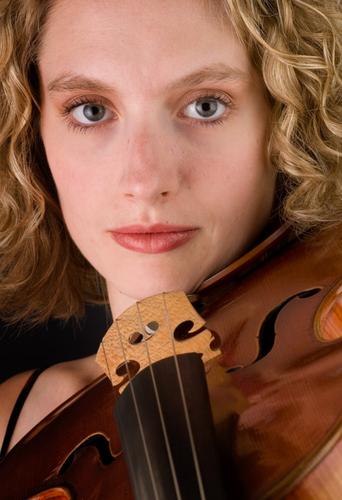
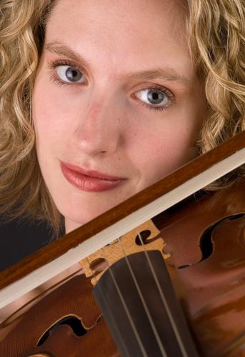
Here's one that's not an abstract.
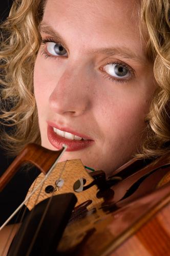
Yes! Someone finally broke the portrait barrier! (For whatever reason, we seldom see portraits in critique sections.) This one is lovely, with perfect and gentle warm lighting coming in from slightly below the subject. Creating such lighting is a skill set I admire. It is a form of photography-related magic.
The angle is pleasing and the eyes and smile are engaging. The young musician is quite beautiful in a natural way, without the heavy makeup and weird expressions we see in model photography.There is just enough of her instrument for us to understand the nature of the photo but not so much as to take away from the portraiture. Fine image.Thank you. The outtakes, and one more portrait:
The lighting is pretty wonderful on all of them. I actually prefer the first out-take to the original one submitted. The same general angle is taken but no part of the instrument intrudes on her lip.
The way you've shot close is interesting to me. I have a young cousin who plays in the local symphony and I've been taking photos of him with his violin since he was 14. I've always wrangled with how much of the violin I need to include and in what way. My own style (which I refer to as Kitchen-Sink style) involves lots of context, also known as too-much-stuff-in-the-frame, so I'd never have thought of such as this.
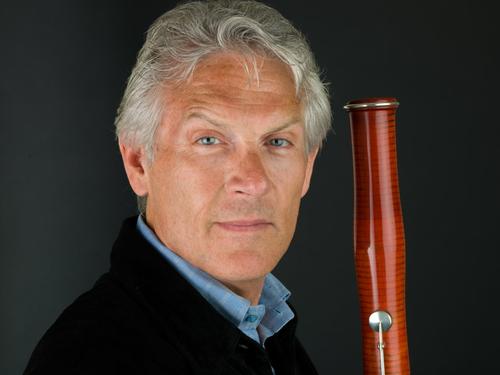
The gentleman's image is quite nice as well, again with kudos to the lighting.
-
@OpenCube has written:
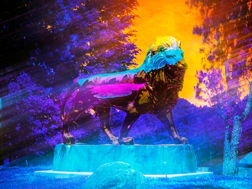
I like the general idea of enhancing the lion statue, which might have been of minimal interest on its own, with color and some kind of simplifying effect. However, the intensity of colors rattles my brain a bit, and as I have mentioned in other responses (perhaps your photos, but not sure) magentas and purples don't have any appeal to me so I'm an unfair judge of images that are heavy in that end of the spectrum.
-
You may not be a famous musician but you've found some interesting ways to use selective focus to creat images of them. (BTW I admire anyone who can make their own music instead of having to rely on Spotify).
@simplejoy has written:@Rich42 has written:Gasp
Get a grip! One guitar?! How do you play more than one song!?
Better get working on that. At least several electrics (Strat, Les Paul at the minimum), Tele, at least one acoustic, nylon string . . .
My wife rolls her eyes and asks when I say I need another guitar, "Will I be able to hear the difference between that one and the ones you already have?," I say, "No . . . but I will!"
😉
Rich
I know, I know... Well, I got an acoustic guitar too, the one from back when I was five and started playing guitar. And I got other instruments as well. Finally I'm not a good guitar player, so it would not feel right. I do have fun shooting some details of those instruments though:

Not a star on my guitar... by simple.joy, on Flickr
Keys to happiness. Keys to despair. by simple.joy, on Flickr
Pianist writing music on a guitar... by simple.joy, on Flickr
![[000832] copy 2.jpg](/a/thumb/Qy9li8BUp6u212ZI7fReVj5tXuIxL2lediboMx1rTn3c8ooRw5VlvcDqsQbl3gsW/6536/?shva=1)
