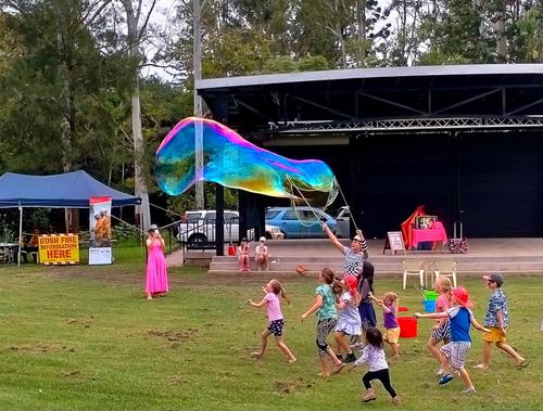
I'm more than a little bit baffled here. I see that you captured the precise moment that a ginormous bubble burst into rainbow tinged explosion. I see that the rest of the folks in the frame are more interested in something out of the frame stage-right than in the huge bubble. I think I see that the phone sensor may have overexposed perhaps being fooled by the very large swath of black curtain in the background. What I am befuddled about is how the kid with the bubble is split apart from himself. He seems to have one monochrome arm and one color arm and they both seem to be his right arm. I'm not sure if that is some kind of creative shooting mode you used for an effect or a haunted photo. Tell us what you think happened here? None of the other people have ghosts...I am so curious.
-

-

The phone took several rapid shots and combined them (poorly). The boy's arms were moving. The other elements in the shots were not moving.
Rich
-

Lou, I see others are answering your question. The image was deleted before I got to it.
-
Apologies to the young lady.
-

The other people were watching previous bubbles as above. Yes I could have cut back the highlights.
Good spot on the lady making them. That is some weirdness from the phone camera or the in camera software. None of the other pics with her in them show that. It seems to have taken a portion of her and shifted it backwards, including some opacity from where it was and below her shoulders. Her left arm has a b&w sleeve from her elbow down. Another to show there were no aliens around. Or maybe there were...[edit] Just saw Rich42's post - I have no reason to doubt that...
-
It feels like an excellent subject for B&W. It's the lines here that are important and the fret is the detail that gives the clue. I really like the concept of the series of B&W shots exploring the details and angles of a single guitar. A framed series mounted together comes to mind. In the shot shown here, the bokeh surprised me. It doesn't look right- sort of vibration that has gone wrong. It might not be the best lens for the series.
-
OK, Rich's explanation makes sense. There's special settings on phone cameras and "real" ones too that blend exposures, so that's understandable. (I probably should play with those more to see what they do but I stubbornly continue to hand blend any images I want to do that with, a bit of a control freak here).
I like the ghost-less version - better exposure, and the obvious joy of the bubble-chasers. Plus the booth about brush fires reminds us where you are, with that ever present threat even in the midst of the joy and fun of play. (And oops I mistook the lady for a boy...)
-
In this shot, I feel that the interest is all in the bursting bubble, the lines of the supporting sticks at the front and the trail of bubbles behind. The black background does a good job of throwing these details into relief. I'd therefore crop the image heavily around these details.
However, from previous experience here I know that my tendency to crop isn't shared by everyone. -
*Andrew, this is quite breathtaking. I assume you have cropped to give the panorama format. It is an excellent choice and especially when combined with the row of footlights across the front, it's masterly. The figures at each side bookend the action as does the cloud. The set designer, lighting designer, ballet master(no idea of the correct term) and the performers would be thrilled. The whole team that is ballet comes together here. It exudes live, theatrical performance. *
-
Whoops. this is one of the problems of a flat view forum. At least, it is the kind of problem I find I have with the format. I was hunting for images I might have missed, found one and posted.Then I find that the shot I responded to wasn't the original and that a previous conversation was underway. Oh well.......
-
Those cubes rising up the hillside still look the same.
One of the shortcomings of tourism is that the tourist, that's me, tends to be wherever for a relatively short time and we hole up in an historic centre where the significant old buildings and museums and quaint streets are located. I saw your lego ranks up the hillsides but I never got near them. Same thing where we are now in Palermo. This morning we went way up to Mon Reale. From there it was easy to see how extensive Palermo actually is. Far, far more city climbs up hillsides well away from the tourist centre. That's where the actual city life must be.
Your shot underlines exactlythat. -

Thank you very much! I'm glad you feel that way, even though I'm afraid making music will be one of the most redundant skills in history, with the abilities of AI in that sector... I'm really happy that I decided a long time ago to make music for me and a close circle of friends first and foremost.
Thanks a lot for your valuable feedback! I absolutely get where you're coming from. The bokeh does and should feel out of place... notice the title "Signals in a foreign language"? When I saw the pattern in the bokeh I thought of some alien species sending signals through space and through some coincidence they ended up on our planet and were interpreted and seized as what we now know as 'music'. I didn't have a fully fledged story in mind, but something like that... 😅
So I did realize the strange bokeh and even exaggerated it in post in order to make it stand out more and don't blend in. This lens can actually create some quite smooth and beautiful rendering:
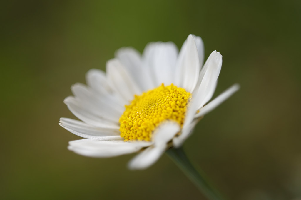
They open as daisy fit by simple.joy, on FlickrHowever being a triplet and a prototype lens without any kind of real body or lens shade, it's quite prone to act in weird ways to direct or stray light and that's what I tried to use here. I get that it's not visually appealing to most people. Even I can't say that I enjoy bokeh like that in most of my shots, but it was quite intentional here. The series you're talking about could be an interesting undertaking - I agree that this is probably not the best lens for such a thing though.
-

A
Or B
-

Holland FlowerlandAt Jim's suggestion, I improved the darkness.
Do you no longer see this photo in comments from others? It's a mystery to me what goes wrong, but I'll leave it as it is now.Lou
-
Love the composition with the beautiful lines and the colors as well - excellent shot!
-

In my personal experience, birds are notoriously difficult to frame effectively and employ in a bigger composition.
I seem to always get the angle wrong.
And when the angle is half decent, there are always wings, necks, beaks or feet that don't want to cooperate and be framed well against a background.
So (again in my experience) i consider it quite the success to get ONE bird well in a frame.
Minnie, on the other hand, routinely makes images that contain three or more birds (four in this case) that all contribute to a pleasing overall composition.
There is one that stands proud and strutting, a dark silhouette perfectly isolated against a light background.
There is another, smaller, one, who seems to mind his own business: his light presence is just perfectly placed to be framed against brutal concrete.
Those are the static extras.
And then there are two main characters, all dynamics and action, with necks perched and wings unfolded, framed against two different strips of medium-coloured concrete.
How does she do that?
It this luck or patience (or both).
They say that luck favours those who come prepared.
I think that Minnie is routinely supremely prepared.
She knows this environment. She knows the water and the light and how they interact at different times of day. She knows the birds and their expected behaviour.
It is a knowledge that cannot be replaced by any amount of sheer luck. -
This is the kind of image where it is easy to get the dimensions wrong as a viewer.
What is sticking out towards us?
What is a zone that recedes into depth?
(Talking about this phenomenon, my wife always gives the example of how she could never un-see the batman logo from the Burton logo as not being a black symmetrical bat against a yellow background, but instead in her eyes, it was always a mouth spread wide open, with weird teeth.)
Images that create such an illusion are the express way towards successful abstraction.
And this is one of them.
The only small little element that gives away what we are actually looking at, even at first glance, is the electrical circuit box on the nearest bright wall. -
I am glad that multiple images from the same session are posted. It is always interesting to consider the artist's decisions in selecting which image to present. That is why I love looking at contact sheets from photo sessions (the wonderful book "Magnum Contact sheets" are a treasure trove for that kind of exercize).
In this case I agree with Minnie on her preference for the first additional image, and also with the reason why. Looking at your initial image by itself, there was something that rubbed me the wrong way, but I could not really pinpoint what. The eyes were OK with a nice catchlight. I also like the very tight framing. (For portraits I have been known to frame so tightly that even just one eye (or an eye and a half) are in the image, with just a bit of hair and half a chin.)
But is was the bow intersecting with the lip that bothered me a bit, and that becomes clear when looking at the other images.
The first additional image gets it all right.
The second additional image is less successful, because the bow becomes just a diagonal stripe with less purpose.
The third additional image has a strong leading line, but the face being straight yanks the image out of the "violinist performing" illusion towards being a more conventional portrait.
I do like the portrait of the man but would crop it tighter. Maybe square, losing almost all the black on the right of the instrument and most on the other side.