This is a fine shot, so I have nothing extra to say about what others have said. In addition to the fact that the analog cameras sometimes show something extra in the atmosphere of the object and the light distribution. Congratulations on this one.
Lou
-
-
Hi Linda,
A café interior from the fifties, which was also used in private homes. The nice thing is that the upright legs here symbolize the transience of fashion styles.
ByTheWay, meanwhile, the fifties style is popular again.
Lou -
-
@Rich42 has written:
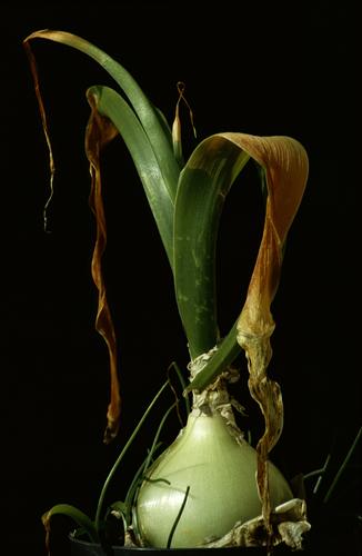
Sprouting Onion
Olympus OM-2n SLR, Zuiko 100/2.8, ~f/4, Ektachrome 200 Daylight film, drum scanThis is gorgeous to study and admire. Not just the colors, but the lines and textures. Would love to have a series to hang in my large kitchen, if I had one (a kitchen, that is 😁 )
-
@LouHolland has written:
Highly imaginative. I love the way your mind works!
-
@LindaS has written:@Rich42 has written:
Sprouting Onion
Olympus OM-2n SLR, Zuiko 100/2.8, ~f/4, Ektachrome 200 Daylight film, drum scanThis is gorgeous to study and admire. Not just the colors, but the lines and textures. Would love to have a series to hang in my large kitchen, if I had one (a kitchen, that is 😁 )
Roel, Lou and Linda . . .
Thank you so much.
Rich
-
@LouHolland has written:@Bryan has written:
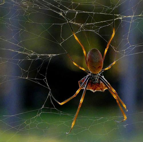
A Golden Orb weaver with lunch. Relatively non toxic and not aggressive. So you can sleep easy...
Brian Hi,
Do you have any idea what the prey is, it seems quite big for a web.
Nicely rendered and good background colour. It makes the spider stands out
LouHi Lou,
Yes I photographed it and a google search revealed it as a Bronze Orange bug - Musgraveia sulciventris - another type of stink bug
I put a pic of it in the Nature & Wildlife forumdprevived.com/t/spiders/3680/post/41606/
@LindaS has written:I adore spiders! The light and color of this is highly appealing. Re the comment about the prey's size, I wonder if it is what caused all the apparent damage to the web or Ms. Golden was simply lazy that morning 😃
Hi Linda,
I wondered about the state of her web. I don't think that particular prey would have done that. Maybe a strong wind or some other prey (I read they are known to catch small birds and snakes!!!). Many species of that spider have quite irregular webs. The silk is quite strong, stretchy and sticky. You know it when you walk into one...@ChrisOly has written:Excellent framing and background for that subject. Also, the colours of the spider are just outstanding in their prominence. Well seen and captured.
Hi Chris,
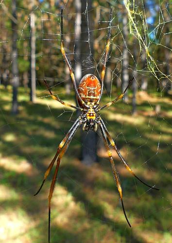
My OOC jpgs require at least some contrast and saturation boost and highlight reduction in pp or they are quite washed out. It was fortunate it was overcast and diffuse light - also showing her translucent legs. There was quite a crop there to fill the frame and keeping the left tree allowed a wider frame and an approximate rule of thirds.Thank you all for your positive comments.
And here is the underside - quite close and personal to get this macro shot... I couldn't get up high enough to block the sun so a lot of speckles...
-
@RoelHendrickx has written:
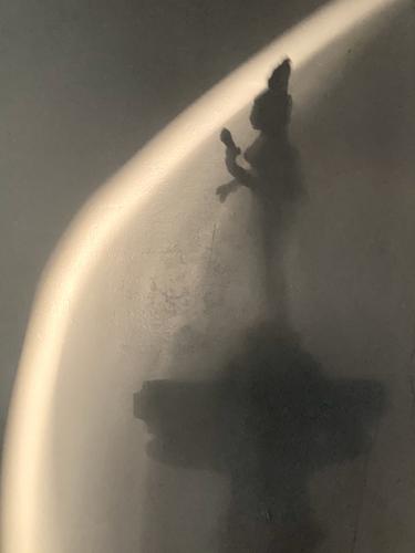
Tourism in our own home, 10 days ago.
Sometimes all it takes is to go down the stairs for coffee to take up to the bedroom.Early sun lightplay on the little statuette of the 2-in-1 unity of Shiva and Parvati that adorns our ground floor staircase railing.
The god and goddess were engaged in a dancing competition in which the male Shiva had an unfair advantage over his spouse.
They made up in the best way possible, creating a new depiction of their everlasting unity: a representation that is literally half man and half woman.
(This is a —for us — very meaningful souvenir from our India trip.)This is an intriguing image because of the use of blur and light. The composition is interestingly bisected diagonally and its curve envelops the statue with light that we don't find any explanation of but can still appreciate. The softness of the capture is no bother to me because it comes across more as an abstract than a standard representation photo, though it lies somewhere in between. The gold toning is very effective in mood creation. My only quibble is the artifacts or something in the area between the dark and light in the curve, but it's not that troublesome and may have some meaning for those who share a home with this statuette. Good work! Again proof that nice images don't require travel, even though travel is fun.
-
@MikeFewster has written:
I'm not sure how this will show up on the forum. I'm trying to post a series of photos that have something of the madness of Naples at the time they won the Italia Cup. At the time there were photo opportunities everywhere. It's difficult to make a selection. I won't, at this time of posting, explain why I selected these as a group.
They are a fine series. As a mother and grandmother of various-aged soccer enthusiasts, I appreciate the vigor and emotion of this set - you captured the crowd from dogs to babies to crowds in the streets. The flags hold the set together (my 13 year old grandson keeps the flag of his favorite European team with him at all times, and it travels with him to his own tournaments for inspiration). And of course there is homage to Maradona, a figure of heroic status there. Soccer (or football) evokes intense loyalty, joys and sorrows and you show it all.
-
@ChrisOly has written:
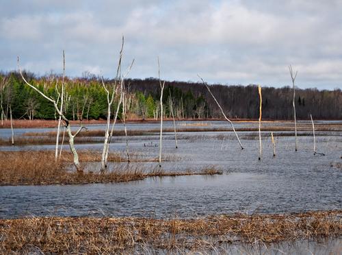
Sticks and no stones
A rather perfectly exposed scene that's not the standard glamour photo of a landscape, but you give us the feel of a real place - the bare trees in the foreground suggest some change in the environment, perhaps an increase or change in the water, has made the place inhospitable for the trees. They are a vestige of what was there in an earlier time before water and marsh grasses took over. In the distance we see the foliage that tells us this is not a seasonal bare-ness but a change. The sky is full of wonderful puffy clouds that could be rendered with more drama but that would detract from the story implied here. Nice image.
-
@Bryan has written:
A Golden Orb weaver with lunch. Relatively non toxic and not aggressive. So you can sleep easy...
Lovely. These ladies are so pretty and their webs so artistic. I always look forward to their season which is October here. The light you've caught her in is perfect and renders her gold bars almost like their own light source. Looks like she's backlit, her most photogenic angle. Here you've got out of focus elements but they are so extremely out of focus that it works in your favor: they form a colorful frame without distracting from your main image. Well done.
-
@JimKasson has written:
Hi Jim,
When I brought up a similar image in the C&C thread years ago, I got negative responses to the same composition as what I see here, which is that the main character on the left who gets the most attention almost walks out of the frame to the left, causing him to loosen up as well. of the other musicians appears to be on the right. That makes his position meaningless as he no longer seems connected to the rest. In this way it absorbs a lot of attention while taking up less than a third of the frame with no further visible connection.
I'm curious about your opinion on thisBy the way, the mono processing is a good choice here, Lou
-
@WhyNot has written:
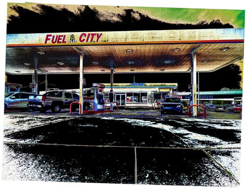
Fuel City
WhyNot
Here you have given us a photo of a very ordinary location that would appear to lack photographic appeal and turned it impactful with your editing. You've done that by altering and sometimes enhancing, sometimes reducing the color palette, by overemphasizing detail, and by putting the whole thing off kilter: the capture is skewed, and so is the frame. The off balance nature of it makes us keep on looking to try to resolve that problem, and meanwhile we find other details. It's an image makes us smile but at the same time has an ominous undertone. As does much of modern life. Nicely done.
-
@PeteS has written:
A Dawn
A time of new beginnings, new hope and new opportunities.
This has strong visual appeal even before we have time to dissect it. There is a sense of peace, and of transcending time. The temple or monument on the left looks ancient, elaborate, and important, with tiny balanced design details to explore. Yet right next door is a less auspicious building with more typical modern appearance and even a graffiti panel. Between them lies the rising sun, huge as it looms above the horizon, and captured in more detail than is usually seen. The finishing touches are the birds, one of them amazingly caught in front of the sun, exiting stage right, emblems of hope. A lovely and frameable image.
-
@LouHolland has written:
...the main character on the left who gets the most attention almost walks out of the frame to the left, causing him to loosen up as well. of the other musicians appears to be on the right. That makes his position meaningless as he no longer seems connected to the rest
That disconnect is pretty much the point of the image.
-
@ChrisOly has written:
Sticks and no stones
This scene reminds me very much of my home state of Maine. In fact, I zoomed in to see if I could find a moose standing in the shallows along the shore 😃
I'm drawn to the sunlit pop of color, but it's the layers of horizontal lines of grasses and weeds cross-cut by the "sticks" that draw me in. Atmospheric sense of place, visually rich.
-
@JimKasson has written:@LouHolland has written:
...the main character on the left who gets the most attention almost walks out of the frame to the left, causing him to loosen up as well. of the other musicians appears to be on the right. That makes his position meaningless as he no longer seems connected to the rest
That disconnect is pretty much the point of the image.
Jim, I wish I done a little more analysis of your photo before reading comments. I thought that the disconnect was probably what caused you to take the picture, but I didn't try to figure out what was going on or why. Through reading everyone's feedback about most of the photos posted every week, I'm slowly gaining ability to see beyond the obvious. Thank you for the challenge!
-
@LindaS has written:
CLOSED
That's a winner. A classic diner, black and white tile floor and red upholstered chrome chairs, 50s napkin holder. This is so much better than a shot of the place open and chairs right side up. This one has a story. The light is exquisite, and the slight specular reflections on the chrome expand the story and mood. Instant appeal whether you're approaching it from nostalgia, art/design, color, or just plain light, it's a very good one.
