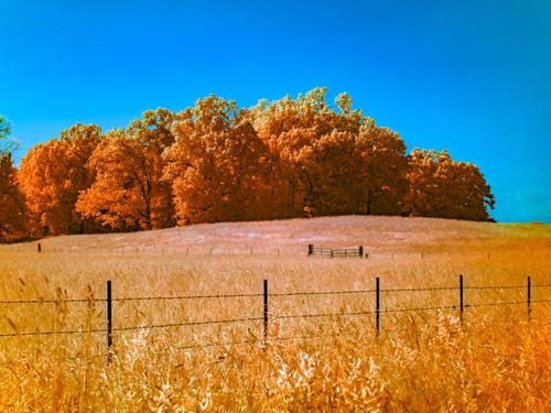
Just the R72 and pushing around the results in ACR to get fun colors.
-
-
@MikeFewster has written:
*If it should be the case that A1 so devalues photography that it becomes meaningless, I'd be confident that we'd have a resurgence of analogue and film as mediums for "art."
What non-capitalist world do you live in? The cost of film is already too expensive now. By the time this recurrence would have to happen, rolls of 35 would probably be $150 each just to manufacture. I'm sure I'm being hyperbolic on the cost, but as this process currently "dies" having to restart it, after it goes away, would be tremendously expensive to the point it would seem utterly cost prohibitive.
Besides, the plan is that we're all gonna go back to cave painting by torchlight to keep it really real. :)
-
@OpenCube has written:@MikeFewster has written:
*If it should be the case that A1 so devalues photography that it becomes meaningless, I'd be confident that we'd have a resurgence of analogue and film as mediums for "art."
What non-capitalist world do you live in? The cost of film is already too expensive now. By the time this recurrence would have to happen, rolls of 35 would probably be $150 each just to manufacture. I'm sure I'm being hyperbolic on the cost, but as this process currently "dies" having to restart it, after it goes away, would be tremendously expensive to the point it would seem utterly cost prohibitive.
Besides, the plan is that we're all gonna go back to cave painting by torchlight to keep it really real. :)
You don’t need to buy film to do chemical photography. You can use wet plates, for example. You don’t need to buy photographic paper either. There are lots of print processes where you can coat your own paper.
-
@MikeFewster has written:
If it should be the case that A1 so devalues photography that it becomes meaningless, I'd be confident that we'd have a resurgence of analogue and film as mediums for "art." Something like what has happened with vinyl v cd and streaming. With film cameras, it is probably underway. I'd be happy. Prints have always seemed to me to be the way to view photos. Could the increasing interest in monochrome cameras be a signpost?
My personal thoughts (and I'll freely admit also mostly gut feeling) are, that this is the least of the concerns we're going to have. But again - I hope you're right and I'm more than happy to be wrong and if debating with myself if I want to finally get an enlarger to accompany my collection of enlarging lenses in 10 to 15 years is my biggest struggle, consider me one happy camper!
Anyway... that's mostly off-topic here, I guess, so here are two images (made with industrial lenses from the past):

Breaking the fabric of space time... by simple.joy, on Flickr
Snakes on a plain by simple.joy, on Flickr -
@PeteS has written:
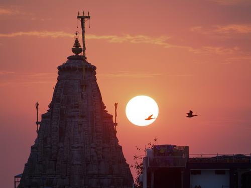
A Dawn
A time of new beginnings, new hope and new opportunities.
A number of things come together here. The dominating shape of the temple with touches of unexpected protusions that give get us thinking about where we are. The orange/red of sunrise/sunset along with the sun orb. The positioning of the birds- especially the helpful one that crossed the sun. I like the plants clinging to the wall and I like them as a foil to the man made shapes attached to the walls opposite.
It all adds up to a recording of the kind of moment that gets people to build temples in the first place. -
-
@OpenCube has written:
I can't see any purpose behind the colour transformations you have made here.
-
@OpenCube has written:@MikeFewster has written:@OpenCube has written:@MikeFewster has written:
*Doesn't bother me either. I also see it is part of the process and in the same basket as dodging and burning.
Bothers me Jake. Bothers me.
IMNHO, it depends on the purpose of the image. Creating images has always been part of photography. If the image is for journalism or evidence, that's a different matter. One of the consoling things about digital photography is that the general public are now more aware than they once were about what might have taken place in the making of the image. We know more about what questions need to be asked before accepting the "evidence" from an image.
I have no issue with humans, taking time and effort, learning, growing, and applying themselves, but this continuing devaluing of creative skills to button clicks is a forebearer of nothing but bad news for the arts and those trying to make a living off it. I love tech in the arts, but tools that replace effort and learning will not make a better artist or artistry and it will make a crowded market even more so. I can honestly see a future where photography is still a thing, but photographer as a paid job will be non-existent because tech will have fully replaced the job. Disney probably salivates at the possibility of droids running around taking pictures and charging customers $50 a photo.
I just spent the last 2 years watching people act like doctors across the globe are trying to con everyone and millions died over this all because people read something on the internet and ran with it. I wouldn't trust the public for much with being critical in thought about anything.
I'm not attacking the images you post, I'm trying to find consistency between the PP techniques you explore and what you are saying here about technology and art.
I agree with you about the internet and its power though. -
@Bryan has written:
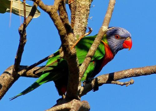
Rainbow Lorikeet, had been feeding in this bottle brush tree.
Rainbow Lorrikeets and bottlebrush! That's an Australian combination with eye popping color possibilities. I'll get to the actual photo in a moment but I gotta say that the photo doesn't have the colours of the bottlebrush and only partly shows that of the lorikeet. A further aside. I'm in southern Italy and bottle brushes and eucalyptus trees are everywhere, as they are in Spain.
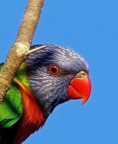
Back to the photo. The head, the beak and the red rimmed eye that seems to look straight at us, plus the small area red breast, all are what get my attention. The branches and the rest of the bird all seem to get a bit jumbled with visual lines that take the eye to them but there isn't something there we want to see. There is a largish dark area instead. What about a crop of the head/eye/beak portion?
-
@RoelHendrickx has written:
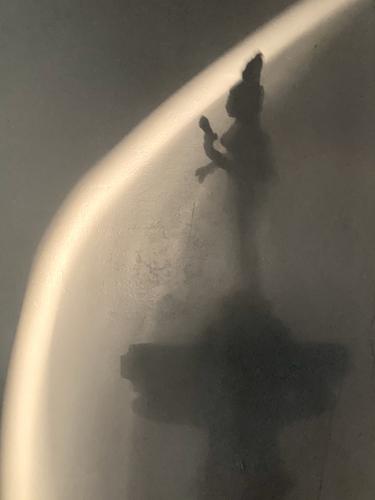
Tourism in our own home, 10 days ago.
Sometimes all it takes is to go down the stairs for coffee to take up to the bedroom.Early sun lightplay on the little statuette of the 2-in-1 unity of Shiva and Parvati that adorns our ground floor staircase railing.
The god and goddess were engaged in a dancing competition in which the male Shiva had an unfair advantage over his spouse.
They made up in the best way possible, creating a new depiction of their everlasting unity: a representation that is literally half man and half woman.
(This is a —for us — very meaningful souvenir from our India trip.)This one proves you don't need total sharpness, exquisite detail and a huge dynamic range to make a compelling image, in fact this photo lives from just the opposite. It provides just enough information to allow the HI (human intelligence, as opposed to artificial intelligence) to generate the missing details, in whatever way it feels.The fact that, despite its appearance, it was created within your own home is a challenge to see our own surroundings a little more creatively.
Pete
-
@MikeFewster has written:
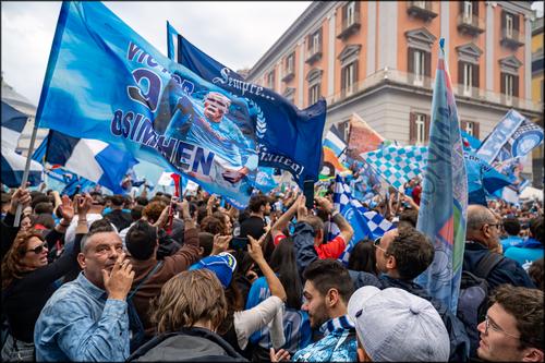
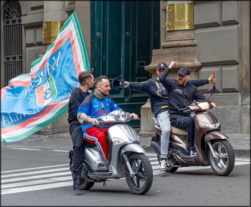
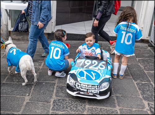
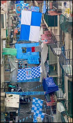
I'm not sure how this will show up on the forum. I'm trying to post a series of photos that have something of the madness of Naples at the time they won the Italia Cup. At the time there were photo opportunities everywhere. It's difficult to make a selection. I won't, at this time of posting, explain why I selected these as a group.
As a football fan, this one speaks to me! Your photos convey the joy at becoming Serie A Champions very well, and the joy is even greater, since Napoli last won the league in the days of Maradonna, who is still idolised today, as the photos show. I think the extra dose of emotion of finally beating the big money regular contenders is visible here too. Unfortunately the German league has just seen Bayen Munich win the league for a boring 11th time in a row, so hopefully Eintracht Frankfurt will win the cup on Saturday!
The selection of photos is good too: the fans, the ecstatic motorcade,the kids and the homes, all linked by the sky blue colours.Pete
-
@Bryan has written:
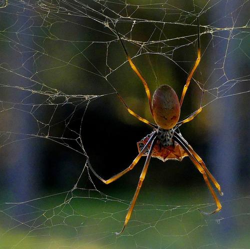
A Golden Orb weaver with lunch. Relatively non toxic and not aggressive. So you can sleep easy...
I'm sure it would be creepy in real life, but in the photo, the spider looks beautiful. I like the way it seems to glow against the dark background. and the frame created by the torn web.
This is not just a good macro, but a very attractive image.Pete
-
@ChrisOly has written:
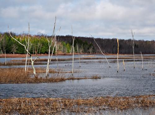
Sticks and no stones
I like the scene, but I agree with the suggestion to crop off the reeds at the bottom, which distract from those stark dead trees.
Pete
-
@minniev has written:
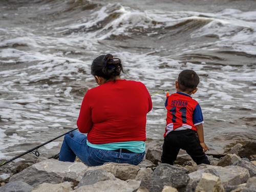
Learning To Fish
Traditional knowledge tells us photos of the backs of humans are uninteresting but sometimes I try it anyway.
The people I meet beneath the dam do not have boats or piers to fish from. Like the birds, they work in challenging environments to make their catch. And the catch goes on the table, not back in the water.
Your text gives this photo extra significance, and we can see the rough, grey water as an allegory for the trials of their life. Their bright red clothing links the mother and child and also sends a bright message of hope. Or is it danger? It is also endearing to see them sharing their interest and learning to fish.
Pete
-
All of your work is very interesting.
-
@LindaS has written:
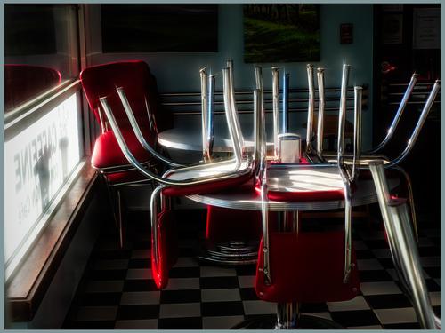
CLOSED
The diner may be closed at the moment, but the rich reds, the chrome shining almost to the point of burning out and the deep black shadows give off a feeling of youthful exuberance, which suggests the place is very much alive. I like the flare effect on the chrome and reds, which is just enough to be effective, but not enough for it to seem gimmicky. The composition works well toowith the window sill on the left matched by the chair legs on the right, for instance. I also like the fact that the pictures on the wall and the chequered floor tiles are only hinted at in the darkness. They add interest and character, but do not distract, which I think would have been the case, if they had been shown in bright light.
Pete
-
@WhyNot has written:
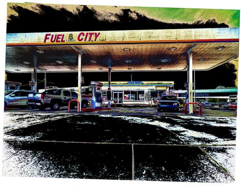
Fuel City
WhyNot
I want to thank all who stopped by long enough to look and think about his picture .. particularly LindS, Chis, Minniev, and Mike who gave much too kind critiques. I can only say that as I have taken these pictures I seem for some reason to have become darker and more gritty in my view ... I always consider the file that comes from the camera as a sketch that I may accept or modify to fit my mood and how I see the world at that time .... and it does change ...
The solarisation (?) is a really effective choice for PP here and really enhances the original, and gives it a real twist and strong voice. The black ground looks like an oil-spillage, and the black sky looks like wild air-pollution. Even the underside of the roofing seems to have been blackened by poorly controlled exhaust fumes! Everything is absolutely perfect for a business named Fuel City.
This could be a poster for an environmental campaign. A superb image.Pete
-
@MikeFewster has written:@Bryan has written:
Rainbow Lorikeet, had been feeding in this bottle brush tree.
Rainbow Lorrikeets and bottlebrush! That's an Australian combination with eye popping color possibilities. I'll get to the actual photo in a moment but I gotta say that the photo doesn't have the colours of the bottlebrush and only partly shows that of the lorikeet. A further aside. I'm in southern Italy and bottle brushes and eucalyptus trees are everywhere, as they are in Spain.
Back to the photo. The head, the beak and the red rimmed eye that seems to look straight at us, plus the small area red breast, all are what get my attention. The branches and the rest of the bird all seem to get a bit jumbled with visual lines that take the eye to them but there isn't something there we want to see. There is a largish dark area instead. What about a crop of the head/eye/beak portion?
I agree with what Mike has said and done here. The bottlebrush tree, if it had the usual blooms on it, would have added a lot. The harsh light that turned the beautiful bird's midsection into a puddle of shadowed confusion was not your friend. I doubt you could retrieve enough from the shadows to make it work - the retrieved areas would probably be noisy and less saturated and give away the retrieval. I would try, but would not be optimistic about it. But the interesting crop shows you do have a quality photo in there, waiting to be discovered, tack sharp, with beautiful details and colors.
