These are so interesting, especially the last one (love the name too) of the red bokeh ball caught in the grip of twisted broken wire.
-
-
@MikeFewster has written:@JimKasson has written:@MikeFewster has written:@JimKasson has written:
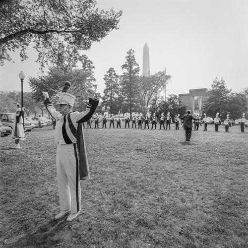
The problem I have with this shot is the positioning of the two figures on the left side close to the frame edge, especially the largest closest to the camera. We can see just enough of the band uniforms to be confident that the two figures are part of the performance. The remoteness of the two, especially the man with his back turned to the conductor and musicians, is what gives the shot its bite. The trouble is, as shown, I can't believe it. Being so close to the left edge, we can't see what is in front of them. My head makes the assumption and fills in the dots that something/someone is before them. and cut off by the left edge. While this may not be so, it feels to me that this is what's happening rather than that they are performing and involved with those behind them at that distance.
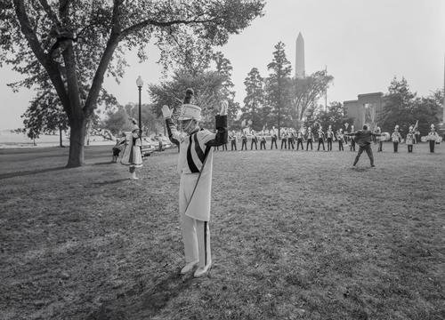
Like this better?
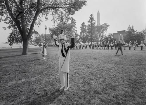
And lose the cars?
Exactly what I had in mind. IMNHO it now works better because the somewhat wacko relationship of the front performer to the group is now apparent. With or without the cars doesn't seem an issue but I really like the conductor's extended arms in the new versions. The energy he is pumping in underlines the remoteness from the closest performer.
How do you see it Jim?I totally get what Mike has said here and agree with what he says about the revised image, but I am still torn between the new and original version. The disconnected character, who was jammed up against the edge of the frame and looking out, breaking the rules of harmonious composition, seems even quirkier and more of an outsider in the first version than in the more pictorially balanced second version. The situation is explained more clearly in the reworked version, but is that a good thing? I am undecided at the moment and could live with either.
Pete
-
@Rich42 has written:
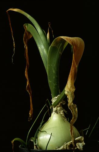
Sprouting Onion
Olympus OM-2n SLR, Zuiko 100/2.8, ~f/4, Ektachrome 200 Daylight film, drum scan1982
I was helping a friend clean up the back yard of a place into which she had recently moved. There was a row of pots with planted onions left on the fence by the previous tennant. They hadn't been watered in weeks and were bone dry, resulting in the withered leaves and remarkable color. I gave them all water.Edit: The forum software has pulled the drum scan info out of the file (D4000/Howtek). I didn't even know it was in there.
The quality of the light and the colours are remarkable and well worth scanning. As is so often the case, the beauty of the plant is enhanced by its imperfections and without the drying and dying leaves, the image would lose the contrasting brown colour and the contrast between the living and dying parts of the plant. The bottom is tightly cropped, but actually, I don't think it detracts, as we are used to seeing plants "cropped" by the soil and there is still plenty to see as shown.
Excellent image.Pete
-
@OpenCube has written:
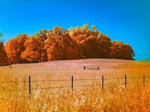
The complementary colours of orange/yellow and blue make this attractive, although it is a shame they go a bit green in the transition.
I'm not sure about the fences. They almost zig-zag as a leading line, but not quite, and so form a bit of a visual barrier into the image. However, they are so thin and the nearer fence so low in the frame, that they don't ruin the shot.Pete
-
@simplejoy has written:
Another shot for a flickr group weekly theme, which was "10:10". Didn't quite know what to do with that theme and was very busy anyway. In the last two hours before the deadline I had a couple of ideas and decided to try it anyway. So here's a shot with everyone's favorite Steinheil V-Cassarit 50 mm f/3.5 *(enlarging lens)
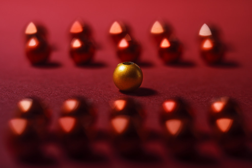
Ten up, ten down! by simple.joy, on Flickr- it's not! 😅
Actually, that is a creative answer to your 10:10 challenge, with your playful use of focus and the lens characteristeics and introducing the golden bead as a focus point.
Pete
-
@LouHolland has written:
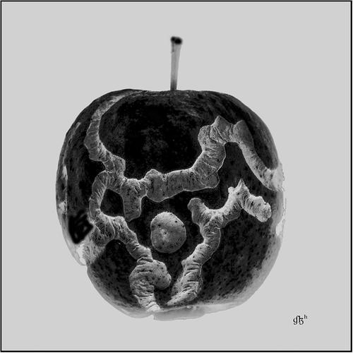
Showing the wormholes in the apple is a clever idea and well executed.
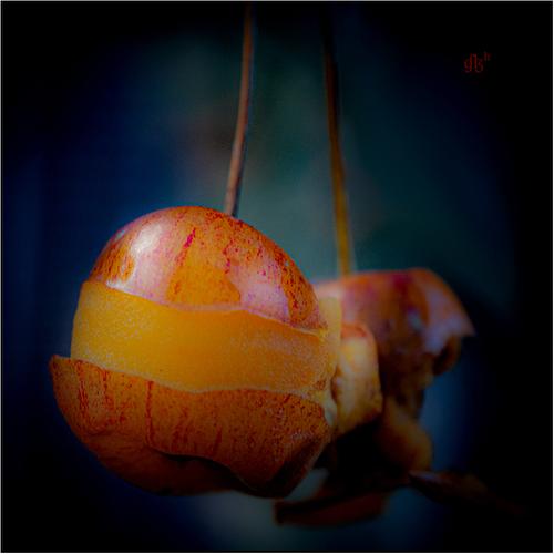
What are the fruit in the second? The stems seem too long for apples. In any case the image seems to be coloured with an orange wash over the exposed flesh abd a blue-green over the background. However it has been done, it is quite effective and gives it a depth and also a dream-like quality.
Pete
-
@PeteS has written:@LindaS has written:
CLOSED
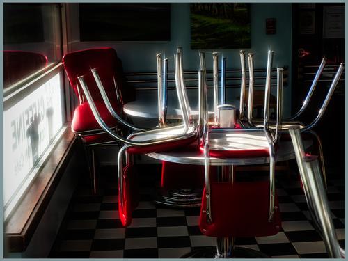
The diner may be closed at the moment, but the rich reds, the chrome shining almost to the point of burning out and the deep black shadows give off a feeling of youthful exuberance, which suggests the place is very much alive. I like the flare effect on the chrome and reds, which is just enough to be effective, but not enough for it to seem gimmicky. The composition works well toowith the window sill on the left matched by the chair legs on the right, for instance. I also like the fact that the pictures on the wall and the chequered floor tiles are only hinted at in the darkness. They add interest and character, but do not distract, which I think would have been the case, if they had been shown in bright light.
Pete
Many thanks for your in-depth analysis and feedback!
-
@MikeFewster has written:@Bryan has written:
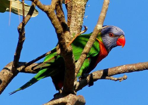
Rainbow Lorikeet, had been feeding in this bottle brush tree.
Rainbow Lorrikeets and bottlebrush! That's an Australian combination with eye popping color possibilities. I'll get to the actual photo in a moment but I gotta say that the photo doesn't have the colours of the bottlebrush and only partly shows that of the lorikeet. A further aside. I'm in southern Italy and bottle brushes and eucalyptus trees are everywhere, as they are in Spain.
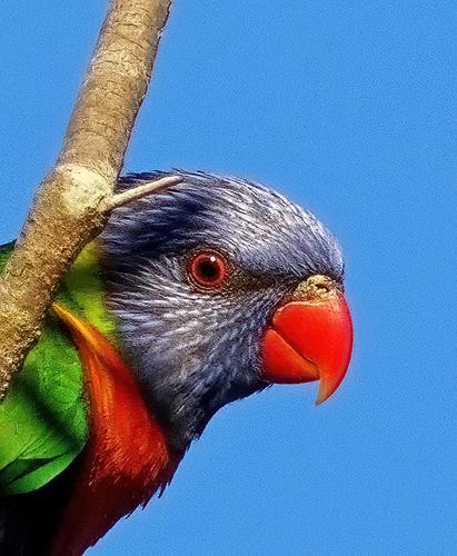
Back to the photo. The head, the beak and the red rimmed eye that seems to look straight at us, plus the small area red breast, all are what get my attention. The branches and the rest of the bird all seem to get a bit jumbled with visual lines that take the eye to them but there isn't something there we want to see. There is a largish dark area instead. What about a crop of the head/eye/beak portion?
The original shows the lorikeet playing peek-a-boo through the branches, although a bird that coloueful must find it impossible to hide!. The branches are a bit busy, and the leaf top left is a distraction, so I find Mike's suggested crop to be a good idea.
Pete
-
@minniev has written:@simplejoy has written:@MikeFewster has written:
If it should be the case that A1 so devalues photography that it becomes meaningless, I'd be confident that we'd have a resurgence of analogue and film as mediums for "art." Something like what has happened with vinyl v cd and streaming. With film cameras, it is probably underway. I'd be happy. Prints have always seemed to me to be the way to view photos. Could the increasing interest in monochrome cameras be a signpost?
My personal thoughts (and I'll freely admit also mostly gut feeling) are, that this is the least of the concerns we're going to have. But again - I hope you're right and I'm more than happy to be wrong and if debating with myself if I want to finally get an enlarger to accompany my collection of enlarging lenses in 10 to 15 years is my biggest struggle, consider me one happy camper!
Anyway... that's mostly off-topic here, I guess, so here are two images (made with industrial lenses from the past):

Breaking the fabric of space time... by simple.joy, on Flickr
Snakes on a plain by simple.joy, on FlickrThese are so interesting, especially the last one (love the name too) of the red bokeh ball caught in the grip of twisted broken wire.
"Photography" is an extremely broad category. I have given up trying to define it and what might be considered a photograph. With images like these I stop thinking about the process and consider simply my reaction to shapes and colours.
Number One. Space/time/the universe and all that. I like the soft focus of the planet like orb as compared to the sharp edges and complex detail of the shape emerging from the right. Kubrick, then Star Wars accustomed us to large objects sliding into view when approaching distant planets or similar. distant planets. All the web like matter suugets threat to the distant, soft object.
Number Two is more difficult. I like the red ball that seems to be in a force field between the points. The hot red goes along with this response. The whole image reminds me of a Miro painting. I like it. something to do with the fuzzy v sharp and the hot red v blue/greys. -
@PeteS has written:@MikeFewster has written:@JimKasson has written:@MikeFewster has written:@JimKasson has written:
The problem I have with this shot is the positioning of the two figures on the left side close to the frame edge, especially the largest closest to the camera. We can see just enough of the band uniforms to be confident that the two figures are part of the performance. The remoteness of the two, especially the man with his back turned to the conductor and musicians, is what gives the shot its bite. The trouble is, as shown, I can't believe it. Being so close to the left edge, we can't see what is in front of them. My head makes the assumption and fills in the dots that something/someone is before them. and cut off by the left edge. While this may not be so, it feels to me that this is what's happening rather than that they are performing and involved with those behind them at that distance.
Like this better?
And lose the cars?
Exactly what I had in mind. IMNHO it now works better because the somewhat wacko relationship of the front performer to the group is now apparent. With or without the cars doesn't seem an issue but I really like the conductor's extended arms in the new versions. The energy he is pumping in underlines the remoteness from the closest performer.
How do you see it Jim?I totally get what Mike has said here and agree with what he says about the revised image, but I am still torn between the new and original version. The disconnected character, who was jammed up against the edge of the frame and looking out, breaking the rules of harmonious composition, seems even quirkier and more of an outsider in the first version than in the more pictorially balanced second version. The situation is explained more clearly in the reworked version, but is that a good thing? I am undecided at the moment and could live with either.
Pete
I have waited long to comment on this image, and now Pete has beaten me to it, articulating what I also felt.
I do not mind (at all) the unconventional composition of the original image: the lone main subject close to the image's edge gives us a beautiful speculation about what is just outside the frame: is there a whole other band there, and is he conducting? Or is he just isolating himself for a moment and stretching his arms, maybe nervous because his band is about to perform on this apparent jamboree. I like that ambiguity.
The revised and AI enhanced image (though technically well done) loses that magic of uncertainty. Now there is just empty grass in front of him.Moreover, I really liked the square crop: it had an internal logic of lines and tensions. That unravels in the wider version.
-
@minniev has written:@MikeFewster has written:@Bryan has written:
Rainbow Lorikeet, had been feeding in this bottle brush tree.
Rainbow Lorrikeets and bottlebrush! That's an Australian combination with eye popping color possibilities. I'll get to the actual photo in a moment but I gotta say that the photo doesn't have the colours of the bottlebrush and only partly shows that of the lorikeet. A further aside. I'm in southern Italy and bottle brushes and eucalyptus trees are everywhere, as they are in Spain.
Back to the photo. The head, the beak and the red rimmed eye that seems to look straight at us, plus the small area red breast, all are what get my attention. The branches and the rest of the bird all seem to get a bit jumbled with visual lines that take the eye to them but there isn't something there we want to see. There is a largish dark area instead. What about a crop of the head/eye/beak portion?
I agree with what Mike has said and done here. The bottlebrush tree, if it had the usual blooms on it, would have added a lot. The harsh light that turned the beautiful bird's midsection into a puddle of shadowed confusion was not your friend. I doubt you could retrieve enough from the shadows to make it work - the retrieved areas would probably be noisy and less saturated and give away the retrieval. I would try, but would not be optimistic about it. But the interesting crop shows you do have a quality photo in there, waiting to be discovered, tack sharp, with beautiful details and colors.
The very tight crop on the bird's face is an excellent idea.
Almost everything that got deleted here, was a distraction.
But most importantly: this crop made me realize what fine feather detail there is on that head, and also it made me remark the catchlight in the eye, creating a sense of the bird making eye contact.
In the uncropped image, I had not remarked those details at all. -
@PeteS has written:@LouHolland has written:
Showing the wormholes in the apple is a clever idea and well executed.
What are the fruit in the second? The stems seem too long for apples. In any case the image seems to be coloured with an orange wash over the exposed flesh abd a blue-green over the background. However it has been done, it is quite effective and gives it a depth and also a dream-like quality.
Pete
I wasn't sure about photo two either. Looking again, I think Lou has created the Orpple, a fruit that combines the best of oranges and apples. It will be immensely popular with fruit salad makers and Lou will make a fortune.
-
@minniev has written:@simplejoy has written:
Another shot for a flickr group weekly theme, which was "10:10". Didn't quite know what to do with that theme and was very busy anyway. In the last two hours before the deadline I had a couple of ideas and decided to try it anyway. So here's a shot with everyone's favorite Steinheil V-Cassarit 50 mm f/3.5 *(enlarging lens)

Ten up, ten down! by simple.joy, on Flickr- it's not! 😅
The larger in focus golden bead is set off nicely by the matched groupings of smaller OOF red ones with their cool triangle bokeh. A visually pleasing image that falls in the realm of the abstract.
Some people are symmetrically orientated and some aren't. The symmetrically orientated are driven nuts by things like earrings that don't match. Vice versa for the other group. I think it is something like left and right handedness. Me, I'm firmly in the non symmetrical group (unless the symmetry occurs accidentally in something like a landscape.)
All of which means that this image simply doesn't appeal to me while I am quite sure it will be different for those on the other side. This is a personal idiosyncrasy. -
@PeteS has written:
What are the fruit in the second? The stems seem too long for apples. In any case the image seems to be coloured with an orange wash over the exposed flesh abd a blue-green over the background. However it has been done, it is quite effective and gives it a depth and also a dream-like quality.
Pete
@MikeFewster has written:I wasn't sure about photo two either. Looking again, I think Lou has created the Orpple, a fruit that combines the best of oranges and apples. It will be immensely popular with fruit salad makers and Lou will make a fortune.
Has Lou replied yet? It looks like a pluot - a real life hybrid of apricot and plum, quite delicious 😃
-
@Bryan has written:
The cropped version and comments about the resulting improvements are worth the price of admission to this week's thread 😁 Fantastic educational moment for me as interested observer.
-
@LindaS has written:@Bryan has written:
The cropped version and comments about the resulting improvements are worth the price of admission to this week's thread 😁 Fantastic educational moment for me as interested observer.
Agree, Linda.
That is what we are here for.
It's the interaction that creates a unique value.
Roel -
@RoelHendrickx has written:
I have waited long to comment on this image, and now Pete has beaten me to it, articulating what I also felt.
I do not mind (at all) the unconventional composition of the original image: the lone main subject close to the image's edge gives us a beautiful speculation about what is just outside the frame: is there a whole other band there, and is he conducting? Or is he just isolating himself for a moment and stretching his arms, maybe nervous because his band is about to perform on this apparent jamboree. I like that ambiguity.
The revised and AI enhanced image (though technically well done) loses that magic of uncertainty. Now there is just empty grass in front of him.Moreover, I really liked the square crop: it had an internal logic of lines and tensions. That unravels in the wider version.
Thanks. I don't think I'll change how I print this image. Square with visual tension is how I saw it at the beginning, and though the image with the additional AI elements is appealing to me, I like to go with my initial take if I can.
-
@MikeFewster has written:
Rainbow Lorrikeets and bottlebrush! That's an Australian combination with eye popping color possibilities. I'll get to the actual photo in a moment but I gotta say that the photo doesn't have the colours of the bottlebrush and only partly shows that of the lorikeet. A further aside. I'm in southern Italy and bottle brushes and eucalyptus trees are everywhere, as they are in Spain.
Back to the photo. The head, the beak and the red rimmed eye that seems to look straight at us, plus the small area red breast, all are what get my attention. The branches and the rest of the bird all seem to get a bit jumbled with visual lines that take the eye to them but there isn't something there we want to see. There is a largish dark area instead. What about a crop of the head/eye/beak portion?Mike, yes it is a far better view. I had made a couple of identical crops more or less the same size as yours to observe the effects of some tweaks. But to me I could see some graininess and softness that I didn't like. The one or two passable shots I have of him feeding are even more cluttered with branches and old seed pods.
