• Members 533 posts
    June 2, 2023, 9:15 p.m.

    There are a number of factors making this a great image. In no particular order:-
    - the bright reds and yellows attract attention
    - the similar poses of the two men, therefore of their shadows too
    - the composition uses the zig-zag and horizontal lines smartly to lead the eye through the image and to frame
    - the men are dressed similarly, but in different colours, and so are the big triangles
    - it is instantly recognisable as a circus, which is a world loved as a child, but remains mysterious to most adults
    - the shadows of the men are completely separate from the men themselves, which is most unusual and gives the shadows a life of their own
    - both heads, but especially that of the left-hand man, are pointed towards the shadows, which ties them into the composition
    - the faces are in shadow, which could be seen as a fault, but I think it makes us wonder about the men, causing us to think about the image for longer

    The strap and tensioner on the left don't worry me, as the complee the triangles and frame on the left-hand side, and the metal is dark enough that it does not cause much of a distraction.

    Pete
  • Members 533 posts
    June 2, 2023, 9:26 p.m.

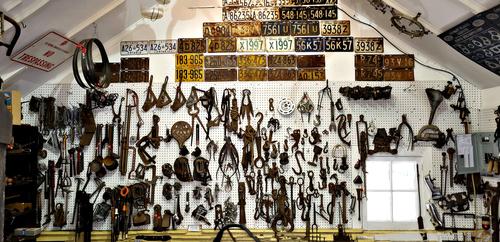
    This takes its appeal from the Where's Wally style and the interesting tools etc. on display, and in both cases it can only really be appreciated by viewing a large version. Maybe a detail shot or two and presented as a series would be a good idea? Having said that, I have had a look at the image as presented for a suitable crop or two and couldn't really find one. So maybe that is the reason you didn't do that!

    Pete

  • Members 533 posts
    June 2, 2023, 9:39 p.m.

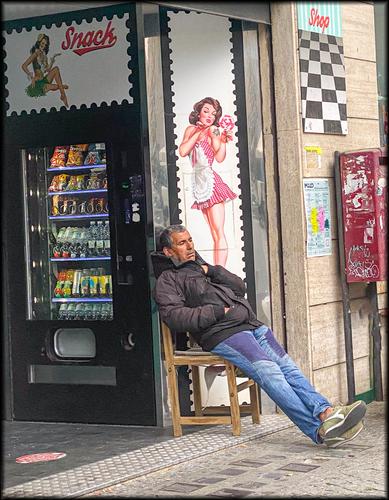
    This is the sort of image everyone hopes to find, if they try street photography. The story is clear, but subtle enough that the viewer needs to look and is then rewarded with the delicious Aha moment as the humorous connection is discovered. I agree with others, that the slight tilt actually adds to the appeal by playing another subtle card in the slumber theme, irrespective of whether it was intentional or not.
    A very enjoyable image.

    Pete

  • Members 1548 posts
    June 2, 2023, 9:45 p.m.

    This is a wonderful image for many reasons. Obviously the bright contrasting primary colors and geometric shapes grab our attention and force us to look closer. Now we see two compelling characters in twin costumes sitting in twinned positions looking in the same direction at something outside our field of view. Then, the best part of all - the shadows, another twinning of form. That they are part of a small circus adds more mystery and charm to the image, but it stands well on its own four feet without the explanation.

  • Members 533 posts
    June 2, 2023, 9:54 p.m.

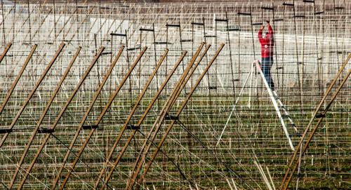
    There are hundreds of vertical lines, horizontal lines and diagonal lines all over the image, so it ought to be a real mess, right? Well, no, actually. The thinner vertical and horizontal lines are so close, that they simply form a web, or a texture. Our eyes are led through the image by the thicker wooden diagonal poles, helped by their slightly brighter yellow colour, towards the man, (although his red jacket helps greatly!). He is also spotlighted by the shiny aluminium ladder and we realise he is the spider creating the web and not the fly. Also the darker poles with their cross-bars help close the frame around the man.
    I like the fact that we see no horizon or anything other than the pattern of wires and poles.
    It is an unusual and satisfying image.

    Pete

  • Members 533 posts
    June 2, 2023, 9:58 p.m.

    I think Mike has said what I wanted to say. Sorry I cant think of anything sensible to add.

    Pete

  • Members 533 posts
    June 2, 2023, 10:05 p.m.

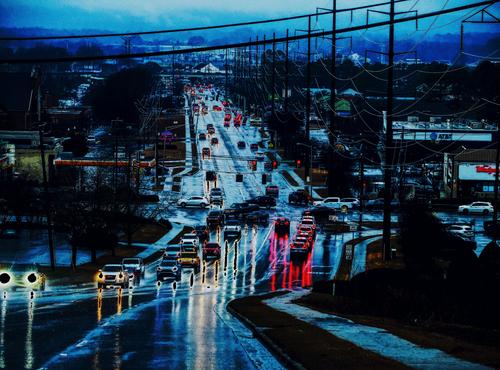
    I hate driving in the dark with wet roads reflecting the oncoming headlights and obscuring the road markings, so this one resonates with me, even if it is a negative experience. The dark processing is therefore appropriate. I also like the poles and cables. They also have negative vibes, but they complete the frame and keep the viewer in the image and the eyes on the road. Imprisoned in the driver's seat, which is much how I feel under these conditions.
    Since it so accurately conveys an emotion, albeit a negative one, I really like the image.

    Pete

  • Members 1548 posts
    June 2, 2023, 10:11 p.m.

    Quite an interesting collection you got there. I like the fact that the tones are all in the same ranges of ivories to browns with yellows and blacks for accents as though chosen from a cinematic color palette. I could get lost in there, asking questions about those things, since my grandsons are digging up rusted remnants of such things on the site of my grandfather's old blacksmithy. Very interesting to me on a personal level.

  • Members 533 posts
    June 2, 2023, 10:15 p.m.

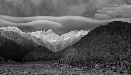
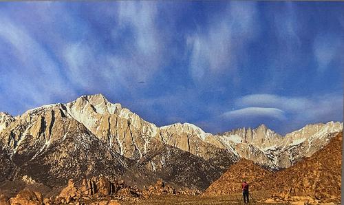
    The desolate beauty is engaging. I assume it was taken on planet Earth, but if you told me it was from a secret NASA mission, I would believe you. It really needs to be seen large to appreciate it properly.
    It lives from contrast. That is not only between the dark shadowy mountains in the foregroand, the ethereal pale mountains in the distance and those white clouds above, but also between the jagged rocks and the dreamy soft waves of the clouds.

    Pete

  • Members 1548 posts
    June 2, 2023, 10:17 p.m.

    dreams of the Snack Goddess who's sprouting out of his left arm as he snoozes? The lilt of the building does not bother me visually like it usually does because his napping tilt matches it with some precision. A universally smile-inducing image that we don't have to know location to appreciate. The colors are bright but none are overpowering and the sprinkling of red makes diagonal that also follows the same slant. Nice catch.

  • Members 1737 posts
    June 2, 2023, 10:20 p.m.

    Because it's from an APS-C camera, I don't like to print it larger than about 10x14 inches. I haven't tried using an AI resampler, though.

  • Members 1737 posts
    June 2, 2023, 10:21 p.m.

    Movie Flat, near Lone Pine, CA. That's Mt Whitney in the distance.

  • Members 1548 posts
    June 2, 2023, 10:22 p.m.

    Another hops farm image I think. Like many of them, it's dominated by dizzying displays of geometry in action: squares, verticals, horizontals, diagonals with all going left to right except that one white ladder that, wonderfully, is topped by a guy with a red shirt. The contrast and the disruption of the pattern gives the illusion that the ladder has stepped out of its actual dimension, in much the same way that the features in your poles image made the poles appear to have moved themselves into floating positions. Something about the geometry in these is very deceiving to the rational eye. And very intriguing.

  • Members 533 posts
    June 2, 2023, 10:25 p.m.

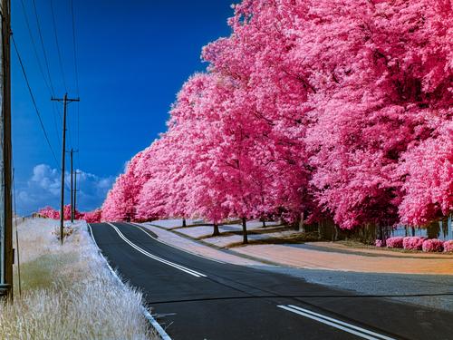
    This has a very optimistic vibe. Is that what pink and spring do?
    It is another image where the poles and wires, despite their ugliness, are actually important. They balance the trees on the right and act as a frame to stop the eyey from wandering out os the frame on the left. Also, their straight-lined ugliness contrasts so well with the billowing pink beauty, making it seem even more attractive.
    We can't see where the road goes, but all the signs suggest it will be a nice place.

    Food for thought? Maybe clone out the shadow across the road in the foreground, which acts as a bit of a visual brake as we travel down the road.

    Pete

  • Members 1548 posts
    June 2, 2023, 10:30 p.m.

    That's pretty cool editing to get the city looking so ominous, with all its blackened patches. The enhanced light reflections on the wet road are a nice touch too. Compositionally, you take good advantage of the leading line of the slick reflective road and its accompanying march of poles, with the vanishing point off somewhere in the hazy mountains. What I'm not sold on is the blackened headlights in the nearest of the vehicles. That's a little too creepy for me. All in all, an interesting image in your city series.

  • Members 533 posts
    June 2, 2023, 10:34 p.m.

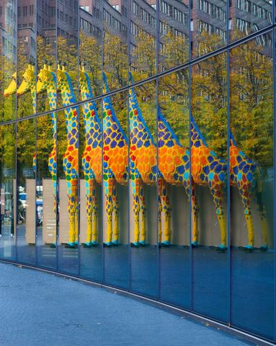
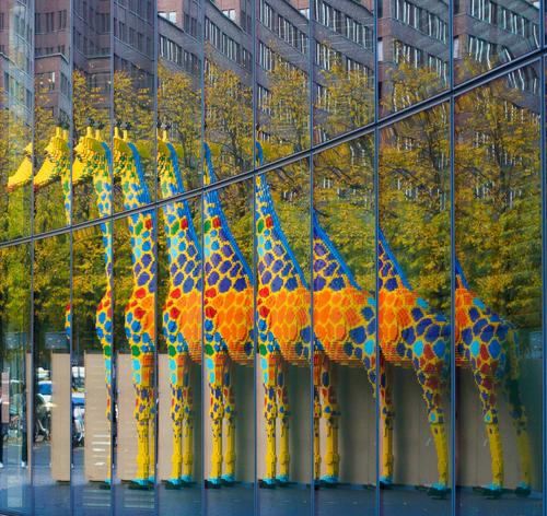
    Whilst preparing the image, I tried a crop similar to Jim's suggestion and was torn, but discarded it for the reasons Mike mentions here. The other reason was that I preferred the narrower vertical frame of the version I posted, as it felt a more appropriate shape for a giraffe. However, I do like a bit of mystery, which would favour the crop, so the decision wasn't easy. Having had time to look at Jim's crop, I could live with either.

    Pete

  • Members 1548 posts
    June 2, 2023, 11:29 p.m.

    I peeped ahead which I usually don't do, to see whether you ever said where this was taken because I was pretty sure it was Whitney from Movie Set road, a wonderful place to photograph like most of the eastern Sierras, especially the Bishop/Lone Pine areas. Love the IR version. You had some pretty special clouds and the capture made them moreso. That contrast between Whitney and the foreground formations (foothills I suppose) is so dramatic in tone and texture, then the smooth cloud formation lies across the spiky peaks. Just beautiful. Makes me want to go there again, if I ever get travel-worthy.

  • Members 1548 posts
    June 2, 2023, 11:44 p.m.

    You have again chosen a set of colors that works together and results in a pleasing image. The cherry tree look is an effective emulation of spring just as the red/orange look emulates fall, and they both work because of the contrast with the blue of the sky. This one has a stylized look that makes me think of Topaz Simplify edits but maybe you got this with just color work. The composition is strong, with that leading line of road and row of poles/wires running from corner to edge so there is a clear way to read the image. I would suggest you crop off the pole that is right at the left edge, and clone out the black line across the pavement in the foreground.