I'm veru grateful for your comments, Roel. I mentioned in another reply that I haven't come across a photo op remotely similar in the nearly 8 years since I shot this!
-
-
My reaction to this is a bit simpler than Mike's.
I just love the humour.
Your title is inspired.
The pattern painted on the piano can indeed cause a big headache.
The beer almost feels like a remedy. -
@OpenCube has written:
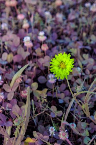
A nice shot of clover and what appears to be a single wildflower, perhaps a dandelion flower. They have wild beauty in their own right and the single flower does well compositionally in front of the clover bed. I must confess I prefer my clover green and the flower whatever its natural color may be. Again, my aversion to purple may play a part in how bothersome purple is for clover.
You have said before that you did your color tinkering in Lightroom. I'm figuring you're using the color curves tool, which makes more radical changes than the HSL sliders or the toning tools?
-
@minniev has written:@OpenCube has written:
A nice shot of clover and what appears to be a single wildflower, perhaps a dandelion flower. They have wild beauty in their own right and the single flower does well compositionally in front of the clover bed. I must confess I prefer my clover green and the flower whatever its natural color may be. Again, my aversion to purple may play a part in how bothersome purple is for clover.
You have said before that you did your color tinkering in Lightroom. I'm figuring you're using the color curves tool, which makes more radical changes than the HSL sliders or the toning tools?
Adobe Camera Raw, but I use it as a replacement for LRC. Different starting tool this time - full spectrum camera. No curves used cept for luma. It starts with vibrance and saturation. Push and pull but always up. HSL actually. Saturation - this one is +20 on all colors. Unmodified camera was +80 as a starting point. Dink around with Lumiances and Hue. Calibration is where I was able to start getting really funky, but it seems that I did none of that for this image. Really its whatever works.
-
@simplejoy has written:
When the first flowers bloomed this year, I tried to capture a few different versions of the liverleaf. Here's a slightly more experimental one:

Second hand halo by simple.joy, on FlickrIt's an interesting choice to show us this flower against an all black background.
I am less sure about the light painting hovering above the flower (at least that is what I think it is: painting with a small light?)
To me, it looks mostly like an elaborate set of puffs of smoke by someone who really knows how to form smoke circles.
And it distracts me from the flower.
I don't really understand its function, and would really love to know what prompted you to include it.
I really do. -
@stevet1 has written:
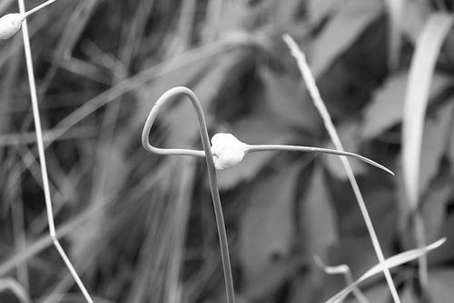
The shortest between two points.
Steve Thomas
Hi Steve,
I like your title. It picks up on the linear nature of the subject and its points. As minniev has already said, it must be garlic week and nice subjects they are too. You are working here with "line" and this is one of the things best suited to B&W.
The interest here is in the loop of the stem and the drooping probiscis thing on the end of the seed head. It is eerily like the mask worn by medieval plague doctors (they believed in garlic as well - maybe the shapes are connected? Anyone know?
I can imagine arguments against what I'm about to suggest so go with your own feelings here. I'd simplify the lines further with a crop. The crop also takes the main subject, the garlic seed head, away fro the centre and gets us to pay more attention to the probiscis.If it is possible I'd also try to add some detail to the seed head. If you use Lightroom, try adding some microcontrast with the texture slider in Presence. Whaat do you think?
-
@RoelHendrickx has written:
!

I was quite simply blown away. I have never forgotten that experience.
Your image brought it back to me.
On this page you can find explanation and also a video about that artwork:
www.collater.al/en/infra-reportage-richard-mosse/Wow - this is truly spectacular work. Very impressive and memorable, that's for sure! Thanks for sharing.
-
@RoelHendrickx has written:@simplejoy has written:
When the first flowers bloomed this year, I tried to capture a few different versions of the liverleaf. Here's a slightly more experimental one:

Second hand halo by simple.joy, on FlickrIt's an interesting choice to show us this flower against an all black background.
I am less sure about the light painting hovering above the flower (at least that is what I think it is: painting with a small light?)
To me, it looks mostly like an elaborate set of puffs of smoke by someone who really knows how to form smoke circles.
And it distracts me from the flower.
I don't really understand its function, and would really love to know what prompted you to include it.
I really do.As mentioned before in my response to @minniev I'm really surprised the light painting is viewed as an ugly distraction. It is VERY central to the whole idea. The shot was created for the theme "light painting". The shape is not meant to be beautiful (hence the title "second hand halo" as a play on its irregular, jaded shape). As I imagined it, the image might show either the clearly limited lifeforce/or soul still left in the - already cut - flower, or its last desperate try at fulfilling its purpose (spreading the life) with the shapes of the lights being a recreation of the stamen.
The light painting is also the only light source used, which makes it even more essential to the whole creation. I totally get it that a vast majority (according to @minniev > 60% is a good indicator, which is a number I tend to agree on) here don't like the image as it is, which is something I think I get and can accept. But I can't quite comprehend the suggestion to shoot the flower alone because it would change the whole meaning of the shot and its original intention completely.
So my takeaway is (as suggested earlier) that I failed in my attempt to visualize my idea of creating a different kind of flower shot, not focusing on its beauty, its full bloom, its colors and vitality, but a perhaps somewhat tragic state of demise and desperation.
Please don't get me wrong: I love showing the beauty of flowers and a vast majority of my flower-shots is an attempt to do that. To be honest I dread using the somewhat in-your-face and over-the-top versions of dead and dried flowers too much, so I'll clearly have to think of something else next time I'm trying something similar...
-
@RoelHendrickx has written:@MikeFewster has written:
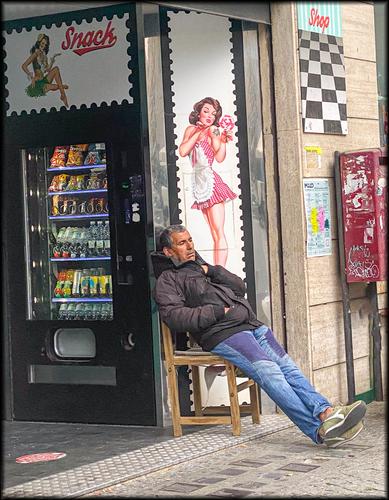
This is the kind of street photography that I enjoy.
There is not much more than the portrait of a relaxing dude and some street paraphernalia, but the combination of the guy with his background creates a winner.
The title is, in that respect, maybe a bit too much on the nose.
The viewer will automatically associate the closed eyes with daydreaming, and the pin up girl is an obvious subject of dreams.
The candy colours complete the "sweet" connection.
One detail that I should mention: the image has a very obvious lean: the verticals all bend over backwards towards the left.
That's a defect (in photo-technical theory) but an asset (in artistic reality): the photographer (and the viewer) are being infected by the lean of the daydreamer in his chair.You are so right about the title. A complete mistake. The title is "on the nose" for sure. It's inclusion was an error. I had downloaded the file to a folder where I keep smaller versions of shots I intend putting up here or for general emailing. These shots get a title so I can remember which is which as I don't get a thumbnail of each. I went to the folder to select the image to post and for some unknown reason, I typed in the name I use to find a shot in this folder and then hit the upload.
-
@simplejoy has written:
As mentioned before in my response to @minniev I'm really surprised the light painting is viewed as an ugly distraction. It is VERY central to the whole idea. The shot was created for the theme "light painting". The shape is not meant to be beautiful (hence the title "second hand halo" as a play on its irregular, jaded shape). As I imagined it, the image might show either the clearly limited lifeforce/or soul still left in the - already cut - flower, or its last desperate try at fulfilling its purpose (spreading the life) with the shapes of the lights being a recreation of the stamen.
The light painting is also the only light source used, which makes it even more essential to the whole creation. I totally get it that a vast majority (according to @minniev > 60% is a good indicator, which is a number I tend to agree on) here don't like the image as it is, which is something I think I get and can accept. But I can't quite comprehend the suggestion to shoot the flower alone because it would change the whole meaning of the shot and its original intention completely.
So my takeaway is (as suggested earlier) that I failed in my attempt to visualize my idea of creating a different kind of flower shot, not focusing on its beauty, its full bloom, its colors and vitality, but a perhaps somewhat tragic state of demise and desperation.
Please don't get me wrong: I love showing the beauty of flowers and a vast majority of my flower-shots is an attempt to do that. To be honest I dread using the somewhat in-your-face and over-the-top versions of dead and dried flowers too much, so I'll clearly have to think of something else next time I'm trying something similar...
It can be frustrating when we come up with a concept we feel invested in, execute it to our satisfaction, and find that others don't "get it". It's very possible to make a good image that simply isn't accessible to your audience. I've run into that with a few of my bird series (which isn't about birds at all), with some that I felt had a message but when I shared them, I got back the online equivalent of blank stares. When this happens, we have several choices: look for a new audience, enjoy the image for what it means to us, or rethink it from a technical and/or accessibility standpoint. When I have one that the majority of viewers in a photo forum don't respond to, I don't include it in a display collection because I figure if other photographers don't "get" it, the likelihood of the general viewing public responding to it is kinda slim.
I hear you on the desire to do something with flowers other than floral perfection or utter ruination, I have the same dilemma with flowers. Keep up your quest and share your results!
-
@RoelHendrickx has written:@minniev has written:@Bryan has written:
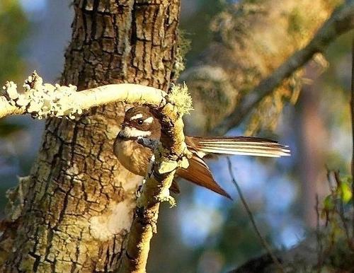
Enchanted forest
It is enchanted and you must visit it often. What I like: the almost hidden bird peeking at us from her well-disguised position. And the gorgeous blue bokeh in the background. And the gentle forest colors in the background and around the edges. What I struggle with: the seemingly blown out vine as it curls towards us. It just draws my eye away and dominates the otherwise subtle and lovely image.
If this is a raw file you might be able to find some extra detail to work with. If not, there is a dilemma of what else you might do which would range from removal/replacement to transplanting detail from the less exposed portion, to transforming the whole thing to a more fantasy type image. This is where some really advanced editing might come to the rescue. It's something I might try to do just for the challenge of it. I'm trying to master such things, but still on the journey.
Like with last week's parakeet (or whatever that bird was), I would be tempted to crop in close on this one. The background is OK (with the contrasting blue colour) but not essential. The crooked branch under which the bird comes looking out, is a bit overexposed (on my monitor). Bringing that down could result in a better overall effect (not the brightness or exposure of the whole image, just of that branch).
Zooming in on your image, it seems like the bird's face lacks a bit of sharpness (the parakeet was VERY sharp), but that may be a result of us viewing that face in a zoomed in version of a larger image, embedded here. Maybe there is more sharpness to work with if we would start from the original.In any case: this is a very welcome addition to our thread and I do hope that you will come back next weeks.
Minnie, Roel,
Initially I wasn't going to post this for the very reason you mentioned: the branch to the left is fully blown and a distraction.
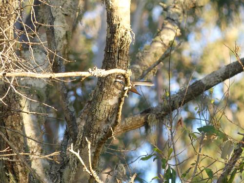
The pic is a ~ 650x500 crop from the 4000x3000 original and given the lowish light was already suffering. The Lorikeet had a much higher % of frame and full light.
Because I liked this pic I cloned the blown lichen and branch areas with some creamy adjacent bits. It was a slight improvement but not enough...
If time permits I may revisit it and grab some more darker areas.
It would be nice if we had a gallery here as I like the idea of posting originals for a comparison, without cluttering threads such as this one.
Thx for your positive comments, really appreciated. -
@Bryan has written:@RoelHendrickx has written:@minniev has written:@Bryan has written:
Enchanted forest
It is enchanted and you must visit it often. What I like: the almost hidden bird peeking at us from her well-disguised position. And the gorgeous blue bokeh in the background. And the gentle forest colors in the background and around the edges. What I struggle with: the seemingly blown out vine as it curls towards us. It just draws my eye away and dominates the otherwise subtle and lovely image.
If this is a raw file you might be able to find some extra detail to work with. If not, there is a dilemma of what else you might do which would range from removal/replacement to transplanting detail from the less exposed portion, to transforming the whole thing to a more fantasy type image. This is where some really advanced editing might come to the rescue. It's something I might try to do just for the challenge of it. I'm trying to master such things, but still on the journey.
Like with last week's parakeet (or whatever that bird was), I would be tempted to crop in close on this one. The background is OK (with the contrasting blue colour) but not essential. The crooked branch under which the bird comes looking out, is a bit overexposed (on my monitor). Bringing that down could result in a better overall effect (not the brightness or exposure of the whole image, just of that branch).
Zooming in on your image, it seems like the bird's face lacks a bit of sharpness (the parakeet was VERY sharp), but that may be a result of us viewing that face in a zoomed in version of a larger image, embedded here. Maybe there is more sharpness to work with if we would start from the original.In any case: this is a very welcome addition to our thread and I do hope that you will come back next weeks.
Minnie, Roel,
Initially I wasn't going to post this for the very reason you mentioned: the branch to the left is fully blown and a distraction.
The pic is a ~ 650x500 crop from the 4000x3000 original and given the lowish light was already suffering. The Lorikeet had a much higher % of frame and full light.
Because I liked this pic I cloned the blown lichen and branch areas with some creamy adjacent bits. It was a slight improvement but not enough...
If time permits I may revisit it and grab some more darker areas.
It would be nice if we had a gallery here as I like the idea of posting originals for a comparison, without cluttering threads such as this one.
Thx for your positive comments, really appreciated.We don't mind the clutter. If we ever get threaded view that will be easily sorted. Gallery displays never seem to get the discussion that we get in threads like this. By the way, what software do you use for editing?
-
I have to admit I am only using the simple tools in FastStone image viewer. The crop had noise reduction 20, sharpening USM 20, contrast 30, saturation 30 and highlights -20. These changes are on the jpg not the raw. I do shoot jpg + raw for a rainy day when I get comfortable with more capable pp software.
I have RawTherapee but haven't done anything with it. For a start my camera's WB generally produces much darker raw files and I never learnt where to start. I have WB set to auto (the only auto setting, all other iauto stuff is off, pic style standard and noise, saturation etc are set to recommended by other users). I will start to explore WB in camera settings as most pics seem to need a push in contrast and saturation. Exception being vivid colours seem to be close to expected.
I see DarkTable appears to have more users in the free pp threads here. I will probably install it at some point. -
@Bryan has written:
I have to admit I am only using the simple tools in FastStone image viewer. The crop had noise reduction 20, sharpening USM 20, contrast 30, saturation 30 and highlights -20. These changes are on the jpg not the raw. I do shoot jpg + raw for a rainy day when I get comfortable with more capable pp software.
I have RawTherapee but haven't done anything with it. For a start my camera's WB generally produces much darker raw files and I never learnt where to start. I have WB set to auto (the only auto setting, all other iauto stuff is off, pic style standard and noise, saturation etc are set to recommended by other users). I will start to explore WB in camera settings as most pics seem to need a push in contrast and saturation. Exception being vivid colours seem to be close to expected.
I see DarkTable appears to have more users in the free pp threads here. I will probably install it at some point.This time, I disagree with everyone. You have to consider what the image is trying to do. I don't think any editing is needed to the original photo, all it needs is a new title. If I understand the post and intent correctly, the image is about showing the effectiveness of the bird's camouflage. We should be looking at this as it might be seen by another critter in the trees. The colours of the bird and its positioning with the curved back nestling into curve of the creeper behind it, are excellent camouflage. It's the tail that eventually gives things away. All I'd do is change the title so this becomes a search for the bird in the overall picture. A "Where's Wally" image. Here, the relative size of the bird and the distracting elements become positives. Re-title the picture something like "Camouflaged" and don't change anything else.
-
@PeteS has written:@JimKasson has written:
The picture:
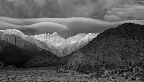
I have waited for nearly a week before commenting on Jim's photo. As I have said before, generally, I don't like IR and I don't feel confident when discussing it. I agree with Pete's comment on the desolation and otherworldliness of the scene. Layer after layer of horizontal lines retreating to the background. The differing tones of each layer plus the different skyline of each layer and the progression to luminous peaks are enjoyable viewing. The IR treatment brings this out. The cloud lines, as picked up by the iR and their parallels with the peaks, are what take the shot out of the ordinary. I like the softer clouds being compared to the harder edged mountains as well.
I'd like this as a framed B&W print on a wall.The desolate beauty is engaging. I assume it was taken on planet Earth, but if you told me it was from a secret NASA mission, I would believe you. It really needs to be seen large to appreciate it properly.
It lives from contrast. That is not only between the dark shadowy mountains in the foregroand, the ethereal pale mountains in the distance and those white clouds above, but also between the jagged rocks and the dreamy soft waves of the clouds.Pete
-
@MikeFewster has written:@PeteS has written:@JimKasson has written:
The picture:
I have waited for nearly a week before commenting on Jim's photo. As I have said before, generally, I don't like IR and I don't feel confident when discussing it. I agree with Pete's comment on the desolation and otherworldliness of the scene. Layer after layer of horizontal lines retreating to the background. The differing tones of each layer plus the different skyline of each layer and the progression to luminous peaks are enjoyable viewing. The IR treatment brings this out. The cloud lines, as picked up by the iR and their parallels with the peaks, are what take the shot out of the ordinary. I like the softer clouds being compared to the harder edged mountains as well.
I'd like this as a framed B&W print on a wall.The desolate beauty is engaging. I assume it was taken on planet Earth, but if you told me it was from a secret NASA mission, I would believe you. It really needs to be seen large to appreciate it properly.
It lives from contrast. That is not only between the dark shadowy mountains in the foregroand, the ethereal pale mountains in the distance and those white clouds above, but also between the jagged rocks and the dreamy soft waves of the clouds.Pete
Hear hear.
What Pete said X 2.
Layered landscapes are how I like landscapes best.
This is a prime example. -
Dear all,
As it is Tuesday and nearing the evening hours (in Belgium), we are slowly winding down after another succesful week.
I've enjoyed many of the images and much of the discussionsTuesday is often a slower day, winding down and replying to messages and comments.
Everybody is gearing up of tomorrow's new edition.
Obviously, it is still allowed (and encouraged to continue commenting on photos, and replying to comments).But please be advised that if you want to post another image, it is often better to wait until the new edition on Wednesday.
This is good for the poster in order to get more traffic.
And also for the group, in order not to confuse the different sequential weekly threadsI will take care of starting the new edition tomorrow. Usually I manage to do that before 12.00 noon (Brussels time).
As I will be occupied between 7.30 AM and 11.30 AM, I will either start the thread VERY early, or only around noon or a bit later (again : Brussels time).
See you then. -
@Bryan has written:@MikeFewster has written:@WhyNot has written:
Forgot the QUOTE!!!! This is in response to MIKE's Post -- SWEET DREAMS
I like the idea ... and the picture ... That everything is leaning makes me want to lean back with them!!!!
WhyNot
Now that's funny. I have a habit of slightly tilting a camera when I'm composing a shot. No idea why, however I am aware of it and usually remember to straighten things before exposing. Much too often I need to do it PP and because of that I tend to frame with a bit of extra room knowing I'll need to correct.
On this occasion I didn't. It was from my phone and I posted it here without my usual check. The whole tilt was quite unintended.An interesting perspective thing within this pic though. My mind processes the tilt and ignores it. But what I noticed was the chair. It looks like it is leaning sideways up on two legs. So I had a closer look and that impression is caused by the chair legs not being parallel to the metal or tiled covering on the floor nor the metal surround of the snacks dispenser.
This is one more oddity that proves that Mike and I must be twins that have been separated at birth (and then one of them got cryogenically frozen for a while).
I also have this persistent unintended tilt in far too many of my images if I don't consciously pay attention. -
@minniev has written:@PeteS has written:
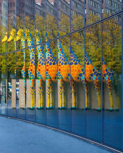
Building a Giraffe
Berlin is always good for a surprise.
Wonderful celebration of your special creative eye that sees what others cannot see and captures it to show it to them with titles that gently explain it for those of us who love words as much as pictures.
The mirrored sequence of the colorful critter are indeed constructed into a whole before our eyes. It has the feel of a kaliedoscoped image flattened and rolled out. I like J Kasson's crop too but I think I prefer the original with the embedded lines which serve to lead us through the construction timeline.
I really like this.
Count me in the same camp of the lovers of this image. Reflections are always cool. Street art is often cool. Reflections of street art can be cool².
-
@Bryan has written:
I have to admit I am only using the simple tools in FastStone image viewer. The crop had noise reduction 20, sharpening USM 20, contrast 30, saturation 30 and highlights -20. These changes are on the jpg not the raw. I do shoot jpg + raw for a rainy day when I get comfortable with more capable pp software.
I have RawTherapee but haven't done anything with it. For a start my camera's WB generally produces much darker raw files and I never learnt where to start. I have WB set to auto (the only auto setting, all other iauto stuff is off, pic style standard and noise, saturation etc are set to recommended by other users). I will start to explore WB in camera settings as most pics seem to need a push in contrast and saturation. Exception being vivid colours seem to be close to expected.
I see DarkTable appears to have more users in the free pp threads here. I will probably install it at some point.And now that you post the original, I am inclined to agree with Mike. The work of repairing the cropped version is going to be onerous, and it will still be a very small crop with some pixelation at any reasonable size. In its original form it is a fascinating "find me" puzzle in a charming wilderness setting. And the blown areas are smaller percentages of the overall picture so they assume much less importance. Lower your highlights as best you can without turning them gray and let it remain full size. Maybe crop a little off the top where that blown piece of light bark is. And now that you know that your camera may tend to lose highlights, you can shoot for that. I have the same problem with egrets, whose reflective white feathers sometimes fool the camera's exposure system. When I think it's gonna do that to me, I underexpose a bit and bring the brightness back in post.
-
@Bryan has written:
Man...looking at this image on mobile is not what it was designed for.
