Fab shot. I think you have easily won the first prize this week. Imaginative and whimsical. Excellent effort.
-
-
Great document shot. Almost from a different era...
-
Great shot. I like the amazing details which are so evident for the viewer. Well seen.
-
Almost photographic masterpiece. Just superb!
-
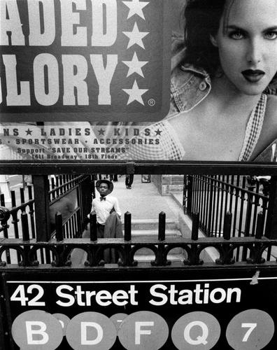
The shot was lined up but I waited, wanting someone on the stairs to give a sense of the scale. Most obligingly, this gentleman turned up.
I don't know the legal position but I have been impressed by the general consideration both the public and the various forms of police have for these guys. Watching the arrival of police when a pop up stall (s) are set up, I get the impression that the police don't want to harass them. Plenty of warning is given, there is no attempt to cut off exits and the men do a relatively leisurely pack up and move on. Or they don't move at all. I think their may be some sort of licence system and some are licensed and some are not. A few years ago in Spain when I first saw pop ups, the cloth was important. At any sign of police, the men grabbed the corners of the cloth and ran. Many had a cord around the circumference that they pulled tight and slung the lot over a shoulder. -
@LouHolland has written:
As someone who has become extremely fond of playful processing, this entry caught my eye immediately. The bright red vs. yellow adds so much to the eerie subjects. This is a photo op I would love to stumble upon, shoot and work with. My only diappointment is the title, which led me to a conclusion rather than having the time to form my own impression of what the scene suggests.
-
@RoelHendrickx has written:
Copperfield
This is another image from that "up-close-and-personal" candid documentary series in a small family circus that I mentioned last week :
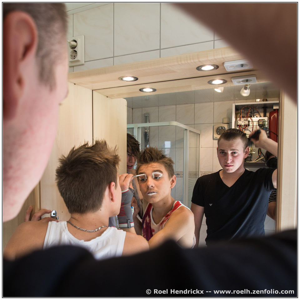
I've enjoyed reading all the feedback and observations. What I've learned is that including a part of the person or object being reflected adds a great deal of interest, whether as a framing device or the feeling of intimacy between photographer and subjects.
-
@simplejoy has written:
This image was created for the theme "single use items" and shot with an old scanner lens.

Toothpicks are handy... quite literally! by simple.joy, on FlickrMy initial response was discomfort, and I still feel a bit uneasy after additional viewings and reading all the reactions. Not sure what that says about my own psyche, but how fun it must be for you to have evoked such different responses. I admire your ability to create such a provocative result from toothpicks. Awesome!
-
@Bryan has written:
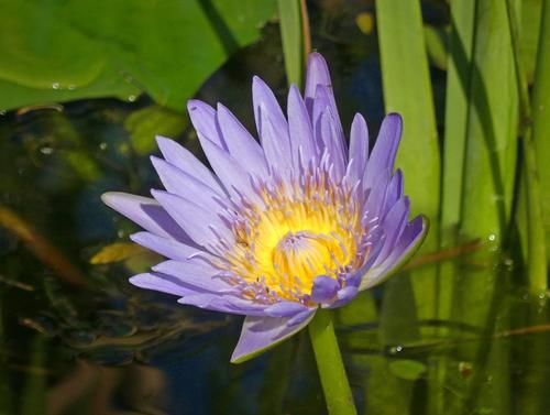
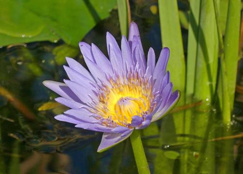
I have been trying to get a half decent shot of some lilies in this dam ever since I bought my camera. What with poor focus, user blur, wind damaged petals, bug eaten green parts, old dead lily pads and other weed, I never succeeded. The other day I noticed a suggested WB tweak I had missed and that has improved natural colors no end. Today my enemy was bright light so a lot of playing with EC and still struggling with sharp focus. Here is one where I have brought up shadows somewhat but not sure what else I should do.
I think you did a very nice job with exposure and I know from experience the challenges of wind, dead and damaged leaves, and being there at an optimum time of day or weather. I have a couple of suggestions. Below are crops of your first and second. I did a slight crop of the first, a bit from the left but more of the right side to eliminate the space beyond the vertical reed. This makes the reed more of a natural framing element and also helps keep our eye from wandering.
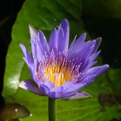
The second I chose a square crop because your flower is the star and I felt the rest wasn't needed or desired for context. Obviously, just one person's opinion 😀
In both I used a very slight vignette to keep our interest on the flower. My preference is the darken edges/lighten center filter available in Nik Color Efex because it offers a lot of control.
-
@JimKasson has written:
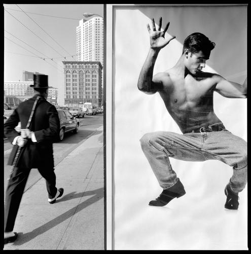
Nikon F4, 15mm f/5.6 Nikkor
I felt an initial discomfort from the black vs. white relative to my country's sad history (I was born in 1951, USA). The photo's complexity is overwhelming, and I was grateful that others sorted through the imagery and context, and offered interpretations. Jim, I'm very interested to know if you waited long at the vantage point, and/or if you knew immediately upon shooting the brilliant story (stories) you captured?
-
@LindaS has written:
Jim, I'm very interested to know if you waited long at the vantage point, and/or if you knew immediately upon shooting the brilliant story (stories) you captured?
I did wait a 20 or 30 minutes to see who would show up. I had the idea for what the final image would look like, but I didn't know who the person in the image would be. I didn't think about the black/white thing at all.
I do sometimes like to mix signage and people:
-
@ChrisOly has written:
Tit
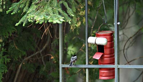
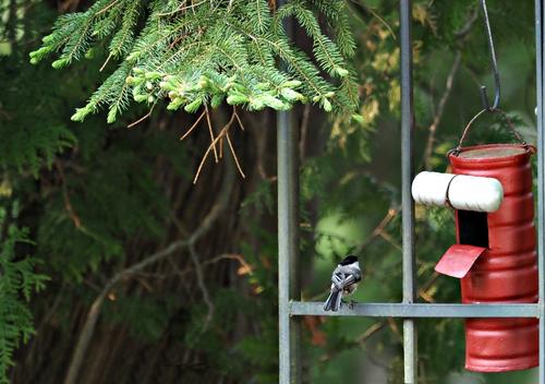
I know this is not avian forum, but i just happened to capture an elusive chickadee...
Well, no, you haven't captured it yet 😅
The trap is set and obviously the chickadee is intrigued. Will it enter the dark maw in search of its favorite treats or will it sense danger and move on? Stay tuned; all will be revealed in our next episode!
-
@LindaS has written:
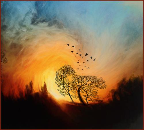
WIND
Bryan mentioned bush fire. Sadly, in the West and Pacific Northwest of USA we have endured the same for many years.
Roel mentioned vortex and whirlwind of fire, especially as relates to climate change. Indeed, the next decade may bring greater challenges than humankind is capable of solving.
ChrisOly and MinnieV suggested whimsy, which was my intent. I pretty much stay away from dark messages with photography or playful processing because this is a joyful hobby for me. Simplejoy and others like the colors. Happy colors make me happy too!
Simplejoy suggested a border isn't needed. Borders are often something I question also. Maybe depends on the color of the web page we're using to view, the size of the photo on our monitor?
MikeFewster mentioned swifts in a narrow alley. My birds were added with a brush - about the only way I can capture the fast little buggers!
PeteS suggests severall interpretations. Love that!
I responded to a couple of comments earlier in thread, and provided the details of how I did the editing, so I won't repeat here. I'm very grateful for the detailed and varied responses. Thanks so much.
-
@MikeFewster has written:
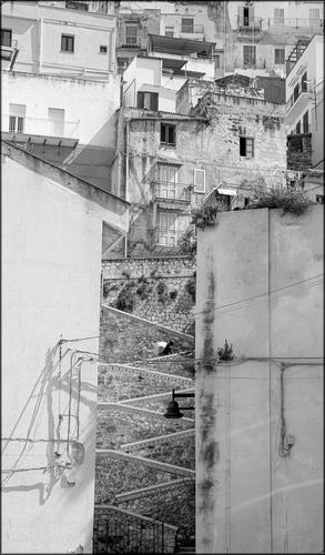
Sciacca.
You have a choice in this cliffside Town in Sicily. You can be going Up. You can be going down.A quite wonderful puzzle of an image to study in detail. In your recent posting, you've featured ways to include unsightly electrical circuitry as elements of charm in these old cities. All the boxy stacked up structures have individual differences that separate them from the usual boring stacks of apartments. There's geometry for us geomtetry lovers: squares, recetangles of windows and doors, slanting diagonals and the repetitive triangles of the daunting walkway (on which one lone figure plods upward. Nice tonalities stretching from the darkened windows to that one top central snow white house.
Old European cities are not my norm, but I see echoes of our most ancient city in the US - Acoma, which sits atop an enormous mesa in New Mexico, and only acquired its first road up (a challenging one even now) in the past half century. Previously, it was reached by ascending the cliff face using carved footholds and ropes.
-
@LouHolland has written:
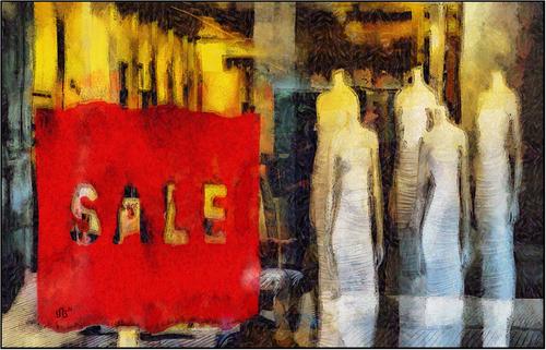
Oh my Lou, what an intriguing offering! The headless zombie women stand in wait for their new masters, their shapes wonderfully compressed and distorted to make them more ghoulish. The choices you made in the brushwork accentuate the distortion and the dancing verticals. The yellows are a perfect lighting color to offset the creepiness. I was going to ask about what software you use as I am one who loves to play with such things, but I see someone beat me to that. I've looked at DAP before but never tried it. I love this image!
-
@Rich42 has written:
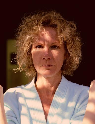
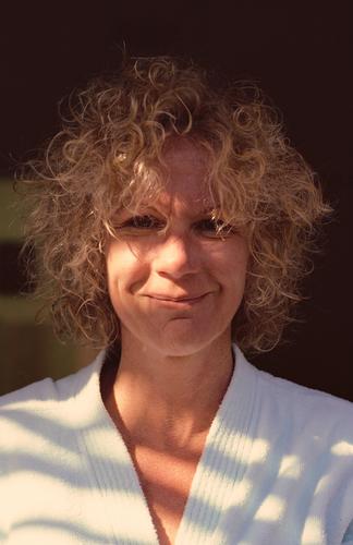
Gayle's one and only fling with a self-permanent. She's doing her best not to break out laughing. But couldn't keep a straight face.
Some time in the mid-80s. Kodachrome 64, Daylight. Olympus OM2n, Zuiko 50mm/1.4, ~ f/5.6, drum scan.
This was a difficult scan. Kodachrome always required extra compensation, scanning slightly blue-ish. The late afternoon light which was mostly skylight was very blue, despite the few rays of sunlight coming through some tree branches. The 'chrome looks quite blue, optically.
I thought she looked great in curls.
Rich
And yes she does (look great in curls). A lovely natural model in natural light, which is how I prefer portraits. I enjoy the quality images you are sharing from that old Oly.
-
@OpenCube has written:
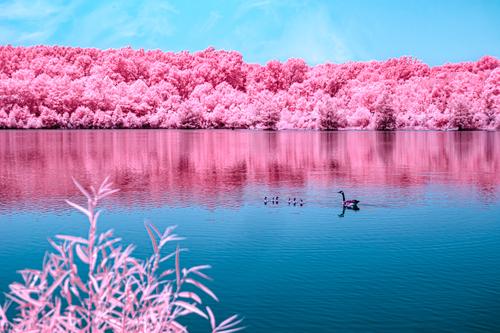
Another in your pink/blue collection. This one seems well done as well. There is a jarring response to the unrealistic nature of the colors, but they are clear and contrasty enough, and the little sprig of pink foliage in the foreground is bit out of focus but at least does not impair our view of the goose family with their pink hindquarters. I usually try to keep foreground elements in focus or else terribly out of focus. With this image I might have ended up combining two exposures, one for the near and one for the geese and the background, if I couldn't get it all in reasonable focus with one shot. You have a bit of a white halo around the pink trees. If that wasn't your intent, you could fix it in post.
-
@Bryan has written:
I have been trying to get a half decent shot of some lilies in this dam ever since I bought my camera. What with poor focus, user blur, wind damaged petals, bug eaten green parts, old dead lily pads and other weed, I never succeeded. The other day I noticed a suggested WB tweak I had missed and that has improved natural colors no end. Today my enemy was bright light so a lot of playing with EC and still struggling with sharp focus. Here is one where I have brought up shadows somewhat but not sure what else I should do.
.
Well, consider this one a success. The flower is as near perfect as a wild water lily can be, your capture is about as good as possible under the lighting conditions. You have a few extras in that the lily has unusually nice coloring, you have those adorable little bugs crawling on the leaf tips, and you have a nice angle that allows a view of the center of the flower. Focus is pretty good. The very middle is a trifle softer than the petal tips but can be sharpened further in post. Lowering the brightness in the just center will also give the appearance of sharpness in that area (plus some local sharpening and clarity). If you have tools for spot editing without changing the entire image, those will help you here. If your editing tools don't allow for this, you may want to track down another option that will let you edit different areas of the image differently. You could also raise the brightness in the water to show a little more blue. These are very small/minor edits that might make you better satisfied with a very nice capture.
(PS - the one you added later, the side view, is nice too, but I like this one best).
