The two humans are perfectly placed, one on the writhing sand, one on the hillock just beyond, facing opposite one another as if unaware of each other as they study the water. I'm not sure I understand why you chose to make the 3 boats identical but I'm assuming you considered other options and chose the triplicates. My own preference would have been to vary the size, orientation, of the trio, but that doesn't take much away from the overall impact. In fact, I'd like it with one boat or even none!
-
-

Parallel bloomiverse by simple.joy, on Flickr -
That's a nice picture to explore beyond the guy practicing his art. I like the way people who perhaps otherwise don't have an outlet get to express their art in public places like this, including the graffiti, even the pink fence posts. Also the youngster learning to skate.
-
Some interesting pp in this shot. The texture / light on sand catches my eye because I have spent plenty of time at beaches and can't say I ever saw it look quite like that. The flouro aqua hat and backpack stand out but not too dominating. As others have said, the 3 boats in single file need to be broken up somehow. Spaced unevenly and with different distances from the viewer would not make it obvious they are cloned. Even alter the location of the people on the boats. Makes me want to go for a swim...
-
I remember peas fresh out of the pod being round, firm and shiny (and very tasty). Perhaps these have been frozen and thawed? In and out of focus polka dots break up the otherwise square pattern. Contrasting colors but my taste would be a less brown orange - that's just my sun sign though.
-
Better to respect the no fly zone... 😌
-
Graffiti over graffiti gone wrong gets rescued by a comedy character. Would be nice if it starts a new trend.
-
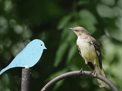
The imitation bird is cute but the look on the mockingbird's face is priceless...
-
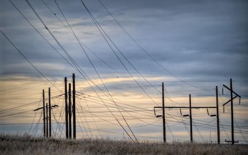
Another title might be Man Made. Not necessarily dystopian but it looks a jumbled mess, because we lose depth. But we know the guy wires are not close to the HV wires.
Quiz: On the wires leading away from the 2nd set of 3 poles are little dumbbells. What is their purpose?
-
Very nice bokeh contrasted with the black gate / fence posts. A little shame that the left yellows are jumbled compared to the right ones that retain their shape even when overlaid (is that real?). But the red and whites save it.
-
Hi Pete,
I love India, but when us westerners spend some time there it is easy to feel otherwise. The vagaries of life are exposed for all to see. I know what you mean but there is another side where the mother is worshipped as godess and women are respected for maintaining personal discipline and order - fabric of society if you like. -
Thx Linda,
was an interesting hour or two (around their afternoon feeding time). If I go out expecting I find nothing. Yesterday it was ok, if something pops up well and good, no expectations. And the birds obliged. -
@LouHolland has written:
Swiss Army knife of the Oil Industry
Lou this is great. I can't quite imagine big oil painting that on their tanks. And I think I can see signs that it is superimposed. Whatever, it's a wonderful concept and witty label on the knife.
-
@simplejoy has written:

Double P's in apple... by simple.joy, on FlickrIf it's not obvious... (some people said, it isn't) these are of course peas, who might dream of being apples, when they grow up! 😉
Love this one for the detail in the forefront of the peas (who knew they looked like that?), the nice color contrast, the polka dot surface which gives it a playful feel, and the intense background blur.
I have a question. Do you decide which parts to hold in focus (like the stem of pea on left) and which to blur (stem of pea on right), or does the capture decide for you? If you decide, is it done in the capture or in selectively managing the masking of layers in the stack? What program do you use for that? I've done only a little bit of this, and usually let the camera do the stacking but retain the images in the stack for it in case I need to do masking in Photoshop because something I hoped would be in focus is blurred or vice versa. If your process is entirely outside my knowledge, just say so. I've not done enough of this to claim any expertise.
-
@JimKasson has written:
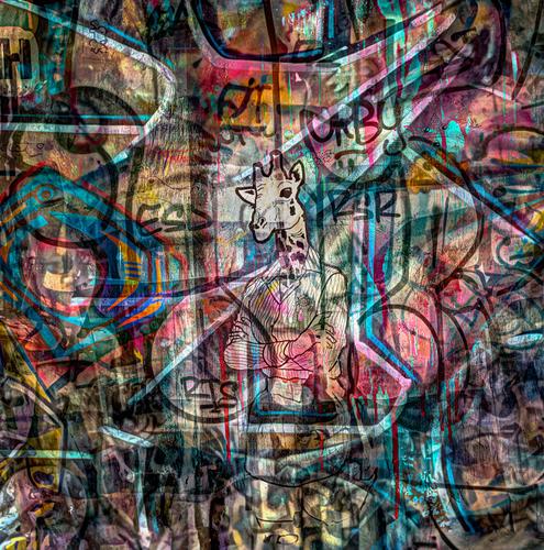
Graffiti composite.
Intriguing visual conglomerate of color, detail and line. At least a couple of graffiti layers and possibly a non-graffiti layer? Composition dominated by the central anthropomorphized lady giraffe attired in business-casual, arms folded, staring at the observer as if daring us to enter her world. In case we missed her stare, lots of the lines in the composition lead to her and force us to confront it. Nicely assembled.
-
@WhyNot has written:
Birds ....
WhyNot
Made me smile! Miss Mockingbird is considering consulting the Cornell app on her iPhone to figure out the identity of this new variety of bluebird. Great detail on Miss Mockingbird (and Mr. Blue). I do like Linda's version with the background foliage darkened just a tad. And if the new kind of bluebird's tail-tip is available, I'd include it if possible.
-
@LindaS has written:
LINES
I hate powerlines and first purchased photoshop long years ago specifically to rid myself of them. Now you have convinced me to view them as possibilities for artistic images. These have a mixed rhythm like a piece of jazz music, spread out across a sky that is equally nuanced. Placing the entry of the lines in the upper left corner has made the image readable instead of confusing. The scattering of birds and the edge of dead grasses remind us that even in the places we have most desecrated with our conveniences, nature survives.
-
@Satyaa has written:
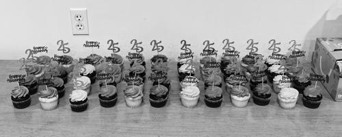
Continuing with my B&W experimentation.
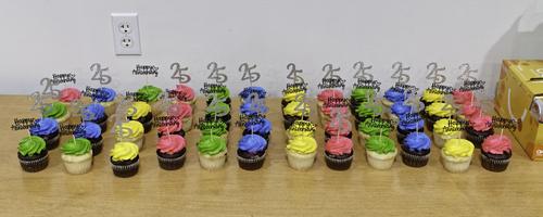
I felt that the B&W would go well with the 25th Anniversary theme... vintage feel.
If the purpose was to show the cupcakes by themselves, then they are actually colorful.
@Satyaa has written:Continuing with my B&W experimentation.
I felt that the B&W would go well with the 25th Anniversary theme... vintage feel.
If the purpose was to show the cupcakes by themselves, then they are actually colorful.
Interesting how different the image is in color and in black and white. The color one has a sort of Steven Shore/William Eggleston feel to it, a simplistic capture of something mundane and ordinary, a set of brightly decorated cupcakes, with an electrical plug and a box of something on the borders that make it even more mundane, which is the charm of that type of image. They add something to it.
The black and white version is more graphical than vintage. The anniversary decorations stick out like 3D objects. This kind of visual hook makes us look again to figure it out, which is a sign of an effective photo. For the black and white version, I'd get rid of the plug and the box. They are visual bothers that don't add to the composition in monochrome, IMHO.
And yes, thinking about B&W before capture is important. But there are two pathways. You will, as you keep at it, see scenes that you know would do well in B&W, and can capture them with that end in mind. Still, there are also scenes that you discover as you are doing your basic editing, and it dawns on you that a crop or rendition of an image is worth converting to see what it looks like in monochrome. So always be alert to both: the on-site spotting and intentional capture, and also the discovery of hidden gems!
![[002121] copy.jpg](/a/thumb/Q8Lp9Pye4lqFynNKak5ALudVW7aZkBNJJ6td6bmEVkNp4kYC0GOdtpDcIu7vJUzm/11579/?shva=1)
