• Members 701 posts
    June 16, 2023, 2:29 p.m.

    Simplejoy and Brian,

    Thanks.

    Serendipity plays a role in a lot of photography.

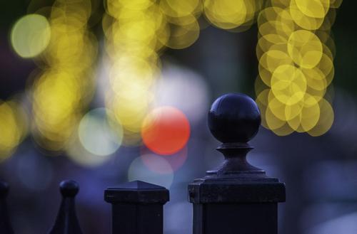
    This was not a "scene" that could be seen in any sense when and where I shot it. I couldn't see it because it didn't exist at all other than on the focusing screen of the camera. And only then if the camera were pointed or tilted "just so." I didn't plan it or have any opportunity to.

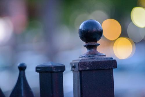
    I was concentrating on getting shots of the wrought iron gate. I took 10 in all. I really didn't try to get the "bokeh balls" into any particular composition, because they weren't evident during the shooting. They are out of focus lights from store windows and signs very far down the street from the old gate and its textured, painted surface - which is all I was trying to capture.

    I really didn't notice the lights while I was shooting. The slightest shift in the camera's position wildly changed their position, relationship to each other and intensity and saturation as their geometry and perspective was splayed all around the focusing screen by the 180mm lens at its closest focus. In some of the shots, they're not in the frame at all, although the foreground objects are hardly changed in position. In others, they are pale and uninteresting.

    Lucky shot. Hey, when yer good, yer good!

    Rich
  • Members 1548 posts
    June 16, 2023, 2:33 p.m.

    This is rather wonderful but the gate is simply an excuse for the scrumptious bokeh balls in their various bright and unexplainable colors. The metal design features seem to be producing the bokeh balls almost like they're bokeh machines. The blue background with its subdued bokeh is nice too. Well done.

  • Members 1548 posts
    June 16, 2023, 2:40 p.m.

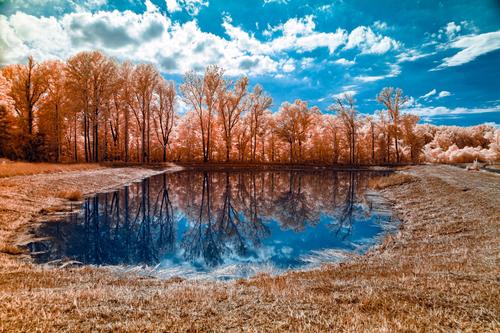
    This is a scene that would be appealing in its normal colors. Compositional features like a frame-encapsulated lake, a backdrop of frothily leafed trees, a nice clear reflection, and a sky full of pleasing clouds are a recipe for a solid landscape photo. That is at the core of the image. You've tinkered with colors and now have rust colored trees and grass and deep blue sky. The rust color works because it "could" be a natural tone for foliage, but the foreground is less appealing than the distant trees and the uncut grass along the left border of those trees because there's so much reflective gray in the shorter grass that's been cut. Still, it is appealing in its unique way.

  • Members 782 posts
    June 16, 2023, 2:43 p.m.

    I can only agree with all the praise that has been heaped onto this image already.
    It is simple and elegant. It brings a smile to anyone watching (if it doesn't, please get your head checked!)
    The idea is a stroke of genius and the execution is flawless.

    What's next? What will you turn into a cauliflower?

  • Members 1737 posts
    June 16, 2023, 2:55 p.m.

    All graffiti.

  • Members 861 posts
    June 16, 2023, 3:33 p.m.

    Gonna doubt that since the water is actually as brown as the river in Willy Wonka's Chocolate Factory and the area around the lake is even browner.

  • Members 701 posts
    June 16, 2023, 3:35 p.m.

    Thank you!

    Rich

  • Members 782 posts
    June 16, 2023, 3:39 p.m.

    I would almost certainly crop this image to square, from right next to the right hand yellow bokeh balls until somewhere to the left of the middle gate post.
    Everything further to the left is not an asset for the image: the left most top of the gate is too small to matter (and stands crooked) and the bokeh on that side is far less attractive than the one one the right and also the middle (thanks to the patches of red and white).

    Did somebody already mention that the shape of the gate post reminds us of a chess piece?

  • Members 701 posts
    June 16, 2023, 3:52 p.m.

    Roel,

    Hmmm. Tried it cropped as suggested. But didn't like it. I kind of like the crooked "chess piece" at the bottom left! And all the lights. (and I significantly crop probably 99% of every image I take! )

    Thanks for the suggestion!

    Rich

  • Members 1548 posts
    June 16, 2023, 4:03 p.m.

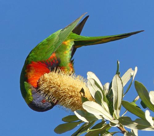
    What an adorable little guy! Brilliant colors, sharp in every aspect including his beady little eye, unique pose, buried in a bottlebrush (I think) bloom. You've made the most of the light awarded to you, and used the harsh shadows to trace his outline, making the photo that much more impactful. There's no shadows impeding our view of him, always a challenge in bright light. The leaves are rendered in detail in spite of their light tone and the bright light. Just wonderful!

  • Members 1548 posts
    June 16, 2023, 4:11 p.m.

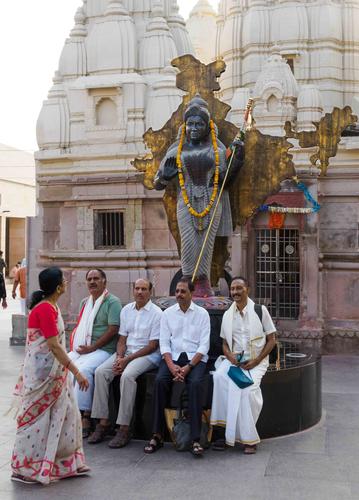
    Regardless of the cultural implications, what we see first is that the men are looking directly at the woman and she appears to not be looking at them but at the statue above/behind them. Whether this is cultural, individual or both, it does offer a story. The statue and the building behind it are impressive from artistic and architectural perspectives. The splashes of red color in her clothing and the red carving above the door behind the statue form a diagonal moving left to right to parallel her apparent purposeful movement. Another engaging image from a country many of us will never see.

  • Members 1548 posts
    June 16, 2023, 4:19 p.m.

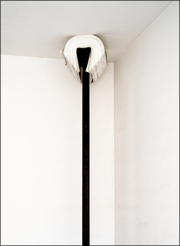
    This makes me think of those museum experiences where one cannot tell what is supposed to be an art display from what tourists or cleaning staff left behind. It could have some deep meaning as a famous piece of text displayed on the end of a pole to represent inaccessibility to the masses, or it could be a pole used to clean light fixtures hastily improvised as a prop for a sagging ceiling edge in a display.

    From a photographic perspective, you have a nice semi-abstract image with lone parallel verticals supporting a curve of the opposite tonality, leading to other diverted lines both horizontal and diagonal. Every 1/6 of space is used as part of the total image, but subject matter is pared down to the minimal.

    Interesting offering, I'll look forward to your explanation.

  • Members 1548 posts
    June 16, 2023, 5:30 p.m.

    Not sure what you might have done to get the exploding line effect coming out of the flower but it's very interesting. And the flower itself seems to be a good anchor for the centerpiece. The flower seems to have been photographed on different planes that are allowed to show their forums through transparency of their layers. Not sure at all but I like it anyway!

  • Members 1548 posts
    June 16, 2023, 5:36 p.m.

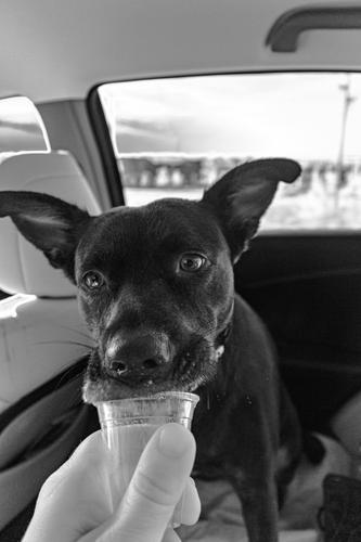
    Love this. Pup is eating his treat with enthusiasm and has adapted his snout to overlap the cup to get the last drop. All the while he's keeping his eye on you in appreciation or perhaps in anticipation of another. Good conversion, B&W is excellent choice as it lets us focus on the subject (pup+cup+ hand) and lose any distractions visible in the car or through the window.

  • Members 1548 posts
    June 16, 2023, 5:41 p.m.

    The fun of this one is the logo. I'm operating on the assumption you created it, right down to the shadows, and if so, nicely and creatively done. Also if it is a Lou Holland original you should perhaps offer it to the company at a nice price. If you found it intact and they did the design, you still spotted and captured it well. Nice black and white image with most tonalities on the high end, which makes the logo, with its tonalities covering the full range of possibilities, stand out all the more.

  • Members 1074 posts
    June 17, 2023, midnight

    Thx Rich, you have just taught me a lot about bokeh, which I would like to explore, in one simple explanatory reply.

    Yep, capture what we can when we can ... Photography has certainly re-opened my eyes to nature and scenery. Yesterday I just stood still for quite a few minutes taking it all in.

  • Members 701 posts
    June 17, 2023, 1:25 a.m.

    Bryan,

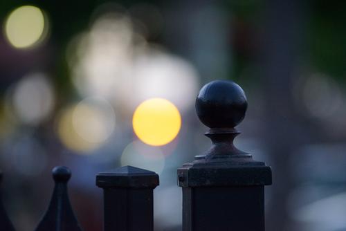
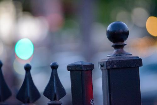
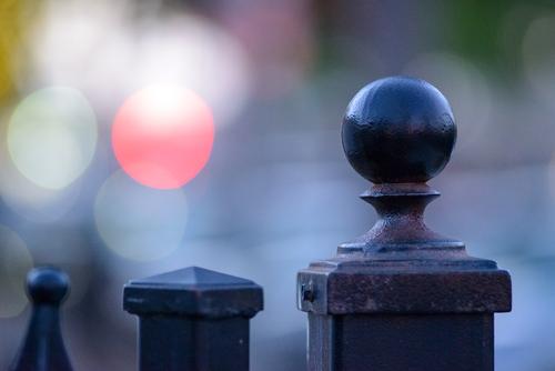
    Here are a few of the other images - camera moved just slightly in each. Very different appearance of the OOF background.

    Gate1.jpgGate2.jpgGate3.jpgGate4.jpg

    Rich

    Gate4.jpg

    JPG, 1.1 MB, uploaded by Rich42 on June 17, 2023.

    Gate3.jpg

    JPG, 1.1 MB, uploaded by Rich42 on June 17, 2023.

    Gate2.jpg

    JPG, 1.1 MB, uploaded by Rich42 on June 17, 2023.

    Gate1.jpg

    JPG, 1.0 MB, uploaded by Rich42 on June 17, 2023.