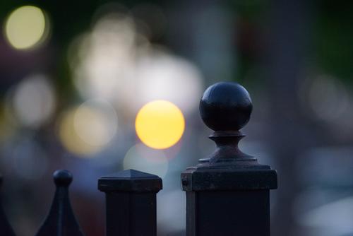
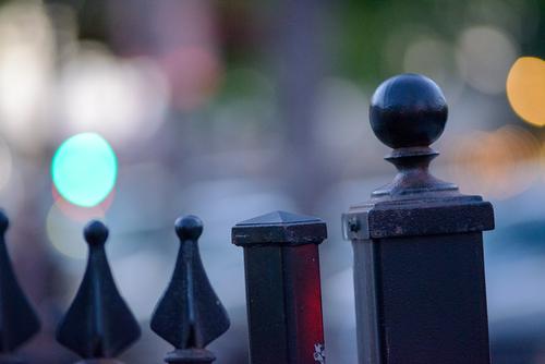
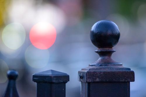
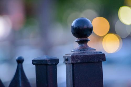
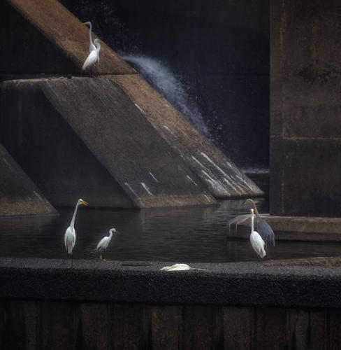
Thx for those. They are still nice enough images themselves. Note to self: if there are distant light sources, be sure to move the camera around the subject to see what effects the lens may create.
-
-
Thx heaps Paula,
Yes a somewhat older bottlebrush bloom. These birds are a great subject. No one shot can show the depth of colors they have. Depending on their pose, different feather colors will predominate. The angle of incident light also affects what we see. I saw, but didn't capture, one facing away from me with the light shining into his lower back. The feathers were a much lighter green with a lot of sheen. Also the lime green band at the back of their heads can show as almost yellow. I hope they stick around a while longer. -
@RoelHendrickx has written:
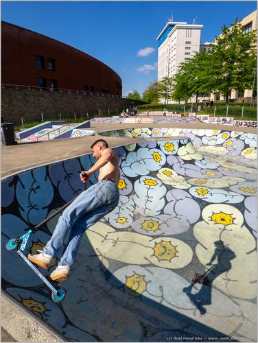
SKATEPARK LEUVEN
I think I have already mentioned that in May I have been busy shooting images for an upcoming book on Leuven (my alma mater).
I've rediscovered familiar places wiht fresh eyes, and have gotten acquainted with numerous new interesting spots.One of those was a skatepark near the reconverted area of a former Philips factory.
The below image will most probably not be considered or used for the book
(because that skatepark, like most items will probably need an image in landscape orientation;
portrait orientations are fairly rare in those books: most images are combined with text and don't fill a full page).So I am free to share this new image here for viewing and critique.
(But just in case I MUST ask you to NOT download the image.
You can view and enlarge it, but it should not be downloaded,
for the possibility that the publisher of the book still would like to licence and use this image)Lots of things come together here to make the image a success. We probably see the patterned arena first and then the boarder. It's a dramatic moment and the angle and the potential to fall, as frozen by the camera, has our attention. The sunlit board and lower half of the rider stand out against the shadow. Next we see the shadow and note that the rider must be hanging in mid air, and we enjoy the "capturing the moment."
The purpose is inclusion in a travel book. The patterned background makes the place significant. The large, curving area, top left, and the avenue of trees, then take us into the location. The photo is more than an action moment, it is concerned with place as well.
If I was the editor, I'd want to use it. -
@LouHolland has written:
Time of the year, no title, it speaks for itself 😎 I gues.
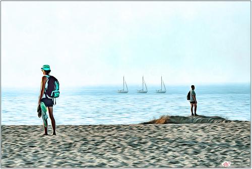
enlarge and then click the down arrow, thanks.The beach as a mystical place. A place we seek and dream of as escape. Two subjects, significantly positioned at the edges of the frame and looking outwards. They look beyond our field of vision. They are equipped to travel and enjoy a beach but they are searching. The sky and sea are there but they are not clearly defined. The same for the boats. Hopes and possibilities on horizons. A state of mind.
A most evocative image lou. -
@simplejoy has written:

Parallel bloomiverse by simple.joy, on FlickrThis is unusual. The centre stamens and pollen are sharply in focus and above the petals. The centre stands out because of this and because of its colour, central position and the lines that radiate from that centre. Everyting else is slightly soft. The black background provides dramatic contrast. There is no equivocation. We are to look at that centre.
This must be the way a bee sees a flower where everything is drawing it to that pollen laden centre.
I don't know whether it was the intent, but what I see is an image with a potent ecological message. -
@Bryan has written:@minniev has written:
Eulogy At A Dam Bird Funeral
I do several types of images of these birds: documentary, artistic, creative, and storytelling. This one is the latter. (Those always involve anthropomorphization).
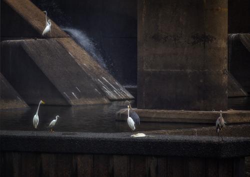
Last weekend I sadly found a departed dam bird who died on his perch. These deaths are usually from birds swallowing a fish with a hook and line in it. I have also seen deaths from diving head-first into the tumultuous rock filled water, but those bodies are usually found on the rip rap lining the river below. This entire week there has been a congregation of blue herons and great and little egrets that has stood around the dead great egret. They are not fishing or fighting or displaying, just congregating. These are very competitive birds who defend their perches aggressively so the behavior is unusual. I could add a flying dam bird in front of the blank post, but apparently, the funeral site is a no-fly zone so I'm undecided.
Better to respect the no fly zone... 😌
Agreed. As always with the Dam Birds, I see this image as part of the series and it is a very different moment. Sometimes the dam is full of movement, boiling waters and stage spotlighting. Not this time. The lighting is dark and the background forms subdued. The pure white birds stand out. Enough of them look towards the fallen bird and that plus the white, mean we cannot miss the death. the attitude of the birds suggests that they feel the moment.
I don't know what I'm looking at here. Are those darker birds real, a different species or caught in different light? The central darker bird has become ghostlike. It's positioning suggests a spirit leaving the body.
It is one of the wonders of your series that the same location can have so many different sides. -
@Rich42 has written:
Bryan,
Here are a few of the other images - camera moved just slightly in each. Very different appearance of the OOF background.
Rich
The first you've shown is definitely the best of this bunch. For me there is not a shadow of a doubt.
And I stick with my suggestion to crop that one to square. -
@RoelHendrickx has written:
SKATEPARK LEUVEN
I like the observation and thought, the idea and execution that went into this photograph ...... I can't say more than repeat what has already been said by others .... very nice ...
WhyNot
-
@minniev has written:
Eulogy At A Dam Bird Funeral
I do several types of images of these birds: documentary, artistic, creative, and storytelling. This one is the latter. (Those always involve anthropomorphization).
Last weekend I sadly found a departed dam bird who died on his perch. These deaths are usually from birds swallowing a fish with a hook and line in it. I have also seen deaths from diving head-first into the tumultuous rock filled water, but those bodies are usually found on the rip rap lining the river below. This entire week there has been a congregation of blue herons and great and little egrets that has stood around the dead great egret. They are not fishing or fighting or displaying, just congregating. These are very competitive birds who defend their perches aggressively so the behavior is unusual. I could add a flying dam bird in front of the blank post, but apparently, the funeral site is a no-fly zone so I'm undecided.
I like the narrative and as a picture on the wall it would warrant the time needed to contemplate the scene but worry that on the Internet that 10 second glance we get will not be enough time without the narrative This is a crude attempt but maybe something that might get more time ..
for the Internet .....
WhyNot
-
@PeteS has written:
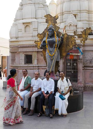
Mother India
The statue is of Mother India, but despite the femininity of the name, India is still a society where women are at the mercy of men more dramatically than many other countries.
Pete
Very effective and good street photography that conveys the idea well .....
WhyNot
-
@LouHolland has written:@LindaS has written:
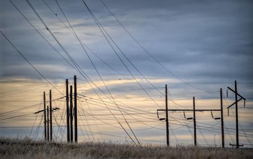
LINES
Hi Linda,
It looks like this is close to a power plant, it's not just lines but three different poles and also where the lines go and find their connection and this makes it more interesting to me. What have you tried to express here, the aesthetic interplay of lines, the chaos compared to a railway line that can also be found randomly on large surfaces or just a combination that raises the riddle!I like this picture because the viewer has to find the meaning for themselves.
Lou
@Bryan has written:Another title might be Man Made. Not necessarily dystopian but it looks a jumbled mess, because we lose depth. But we know the guy wires are not close to the HV wires.
Quiz: On the wires leading away from the 2nd set of 3 poles are little dumbbells. What is their purpose?
@minniev has written:I hate powerlines and first purchased photoshop long years ago specifically to rid myself of them. Now you have convinced me to view them as possibilities for artistic images. These have a mixed rhythm like a piece of jazz music, spread out across a sky that is equally nuanced. Placing the entry of the lines in the upper left corner has made the image readable instead of confusing. The scattering of birds and the edge of dead grasses remind us that even in the places we have most desecrated with our conveniences, nature survives.
Lou, Bryan and Minnie - thank you so much for your impressions. Fun to read the variety! I don't know the answers to any questions posed except Lou's "What have you tried to express here?" Not long after I became enamored with hops growing apparatus and trellis-style orchard apparatus (especially in winter), I found I was also taking photos of telephone poles and wires. I like their geometry, their silhouetted shapes, their organization. Minnie mentioned rhythm. Maybe that is a better word than organization?
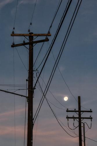
The photo I shared this week was shot a month ago. The photo below is from 2017, one of my favorite telephone pole oldies 😀
-
@JimKasson has written:
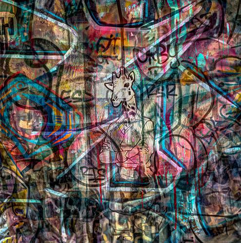
Graffiti composite.
Sometimes it's a standout out colour, this time it's the lack of colour when surrounded by colour and of course, the central position, that makes the elegantly attired gent the main feature. He's nearly buried in the whirl and slashes of spray can like lines and colours that are the hallmark of street graffiti. Add some cryptic initials and tags.
This of course isn't graffiti but it is fun. The figure is whimsical and amusing. If you want an elegant animal, it's hard to better a giraffe. The colours glow with the welcome of a stained glass window. I'd feel it as a tribute to the spirit of graffiti. -
@RoelHendrickx has written:
SKATEPARK LEUVEN
I think I have already mentioned that in May I have been busy shooting images for an upcoming book on Leuven (my alma mater).
I've rediscovered familiar places wiht fresh eyes, and have gotten acquainted with numerous new interesting spots.One of those was a skatepark near the reconverted area of a former Philips factory.
The below image will most probably not be considered or used for the book
(because that skatepark, like most items will probably need an image in landscape orientation;
portrait orientations are fairly rare in those books: most images are combined with text and don't fill a full page).So I am free to share this new image here for viewing and critique.
(But just in case I MUST ask you to NOT download the image.
You can view and enlarge it, but it should not be downloaded,
for the possibility that the publisher of the book still would like to licence and use this image)The photo shows an interesting contrast between the feeling of freedom given by the colour and curves of the skate track and, of course, the skater himself, and the more formal buildings behind. The skater, leaning into the jump, provides a leading line, as does the curved shadow, and this sense of movement continues through the shape of the track as we look further into the image, giving a sense of dynamism.
The separated shadow is cool too, and shows the skater’s trick even better than the actual skater.
The choice of babies as the decoration for the surface of the track is peculiar. Maybe the fact that they are tightly swaddled provides another contrast between the free-moving skater and the immobilised babies. Although I was amused to see that one of the babies, very definitely a boy, on the far bank of the track had managed to free himself partially at least from his restraining garment, and looked very pleased with himself!Pete
-
@LouHolland has written:
Time of the year, no title, it speaks for itself 😎 I gues.
enlarge and then click the down arrow, thanks.Summer feelings at last, and those feelings are linked to a sense of freedom too. We are no longer confined to a house, no longer need to wear so many clothes and are free to explore the world and express our individuality. Except it is difficult to be completely individual, completely alone. The disturbed surface of the sand shows dozens of other freedom seeking feet have passed that way. The small sailing boat, the ultimate symbol of freedom, is one of three identical boats, all heading the same way. Even the people are not alone, but make the best of it by being on opposite sides of the frame and face away from each other. We cannot see what they see, and this actually creates a feeling of curiosity and we experience the need for freedom to be able to explore outside the frame.
The colours are subdued, and it seems to be the evening of a fine day. The texture of the sand replicates the waves on the sea, and this is helped by the processing, which is painterly and works well with the scene.Pete
-
@simplejoy has written:

Double P's in apple... by simple.joy, on FlickrIf it's not obvious... (some people said, it isn't) these are of course peas, who might dream of being apples, when they grow up! 😉
Well, it wasn’t obvious! I might have guessed they weren’t apples, but I don’t think I would have recognised them as peas. It is a lovely idea, and so much more interesting than a macro shot of a couple of peas - or apples.
The choice of patterned cloth as a backdrop is not intuitive, as a plain colour would be more usual, but it is actually a great choice, and the round patterns link well with the peas, and, surprisingly, do not draw attention away or confuse the image.Pete
-
@minniev has written:
Eulogy At A Dam Bird Funeral
I do several types of images of these birds: documentary, artistic, creative, and storytelling. This one is the latter. (Those always involve anthropomorphization).
Last weekend I sadly found a departed dam bird who died on his perch. These deaths are usually from birds swallowing a fish with a hook and line in it. I have also seen deaths from diving head-first into the tumultuous rock filled water, but those bodies are usually found on the rip rap lining the river below. This entire week there has been a congregation of blue herons and great and little egrets that has stood around the dead great egret. They are not fishing or fighting or displaying, just congregating. These are very competitive birds who defend their perches aggressively so the behavior is unusual. I could add a flying dam bird in front of the blank post, but apparently, the funeral site is a no-fly zone so I'm undecided.
The Dam Birds deliver again! The occasion may be sad, but it actually gives the photo an unusual tranquillity and beauty. The grey heron behind the birds dead body really does look like its should departing. The other birds look solemn and motionless too. A fascinating scene.
Rather than placing a flying bird in front of the bare pillar, you could consider cropping it off. The dead bird would be near the corner instead of centre stage, where it is now, but those sloping surfaces lead to it quite nicely, so I think it would still have a suitable prominence.Pete
-
@JimKasson has written:
Graffiti composite.
One layer of graffiti over another is a very natural occurrence and it was a nice idea to pick up on that with your collage. The result is a pleasing composition. The giraffe has an informal frame, with two roundish shapes either side, some lines and even a couple of almost parallel diagonal lines. This helps draw attention to the centrepiece, but I think Mike is right, the fact that it is almost devoid of colour is what really makes it stand out against the chaos of colour all around it.
It is a good idea and well executed.Pete
-
@WhyNot has written:
Birds ....
WhyNot
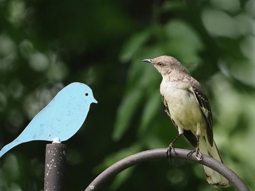
What a well seen piece of humour. The blank expression of the bluebird compares beautifully to the suspicious, inquisitive look of its feathered friend.
I agree with others that the darkened leaves in the background is an improvement.Pete
